Create a striking exhibition poster
Luke O’Neill shows you how good asset management can be key to streamlining multi-format projects
Sign up to Creative Bloq's daily newsletter, which brings you the latest news and inspiration from the worlds of art, design and technology.
You are now subscribed
Your newsletter sign-up was successful
Want to add more newsletters?
As the art editor of Computer Arts Collection, I’m responsible for the design of a lot of marketing and promotional materials related to the magazine. These can range from display ads in magazines to promotional booklets, web banner ads, stickers, and anything and everything in-between. As time has gone on, I’ve found that good asset management can not only streamline your workflow, but also make the realisation of a consistent, overall aesthetic for a campaign much easier.
In this tutorial I’ll run through the creation of a poster for an imaginary exhibition called Sirens, covering the creation of a simple logotype and grid, use of typography, image editing and pattern creation, and how all of these elements can easily be managed and rolled out across a range of collateral.

01 Begin by setting up a new document in InDesign. Select A3 as the page size and uncheck Facing Pages as we’re not creating a publication. We’re making everything from scratch, so I set the column number to one and everything else to zero because I’d like the design to inform the grid that we set up later.

02 First, let’s create a simple logotype. I chose Futura because it’s a contemporary sans serif that isn’t too overpowering, and I set the tracking to 500 in Optical mode. To add some character, draw some simple 0.3 weight lines and paste them between each letter in the text frame. As they’re pasted within the text frame, it’s possible to manually kern the lines as well as the letters. Once satisfied, convert the text to outlines and group all the objects.
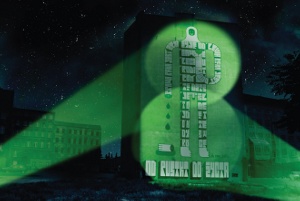
03 Now that we’ve created our first design element, we can begin setting up a library. In InDesign, go to File>New>Library, name it and save it in a suitable location. Now simply drag our grouped logotype into the library and, if you wish, you can double-click it to give it a name and a description. For now we can delete the logotype from our main document and simply drag it from the library later when we need it.
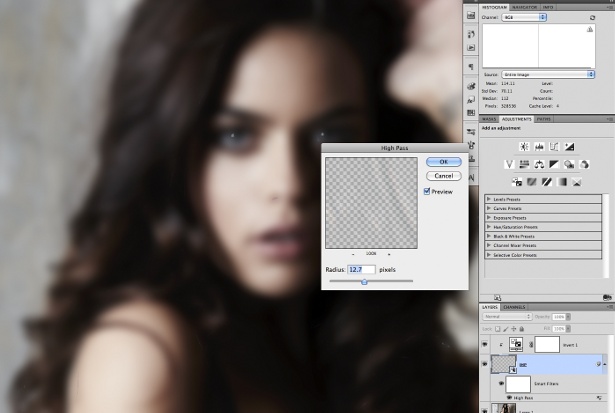
04 Now begin setting up the grid by navigating to Layout>Margins and Columns. Set the right-hand and top margins to 40mm – wider than the 15mm inside and bottom margins, as we want the poster to have a layered look. Drag a ruler guide to the righthand margin, hit Ctrl/Cmd+Alt/Opt+U to step and repeat the guide, and set the horizontal offset to -40mm. repeat this for the top margin, setting the vertical offset to +40mm.
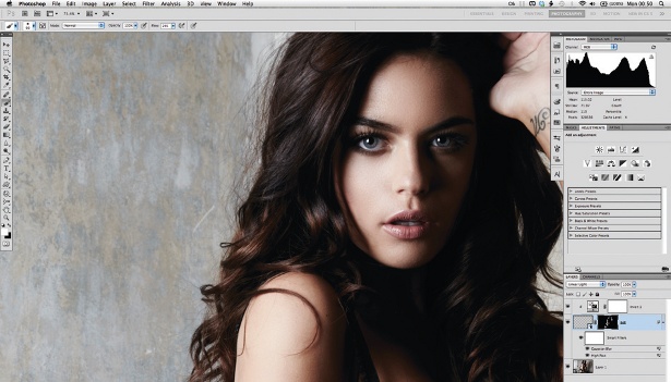
05 I always like to work in grayscale initially, so set up some grey swatches and use the rectangle Frame tool to block out the composition. At this stage we can drag our logotype back in and position it flush against the right-hand margin. It’s also a good idea to organise your layers at this stage. I’ve chosen to set up background, graphics, text and logotype layers for all of the separate elements.
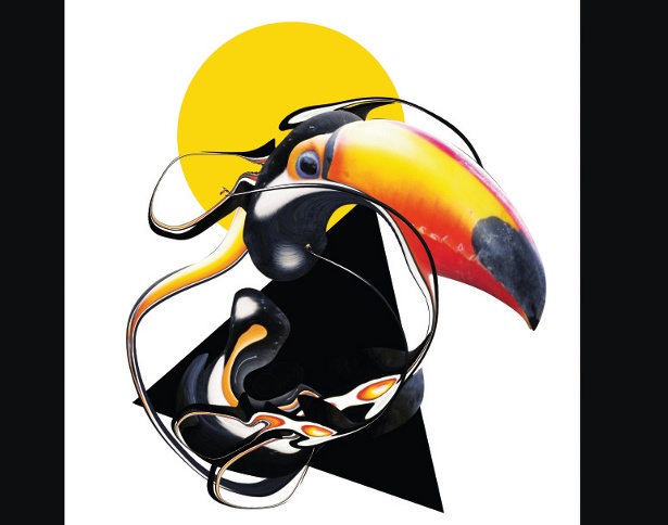
06 I then imported a text file – in this case, a list of designers who will feature in the exhibition. To keep the overall look and feel simple and consistent, choose Futura again to mirror the logotype, but this time reduce the tracking to 300 to increase the text’s legibility at the much smaller 12pt text size. Select the All Caps command and set the leading to 16pt.
Sign up to Creative Bloq's daily newsletter, which brings you the latest news and inspiration from the worlds of art, design and technology.
07 Now that we’ve decided on a style for the body copy of the poster, we can set up our baseline grid based on those values. go to Preference> grids. Set the grid to start at 40mm – the same as our top margin – and set it to increment every 16pt (the same as the leading of our text). Uncheck the ‘grids in Back’ option so that the grid is always visible, and in the Paragraph panel, select the ‘Align to Baseline grid’ option.
08 It’s always wise to create style sheets for any text, regardless of whether it’s a one-page document or not. Simply select some of the text and, in the Paragraph Styles panel, select New Paragraph Style from the drop-down menu in the top-right. The beauty of style sheets is that if at any point we want to adjust the type, we can go back into the style sheet, select redefine Style and it will update all of the type assigned to that style.

The Creative Bloq team is made up of a group of art and design enthusiasts, and has changed and evolved since Creative Bloq began back in 2012. The current website team consists of eight full-time members of staff: Editor Georgia Coggan, Deputy Editor Rosie Hilder, Ecommerce Editor Beren Neale, Senior News Editor Daniel Piper, Editor, Digital Art and 3D Ian Dean, Tech Reviews Editor Erlingur Einarsson, Ecommerce Writer Beth Nicholls and Staff Writer Natalie Fear, as well as a roster of freelancers from around the world. The ImagineFX magazine team also pitch in, ensuring that content from leading digital art publication ImagineFX is represented on Creative Bloq.
