
Fashion has always been an industry of abundant creativity, but when we're blinkered by luxe fabrics and exuberant garments, it's easy to overlook the raw foundation of fashion branding. You'll find that beneath the glamour, each fashion house has a strong brand identity, and holding it all together is the crucial yet overlooked power of typography.
To learn more about the influence of typography in fashion, I caught up with Monotype's senior executive creative director, Charles Nix, to discuss the important role of type in couture. From the “great sans scare” to the influence of AI, Charles uncovers the heritage of fashion typography and what the future holds for this important creative alliance.

Charles Nix is a senior executive creative director, designer, typographer and educator. As lead designer for Helvetica Now, he has gone on to design a number of popular typefaces in the Monotype Library.
How have fashion brands evolved their use of typography over the years?
Some fashion brands have been here for a century or more. Others are decades old. Others are newcomers. Some inherit heritage. Some are trying to establish it. Some are still finding their voice. Some are making their mark – literally typing themselves into existence.
The “great sans scare” of the 2010s was real, but largely overstated. The pandemic forced nearly every brand to become more digital, and many responded by simplifying. For some observers, that felt like a betrayal of distinctive brand voices. In retrospect, it looks more like a temporary adaptation than a permanent shift.
Fashion changes season by season. The logo endures.
Ultimately, it was a short-lived trend. Distinctive marks never really disappeared. If anything, they’re returning just as brands face a new challenge: maintaining a recognizable voice inside increasingly standardized AI environments.
The pandemic demand for digital-first did something to websites that may be non-obvious. The momentary disappearance of in-store experiences thrust websites to a new prominence. Fashion websites already existed alongside physical retail experiences, but in their new digital-first role, they became the design and typographic equivalent of those spaces – quiet, tasteful, and ultimately very predictable. Nearly every fashion website uses the same minimal, sans-serif type, lots of white space, and the discreet logo as brand mnemonic.
Why do fashion houses lean so heavily into typography, rather than relying solely on visual imagery or garment design?
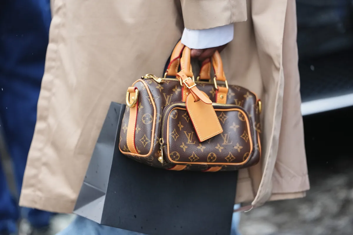
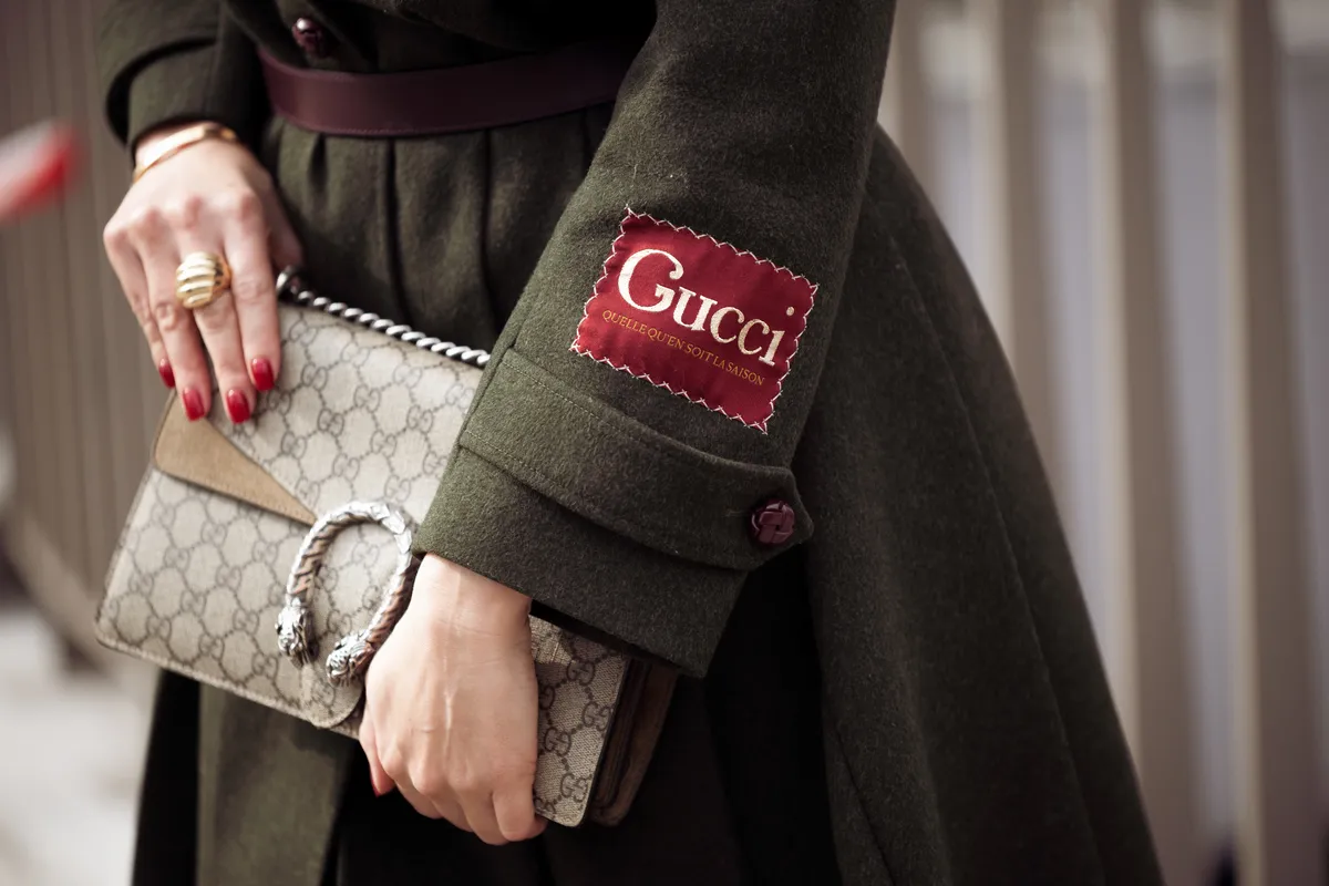
Fashion’s (and the fashion consumer’s) obsession with the label is nothing new. The label – the logo – is an icon in the most fundamental sense of the word. It stands in for the long-term promise of a product that is inherently ephemeral. Fashion changes season by season. The logo endures. The logo and typography, more broadly, act as anchors. They hold fast to the unifying idea of the brand while everything else evolves.
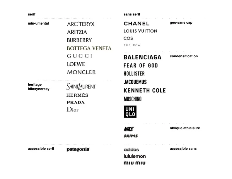
Fashion is a big tent. High-end heritage brands share space with upstart sport and streetwear brands. Still, a few broad typographic categories begin to emerge.
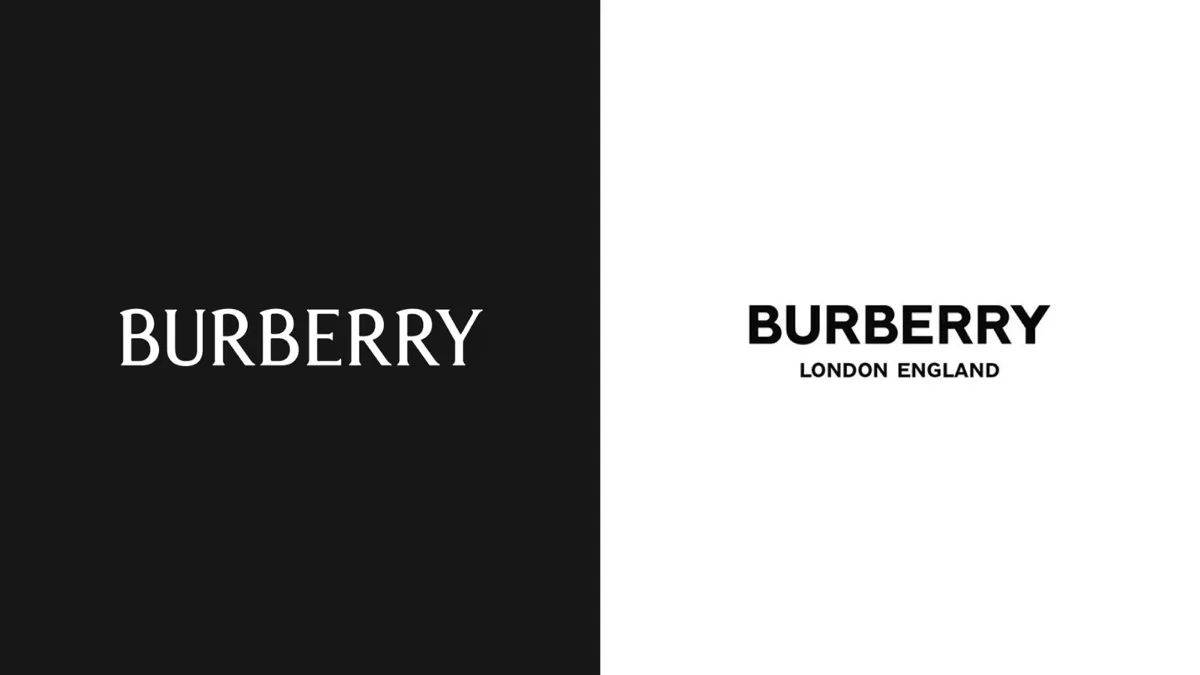
We’ve seen a massive wave of “blandification” in luxury logos. Is this a loss of individual brand heritage, or is it a strategic move to let the broader typographic system do the heavy lifting?
“Blandification” is a great word, but the evidence suggests the premise behind that widely circulated graphic was overstated. Heritage and luxury fashion remain deeply attached to their collection of idiosyncratic, meticulous, lettering-based logos.
There are high-profile examples of struggles to refine favorite logos, but the heart of the order is solid, entrenched, wed to their logo heritage. I think that single graphic of all of those sans-serif logos was a kind of design-criticism McGuffin. It was stark visual evidence, but carefully picked to tell a story.
For instance, I could construct an equally convincing narrative that blandification has given way to “minumentalism.” The evidence would be selective. The conclusion would be dubious. The graphic would still look persuasive.
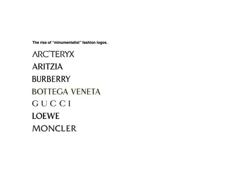
To drive the point home, here’s a second red herring:
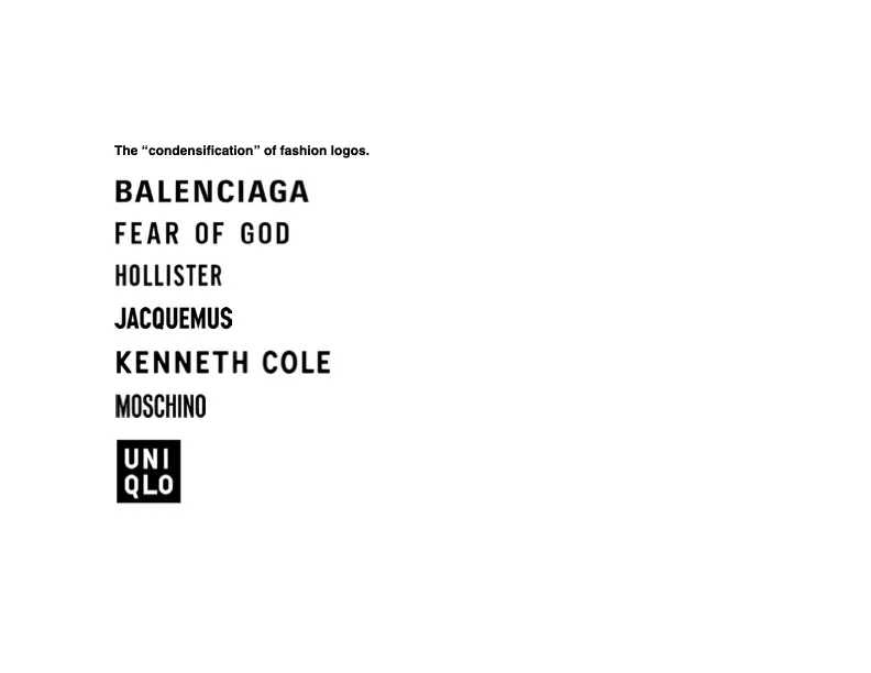
Both of these trend-non-trends are remarkable on the surface, but the brands occupy different segments, were designed at different times, and – most importantly – exist within a much larger and more varied universe of fashion logotypes.
How does type act as a brand’s tone of voice?
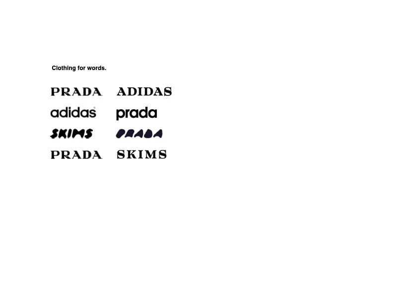
Typography does not act alone. A typeface becomes meaningful when attached to a specific word. Adidas is not iconic because it uses a geometric sans. Adidas is iconic because generations of people have learned to associate that specific geometric sans with the word adidas.
Historic and emotional connections with form, coupled with unique names, can be a potent combination.
What’s the biggest challenge facing today’s fashion brands when it comes to typography?
It isn't AI itself. It's what current AI environments do to brand identity.
The current interface for LLMs is akin to email advertising or the web before fonts (yeah, at the turn of the century, typography on the web was laughably limited).
Typography is such an essential aspect of brand connection that when it’s missing entirely, it’s like a world with only vanilla ice cream. Brands spent decades developing typographic voices. Current AI interfaces largely strip those voices away.
Looking toward the future, how do you see typography being utilised in fashion?
I’m always up for seeing type enter the surface of the garment in more thoughtful and thought-provoking ways, as in the work of Lamine Badian Kouyaté, Virgil Abloh, and nearly every streetwear brand to some degree.
I had a conversation just last night with a fashion designer friend ready to launch a new line. I posited to him that the fashion logo, in a wholly non-cynical way, is the promise of the brand. Before a single garment is designed and put into the world, the logo architects expectations.
I'd like to see more brands fully embrace that reality. The logo is not attached to the fashion brand; it is the first manifestation of the fashion brand. The typography arrives before the garment, before the campaign, and before the collection. The promise comes first.
The Brand Impact Awards 2026 are now open for entries! If you have a standout branding project from the last year that you think deserves recognition, you need to enter the BIAs. You have until July 9 to enter can do so on the Brand Impact Awards website.

