

It seems logo redesigns can cause big controversy everywhere these days. It doesn't matter if it's the real city of Bloomington, Indiana, which has managed to propose a logo design that looks like a butt, or the fictional world of Harry Potter.
HBO's Harry Potter TV series is coming in December, and the channel has revealed the new symbols for each Hogwarts house: Gryffindor, Slytherin, Ravenclaw and Hufflepuff. Naturally, they were never going to be the same as the designs used in the Warner Bros movies, but some fans feel the new look is too much of a departure – and even a sign of the decay of art itself.
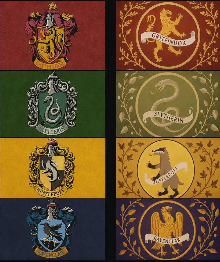
HBO Max provided a glimpse of the new Hogwarts logos in its preview documentary, Finding Harry: The Craft Behind the Magic. The designs mainly retain the colours of those from the movies, but the emblems themselves are very different.
The movies presented the Hogwart house symbols in the style of classical family crests, complete with healm, shield and mantle. They were elaborate and fussy – the sort of design that would make an app or merchandise designer despair. But we are talking about a centuries-old school of magic housed in a sprawling, seven-storey castle. Logo design scalability probably wasn't a priority for Godric Gryffindor, Rowena Ravenclaw and the other founders.
But it is for HBO. Perhaps thinking that a smaller screen needs more readable designs, its created much simpler Hogwarts icons with bigger mascots. They're placed on medieval-looking circles instead of shields and have less fussy ornamentation.
In one aspect, the new designs are more faithful to the books. The Ravenclaw's house crest depicts an eagle, which is how JK Rowling described it. The movies had changed this to a raven, presumably to link with the house name. But the mascots were never intended to represent the names (Gryffindor's symbol is a lion, not a mythical griffin).
This is hilarious, so we are witnessing the decay of art. The new crests looks like AI generated images. There are many passionate designers who would have done better. HBO is not interested in putting efforts. Not to mention the crests' lake of elegance and auraSeptember 3, 2026
But despite the correction of that departure from the literature, it seems that many Potterheads are unimpressed. Some are concerned that the trend towards minimalism in logo design is now entering fictional worlds too. "They look like tech app logos," on disgruntled fan complains on X.
"Beautifully decorated vivid heraldic compositions or bleak generic minimalistic circles with shabby sticks that look like it's grandma old plates that were forgotten in a park after a picnic and will remain there because nobody cares enough to return for them," is another view.
Some go even further. "We are witnessing the decay of art," one person writes. "The new crests look like AI generated images".
Someone else has the same suspicion. "This has to be AI. The centering is off for the animals, the thickness of the lines is inconsistent, the shape of the badges is off".
There appear to also be variant crests in the series (what is this, the NHL?). These are also being questioned, with some fans unconvinced that the house of Ravenclaw would choose to express its motto in Arial Rounded. "Very muggle," one person writes on Reddit.
Perhaps they would be better using the new Lionel Messi font.
Our first look at a variant of the Hogwarts Crest from HBO's Harry Potterfrom r/HarryPotteronHBO
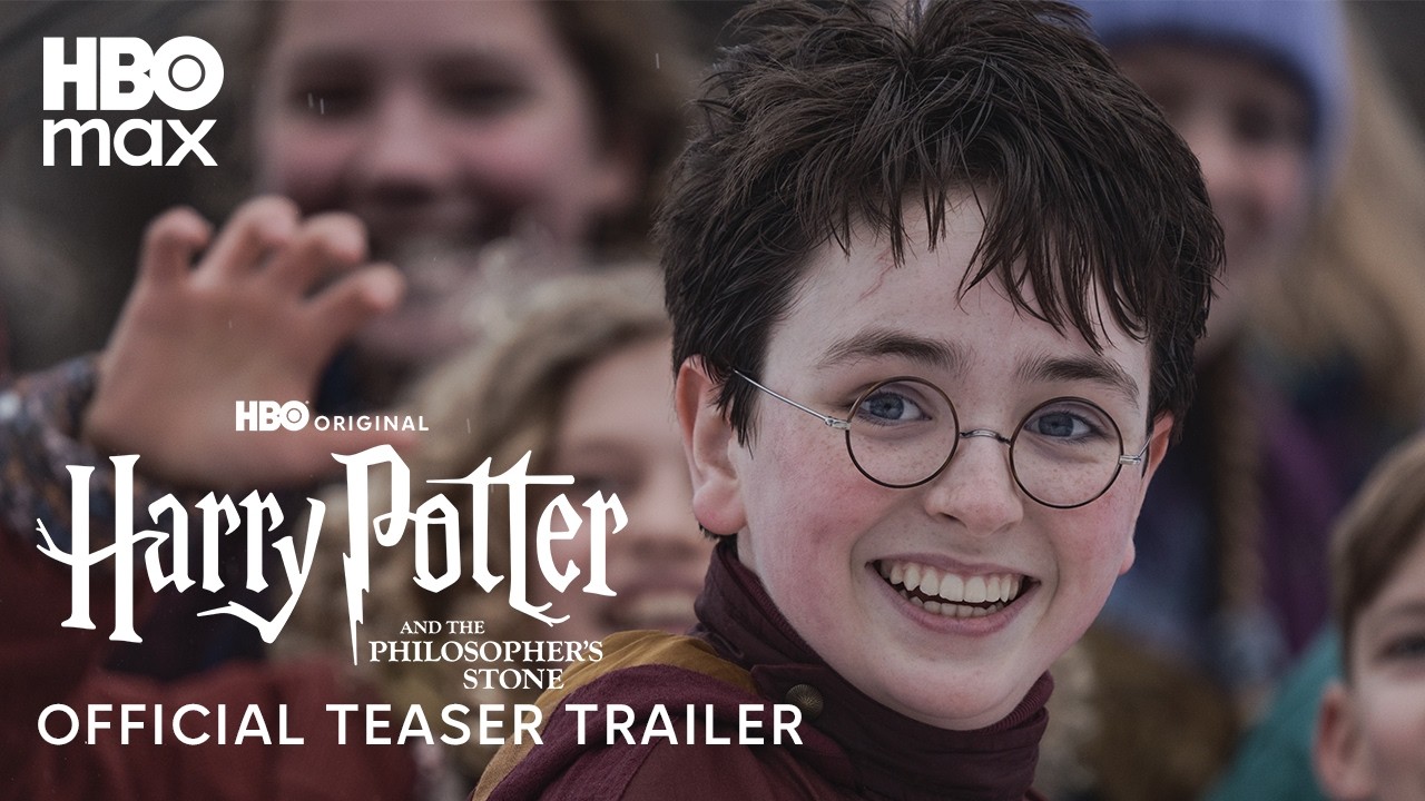
Here's the trailer.