The top colour trends for 2017 revealed
Creative consultancy FranklinTill delivers in-depth analysis of the colour palettes for the coming year.
Pink was rebranded in 2016. No longer the reserve of the soft and the meek, the world became awash with pink tint as designers and brands indulged in shades ranging from rose to fuchsia.
In last year’s forecast we predicted that industrial pastels would be big, and that pink would become the new neutral, shaking off its feminine connotations to represent gender neutrality and equality. At the end of 2015 Pantone announced a shade of soft pink, Rose Quartz, as one of its joint colours of the year, and the pastel soon popped up on everything from catwalks to convertibles.
It’s perhaps no coincidence that 2016 also became the year of neutrality. Ideas of gender norms dissolved, and identity became self-defined rather than something you’re born into. Product, space, fashion and packaging design not only rejected gender stereotypes, but went on to rebel against them. Shades of powder, blush and rose were de-feminised and adopted by confident millennial brands across all consumer sectors.
Article continues below 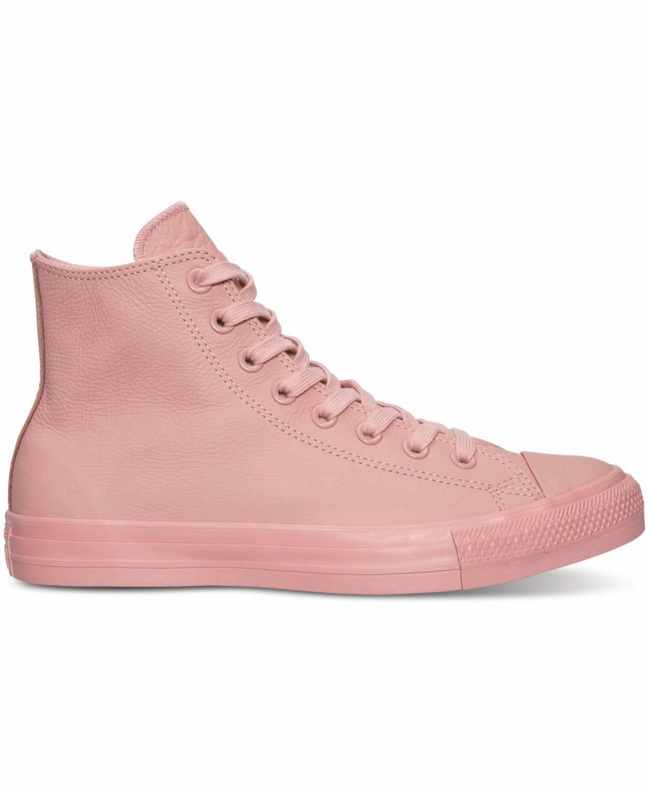
Following in the footsteps of Swedish fashion brand Acne, whose unapologetic brand pink inspires nothing but confidence, young labels such as the confrontational underwear company Thinx juxtaposed vibrant shades of pink, in brash adverts that didn’t shy away from their somewhat censored message.
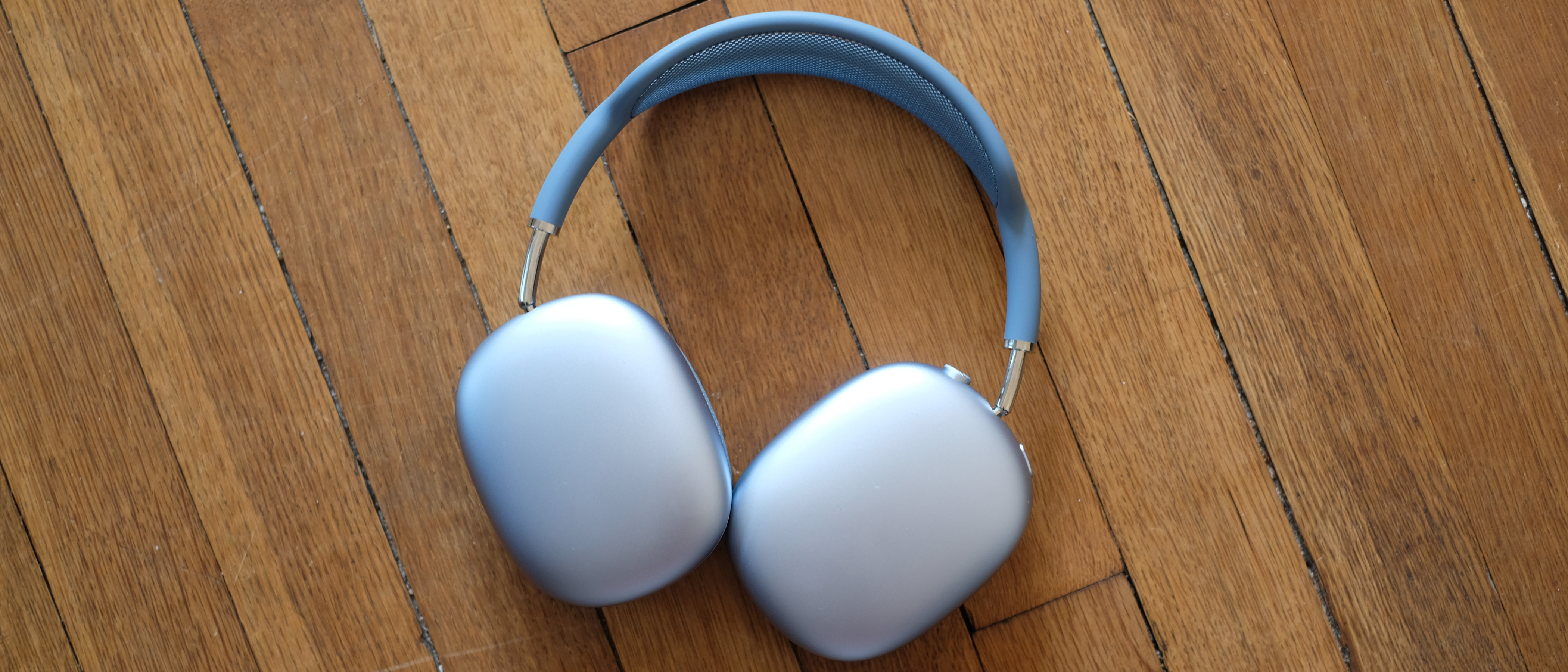
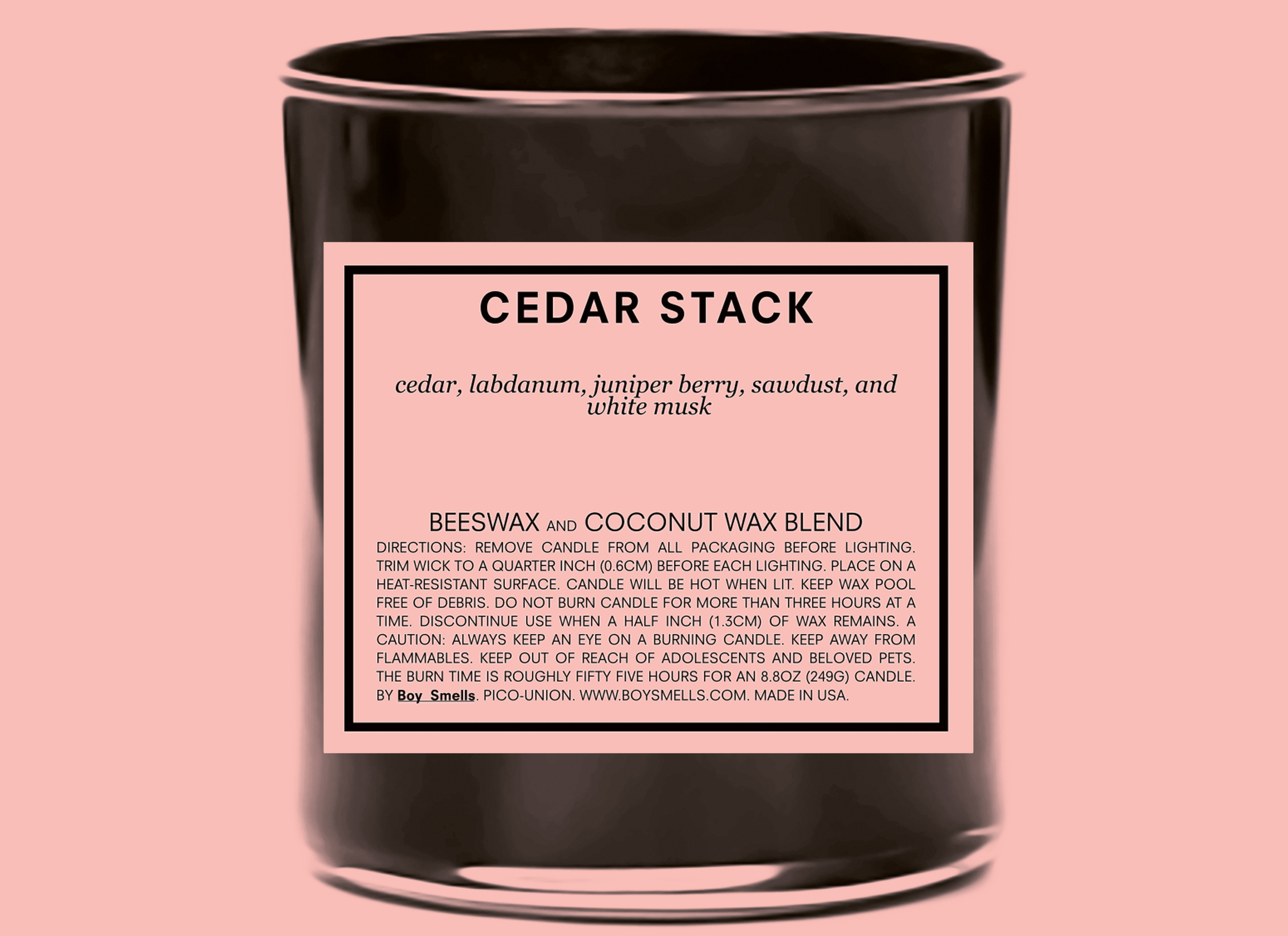
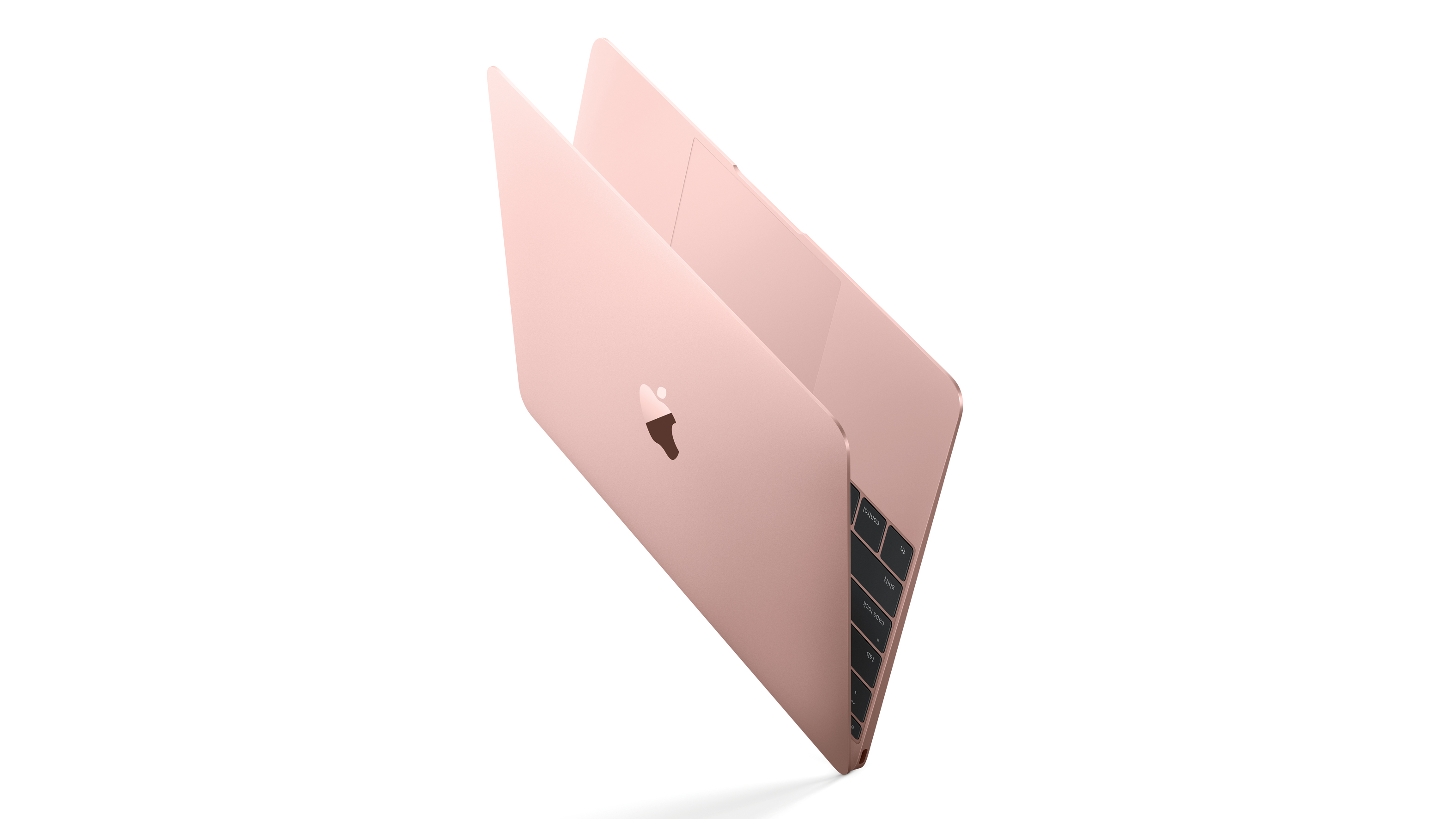
Masculine home-wear brand Boy Smells also adopted the colour pink to challenge conventions around typical masculinity. Even tech pinked up, by way of Apple’s rose-gold iPhone, and according to Beveragedynamics.com, even rosé wine sales in the United States had grown by 31.8 per cent by the end of 2015.
2016 saw social media become a vehicle for contextual rebranding, as shades known as ‘millennial pink’ and ‘Tumblr pink’ proliferated on Instagram and Pinterest, by way of youth self-expression of curated good taste. Perhaps another reason pink has dominated visual communication and branding over the past year is its psychological impact.
As a derivative of red, the most stimulating of colours, pink is believed to have a calming and soothing effect on our emotional state. In a year of political tension and economic unrest, some neutrality and nurturing design is a welcome distraction.
Sign up to Creative Bloq's daily newsletter, which brings you the latest news and inspiration from the worlds of art, design and technology.
Experimental extreme sportswear brand Vollebak has even used Alexander Schauss’ Baker-Miller Pink theory (where a tone of pink known as P-618 is claimed to reduce hostile, violent or aggressive behaviour) to develop a mind-hacking hoodie that helps slow down heart rates, and quickly eases athletes into a state of utter calm and recovery.
As 2017 begins, we’re approaching a tipping point. Pink is not set to disappear, but we’ll see our base palette shift towards flesh and tan. Reflecting humanness and realism, and concepts of naked and nude, visceral skin tones will come to the fore as the next neutral.
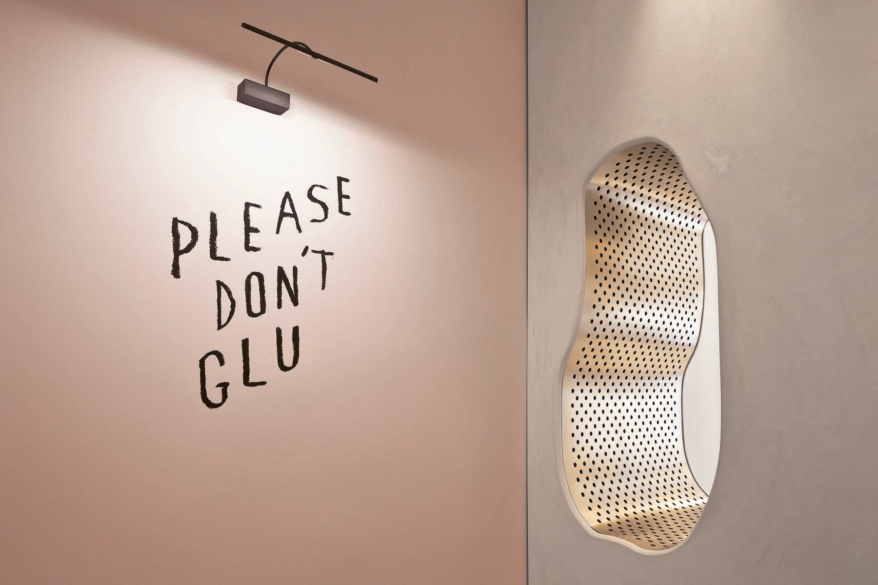
In this article we’ll provide you with the key colour trends for 2017, together with the key insights driving these palettes. At FranklinTill we don’t believe in reporting flash-in-the-pan seasonal trends. We don’t believe trends simply disappear to make room for new trends, but that movements gather momentum and colour palettes evolve, manifesting in different ways as they move from the periphery towards the mainstream.
Neither do we believe in mimicking the work of great design in an attempt to be ‘on trend’. We aim to draw attention to those who are the driving force behind emerging design movements and celebrate their inspirational creativity. Read on to discover which colours will lead the way in 2017...
Read on to find how nude and beige colours will be redefined
