The best graphic design software, for pros, hobbyists and everyone in between
The best graphic design software should be an extension of your creativity, not a hindrance, and with so many available, it can feel overwhelming to find the right fit. Whether you're just starting out or thinking of migrating to a new program, this extensive guide should help you make an informed decision.
There are plenty of things to consider when choosing your graphic design software, from price to functionality, so it's best to consider a wide range of options before splashing out the cash on popular options like Adobe’s Creative Cloud Suite. In this guide, we'll take you through budget-friendly and industry-favourite options to help you pick the right program for your needs. For more creative insight, check out the best laptops for graphic design, and take a look at our guide to the best digital art software.
Quick list
Illustrator remains the industry-standard graphic design software for creating and editing vectors, from logos to illustrations. Regular updates have kept it ahead of rivals.
Read more below
Photoshop continues to dominate the profession when it comes to image editing for raster graphics, now boasting impressive AI features like Generative Fill and Expand.
Read more below

If you're put off by Illustrator's subscription, we think this is the best alternative with a one-off cost. It doesn't match all of Adobe's most advanced tools, but it's versatile nonetheless.
Read more below
Don't want a subscription? Affinity Photo is a powerful, cost-effective alternative to Photoshop that offers professional-grade editing capabilities without the subscription burden.
Read more below
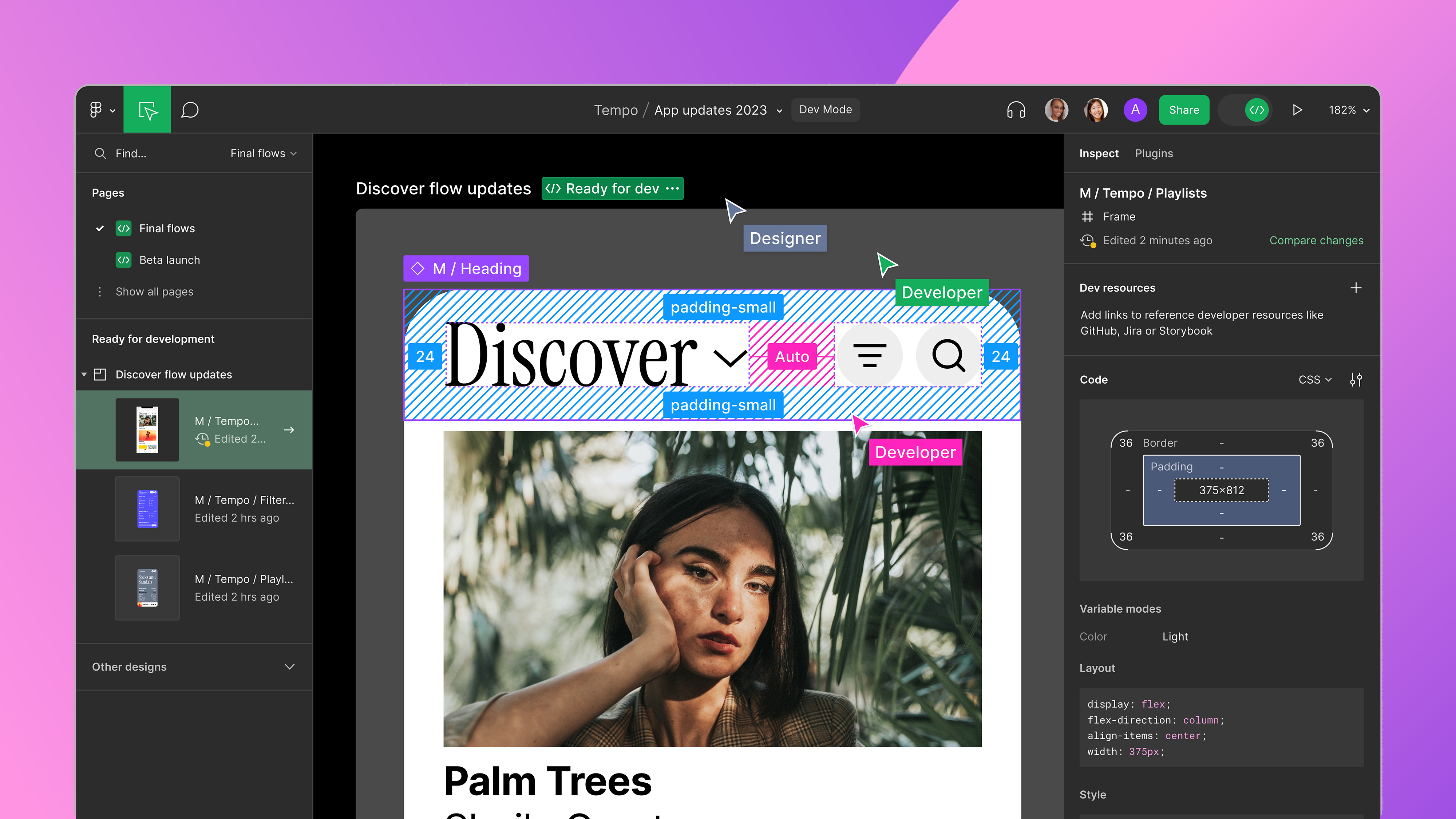
Primarily designed for UI/UX designers, product teams, and digital designers, Figma is great for its collaborative tools, which makes it easy for teams to work on a project simultaneously.
Read more below

GIMP is the most feature-rich software you'll get for no money. While it's not as powerful as others on this list, it's open source, which means it's constantly being updated and improved.
Read more below
The best graphic design software in full
Why you can trust Creative Bloq
The best vector editor

Specifications
Reasons to buy
Reasons to avoid
✅ You work as a professional designer: It's the industry standard, and employers expect you to know it.
✅ You want integrated AI tools: Adobe are adding these all the time.
❌ You're short of cash: It's only available by subscription.
❌ You only work on iPad: The iOS version of Illustrator isn't the same as the desktop version.
🔎 Adobe Illustrator is the best vector design software we can recommend today. It lets you create everything from illustrations to logos, and has a lot of useful features and shortcuts to help speed up your workflow. ★★★★
What you need to know: Adobe Illustrator remains the industry-standard vector graphics software in 2025. It features regular updates and now includes powerful AI-powered tools through Adobe Firefly. While it has a steep initial learning curve, it offers a pleasant interface once mastered. The latest version (29.5, April 2025) includes significant performance upgrades with up to 10x faster processing for common tasks, enhanced AI capabilities like Generative Shape Fill, Text to Pattern, and improved Text to Vector generation. New features also include Japanese typography improvements, Retype font matching, and highly requested user features such as pattern/gradient saving to Creative Cloud Libraries, area calculation for shapes, and font embedding directly into files.
Who it's for: Illustrator is primarily designed for professional graphic designers and illustrators, particularly those working in industry settings where it's the expected standard. It's essential for vector artists creating logos, illustrations, and other vector graphics, and particularly valuable for those who need to collaborate with other industry professionals. The latest performance and typography improvements also make it valuable for international designers, especially those working with Japanese, Korean, French, and German type.
What it can do: The software enables you to create and edit vector illustrations, logos, and graphics with professional precision. You can create mockups by automatically wrapping designs onto objects, and match fonts with the enhanced Retype tool that now supports multiple languages including Japanese, French, and German. The online collaboration feature works via the browser, while integration with other Creative Cloud apps enhances workflow further.
Pricing and payment: Illustrator is only available through subscription for $22.99 per month, which includes Adobe Express and Adobe Firefly. You can also access Illustrator as part of an all-apps Creative Cloud subscription for $59.99. The best strategy is to sign up during promotional offers to secure first-year discounts, though the long-term subscription model makes it more expensive than one-time purchase alternatives. Student discounts are also available.
Should you buy it?: Casual users might find the subscription cost difficult to justify, but for professionals and industry workers, Illustrator remains an essential purchase as the industry standard. The expanded AI tools now include more refined generative capabilities for shapes, patterns and vector graphics, while typography improvements make it particularly valuable for international designers. Regular updates and seamless integration with other Adobe products make it particularly valuable for professional workflows. For other vector editing options, see our guide to Illustrator alternatives.
See our full hands-on Adobe Illustrator review for more details, and see our guide to how to download Adobe Illustrator.
Attributes | Notes | Rating |
|---|---|---|
Price | Subscription-only, expensive | ★★★ |
Features | Extensive range of tools | ★★★★★ |
Works with other software? | Fully integrated with Creative Cloud | ★★★★★ |
The best raster editor
Specifications
Reasons to buy
Reasons to avoid
✅ You need industry-standard tools: This is the most widely used professional image editor.
✅ You want cutting-edge AI features: The latest generative tools are powerful and well-implemented.
❌ You're on a tight budget: The subscription model makes it expensive in the long term.
❌ You only need basic photo editing: Simpler, cheaper alternatives exist for basic tasks.
🔎 Adobe Photoshop continues to define professional image editing with its comprehensive toolset and innovative AI features, though the subscription model may deter casual users. ★★★★
What you need to know: Adobe Photoshop remains the industry standard for image editing and digital artwork, continuously evolving since its release 34 years ago. The 2025 version builds on the AI momentum established in previous years, enhancing Adobe Firefly and Sensei capabilities with new features like Composition Reference and Select Details. These join existing AI tools like Generative Fill and Generative Expand, allowing you to intelligently manipulate, extend, and generate content with increasing precision and creative control.
Who it's for: Photoshop caters to a broad audience, including photographers, digital artists, graphic designers and UX designers. While the learning curve can be steep for beginners, the software remains the go-to choice for professionals working in creative industries, from photo retouchers to digital painters.
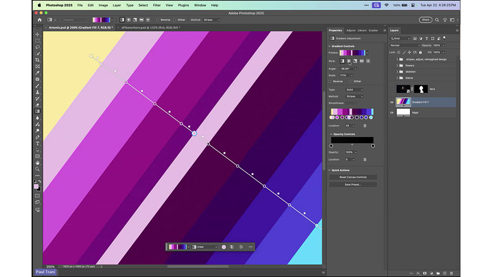
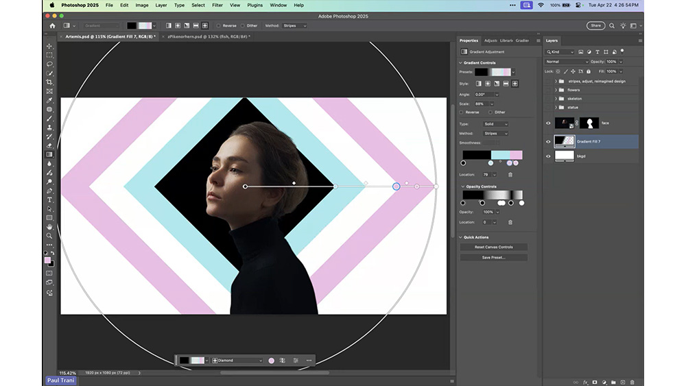
What it can do: Beyond basic photo editing, Photoshop offers a vast array of sophisticated tools for digital painting, 3D modelling and UX design. This means the software can handle everything from basic photo touch-ups to complex digital art creation. The 2025 update introduces several significant improvements, including Stripes in Gradients (a new interpolation option for the Gradient Tool), Composition Reference (allowing you to apply structure and visual arrangement from reference images), Select Details (which makes selecting difficult elements like hair, facial features, and clothing faster and more intuitive), and a reimagined contextual task bar that learns from your workflow. These join existing capabilities including advanced layer management, colour correction, selection tools and filter options.
Pricing and payment: Available only through subscription, Photoshop costs $29.99/month individually or comes as part of the Creative Cloud suite for $59.99. While the subscription model may be costly for casual users, it ensures regular updates and access to the latest features. Discounted educational pricing is available for students and teachers.
Should you buy it?: For professional creatives, Photoshop remains an essential purchase, particularly given its integration with other Adobe products. The continued evolution of AI features makes it even more powerful, with the 2025 updates focusing on both workflow efficiency and creative possibilities. These improvements further cement Photoshop's position as the industry leader, though casual users might still find the subscription cost hard to justify.
See our full Photoshop review for more details. For help understanding the different payment options, see our article on How to download Photoshop.
Attributes | Notes | Rating |
|---|---|---|
Price | Subscription-only, premium pricing | ★★★ |
Features | Comprehensive professional toolset | ★★★★★ |
Works with other software? | Full integration with Creative Cloud | ★★★★★ |
The best-value vector editor
Specifications
Reasons to buy
Reasons to avoid
✅ You don't want a subscription: The one-time payment model offers excellent long-term value.
✅ You need speedy performance: Affinity Designer is fast at handling complex documents.
❌ You need specific Illustrator features: No mesh fill or image tracing capabilities.
❌ You rely on plugins: There's no plugin or scripting support here.
🔎 Affinity Designer offers professional-grade vector design capabilities with exceptional performance and value. While it may lack some specialised features, it more than makes up for this with its speed, stability, and affordable one-time payment model. ★★★★★
What you need to know: Affinity Designer is a powerful vector graphics software that offers a compelling alternative to Adobe Illustrator which is cheap and subscription-free. It also offers some unique capabilities such as infinite redos, zoom levels over 1,000,000%, and the ability to switch between vector and pixel editing within a single application.
Who it's for: Affinity Designer is ideal for both professional designers and hobbyists who want professional-grade vector tools without taking out a subscription. It's particularly well-suited for those who work across both vector and raster files, thanks to its interchangeable personas. The software caters to print and digital designers, technical illustrators, and those working on CAD-related documents, while remaining accessible to newcomers.
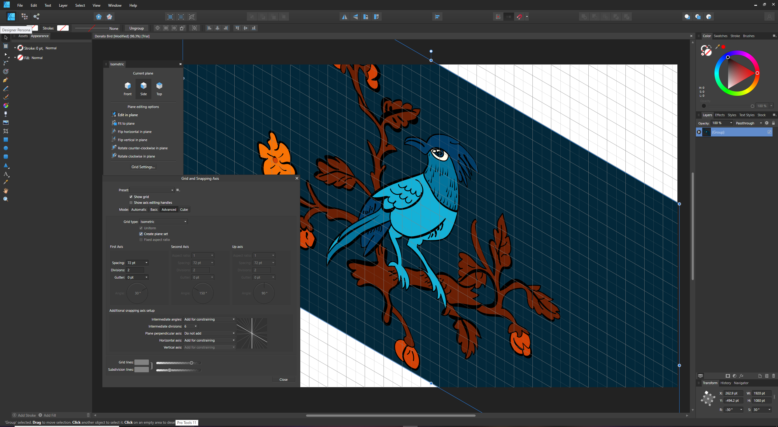
What it can do: The software provides comprehensive vector editing capabilities with a solid range of tools comparable to Illustrator. It handles both AI and PSD files, ensuring compatibility with Adobe workflows. Notable features include the ability to switch between vector and pixel personas without changing applications, comprehensive grid and smart snapping options, and advanced brush tools with pressure sensitivity support. The software runs at 60fps and offers exceptional performance when handling complex, layered documents. Highlights include the Stroke Width tool for editing pressure profiles of curves, support for variable fonts, and an enhanced Spiral tool with multiple spiral types. It also offers specialised tools like Shape Builder, Contour Tool for path offsetting, X-Ray View for split-screen editing, and an Area Tool that measures the perimeter and area of any shape.
Pricing and payment: Affinity Designer 2 is available for a one-time payment of $69.99 for Mac or Windows, with the iPad version costing $18.49. A complete suite including Designer 2, Photo 2, and Publisher 2 costs $164.99. This pricing is significantly more affordable than Adobe Illustrator's subscription model ($20.99 per month) or CorelDraw's higher up-front cost. Free upgrades last until the next major version release, at which point an upgrade fee applies.
Should you buy it?: For those seeking a professional-grade vector editor without ongoing subscription costs, Affinity Designer presents excellent value. While it still lacks some specific features like comprehensive symmetry and pattern-making tools, its performance improvements, unique capabilities, and smooth workflow make it a serious contender in the vector design space. Notably, the current version maintains Pantone color libraries at no additional cost, which is a significant advantage over Adobe products that now require a separate Pantone Connect subscription ($59.99-$90 annually).
See our full Affinity Designer review for more details.
Attributes | Notes | Rating |
|---|---|---|
Price | Subscription-free, cheap | ★★★★★ |
Features | Strong core toolset | ★★★★ |
Works with other software? | Compatibile with AI/PSD files, integrates well with other Affinity products | ★★★★ |
The best value raster editor

Specifications
Reasons to buy
Reasons to avoid
✅ You want professional editing tools on a budget: Affinity Photo is cheap and subscription-free
✅ You don't like clutter: Affinity Photo's interface is nice and streamlined
❌ You require AI-powered features: Serif aren't going hard on this like Adobe.
❌ You're deeply embedded in Adobe's ecosystem: You can save to Adobe file formats, but that's about it.
🔎 Affinity Photo is a powerful, cost-effective alternative to Photoshop that offers professional-grade editing capabilities without the subscription burden. While it may lack some cutting-edge AI features, its performance, compatibility and feature set make it an excellent choice. ★★★★
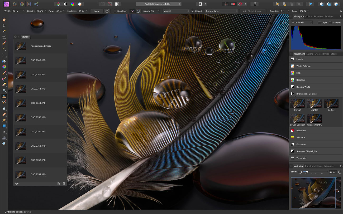
What you need to know: Affinity Photo is a powerful alternative to Photoshop. It offers professional-grade photo editing capabilities with a one-time purchase model rather than a subscription. Now in version 2.6, it provides comprehensive photo editing tools, supports PSD files and smart objects, and operates efficiently even on older hardware with minimal system requirements. While it excels at traditional editing tasks, it notably lacks an asset management system and some AI-powered features found in rivals.
Who it's for: Affinity Photo is designed for photographers, digital artists and designers who want professional-grade editing capabilities without ongoing subscription costs. It's particularly suitable for those with older hardware, as it runs smoothly on systems with minimal requirements. The software appeals to both professional photographers seeking a Photoshop alternative and hobbyists who want powerful editing tools without the premium price tag. It's especially valuable for those who prefer traditional editing skills over AI-driven solutions, and for photographers who create panoramas, focus-stacked images, or astrophotography.
What it can do: The software's architecture revolves around five specialised workspaces called "Personas." The Photo Persona serves as your primary workspace for general editing and layer manipulation, while the Liquify Persona enables sophisticated pixel distortion and advanced retouching. For photographers working with RAW files, the Develop Persona provides processing capabilities, though less comprehensive than some competitors. Those working with HDR can utilize the Tone Mapping Persona for natural-looking results without ugly halos or artifacts, and the Export Persona facilitates continuous export capabilities for efficient workflow management.
The feature set includes non-destructive editing throughout, advanced brush tools for precise work, and intelligent inpainting for seamless object removal. The sophisticated selection tools and comprehensive adjustment options rival those found in more expensive software. Importantly, Affinity Photo maintains strong PSD file compatibility and supports third-party plugins, making it a viable option for professionals who need to collaborate with Adobe software users.
Beyond standard editing, Affinity Photo excels at specialized tasks like astrophotography stacking, HDR processing, focus stacking, panorama stitching, and creating multiple exposures in layers. However, it lacks asset management functionality (no catalog, ratings, or keywords), content-aware editing tools, and AI-based noise reduction that some competitors offer.
Pricing and payment: Affinity Photo embraces a straightforward one-time purchase model, with the desktop version priced at $69.99/£69.99 for Mac and Windows, and the iPad version available separately at $18.49. You can also opt for a universal license that bundles all Affinity apps (Photo, Designer, and Publisher) across platforms for $164.99. There's a free trial available, allowing you to thoroughly test its capabilities before purchase. All updates within major versions are provided free of charge, adding long-term value to the initial investment. The license allows installation on unlimited computers that you own.
Should you buy it?: Affinity Photo offers a compelling alternative to subscription-based photo editors, particularly for those seeking professional features without ongoing costs. While it may lack some of Adobe's AI-powered features and asset management capabilities, it compensates with fast performance, efficient workflow tools, and comprehensive editing capabilities.
If your editing needs focus primarily on adjustment layers, standard editing tools, and specialized photography functions like panoramas or focus stacking, Affinity Photo 2.5 represents excellent value. However, if asset management is crucial to your workflow, you'll need to factor in the cost of additional software. For many photographers, especially those who prefer traditional editing skills over AI solutions, Affinity Photo continues to be an appealing and cost-effective alternative to Photoshop.
See our full Affinity Photo review for more details.
Attributes | Notes | Rating |
|---|---|---|
Price | Cheap and subscription-free | ★★★★★ |
Features | Comprehensive editing toolkit | ★★★★ |
Works with other software? | Good PSD compatibility | ★★★ |
The best graphic design software for UI
Specifications
Reasons to buy
Reasons to avoid
✅ You work in collaborative design teams: The real-time collaboration features are unmatched.
✅ You need an end-to-end UI design solution: From ideation to handoff, Figma covers the entire process.
❌ You primarily work in print design: There's no CMYK colour support, making it unsuitable for print work.
❌ You need advanced vector illustration tools: Figma lacks the depth of dedicated vector software.
🔎 Figma has revolutionized UI design with its collaborative features and comprehensive toolkit. While not a replacement for traditional vector design software, it's the go-to choice for digital product design teams. ★★★★½
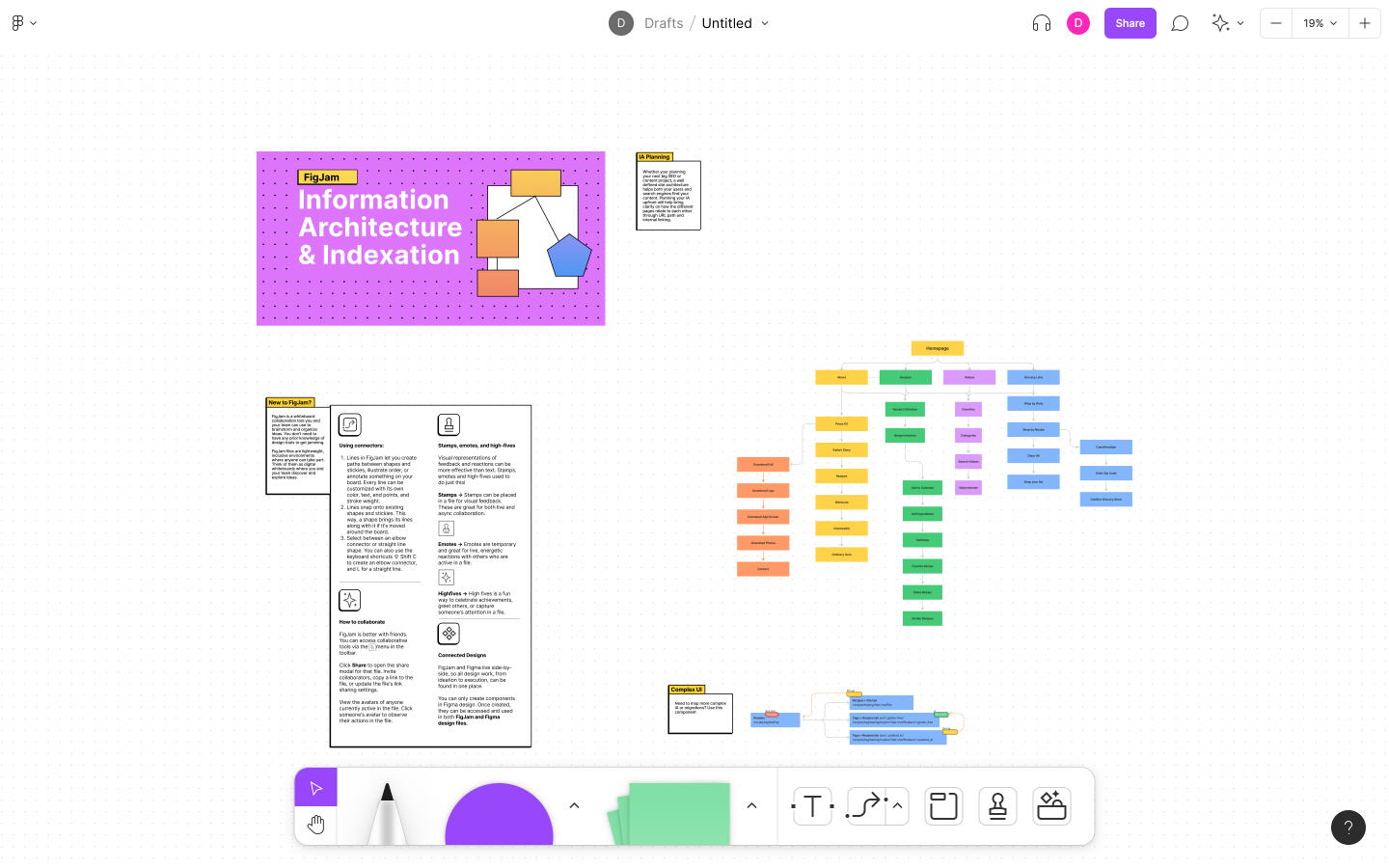
What you need to know: Figma has established itself as the leading UI design tool across all platforms, available on Windows, macOS, and through web browsers. While it can handle vector work, its true strength lies in UI design and prototyping. The platform stands out for its collaborative features and real-time multiplayer editing capabilities. The latest update this April introduced an Edit Image tool that lets you make changes to an image, such as changing the background or moving objects, using text prompts alone.
Who it's for: Figma is primarily designed for UI/UX designers, product teams, and digital designers who need to collaborate in real-time. It's particularly valuable for teams working remotely or in hybrid environments. While it can be used for basic vector work like logo design, it's best suited for those focusing on digital product design, from wireframing to final UI implementation.
What it can do: The software excels in UI design workflows with features like Auto Layout for creating dynamic, flex-based layouts. Its prototyping capabilities allow for interactive design presentations, while built-in handoff features can translate designs into CSS, iOS, and Android code. The companion tool FigJam provides whiteboarding capabilities for ideation and planning. Notable features include audio conversations for team collaboration, version control with branching and merging, and comprehensive design system documentation tools.
Pricing and payment: Figma offers a freemium model with a generous free tier for individuals. Professional plans ranging from $3-$16 add unlimited files, team libraries and audio conversations, while Organisation plans ($5-$55) include advanced features like branching and merging. The pricing structure makes it accessible for startups and small teams while offering enterprise-level features for larger organisations.
Should you buy it?: For UI design teams and digital product designers, Figma represents excellent value, particularly given its collaborative features and browser-based accessibility. However, those primarily focused on print design or complex vector illustration might be better served by dedicated vector software.
Read our full Figma review for more details on the software.
Attributes | Notes | Rating |
|---|---|---|
Price | Totally free | ★★★★★ |
Features | Quite powerful but complex to learn | ★★★ |
Works with other software? | Extensive file support | ★★★ |
The best free graphic design software
Specifications
Reasons to buy
Reasons to avoid
✅ You want free software: GIMP is the most feature-rich software you'll get for no money.
✅ You appreciate open-source flexibility: You'll find plenty of opportunities for customisation.
❌ You're a total beginner: GIMP has a steep learning curve, and there are simpler graphic design tools to try.
❌ You want to design on the go: There's no mobile or tablet support.
🔎 GIMP is the best free image editor available, offering high-end editing tools without the expense of paid alternatives. While it’s not ideal for every creative task, it’s a strong choice for those willing to invest the time in learning its intricacies. ★★★
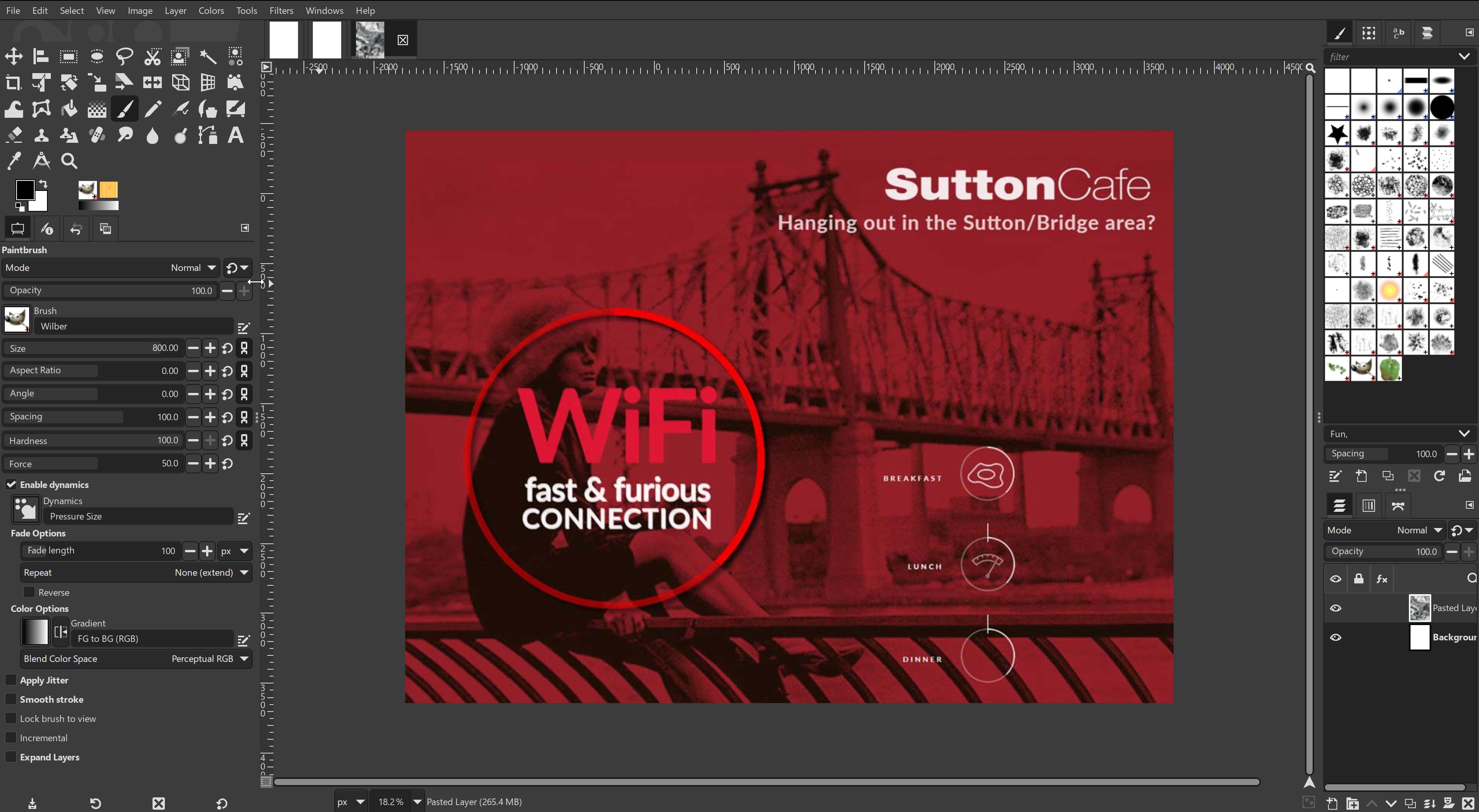
What you need to know: GIMP, which stands for GNU Image Manipulation Program, is a free and open-source graphic design toolkit, which can be used on Windows, macOS and Linux. The program is known for its comprehensive features and highly customisable, modular design, thanks to its open-source nature. GIMP supports most common image formats and allows users to work with advanced tools such as high-bit depth image processing, various image correction filters, customizable brushes, and numerous downloadable plugins. However, the interface can be challenging for beginners, with a big learning curve.
Who it's for: GIMP is ideal for users who need robust software but don't want to spend any money. It’s popular among amateur photographers, hobbyists and students, as well as professional designers who are comfortable navigating complex tools and plugins. GIMP's open-source community provides an extensive array of plugins and support resources, making it a viable option for users willing to invest the time to master it. However, it does lack mobile support.
What it can do: GIMP offers essential photo-editing capabilities like cropping, resizing, exposure correction, and distortion correction. Its high-bit depth support ensures excellent colour accuracy for advanced edits. It also supports vector-based tasks and basic graphic design, though it doesn't quite match Photoshop in ease of use or advanced text and vector capabilities. You can further enhance GIMP's functionality by downloading plugins like RawTherapee (for raw image processing) or Resynthesizer (for content-aware fill), which add versatility. GIMP is constantly being improved, and the latest major update (3.0) has brought non-destructive editing; a long-standing request from creatives.
Pricing and payment: GIMP is entirely free. As an open-source platform, it has no hidden fees or subscription models, making it an economical choice for users who need powerful software without recurring costs.
Should you download it? GIMP is an excellent download for those seeking a capable, free design software with a strong community. Its complexity may deter casual users or those who need simple graphics tools, as it lacks the intuitive interface and user-friendly design of paid software. While it doesn’t offer AI-powered enhancements, GPU acceleration or other features found in premium software, GIMP’s wide range of tools and customisation potential make it a valuable tool for those willing to work through its learning curve.
For more details, read our GIMP review.
Attributes | Notes | Rating |
|---|---|---|
Price | Freemium model with decent free tier | ★★★★★ |
Features | Excellent for UI design and collaboration | ★★★★ |
Works with other software? | Strong export options and developer handoff features | ★★★★ |
Best graphic design software for flexible licensing
Specifications
Reasons to buy
Reasons to avoid
✅ You want a full-featured drawing suite without an Adobe subscription: CorelDRAW offers strong design tools with a familiar interface.
❌ You want cutting-edge AI tools: Most AI features are bolt-on extras, not built in.
❌ You’re looking for the cheapest option: Affinity and free tools offer similar basics at lower prices.
🔎 CorelDRAW remains a serious contender for professional designers seeking a non-Adobe vector tool with flexible purchase options. However, its limited AI and lacklustre photo-editing features may hold it back for more demanding users. ★★★½
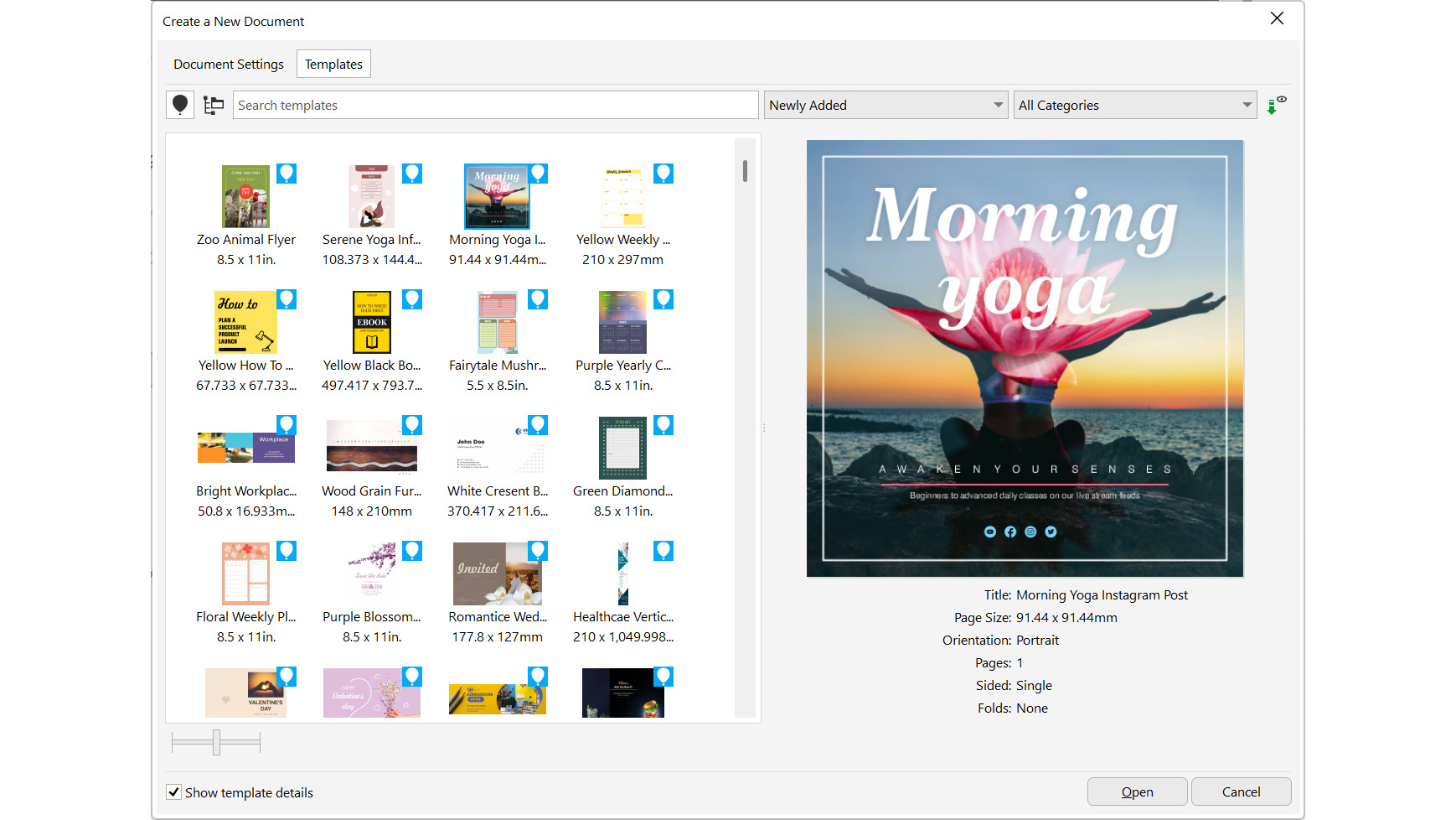
What you need to know: The 2025 version of CorelDRAW Graphics Suite refines its core tools while staying loyal to its roots. The suite includes CorelDRAW, Photo-Paint, and extras like a font manager and Capture, plus access to CorelDRAW Web. Though Corel’s AI tools (like VectorFX) are sold separately, the app excels in vector design and layout. It includes a handy learning panel that adapts to your tools—ideal for onboarding newcomers or switchers from Adobe.
Who it's for: CorelDRAW appeals to a broad spectrum, from beginners to experienced pros. The perpetual license is attractive to long-time users, while the tutorial-rich interface helps ease in Adobe refugees. It’s best suited to those who focus on vector illustration and layout more than photo editing.
What it can do: This suite provides robust drawing and layout tools, including natural media brushes, shape recognition, and frame-based text design. Photo-Paint handles basic photo editing but lacks the power and polish of Photoshop or even Affinity Photo. AI functionality exists through plugins, not natively. File support is wide—AI, PSD, EPS, AutoCAD and more—though InDesign file support is still limited to workarounds.
Pricing and payment: CorelDRAW is one of the few high-end suites offering both subscription (£26.58/month) and perpetual licensing (£659). However, given how much more expensive it is than Affinity, it sits in an awkward middle tier—cheaper than Adobe, pricier than most others.
Should you buy it?: If you need powerful vector tools and want to avoid subscription-only models, CorelDRAW Graphics Suite is worth a look. Just be sure to weigh its cost and secondary features—especially if you lean heavily on photo editing or AI-driven design.
For more details, read our CorelDRAW Graphics Suite 2025 review.
Attributes | Notes | Rating |
|---|---|---|
Price | Subscription-only, expensive | ★★★ |
Features | Extensive range of tools | ★★★★★ |
Works with other software? | Fully integrated with Creative Cloud | ★★★★★ |
The best graphic design software for non-professionals
Specifications
Reasons to buy
Reasons to avoid
✅ You're not a pro designer: The template-based approach and intuitive interface make design accessible.
✅ You create lots of social media content: The template library and scheduling features streamlines this process.
❌ You're a professional designer: The software lacks the advanced features needed for pro work.
❌ You need offline access: Canva requires an internet connection.
🔎 Canva Pro makes professional-looking design accessible to non-designers, offering excellent value for small teams and businesses needing consistent branded content. It's not suitable for professional designers, though. ★★★★½
What you need to know: Canva is the most user-friendly design platform for non-designers in 2025. It offers both free and premium (Pro) versions, with the latter providing extensive features like brand kit management, background removal, and premium assets. While it lacks the advanced capabilities of professional design software, it excels at making design accessible through templates, intuitive tools, and new AI features. The platform works seamlessly across web and mobile devices, requiring only an internet connection.
Who it's for: Canva is primarily designed for non-designers who need to create professional-looking content quickly. This includes small business owners, social media managers, marketers, bloggers, and anyone needing to produce visual content without graphic design expertise. The Pro version particularly suits teams and businesses requiring brand consistency across their materials. It's not intended for professional designers who need advanced vector editing or precise control over their designs.
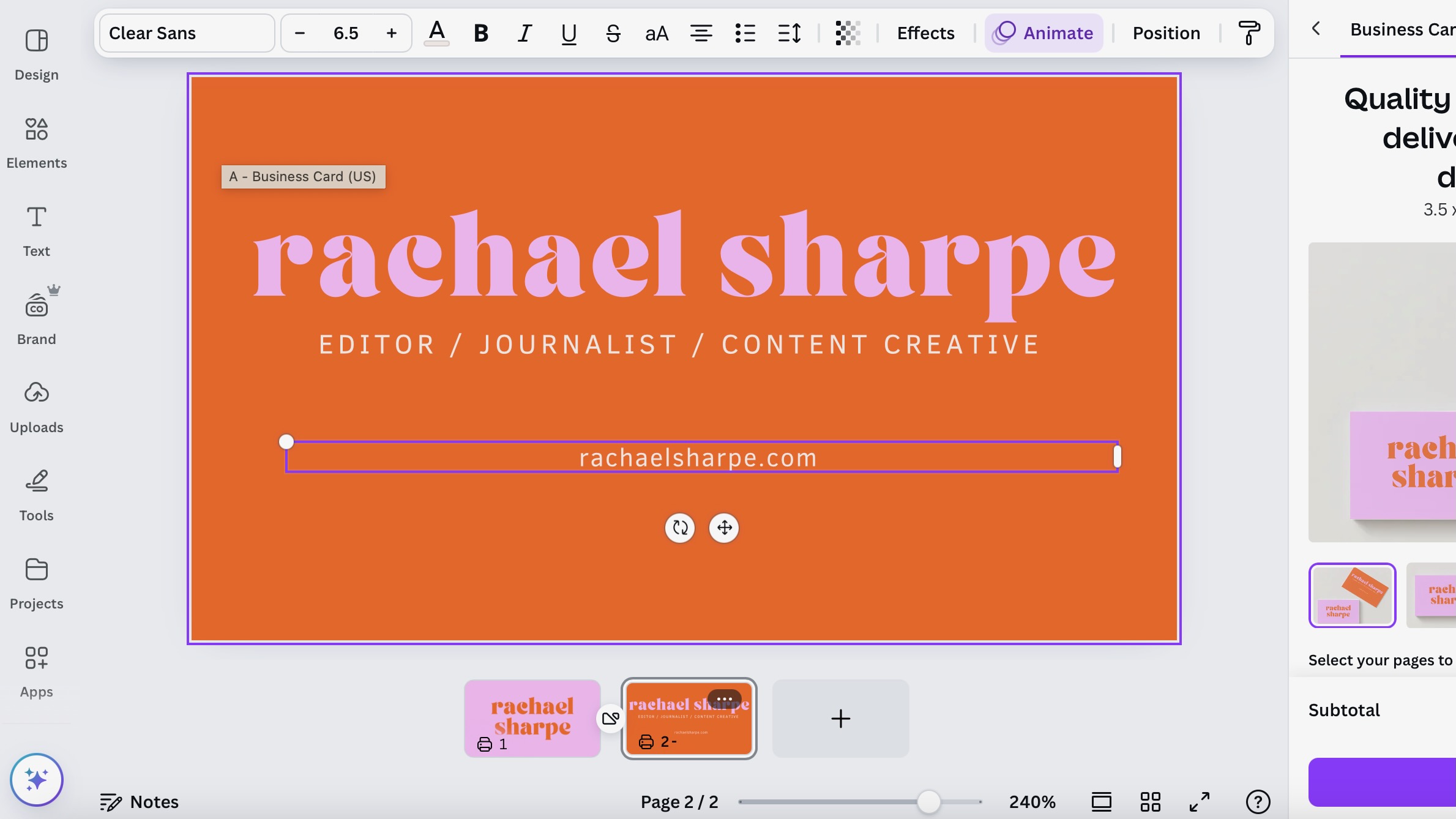
What it can do: The software enables users to create a wide range of digital and print materials through templates and drag-and-drop functionality. With Canva Pro, users can access unlimited premium templates, millions of premium photos and graphics, and AI-powered tools like Background Remover, Magic Eraser, Magic Grab, and Magic Edit. The Brand Kit feature ensures consistency across designs, while new AI tools enhance content creation. Dream Lab creates custom images from text descriptions, while video creators benefit from Highlights (which automatically creates share-ready clips), Beat Sync (matching video to music), and Enhance Voice (removing background noise). You can schedule social media content directly from the platform and access direct printing services. The platform also includes presentation tools, video editing capabilities, and extensive collaboration features.
Pricing and payment: Canva offers a generous free tier with basic features. Canva Pro costs $120/£100 per year or $12.99/£8.99 monthly for one person, making it particularly cost-effective for individuals and small teams. The Enterprise plan, at $30/£24 per person monthly, adds advanced team features and unlimited storage. All paid plans include a 30-day free trial, allowing users to test premium features before committing.
Should you buy it?: For non-designers needing to create professional-looking content regularly, Canva Pro offers excellent value. The platform's extensive template library, easy-to-use tools, and new AI features can save significant time and effort. It's particularly valuable for those starting new projects or businesses, as the Brand Kit enables creation of everything from websites to business cards with a coherent look. However, professional designers will find it too limiting compared to industry-standard software. The free version is worth trying first to determine if the premium features justify the investment.
See our full Canva review for more details.
Attributes | Notes | Rating |
|---|---|---|
Price | Free version available, Pro version good value | ★★★★★ |
Features | Extensive templates and assets, limited advanced tools | ★★★★ |
Works with other software? | Good export options, limited import capabilities | ★★★ |
How to choose the best graphic design software
Finding the ideal graphic design software for you means considering a range of factors. The first is what you actually want it to do. Assess the specific design tasks you'll be undertaking, such as illustration, photo editing, or layout design, and opt for software that excels in those areas.
Secondly, think about your skill level, as some programs are more user-friendly for beginners, while others offer advanced features for seasoned professionals that newbies may be hopelessly confused by. Take into account the learning curve and available support resources, including tutorials and community forums.
A third factor is your operating system and hardware. Some graphic design software is limited to either Windows, macOS, iOS or Android, so always check this before you decide. Finally, software can be expensive, so it's worth exploring free trial versions before committing to a purchase to ensure it aligns with your workflow and preferences.
How we test the best graphic design software
Our experts test graphic design software in a way that's both comprehensive and mimics real-world use. Firstly, we assess the user interface for intuitiveness and efficiency, considering how easy it will be for both beginners and advanced users to pick up.
We'll then put functionality and feature sets to the test across common design tasks like illustration, photo editing, and layout design, to ensure it actually works in practice and delivers what it promises. We'll also pay attention to compatibility with various operating systems and hardware configurations; performance, including speed and responsiveness; and the availability of support resources, such as tutorials and customer service.
FAQs
What's the difference between vector and raster editors?
Vector and raster editors are two primary types of software used for image creation and manipulation.
Vector images are composed of mathematical equations that define shapes, lines, and curves, allowing for precise scaling without any loss of quality. This makes them ideal for logos, illustrations, typography, and technical drawings.
Raster images, on the other hand, are composed of a grid of pixels, each with its own colour information. This format is better suited for photorealistic images, digital paintings, and image editing. When choosing between the two, consider the image type, intended use, and level of detail required. Often, a combination of both vector and raster elements is necessary for a comprehensive design project.
What software do graphic designers use?
For most working graphic designers, Adobe’s Creative Cloud suite of apps is the standard choice. Its main tools for graphic design are Photoshop (raster image editing), Illustrator (vector image editing), InDesign (desktop publishing) and After Effects (motion design). You can subscribe to the Creative Cloud suite as a whole, or take out a single-app subscription. Either way, you'll also get the Behance portfolio service and access to Adobe Fonts. See our guide to getting a Creative Cloud discount to make sure you find the best price.
For graphic designers on a budget, Affinity's suite of apps provide a close approximation to Adobe's tools, namely Affinity Photo (which rivals Photoshop), Affinity Designer (which rivals Illustator) and Affinity Publisher (which rivals InDesign). There is no equivalent, however, to After Effects.
What's the best graphic design software for beginners?
If you're new to graphic design, there are a number of apps that allow you to get started for free. One of our top recommendations is Canva, a lightweight app for making quick designs in your browser. You don’t need to download anything, and you don’t have to pay either, unless you want to unlock advanced features and extra resources. While you learn graphic design theory, Canva will allow you to put it into practice. Once you've reached a certain level of expertise, you'll then naturally gravitate towards one of the paid apps on our list to get more sophisticated tools.
Is the best free graphic design software any good?
Logically, most of the best graphic design software has a cost since developing and updating the programs requires investment. If you're working as a professional designer, or hoping to, then you'll almost certainly want to invest in the best graphic design software overall.
That doesn't necessarily mean you need to subscribe to Adobe's Creative Cloud since there are now many competitive subscription-free alternatives, but you're likely to find that agencies and even direct clients may expect you to use Illustrator and Photoshop (some may even have a preference for other software).
However, the best free graphic design software is worth considering if you're just starting out or only need to create occasional design work for personal projects. There are completely free open-source programs like the free vector software SVG Edit and Inkscape and the image-editing software GIMP that may offer you everything you need depending on your requirements. Their interfaces may look a little more rustic but they do the job for a lot of creative tasks.
What computer do I need to run graphic design software?
When it comes to system requirements, it should be possible to run most software for static graphic design on most modern laptops as long as the corresponding operating system is supported. We would recommend ensuring your device has at least 8GB of RAM, and 16GB would be more ideal for the smoothest experience if you work with lots of layers with more fully-featured software like Illustrator or Photoshop.
Software for motion design and 3D design can be more demanding, and in some cases you may require a device with a dedicated GPU for the best experience. For recommendations in terms of hardware, see our pick of the best laptops for graphic design. We also have a guide to the best graphics cards for video editing.
The best graphic design software for flexibility
Sign up to Creative Bloq's daily newsletter, which brings you the latest news and inspiration from the worlds of art, design and technology.

Tom May is an award-winning journalist specialising in art, design, photography and technology. He is the author of the books The 50 Greatest Designers (Arcturus) and Great TED Talks: Creativity (Pavilion). Tom was previously editor of Professional Photography magazine, associate editor at Creative Bloq, and deputy editor at net magazine.
- Joe FoleyFreelance journalist and editor
