Rejected early drafts of iconic movie posters
Sometimes, a movie poster design becomes as iconic as the film itself. Take a look at what could have been...
Sign up to Creative Bloq's daily newsletter, which brings you the latest news and inspiration from the worlds of art, design and technology.
You are now subscribed
Your newsletter sign-up was successful
Want to add more newsletters?

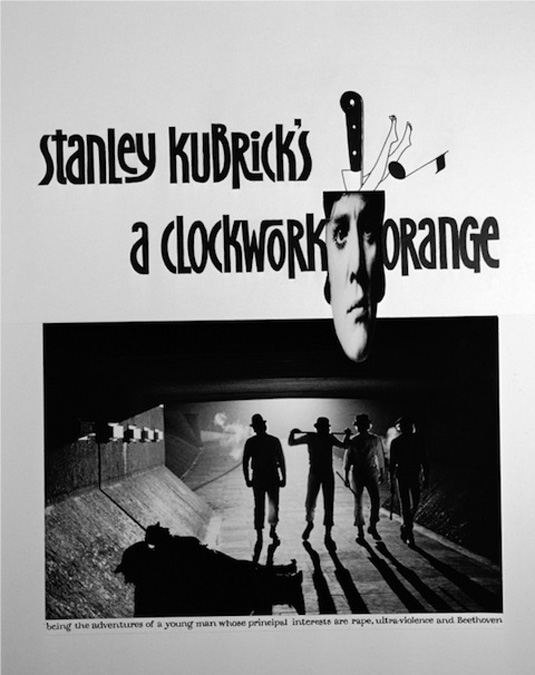
Classic movie posters for the likes of Pulp Fiction, A Clockwork Orange and Batman have become as iconic as the films themselves. But hitting the right buttons in terms of everything from illustration to logo design and typography isn't easy. And there are usually many, many attempts on the way to the perfect design.
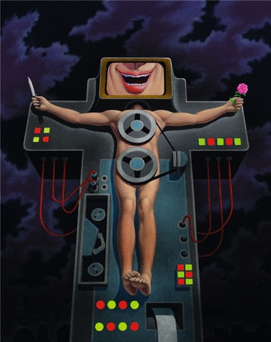
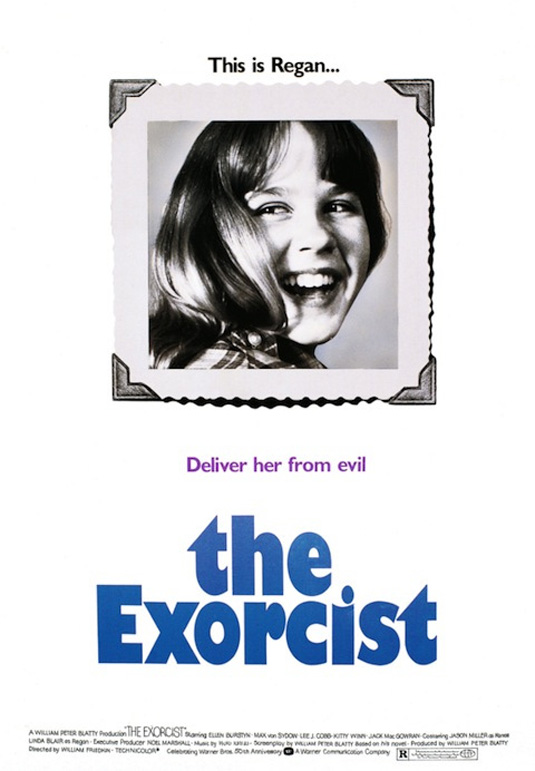
These rejected drafts give us a rare glimpse into the process of designing movie posters, which see some titles going through 20 to 30 versions before a final design is chosen.
They were mainly designed by veteran graphic designer Bill Gold, an artist who worked for Warner Brothers for over 70 years, creating over 2,000 posters for movies of every genre. Whether or not you feel these drafts would have worked, seeing these unpublished creations offers a fascinating insight into the movie poster process...
Article continues below 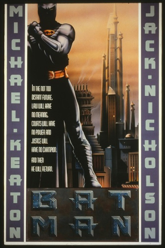

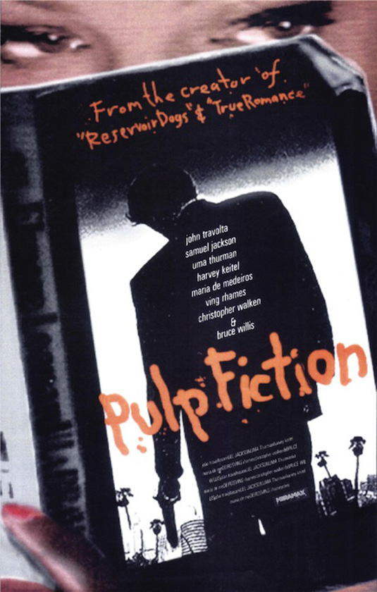
See more alternative movie posters over on daybees.
Like this? Read these!
- The best 3D movies of 2013
- Discover what's next for Augmented Reality
- Download free textures: high resolution and ready to use now
Do you think the right poster was chosen? Let us know in the comments box below!
Sign up to Creative Bloq's daily newsletter, which brings you the latest news and inspiration from the worlds of art, design and technology.

The Creative Bloq team is made up of a group of art and design enthusiasts, and has changed and evolved since Creative Bloq began back in 2012. The current website team consists of eight full-time members of staff: Editor Georgia Coggan, Deputy Editor Rosie Hilder, Ecommerce Editor Beren Neale, Senior News Editor Daniel Piper, Editor, Digital Art and 3D Ian Dean, Tech Reviews Editor Erlingur Einarsson, Ecommerce Writer Beth Nicholls and Staff Writer Natalie Fear, as well as a roster of freelancers from around the world. The ImagineFX magazine team also pitch in, ensuring that content from leading digital art publication ImagineFX is represented on Creative Bloq.
