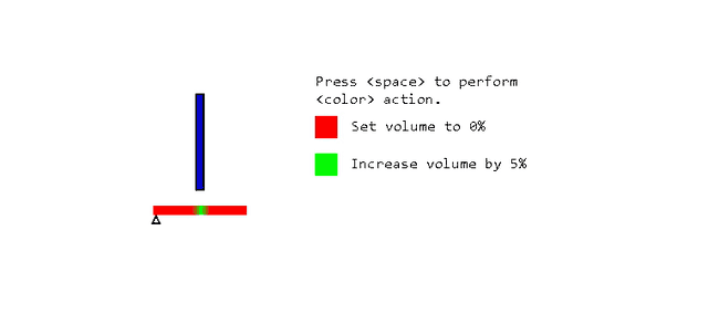
If you want to know how not to do UI design, these deliberately awful volume controls are a usability goldmine.
We've all been faced with egregious examples of UI design at times. They're infuriating if you actually have to deal with them. But if they're not actively preventing you from doing something they can be entertaining, and can even provide useful tips on how not to do things.
So, what happens when coders and designers deliberately set out to create staggeringly bad UI? Well, that's exactly what's been happening recently over on Reddit.
It started with an innocent enough post in r/ProgrammerHumor, asking, "Who can make the best volume slider?" and accompanied by this fantastic GIF:
Oh. Oh my word. Who could possibly top this?
This being the internet, things got swiftly out of hand, as this cavalcade of crimes against usability will attest.
'Hold my beer'
Actual genius
Actually, yeah, why not?
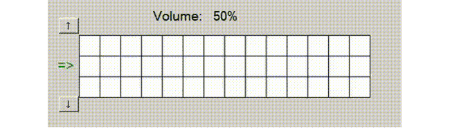
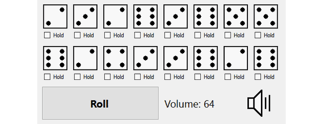
There's probably a 'dicey' pun in this one
Fun for all the family
Literally pumping up the volume
10/10, would definitely use
It's the bad colour choice that really make this one pop
But what if you want a volume of more than 90?
Not content with merely creating images and animated GIFs, someone's even gone to the trouble of making a (sort of) working version of one of our favourites – click and hold the speaker icon to play.
Brilliant. If you're after some excellent tips on how not to do UI, or just want to see more usability hilarity, head over to r/Programmers, where the dreadful sliders are still coming in thick and fast.
Jim McCauley is a writer, performer and cat-wrangler who started writing professionally way back in 1995 on PC Format magazine, and has been covering technology-related subjects ever since, whether it's hardware, software or videogames. A chance call in 2005 led to Jim taking charge of Computer Arts' website and developing an interest in the world of graphic design, and eventually led to a move over to the freshly-launched Creative Bloq in 2012. Jim now works as a freelance writer for sites including Creative Bloq, T3 and PetsRadar, specialising in design, technology, wellness and cats, while doing the occasional pantomime and street performance in Bath and designing posters for a local drama group on the side.