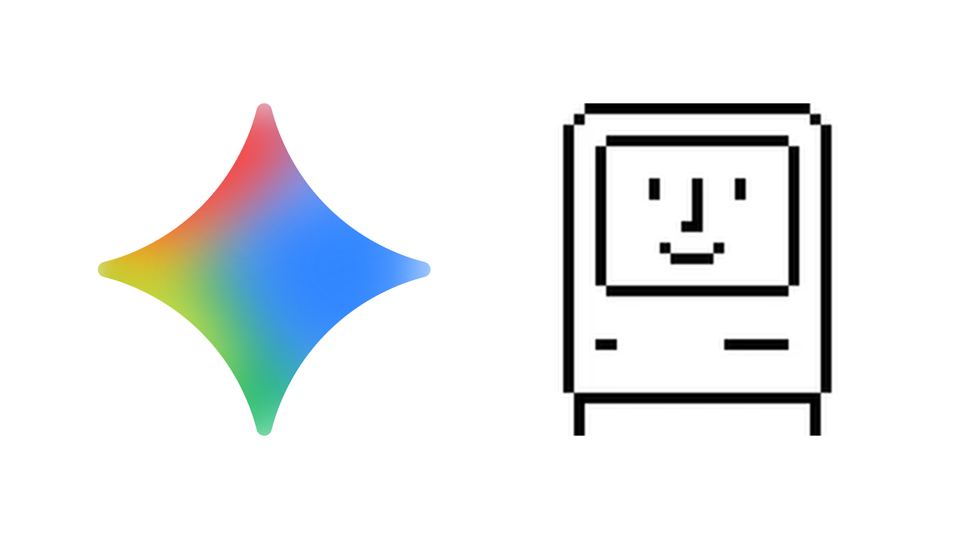
Google compares Gemini AI design to Apple in the 1980s
This wasn't on my 2026 design bingo card.

Sign up to Creative Bloq's daily newsletter, which brings you the latest news and inspiration from the worlds of art, design and technology.
You are now subscribed
Your newsletter sign-up was successful
Want to add more newsletters?
For rival tech brands, Google and Apple have seemed awfully cosy lately. Earlier this month it was announced that, in a huge blow to OpenAI, Google's Gemini will be powering the much awaited (and much delayed) enhanced Siri assistant on every iPhone. And now, Google has compared its UI design with that of Apple. Apple of 40 years ago, that is.
In a comprehensive new blog post detailing the illustration of the Gemini app, Google explains how designers have found themselves "navigating uncharted design territory," citing a very specific piece of Apple design as an equivalent touchpoint from the 1980s.
"Consider designer Susan Kare, who pioneered the original Macintosh interface," Google's blog post proposes. "Her icons weren’t just pixels; they were bridges between human understanding and machine logic. Gemini faces a similar challenge around accessibility, visibility, and alleviating potential concerns. What is Gemini’s equivalent of Kare’s smiling computer face?"
Article continues belowAccording to Google, it's gradients. These offer "an amorphous, adaptable approach," one that "inspires a sense of discoverability."
Google appears to recognise that it might be a bit of a stretch to equate gradients with something as iconic as the smiling Macintosh. "Gradients might be much more about energy than “objectness,” like Kare’s illustrations (a trash can is a thing, a gradient is a vibe), but they infuse a spirit and directionality into Gemini."
But it's certainly true that designing for AI systems brings a new and unique set of challenges. "Designing illustrations for Gemini is like charting a continuously evolving map," Google says. "How do you build trust with a tool that won’t look the same tomorrow?"
Last year we heard similar comments from the creative director of Microsoft's Co-Pilot, who discussed the challenges of creating a "personal, empathetic AI experience".
Sign up to Creative Bloq's daily newsletter, which brings you the latest news and inspiration from the worlds of art, design and technology.

Daniel John is Design Editor at Creative Bloq. He reports on the worlds of design, branding and lifestyle tech, and has covered several industry events including Milan Design Week, OFFF Barcelona and Adobe Max in Los Angeles. He has interviewed leaders and designers at brands including Apple, Microsoft and Adobe. Daniel's debut book of short stories and poems was published in 2018, and his comedy newsletter is a Substack Bestseller.
You must confirm your public display name before commenting
Please logout and then login again, you will then be prompted to enter your display name.
