Sign up to Creative Bloq's daily newsletter, which brings you the latest news and inspiration from the worlds of art, design and technology.
You are now subscribed
Your newsletter sign-up was successful
Want to add more newsletters?
Think back to the year 2000. If you weren't alive then, try to imagine it. If you were, play Sisqó's Thong Song in your head and it'll all come flooding back.
We're talking huge, beige desktop towers humming under desks. The screech of trying to access dial-up internet. Websites that looked like mad ransom notes in garish colours and terrible fonts. The annoying bleep of a plasticky dumbphone that allowed you to call and text but little else. A home piled high with printed newspapers and magazines, CDs and vinyl records, DVDs and videotapes of your favourite TV shows.
Now come back into 2025 and look around. We're living through our phone screens, swiping through spatial interfaces, asking AI to conjure worlds from single sentences. In some ways, it feels like we've travelled to a different planet. We've just done it whilst sitting in the same chair.
Article continues belowSo how did we get here, exactly? As we call time on the first quarter of the 21st century, I thought it might be a good opportunity to look back at some of the landmark moments that built the bridge between those two realities.
As the author Michael Crichton once said: "If you don't know history, then you don't know anything. You are a leaf that doesn't know it is part of a tree." So read on, and either familiarise or refamiliarise yourself with the design moments that made modern creatives who they are. (Also see my piece from five years ago on graphic design history).
The 2000s: The Touch & Feel Era
Computers and the internet were around in the 1990s, but it was the 2000s when they truly entered the mainstream. The question was: could we make the digital feel human? Could design seduce us away from the physical world of print and into glass rectangles?
2003: iPod silhouette ads
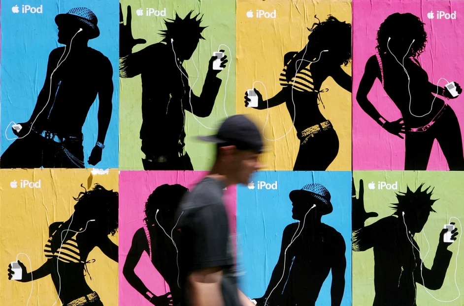
One of the best print ads of the 2000s, Apple's campaign featured anonymous black silhouettes dancing against vibrant neon backgrounds; pink, green, orange, electric blue. The only identifiable details: white earbuds and the iPod itself.
Sign up to Creative Bloq's daily newsletter, which brings you the latest news and inspiration from the worlds of art, design and technology.
No faces, no celebrities initially, no product specifications. Just pure kinetic joy and the suggestion that this device would transform you into one of these impossibly cool shadow-people. The campaign ran on billboards, in magazines, and on television, and became instantly iconic.
Why it mattered: This campaign divorced tech from the beige box forever. Before this, gadgets were sold on features and specifications, and the terms for people who were interested in it ("geek" or "nerd") were terms of abuse. Apple flipped this around by making tech aspirational, cultural and yes, even sexy. The iPod wasn't just a music player: it was an identity. Design became the product itself, and the product became who you were.
2004: Launch of Gmail
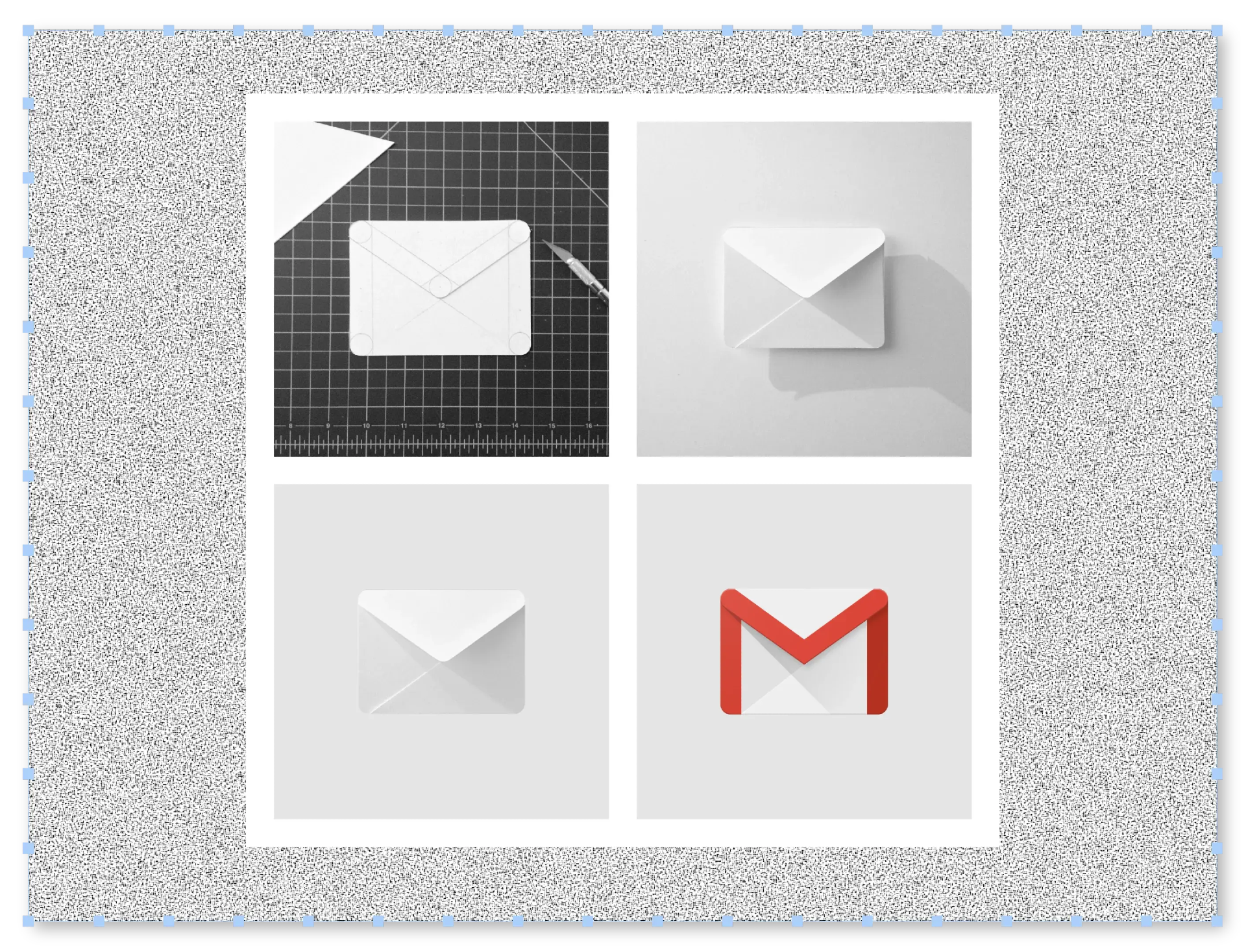
When Google launched its email service on April Fools' Day 2004, people thought it was a joke. A gigabyte of free storage when competitors offered mere megabytes? An interface organised by conversation threads rather than individual messages? A clean, white design that made the page feel responsive and alive rather than constantly reloading? Email hasn't felt the same since.
Why it mattered: Web 2.0 wasn't just a technical shift; it was an aesthetic one. Gmail proved the internet could feel polished, professional and thoughtfully crafted, rather than hobbyist and homemade.
2007: iPhone skeuomorphism
In 2007, Steve Jobs unveiled a phone without a keyboard, controlled entirely by touch. But the real innovation was making the alien feel familiar.
The Notes app looked like a legal pad with stitched leather binding. The bookshelf had wood grain. Buttons were glossy and three-dimensional. This skeuomorphic design philosophy – making digital objects resemble their physical counterparts – was deliberate handholding; easing humanity's transition from buttons to glass.
Why it mattered: The iPhone was just a new phone; it redesigned human behaviour. Apple created new gestures: the swipe, the pinch-to-zoom, the infinite scroll. It changed our posture, giving us "tech neck" and smartphone thumb. It altered how we navigate cities, capture memories and fill moments.
2008: Obama 'Hope' poster

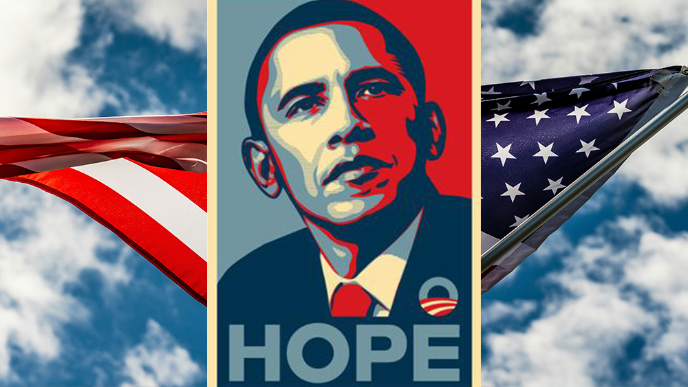
In 2008, Shepard Fairey took a press photo of Presidential candidate Barack Obama and transformed it into a stylized portrait in red, beige and blue with the single word 'HOPE' beneath it. The poster borrowed from propaganda art and street art aesthetics; bold, screenprinted, instantly reproducible.
It became ubiquitous during Obama's presidential campaign, and transcended its campaign origins to become a symbol of optimism and grassroots energy.
Why it mattered: Design demonstrated it could mobilise movements, not just sell products. The Hope poster demonstrated that visual design could function as a weapon of cultural change in the social media age. Its endlessly remixed format showed how a design could become a movement unto itself.
2008: Bitcoin whitepaper
In 2008, Satoshi Nakamoto published a nine-page technical document that introduced cryptocurrency and blockchain technology. Beyond the financial concept, it catalysed an entirely new visual and conceptual language: blockchain diagrams showing distributed networks, cryptographic symbols, flowcharts of peer-to-peer transactions, and (a little later) the now-iconic Bitcoin symbol.
Why it mattered: This was systemic design at its most radical; creating the visual grammar for a parallel financial reality that would reshape global economics. It demonstrated that design isn't just about making things look good; it's about making invisible systems visible and comprehensible.
The 2010s: The Great Flattening
In the 2010s, skeuomorphism began to die on the vine. Gradients vanished. Shadows flattened. Design got efficient, scalable, and (let's be honest) a bit dull. But it also became genuinely universal and useful.
2010: Instagram
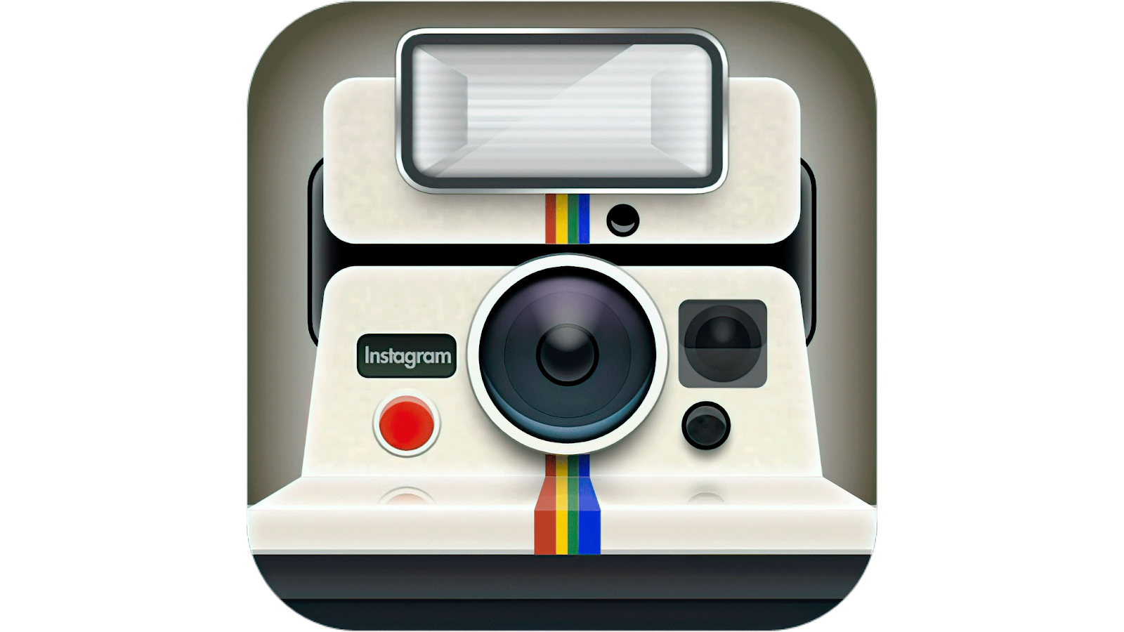
Kevin Systrom and Mike Krieger launched an app that did something simple: it took photos, cropped them to a square format reminiscent of Polaroids, applied nostalgic filters, and shared them to a feed. The square format was democratic: it forced composition. The filters were instant art direction, turning mundane snapshots into something aesthetically coherent.
Why it mattered: Design was democratised. Suddenly, everyone could be a photographer, curator and art director of their own lives. People who'd never thought about composition, colour balance or mood suddenly began to make those choices on a daily basis.
2012: Snowfall design
In the year Creative Bloq launched, The New York Times published 'Snow Fall: The Avalanche at Tunnel Creek', a feature that combined traditional journalism with something entirely new. As you scrolled, text gave way to full-screen videos, interactive 3D mountain maps and parallax animations that made you feel like you were descending the mountain yourself. The piece took six months to produce and won a Pulitzer Prize in 2013.
Why it mattered: Snowfall design became a term everyone started using. Journalism transformed from static text on a page to an experience that surrounded you. Design evolved from supporting the story to being part of it.
2013: iOS 7 kills skeuomorphism
When Jony Ive took over iOS design, he sent skeuomorphism to the retirement home. Out went the stitched leather, the wood grain, the glossy buttons with shine and shadow. In came flat colours, translucency, simple geometric shapes and generous white space. Icons became minimalist symbols.
Buttons lost their borders entirely. It all signalled a new confidence: humanity no longer needed training wheels; we already knew how touchscreens worked.
Why it mattered: Every app, every website, every interface followed Apple's lead. Clean became corporate. Simplicity became the standard. Flat design became the default visual language. Minimalism won the day.
2014: Google Material Design
Google created Material Design; a comprehensive design language complete with clear rules about how elements should move and cast shadows. This suggested that digital interfaces existed on layers like sheets of paper, that shadows indicated hierarchy, and that motion should have meaning and intention. Material Design was offered as gospel for designers everywhere building apps and websites.
Why it mattered: Design systems went mainstream. Material Design proved that consistency at scale was not only possible but could be beautiful and flexible. It became the Helvetica of digital interfaces, and normalised the idea that large organisations should have comprehensive, public design languages.
2015: Google’s Alphabet Rebrand
When Google announced it was restructuring under a new parent company called Alphabet, the news was corporate, but the design response was cultural. Google quietly replaced its old serif logo with a clean, geometric sans-serif and introduced a flexible identity system built for motion.
The logo could shrink into dots, bounce, spin and respond to interaction. This wasn’t a mark designed for letterheads; it was designed for loading screens, micro-interactions and a world of infinite device sizes.
Why it mattered: This was branding recognising it no longer lived on paper. The new logo system normalised the idea of responsive identity: brands that adapt, animate and exist as systems, rather than static marks.
2017: Fearless Girl
Kristen Visbal's bronze statue of a young girl (hands on hips, chin raised) appeared overnight facing Wall Street's famous charging bull sculpture. Commissioned by State Street Global Advisors to promote gender diversity in corporate leadership, it went viral overnight.
Tourists flocked to photograph it. The image circulated globally as a symbol of female empowerment and resistance. The statue's placement transformed the meaning of the bull itself.
Why it mattered: Public art collided with hashtag culture and guerrilla marketing. It demonstrated that context is everything: the same statue elsewhere would be merely inspirational, but placed defiantly before the bull, it became revolutionary.
2018: Pride flag redesigns
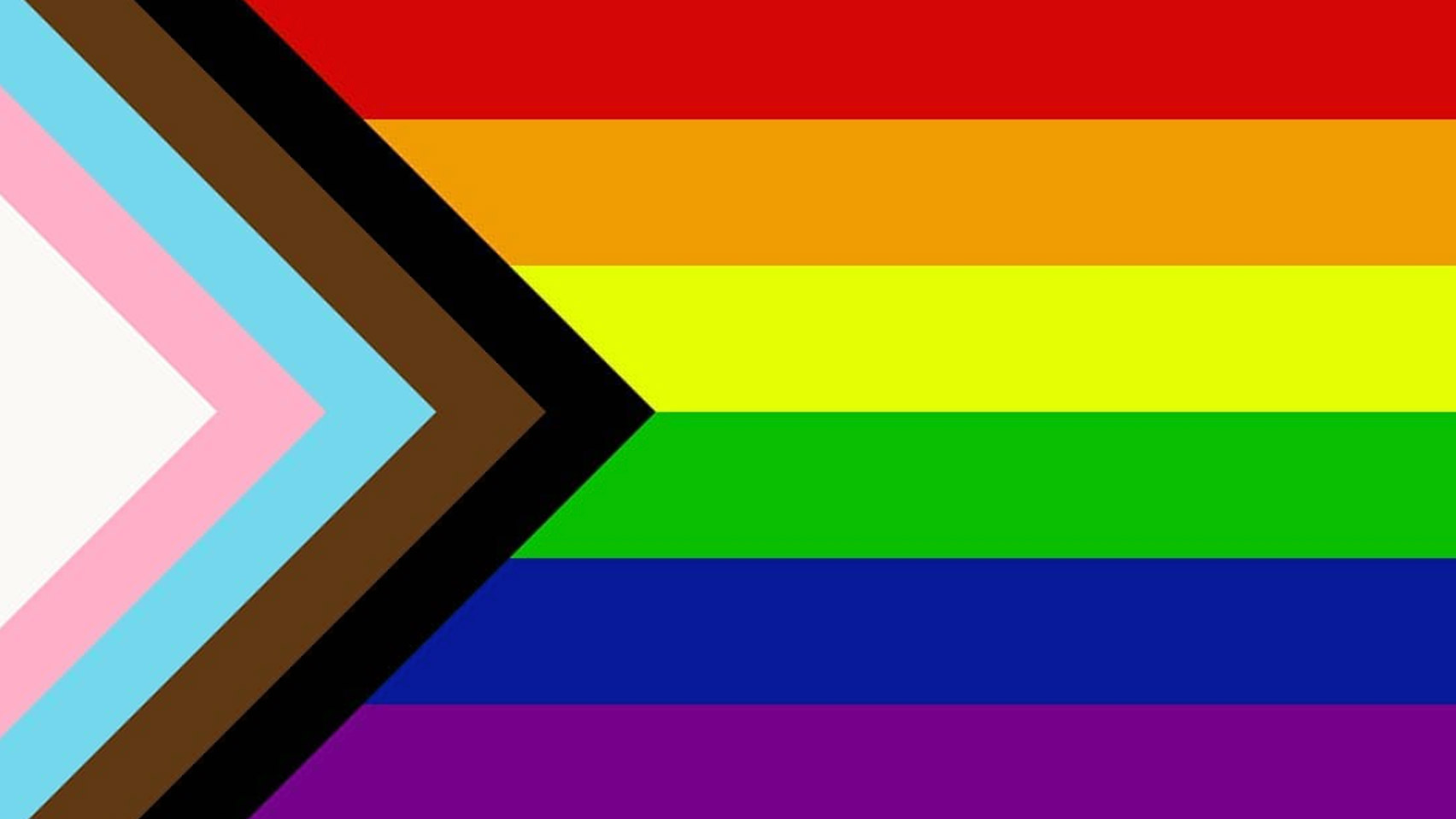
In 2018, Daniel Quasar redesigned the rainbow Pride flag by adding a chevron containing black, brown, light blue, pink and white stripes to represent people of colour and transgender individuals. It was one of many Pride flag redesigns during this time.
The proponents of change argued that the LGBTQ+ movement needed to explicitly include communities that had been historically marginalised within the gay community. Some, though, argued the opposite: that this merely diluted the concept of the rainbow (everyone is welcome).
Why it mattered: This controversy was symptomatic of how increasing polarisation has made any updating of symbols – from national flags to public moments, and increasingly, even logos – deeply controversial in the modern era.
2018: Corporate Memphis
You know this style, even if you don't know its name. Flat illustration with impossibly long limbs and disproportionate bodies, rendered in cheerful, optimistic colours; coral, mint, lavender. The style originated from design studios like Facebook's in-house team and Buck Design, then metastasized across every tech startup, bank, and healthcare company's website. Around 2018-2020 it became entrenched as the visual language of "we're friendly and modern and definitely not threatening."
Why it mattered: Visual homogeneity reached its apex. Every company looked friendly, approachable, modern and utterly indistinguishable. The style became a meme for blandness itself, eventually spawning a backlash and our article, Why I'm glad the Corporate Memphis art style is dead.
2019: Tesla Cybertruck

When Elon Musk unveiled Tesla's electric pickup truck, the design was so angular and unfinished-looking, people assumed it was a concept vehicle, not a production model. It looked like a low-polygon 3D render from a 1990s video game made physical, and even the unveiling demonstration went wrong when the supposedly unbreakable windows shattered. Yet the truck's brutal, uncompromising design generated massive attention and hundreds of thousands of pre-orders.
Why it mattered: Brutalism had returned with a vengeance, not just in architecture but in product design. The Cybertruck rejected smoothness, aerodynamic curves and consumer expectations entirely. Ugliness, or at least confrontational aesthetics, became a statement, even a selling point.
The 2020s: The New Frontier
As the decade began, we all thought it would be defined by Covid and the lockdowns. But then AI arrived, and many in the creative community wondered how soon it would be before it took their jobs.
2020: The Zoomification of Reality
In March 2020, the world moved indoors. As the Covid-19 pandemic triggered global lockdowns, the traditional office evaporated overnight, replaced by a 13-inch glowing rectangle. Conferencing tools such as Zoom morphed from a corporate utility into the primary interface for human connection. We didn't just work on Zoom; we had birthdays, weddings and funerals on it.
Why it mattered: Lockdown accelerated the death of the physical boundary. Design had to adapt to a world where our homes were simultaneously gyms, schools and boardrooms. Tools such as Figma and Notion became the new drafting tables, proving that creativity didn't require a shared physical space, just a shared digital canvas.
2021: Frutiger Aero Revival

What to older people seems relatively recent, to younger people feels like a lifetime ago. And so it was that Gen Z discovered and romanticized an aesthetic from the mid-2000s: the glossy, optimistic visual language of Windows. The aesthetic had names like Frutiger Aero (named after the typeface and the transparent, airy feeling) and spread through TikTok and Twitter like wildfire.
Why it mattered: A generation too young to remember 2007 felt homesick for its visual optimism and techno-utopianism. The revival revealed a longing for a moment when digital tech still felt genuinely new and exciting, before phones became a cause of anxiety and social media fractured discourse.
2021: Spotify Wrapped becomes a big deal
By the 2020s, what had begun as a novelty feature (a year-end summary of your listening habits) had evolved into a full-blown cultural ritual. Every December, Spotify Wrapped flooded social media with personalised slides: bold typography, clashing colours, playful data visualisations and just enough self-knowledge to feel intimate without being creepy.
Why it mattered: Spotify Wrapped demonstrated that data, when designed with wit and warmth, could feel emotional rather than cold. It reframed analytics as storytelling and proved that personalisation could scale without losing charm.
Wrapped also showed how design could turn a private experience into a communal one; transforming individual data into a shared cultural moment.
2022: DALL-E 2 and Midjourney
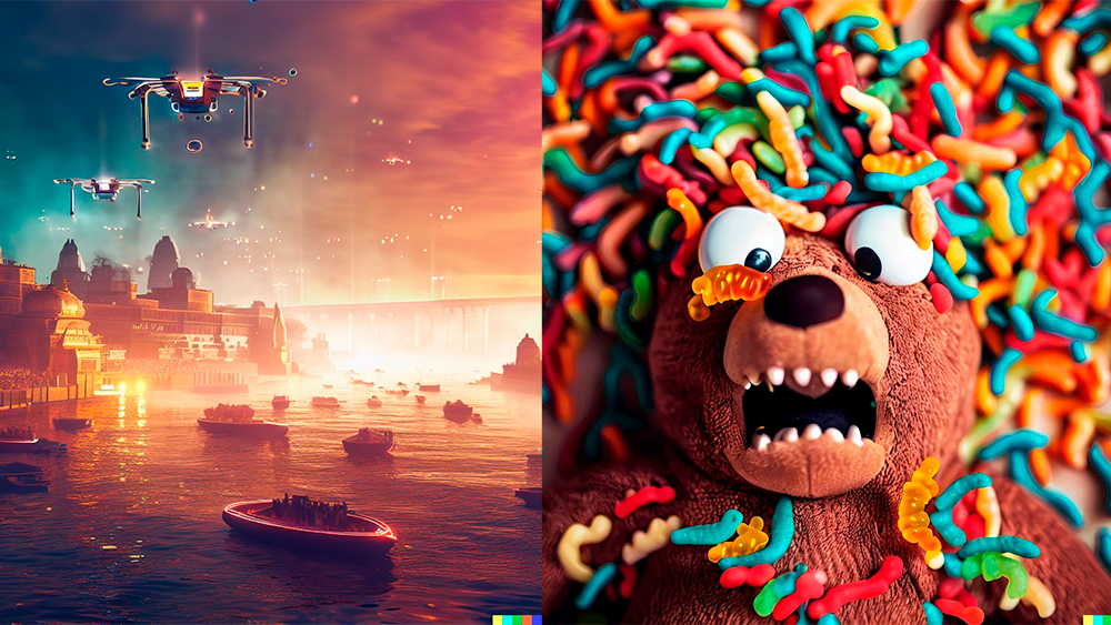
OpenAI's DALL-E 2 and Midjourney brought AI image generation to the mainstream. Type a text prompt ("a mouse wearing a spacesuit on Pluto, oil painting style") and seconds later, you got a unique image that never existed before. The tools allowed anyone to manifest visual ideas at the speed of thought, and Discord servers filled with people sharing prompts and results.
Why it mattered: The creative process fundamentally fractured. Was the person writing the prompt the artist? The AI? Both? Neither? Design's scarcity vanished overnight: suddenly anyone could generate hundreds of publication-quality images in an afternoon, leading to an existential crisis about authorship, copyright, and what creativity means when the tools can dream.
2023: The MSG Sphere
A 366-foot-tall spherical LED structure opened in Las Vegas, with an exterior wrapped in 1.2 million LED pucks capable of displaying content visible from miles away. The Sphere displays eyeballs that blink and look around, the moon in photorealistic detail, abstract patterns, advertisements and art. Inside, audiences experience concerts and films on the world's highest-resolution screen, wrapped 160 degrees around them.
Why it mattered: Buildings no longer needed to be fixed objects. The Sphere proved that cities themselves can become interfaces, screens, and experiences. This all raised questions about urban environments, light pollution and whether buildings should be permanent statements or endlessly mutable surfaces.
2023: MSCHF's Big Red Boots

Brooklyn-based art collective MSCHF released cartoonishly oversized red boots. Yes, they were real footwear, but they looked like they'd been pulled from a video game or anime; bulbous, comically large, essentially unwearable.
They retailed for $350 and sold out immediately. Celebrities wore them. Memes proliferated. They existed primarily as images to be photographed and shared rather than as functional footwear; product as performance art.
Why it mattered: Meme culture had become commerce. These boots proved that products could exist primarily for their shareability and virality rather than utility. Design had shifted from solving problems to creating moments.
2023: Adobe’s Content Credentials
As AI-generated imagery exploded, anxiety followed close behind. Who made this? Was it real? Was it trained on someone else’s work?
Adobe’s response was Content Credentials: a system that embeds metadata directly into files, showing who created them, what tools were used, and whether AI played a role. Small icons appeared on images across Adobe’s ecosystem, offering transparency rather than prohibition.
Why it mattered: This was design stepping into governance. Instead of pretending AI didn’t exist, Content Credentials acknowledged it, and attempted to build trust into the fabric of creative work itself. In a moment when visual truth was destabilising, design became a stabilising force; not by judging, but by revealing process.
2024: Backlash against blanding
After a decade of geometric sans serifs, minimalist logos and visual homogeneity, brands started breaking ranks. Burberry brought back its ornate serif wordmark. Kleenex updated its logo to include a more expressive, arched, and script-like font. And countless other brands rejected the safe, corporate aesthetic in favour of personality, serifs, quirks and visual risk-taking.
Why it mattered: We'd reached peak minimalism and the pendulum had swung back. Differentiation mattered again after years of convergence. Character, even imperfection, became valuable in a landscape of surgical precision. Design remembered it could have a voice, an opinion, a personality beyond approachable friendliness.
2024: Paris Olympics Identity
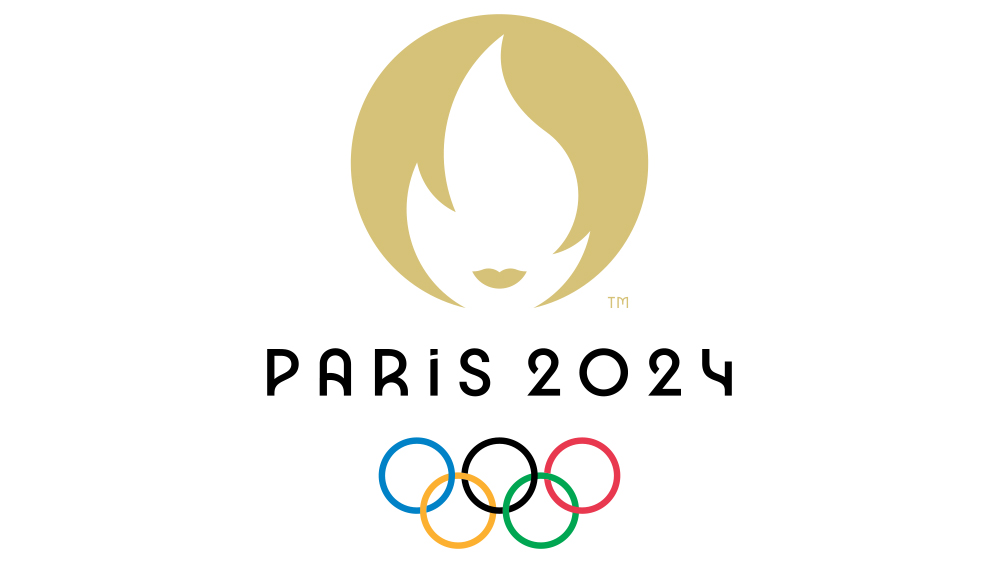
The Paris 2024 Olympics visual identity embraced France's Art Deco heritage whilst feeling thoroughly contemporary. The logo combined a gold medal, the Olympic flame, and Marianne (symbol of France) into a single geometric mark. Pictograms for each sport referenced 1920s posters with their angular elegance.
Why it mattered: It demonstrated that the past and present could dance together productively. Heritage became an asset rather than baggage. It proved design doesn't need to choose between history and innovation: sometimes the most forward-looking design is one that knows where it came from.
2024: Apple Vision Pro
Apple released a spatial computer; a headset that blended digital content seamlessly with the physical environment around you. Apps floated as windows in your actual room.
You navigated interfaces using eye tracking and hand gestures, with no controllers. The new buzzword was "spatial design": a discipline focused on creating interfaces that exist in three-dimensional space rather than on flat screens.
Why it mattered: Design has long been confined to rectangles, but in the 2020s it started occupying the same space as reality. We were moving into a world where digital and physical genuinely share the same environment, requiring entirely new thinking about hierarchy, attention, and interaction. The next generation of interfaces will exist around us rather than in front of us.
2025: Launch of Sora 2
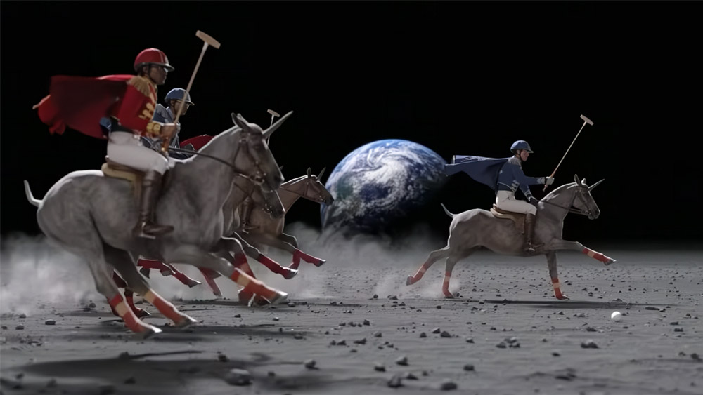
If the original Sora stunned the world with its silent clips, Sora 2 was the moment generative AI evolved into an industry-grade world simulator. Launched in late 2025, it moved beyond stitching pixels to mastering real-world physics, introducing perfectly synchronised audio and persistent character likenesses that allowed for consistent, high-fidelity storytelling across different scenes. Or, in layperson's terms, it made it simple to make believable looking videos just by typing a prompt.
Why it matters: Make no mistake: this was a huge transition from production-led creativity (hiring crews and cameras) to orchestration-led creativity (typing a prompt). The barrier to entry for cinematic-quality visuals no longer required a budget in the millions, potentially shifting the role of the creative from "maker" to something more akin to "conductor".
How this will play out in the real world, though, is anyone's guess...
For more on what we can learn from the history of design, see my pick of some of the best design ideas.

Tom May is an award-winning journalist specialising in art, design, photography and technology. His latest book, The 50 Greatest Designers (Arcturus Publishing), was published this June. He's also author of Great TED Talks: Creativity (Pavilion Books). Tom was previously editor of Professional Photography magazine, associate editor at Creative Bloq, and deputy editor at net magazine.
You must confirm your public display name before commenting
Please logout and then login again, you will then be prompted to enter your display name.
