Get ready to pay close attention, because these typographic designs aren't quite what they seem. Created by designer Mustafa Ömerli, this clever typography series contains both hidden and obvious messages in order to give literal sense to the word being spelt.
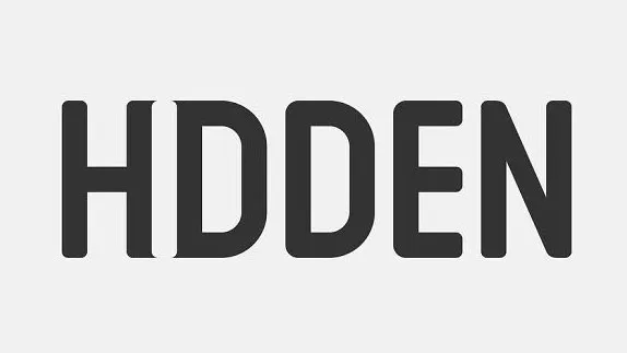
Shared on Ömerli's Instagram page, each word features a design that reflects its meaning. Just take the word 'hidden' (above). Did you notice that some subtle sharp serifs on the 'H' and 'D' create the letter 'I'? It's a brilliant use of negative space.
Take a look at a selection of Ömerli's typography designs below, and head over to his Instagram page to see dozens more. Be warned though, scrolling through his feed and deciphering each design is really addictive.


If you think that these designs are fun but nothing like this would be used in the real world, you're wrong. Only recently Canada Jetlines launched a logo with a hidden meaning. So, who knows, maybe we'll be see one of Ömerli's designs picked up by a big brand too?
Related articles:

