





If you'd asked me last month to name the most politically explosive branding project in Australia, I wouldn't have guessed it'd be a local council's email signature. But here we are.
Sutherland Shire Council, in Sydney's south, covers a population of around 240,000 people. It rarely gets much coverage in the national press, let alone grabs attention in England over 10,000 miles away.
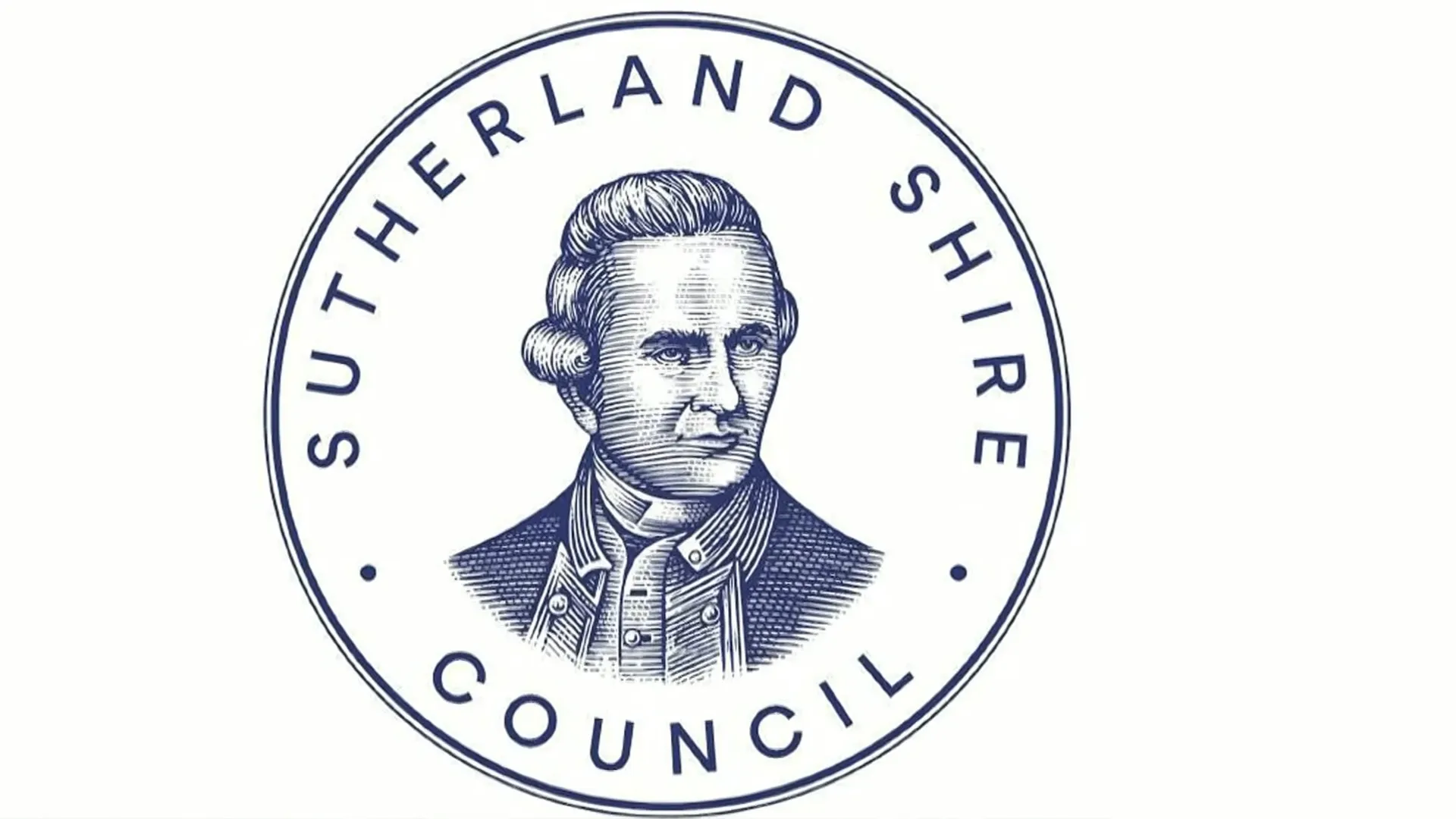
Yet in recent weeks, it's been at the centre of a row over its crest: an engraved portrait of Captain James Cook, who first came ashore on Australia's east coast at Kurnell, within the shire, in 1770.
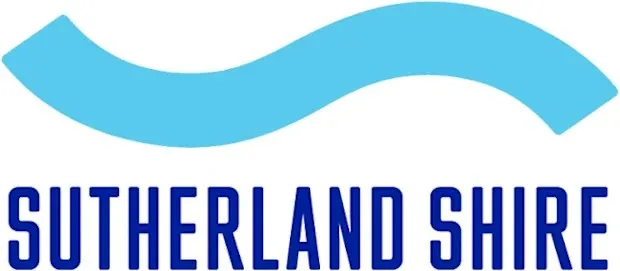
Back in July, staff began favouring a newer, simpler logo across its communications. It's a light blue wave that's simple but effectively represents an area on Australia's east coast.
The Captain Cook crest row explained
To be clear, Cook has not been "cancelled", removed or erased by the council. They've simply moved the emblem featuring him to what they call "civic, ceremonial and high-value corporate applications", while using the newer one for things like email signatures, where a simpler mark works better.
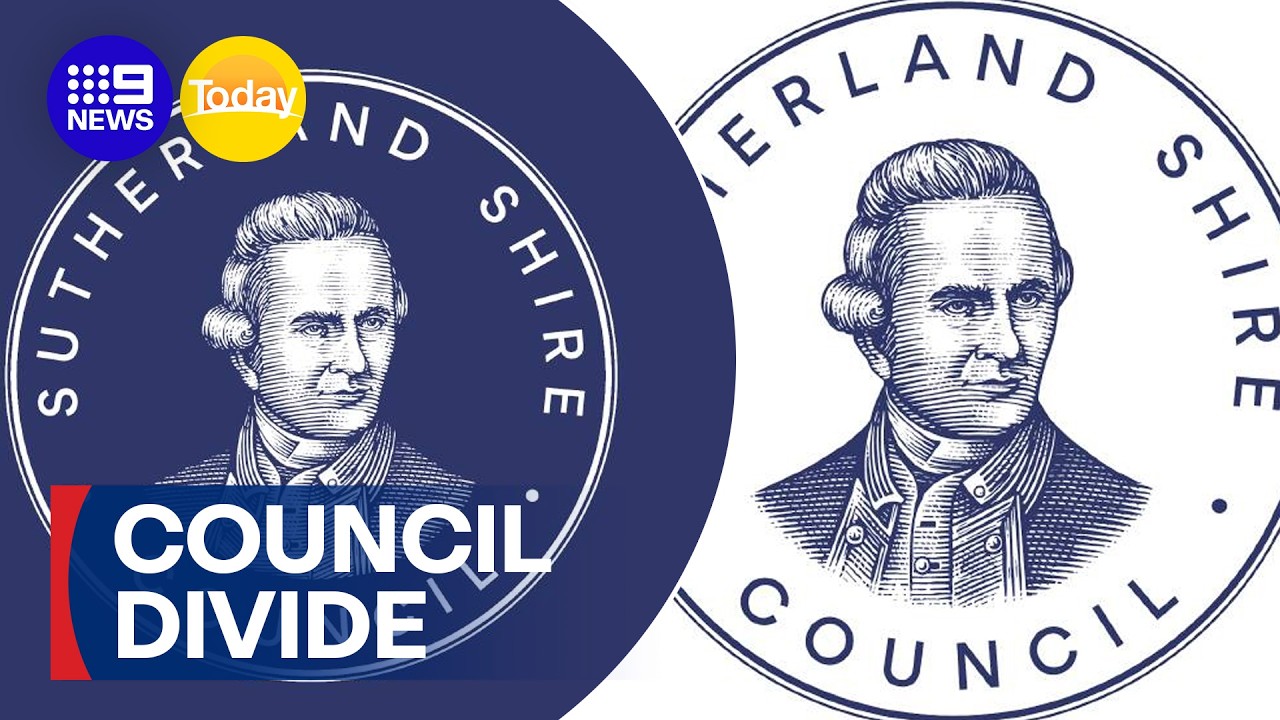
Councillor Haris Strangas, though, wasn't happy that he'd never been asked about this change. So he tabled a motion to review the council's policy, then went on the Today show, a major national breakfast TV programme in Australia, to discuss what he'd done.
Admittedly, in the clip, Haris came across as a likeable, ordinary guy who said he didn't want to inflame the issue and acknowledged most people have better things to talk about. Nonetheless, he wasn't backing down, and as a result, Sutherland Shire found itself a front in Australia's long-running culture wars. Lots of other people then piled in with their own agendas, and you can imagine how it's all spiralled out of control since.
While I imagine most people in the area simply shook their heads and ignored this episode, I think it says something about how politics is making it harder for designers to do their jobs.
Why logos need to change
Logos are tools, not monuments. They need to be tweaked, updated, redesigned or replaced when they start to look tired, or for practical reasons, like when they don't work on small screens. It's not vandalism; it's maintenance.
Ninety-nine per cent of the time, this happens, and nobody bats an eyelid when logo redesigns get it right. Mastercard dropped its name from its circles emblem in 2019. Volkswagen flattened its badge the same year. Burger King reverted to its retro bun in 2021. Pepsi brought back a bolder, blacker globe in 2023. Few people outside the Creative Bloq audience would ever have noticed.
Even changes to the Sunderland Shire logo followed the same pattern. In 2008 the council shrank Cook in favour of its name and a new colour scheme. Ahead of the 250th anniversary of Cook's landing, it restyled the portrait for digital screens. The wave itself was introduced back in 2017. None of this made the national news.
What this means for designers
So what's changed? Well, sadly, we're in an era when a rebrand isn't just a rebrand. If people can make it a symbol of something bigger, they will. It's no longer about colours, type or kerning. It's about identity.
None of this means history doesn't matter, or that communities shouldn't have a say in how they're represented. But let's be clear: Cook has not been, and has not been, erased. The council just introduced a different design for specific use cases. That's all.
The fuss that people make over such minor tweaks puts designers in a difficult position. The lesson many clients will take from this, Cracker Barrel, Jaguar et al is that it's safer never to change anything at all. That's bad for design, and frankly bad for the organisations themselves, which end up stuck with identities that no longer work.