




From Pop-up Pirate to Screwball Scramble, the Japanese toymaker Tomy became synonymous with mechanical puzzle games in the 1980s, and it's still going strong. It's just announced its first rebrand in 20 years, and it's the company's most radical identity change yet.
Tomy will have a new name for those of us outside of Asia. It's also introduced a new unified logo for all markets, and the dramatically different look has caused a lot of surprise.
See our guides to the best laptops for graphic design and the best monitors for graphics artists if you need new tools for your own work.

Tomy will now be known as Takara Tomy everywhere, consolidating its global branding under the name it was already using in Asia. In all markets, the familiar white and blue wordmarks are being replaced by a new logo design that combines the name with a rather abstract-looking symbol with a teal-to-magenta gradient. The company calls its colours 'Quality Blue' and 'Quality Gradation'.
While the symbol looks fairly inscrutable, the company says it's based on the katakana symbol for 'asobi' a term that can be translated as 'play', 'recreation' or 'amusement'. So although the logo looks indecipherable, it's actually a literal representation of the brand's playful spirit.
That playfulness is apparent in the wordmark too, if you look closely. There are two Ts, and three As in the company name, but each one is rendered different. The first A has a slight downward curve on the crossbar, the second a slightly upward curve, and the last has serifs on the feet and apex. From a distance, the wordmark looks fairly uniform and reserved, but each letter has its own personality.
However, some people aren't sure that the icon works. Even in Japan, people seem to be struggling to decipher its meaning.
"Is it the chip on a credit card," one person wonders on X. "It looks like a seafood processing company," someone else thinks.
Some are even suggesting that the company's announcement that the new identity will be rolled out on 1 April 2027 is a sign that the rebrand might be an extremely early April Fool's Day prank.
I'd say it actually looks like a Screwball Scramble.
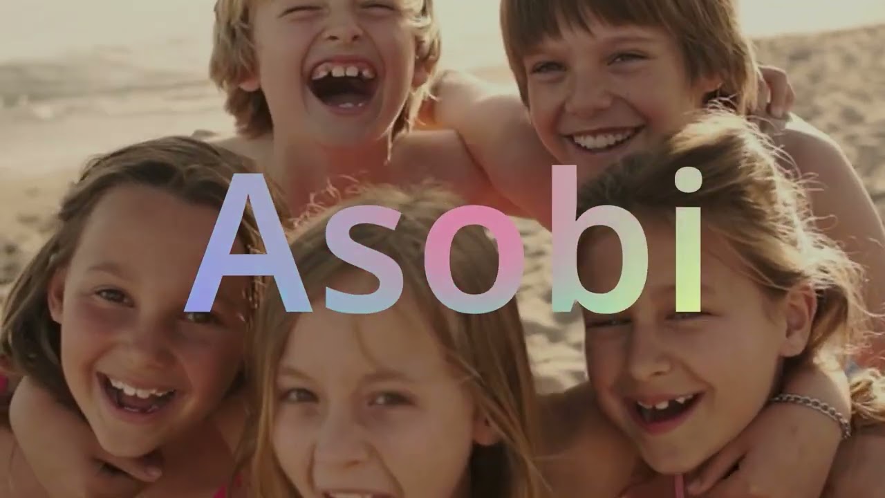
Here's the company's video explainer, which shows how the design was formed.
Tomy is an abbreviation of the name of Eiichirō Tomiyama, who founded the company in 1924. The company merged with Takara, another Japanese toymaker, in 2006. That led to the last rebrand, under which the company adopted the Takara Tomy name in Asia.
In an explanation of the rebrand on its website, Takara Tomy says it's now transforming from a 'toy company' to a 'play company' and that it will adopt the motto "One Takaratomy" as it unifies its branding".
For more of the week's branding news, check out the winning Caixa rebrand in Brazil.