







Banks don't always have the most exciting branding, but Brazil's Caixa Econômica Federal, a huge state-owned financial institution with 165 years of history, has a good go. The bank's rebranded for the first time in almost three decades, and the new identity ticks all the boxes.
The new identity is a fine example of a redesign done right. It feels more modern, more human and approachable, and it remains instantly recognisable, maintaining a clever hidden symbolism.
See our guides to the best laptops for graphic design and the best monitors for graphics artists if you need new tools for your own work.
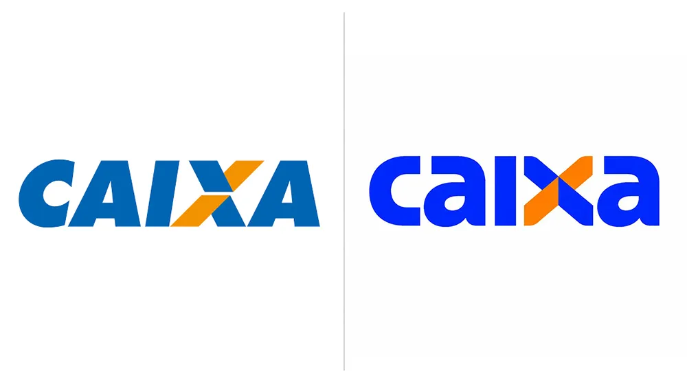
The Caixa rebrand was the work of the Brazilian agency Tátil. It looked to the bank's history and its existing identity, kept the elements that people most recognised, and turned them up.
The previous logo design had lasted 29 years, so it was doing something right, but it was starting to look drab and dated with the old corporate feel of those muted colours and slightly italicised all-caps letters.
The rebrand turns the colours up with more modern, vibrant hues. Tátil suggests the blue represents enduring solidity while the orange reflects the diversity of Brazil.
The wordmark gets a cleaner lowercase design, and the core X motif, which features in the wordmark and also stands alone, gets a significant refresh.
The letter now more clearly resembles a box when applied in repeating patterns, reflecting the bank's name, which means box (as in savings box) in Portuguese. It also continues to resemble the roof of a house, reflecting the bank's role as Brazil's biggest mortgage lender.
You can see the evolution of the institution's branding in the video below.
"While every app was busy calling itself a bank, we went against the grain and found what only Caixa has, a bank that brings together the social and the commercial, today's needs and the drive to grow," Tátil says of the rebrand.