




Rebrand Revisited is a new series examining the brand redesigns that divided opinion, and asking whether history has been kinder to them than the comments section.
We all remember where we were when Airbnb revealed its new logo in 2014. Okay, maybe not. But it was certainly one of the biggest design stories of the year. The new logo was designed to represent "people, places, love and belonging". The internet promptly decided it looked like genitalia, leading to many thousands of social media posts and column inches. It probably wasn't quite the heartwarming response the company had in mind.
But skip forward twelve years, and the Bélo (as the symbol was officially named) is still going strong. Indeed, these days it's hard to imagine Airbnb without it. So how did a logo that launched to an avalanche of mockery and anatomical comparisons become one of the most recognisable symbols in travel? And was the backlash ever really justified, or was this early proof that the internet can't help but judge a rebrand too quickly?
Before: The blue years
When Airbnb launched in 2008, its proposition was pretty simple: why stay in a hotel when you could sleep in a stranger's house? What began with its founders renting out air mattresses in their San Francisco flat quickly grew into a global accommodation platform.
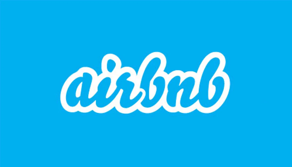
Its original branding, however, was decidedly less ambitious. The company's blue, handwritten wordmark had a distinctly late-noughties feel, complete with bubbly lettering and a white outline. It was friendly, playful and just a little bit naff.
But by 2014, Airbnb was no longer a quirky little startup. It was becoming a serious challenger to the hotel industry, and its branding needed to reflect that. Enter London-based agency DesignStudio, tasked with creating an identity that could grow with the company.
The birth of the Bélo
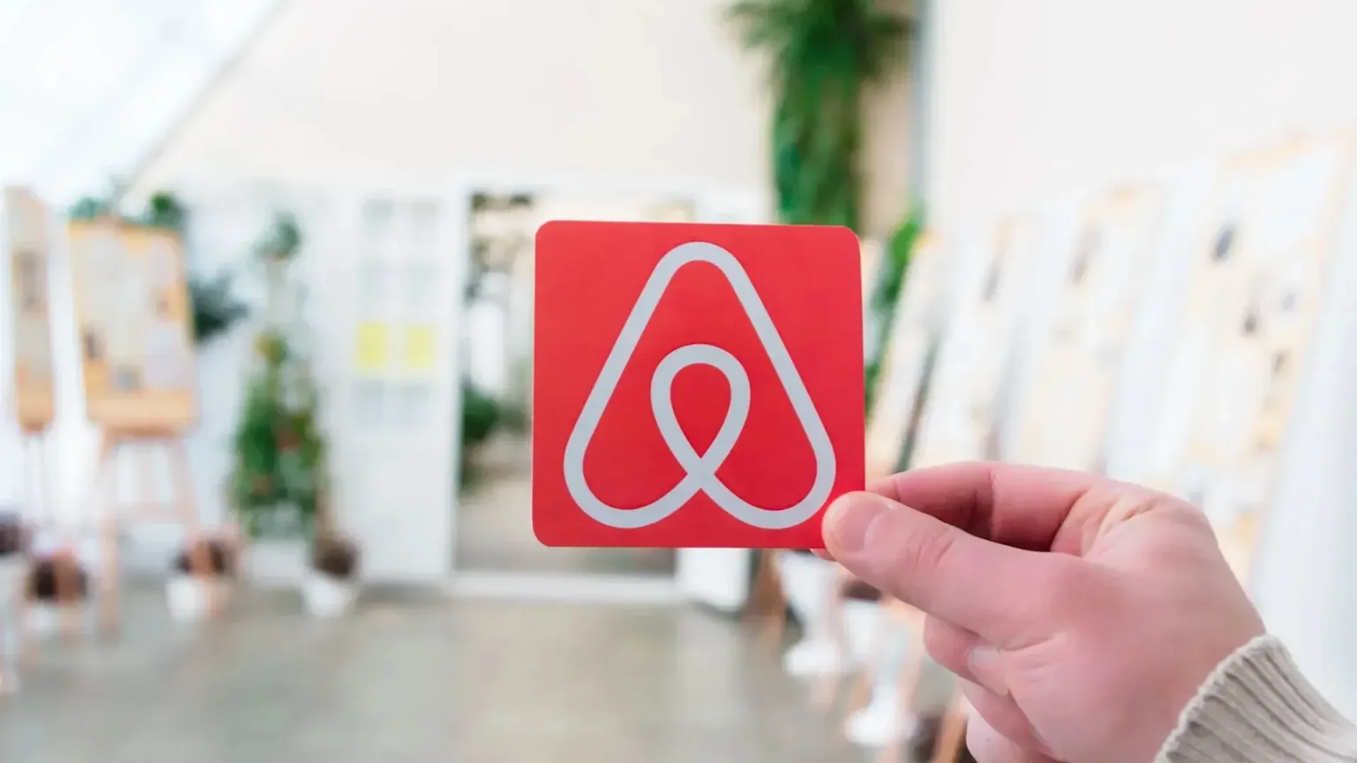
On 16 July 2014, Airbnb unveiled its new identity. Gone was the blue, bubble-like wordmark, replaced by a clean sans-serif typeface and a bold coral-red symbol called the Bélo.
The new logo was designed to combine four elements: a person with their arms outstretched, a location pin, a heart and the letter A. The idea was that these would come together to form a universal symbol of belonging. It was certainly ambitious.
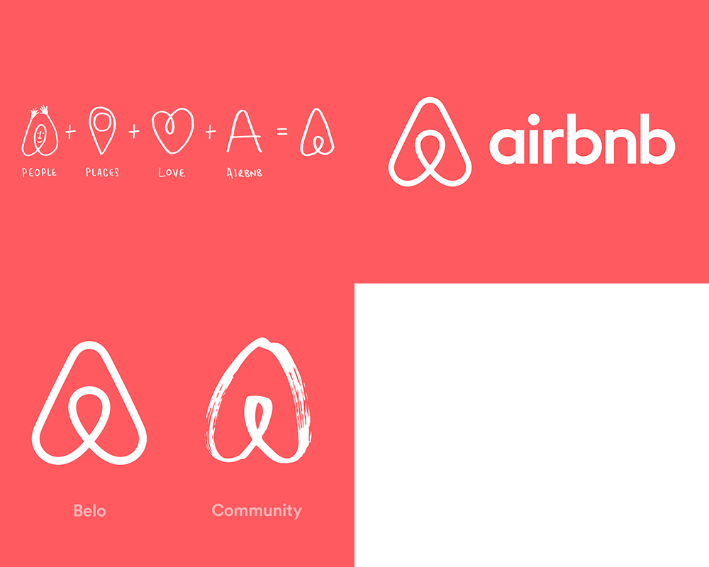
And this wasn't just a logo redesign. DesignStudio overhauled the company's entire visual language, introducing a new colour palette, typography and redesigned digital experiences.
The agency had certainly done its homework. As DesignStudio's James Greenfield explained to Creative Bloq in 2014, the project involved visits to 13 cities, stays with 18 hosts across four continents and interviews with more than 120 people. This was no quick afternoon in Illustrator.
Crucially, Airbnb wanted the Bélo to be something anybody could draw. The company even launched a 'Create Airbnb' initiative, inviting its community to customise the symbol and make it their own.
The internet's mind enters the gutter
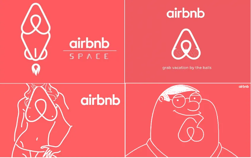
Almost immediately, the comparisons began. While Airbnb saw a welcoming person, a heart and a map pin, everybody else seemed to see genitalia. Social media was flooded with jokes about the logo's resemblance to breasts, bottoms, vaginas and testicles. A Tumblr account dedicated to Airbnb logo parodies soon appeared, featuring everything from questionable anatomy to Peter Griffin's chin. The Guardian went with the wonderfully direct headline, 'Is it balls, vagina, or both?'
And the unfortunate comparisons weren't limited to human anatomy. Designers were quick to point out similarities between the Bélo and existing logos, most notably that of software company Automation Anywhere. Airbnb and Automation Anywhere subsequently issued a joint statement explaining that the resemblance was coincidental, with the latter agreeing to transition to a different design.
To DesignStudio's credit, the team appeared unfazed. Writing for Creative Bloq shortly afterwards, Greenfield insisted that the designers had taken the response in good humour, declaring that they had actually enjoyed the experience. After all, the logo had got people talking (and talking).
What came next
Spoiler alert: the Bélo is still here. Not only did Airbnb resist the temptation to pull a Cracker Barrel and replace its controversial new logo (or pull a Jaguar and fire its head of design), but it stood firm, and the design has become fundamental to the company's identity.
It's also aged remarkably well. The stripped-back shape works at almost any scale, from a tiny app icon to a giant billboard. The coral colour is distinctive, the symbol is instantly recognisable, and the whole thing manages to feel both friendly and professional.
But perhaps most importantly, after all these years, it still doesn't look particularly dated. Unlike the company's original blue wordmark, which now screams early internet startup, the Bélo still somehow feels contemporary. And while Airbnb itself has changed enormously, its branding has remained remarkably consistent. In 2025, the company launched an entirely redesigned app, expanding its offering beyond accommodation to include services and experiences. The Bélo remained firmly in place.
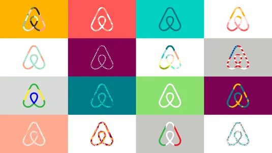
Indeed, like the 2016 Instagram logo, the Bélo's longevity is perhaps its greatest achievement. What once looked baffling or faintly obscene has become so familiar that most people probably don't give its shape a second thought. The symbol hasn't changed. And that's the interesting thing about controversial rebrands. The initial reaction is often less about the quality of the design than the shock of seeing something unfamiliar. Give a logo enough time, and it might start looking less like a disaster and more like a design classic.
In a world of rebrand backlashes and apologies, brands would do well to remember the lessons of Airbnb's Bélo. Here was a design that was strange enough to provoke ridicule but strong enough to weather the jokes. And while Airbnb's lofty claims of creating a 'symbol of belonging' might have been overblown (hey, isn't every design case study?), it did create a symbol that's become inseparable from the brand itself.