




The weird 'war on woke' being waged in the US has already claimed some high-profile design victims. The most famous examples have been the Cracker Barrel rebrand, which was deemed too modern for conservatives, and the US State Department's use of the famously liberal typeface Calibri.
Several brands have held their nerve in the face of the onslaught. Mars refused to entertain Tucker Carlson's fetish for the green M&M, the Jaguar rebrand is starting to make sense, and Bob's Red Mill seems to be sticking to its decision to 'kill off' Bob.
Alas, it seems a library in North Carolina didn't have such guts. Farmville Public Library has reportedly ditched the logo design it had been using for the past 14 years because three people complained that it looked a little bit like a rainbow, which apparently reminded them of gay people.
THESE PEOPLE HAVE LOST THEIR MINDS!!! For 14 years, the Farmville Public Library's logo was an open book with each page in a different color. Now it's gone. Three residents complained that it "resembled a rainbow" and might suggest support for LGBTQ+ people. https://t.co/09sYGqk7jtOctober 23, 2026
According to Farmville mayor Alex Joyner, the town's library changed its logo after three complaints were made to a town commissioner. I won't comment on the choice of typeface, but the mark itself was perfectly serviceable for a public library: it was cheerful, it stood out, and it obviously depicted a book rather than a weapon of LGBT propaganda.
The mayor himself has taken issue with the decision. He pointed out that the iconic television series Reading Rainbow had made said climatic phenomenon a “significant symbol of libraries across the entire US”. He also complained that the logo was changed “in the dead of night behind a curtain” with no opportunity for public comment.
“The library is a symbol of inclusion and is supposed to be welcome to all. For a handful of people to be able to decide who is welcomed and who is not here is unacceptable in my eyes,” he said, as reported by ABC.
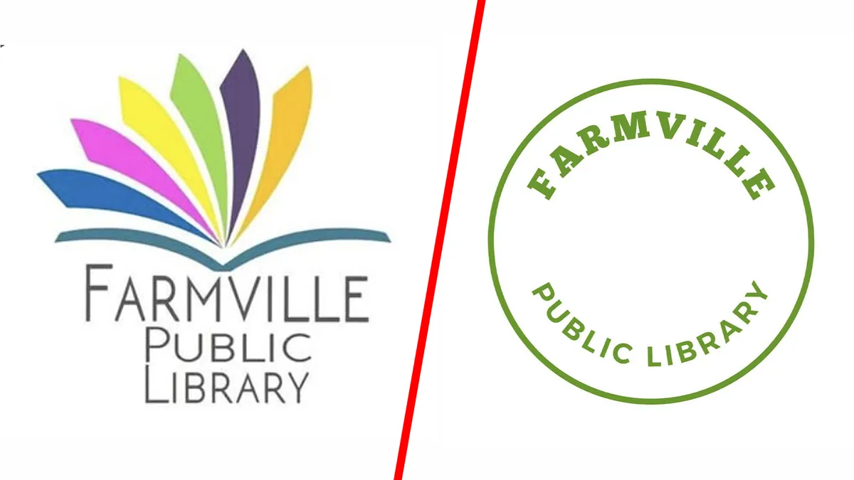
I'd also point out that the logo's seven colours don't even depict a rainbow and aren't the same colours as the pride flag. It's clearly an open book, with each colour depicting a different page. It's a nice way to show that books can contain a wide array of knowledge on diverse subject matters, like how colours are used to depict different subjects in Trivial Pursuit. Although admittedly, Trivial Pursuit is very woke.
The culture war, it seems, has now become a war on colour. Next, we'll be banning box sets of the best coloured pencils. Apple's iconic rainbow logo would never be allowed today, and I'd be surprised if Google doesn't soon receive complaints too: it's workmark contains red, yellow, green and blue. At this rate, everyone is going to have to dress in black, and any splash of colour will become the ultimate act of rebellion.
A public meeting to discuss he logo controversy will be held at Farmville Town Hall on 2 November at 5:30pm.