






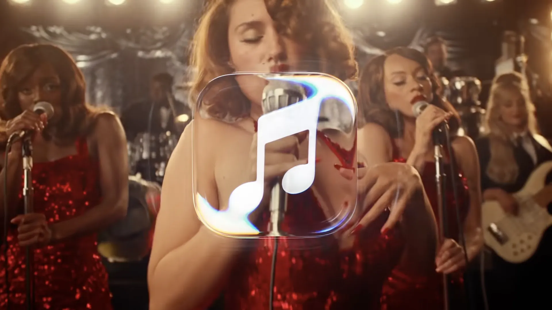
Apple has finally announced its comprehensive rebrand of its streaming service, Apple Music, revealing an unexpectedly creative (and sonic) approach to crafting the new identity. With the help of electronic producer Fred Again, the new visuals were "made by sound" – which, of course, involved dunking the logo in huge tank of water.
Fred Again and NEST Acoustics created a short musical composition, which was played through an underwater transducer, resulting in physical vibrations and ripples. These were in turn used to animate a delightful new identity that looks like the ultimate expression of Apple's Liquid Glass aesthetic.
The months-long project involved building a custom rig and software to control the transducer which played Fred Again's mnemonic sound (which also serves as a new sonic logo for Apple Music).
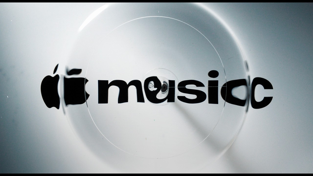
Apple's video case study (above) is a treat, revealing just how hand-made the identity really was. The company set out to create "music, made visible", and the liquid-based process was clearly as mesmerising as it was intricate. The result is a visual identity that feels both playful and visceral, much like the bold new Apple Music wordmark we first encountered earlier this month.

The only question is how the overall identity will translate to the most important part of Apple Music: the app itself. Sure, the liquified animation will look fantastic in music videos and ads, and the mnemonic will sound great in the same context. But from what we've seen of the actual new Apple Music icon, very little of that creative expression has made its way to the nuts and bolts of the daily Apple Music experience.
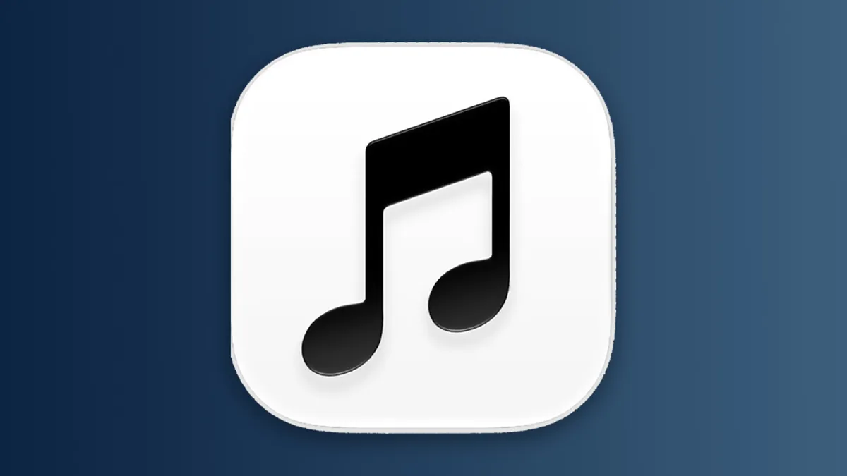
Indeed, the new black-and-white Apple Music icon, first glimpsed in iOS 27.2, has been described as 'boring' and even 'miserable' – and now that we've seen how gorgeous Apple Music can look as a brand, users are wondering where that magic is in the app. "This is a genuinely exciting rebrand that has translated HORRIBLY to the elements most of us interact with - the Home Screen icon, the navigation bar and other in-app elements," one Redditor comments, while another adds, "So they have all these gorgeous colours for changing an Icon to black and white?"
As for the app itself, Apple seems to have simply stripped out the previous red accents, with text accents now blue, and the 'Favourite' star now yellow.
We can but hope that the dull black-and-white logo is a placeholder, and a splashier design for the app and icon are on the way. But for now, we're looking at a beautiful brand with a not-so-beautiful app.