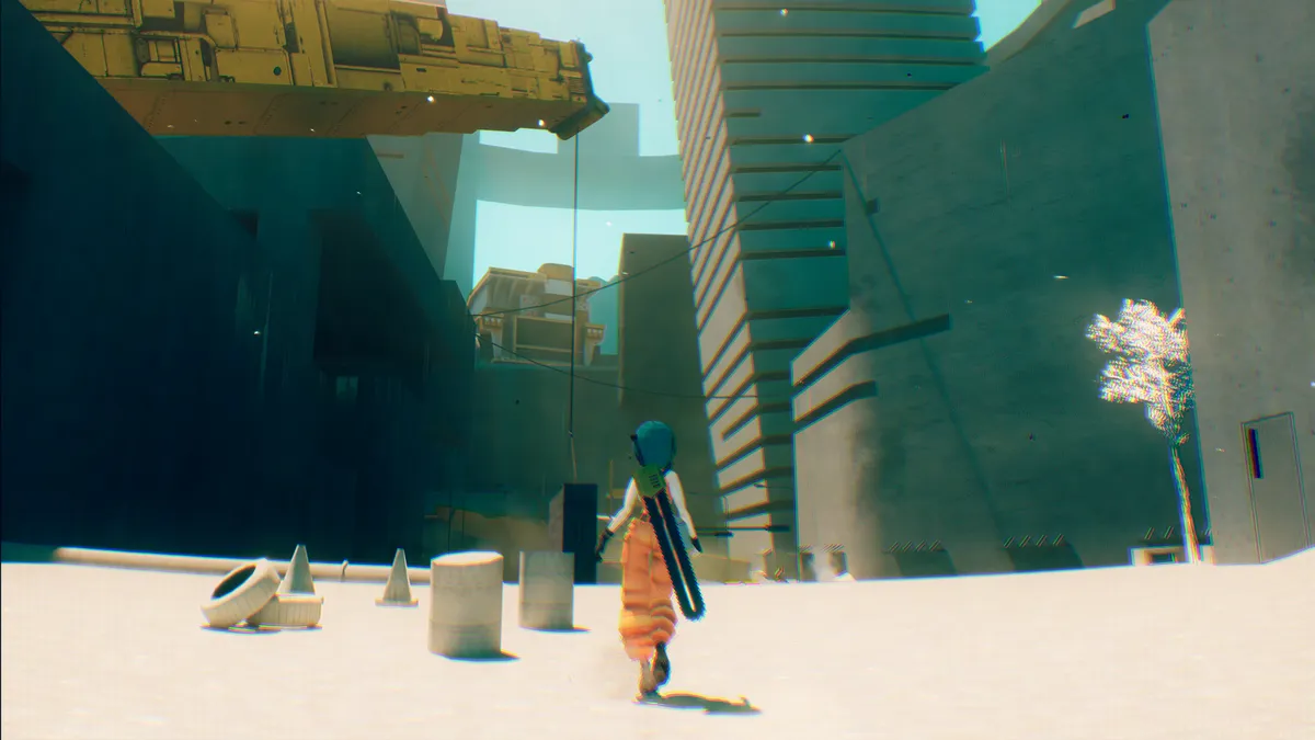
For me, indie game Motorslice is one of the year's sleeper success stories. It has a visual design that feels familiar, but with the confidence to do more than just replicate; it's partly a love letter to brutalist megastructures, but also a nostalgic nod to some of the 3D action games, from Shadow of the Colossus to Mirror's Edge. Read my Motorslice review for a deeper dive, but it left such an impression I had to track the dev down to hear how it was made.
Built by a tiny two-person team at Regular Studio, Lucas Bonatti and his brother Luiz Bonatti, the project leans into constraint, turning limitations into a visual style and a gameplay hook that feel lean and engaging. Across its towering concrete structures, yellow hazard markings and rich blue skies, the game channels influences as varied as Fumito Ueda’s vast, lonely worlds, the guided clarity of early Prince of Persia, and the oppressive megastructures of Tsutomu Nihei’s Blame! – all filtered through a deliberately hand-crafted approach.
In this interview, Lucas breaks down how readability survives at high speed, why brutalism became both an aesthetic and production strategy, and how an interconnected world was painstakingly built as a single continuous space (that last one surprised me in its scope).
From colour theory and lighting choices powered by Unreal Engine 5’s Lumen system to the decision to avoid photorealism entirely, this is a deep dive into a game positioning itself among the best indie games of the year and one of the most striking new Unreal Engine games around at the moment.
Visit Regular Studio for more details on Motorslice.

CB: What was the original artistic spark or moodboard that defined the game’s look?
Lucas Bonatti: Since the very beginning, we’ve had a strong vision on what we wanted the game to be. A striking atmosphere. We wanted to make an atmospheric deadly place, but not in the common sense of a gritty world, but with a colourful yet desolate art direction.
CB: xxx
LB: xxx
CB: Which artists, films, games, or subcultures most influenced the game’s aesthetic language?
LB: Fumito Ueda's games were a huge inspiration, particularly in how his games achieve this desolate vibe with a huge sense of scale and solitude. Mirror's Edge has timeless art direction that’s used for both gameplay purposes to guide the player and to create a striking and unique atmosphere. Brutalism architecture takes a huge part as well, which I will explain later on.
Besides that, Blame! is an indirect inspiration. I was not objectively trying to replicate Blame, but when you’re trying to make a megastructure work, this is inevitable to some degree.
CB: How did you approach balancing readability with visual chaos, especially in high-speed gameplay moments?
LB: It comes down to the art direction. We created rules using our visual style to help the player and other things. Motorslice uses the yellow colour from heavy machinery as a motif for the world design, and this is the major key element for readability, but there are other elements as well, such as shapes, vistas, and other types of world elements to make things clear.

CB: What led you toward stylisation over realism, and how did it shape production workflows?
LB: We didn't pursue realism, but rather a graphic fidelity that makes sense on the main core elements we are trying to do, which is an old school parkour game trying to evoke a PS2-PS3 era vibes, brutalism and a striking and memorable art direction.
CB: Were there any technical limitations that unexpectedly became part of the game’s visual identity?
LB: Brutalism was chosen for multiple reasons, and one of them was because of our limitations as a tiny team. Because of the minimalist nature of this movement, it gave us a way to create beautiful vistas with very little, and as a tiny team, this is crucial to be able to make such a huge game.
The machines were also included for this reason. We couldn’t afford to have complex models, and machines are easy to be done for us. So, a game about killing construction equipment with brutalist architecture felt right, with the huge focus on concrete.

CB: Can you talk about your approach to texture work, material definition, and environmental storytelling?
LB: Early on, we decided to make the world one big place, and this affected everything about the game. From how the game feels and plays, to how textures were made to all feel part of one big thing.
This gives this huge sense of a "tactile" game world. And we literally made a physically connected world, all handcrafted, every single window and dune. And you can feel this while playing. It is not something you can achieve otherwise.
But this also comes to gameplay elements on how P is connected to this world and how reactive she is to everything. Everything comes together to give this grounded feeling to the world.
CB: How early in development did the final visual style lock in, and how much did it evolve during production?
LB: Since day one I had a strong vision of what I wanted to achieve. You can see on early footage. There is an experimental process across development, with decisions being made based on what best serves the bigger picture, but the art direction was decided really early on and didn’t evolve much since early days.

CB: There’s a strong sense of space and scale in the art direction itself. How did you reinforce this?
LB: The game was designed to have this big obelisk on the centre, connecting everything. This defines everything in the game, like how big things can be without feeling boring. It was about how big the game needs to be rather than just how big I want to be. It was an interactive process, and it was really fun to achieve this.
CB: What were the biggest challenges in translating concept art into fully playable 3D spaces?
LB: We don't work much with concept art, since I believe this doesn't translate that well and it is not the most efficient way to work as a tiny team of 2 who develop everything. But I did some, mostly trying to communicate what I have in mind when transforming the block levels prototype into something. But overall, it was pretty much a free form on the go.

CB: Were there any smart shortcuts, procedural tools, or unconventional techniques that helped achieve Motoslice's look?
LB: It is exactly the opposite in our case (ha-ha). I started using some procedural tools, but later I realised it was easier and the results far better if everything was handcrafted. Yes, every build, every dune was handcrafted without any procedural tool at all. I might be insane; who knows.
CB: How did you decide on the game’s visual tone, and were there colours or lighting setups you deliberately avoided?
LB: The first thing I decide was to use cyan as the sky colour. That was because of what I said previously, to evoke a certain feeling from older games. From that the rest of the colour palette was to fit and feel beautiful with each other. The brutalism architecture makes things grey, so I wanted to add another colour to make readability better, so it becomes the white sand on top of almost every platform. And so on.

CB: Were mechanics ever redesigned to better suit the visuals, or vice versa?
LB: As I said, I did sketch on top of prototype screenshots to illustrate what I had in mind. There were a few redesigns to better fit the gameplay, especially on bosses, but nothing major, since I did not waste much content during production.
CB: What part of the game's visual design are you personally most proud of, even if players might not consciously notice it?
LB: Definitely the interconnected world. It was a massive amount of work to make this place believable and grounded. Like opening holes to connect into the grand scheme of things was a common thing I did while developing the world and this kind of thing. But luckily, players are noticing this, and they are also thinking it is the coolest aspect of the game.

CB: Did you build the game’s art style around modern hardware capabilities, or was the goal to create something more timeless?
LB: The game was built with Lumen in mind. The expensive lighting system from Unreal Engine 5. The visual style is only possible because of this tech. The soft shadows, the subtle colour palettes, the gradient darkness... All of this was used to create the visual fidelity. But it was also made to be a low-poly, low-fidelity style. A combination between old and new I would say.
CB: Looking back now, is there anything about the game’s modelling or visual design philosophy you’d approach differently today?
LB: There were a few things regarding game design that affects how the game was built, which made things a bit harder for us, and I would have done better now, but I don't think this affects the game and players will never notice any of this.
So, there is nothing that I want to change. I think we did our best with what we had, and we barely discarded anything. This is huge for a tiny team and a project that was made within just three years.