When one of the world's biggest brands reveals an updated brand identity, regardless of how dramatic the new look, it's going to make headlines. That was certainly the case with Coca-Cola's new identity, unveiled last month. With a strong focus on typography, JKR's brand refresh has received a lot of attention, with many comparing the new font to a certain cigarette brand.
We recently caught up with three experts from leading creative, marketing and branding agencies to hear their take on not only why Coca-Cola felt one of the most recognisable brands in the world needed a stronger brand identity, but also the impact small tweaks make to a design and customer behaviour.

"Styles can be rediscovered and reinterpreted": Brendan Murphy, Global Creative Director, Lippincott
"Loved brands are in a constant battle between visibility and relevance. Familiarity builds trust, but overexposure can make even the most iconic brand fade into the background.
For CPG brands, particularly those purchased every day, the challenge is to continually give loyal audiences new reasons to believe. They must remain relevant to today’s culture while earning a place in the conversations of the next generation. And because the core product rarely changes, beyond innovations like new flavours and partnerships, it’s often the storytelling and identity that carry the weight of transformation and create renewed interest.
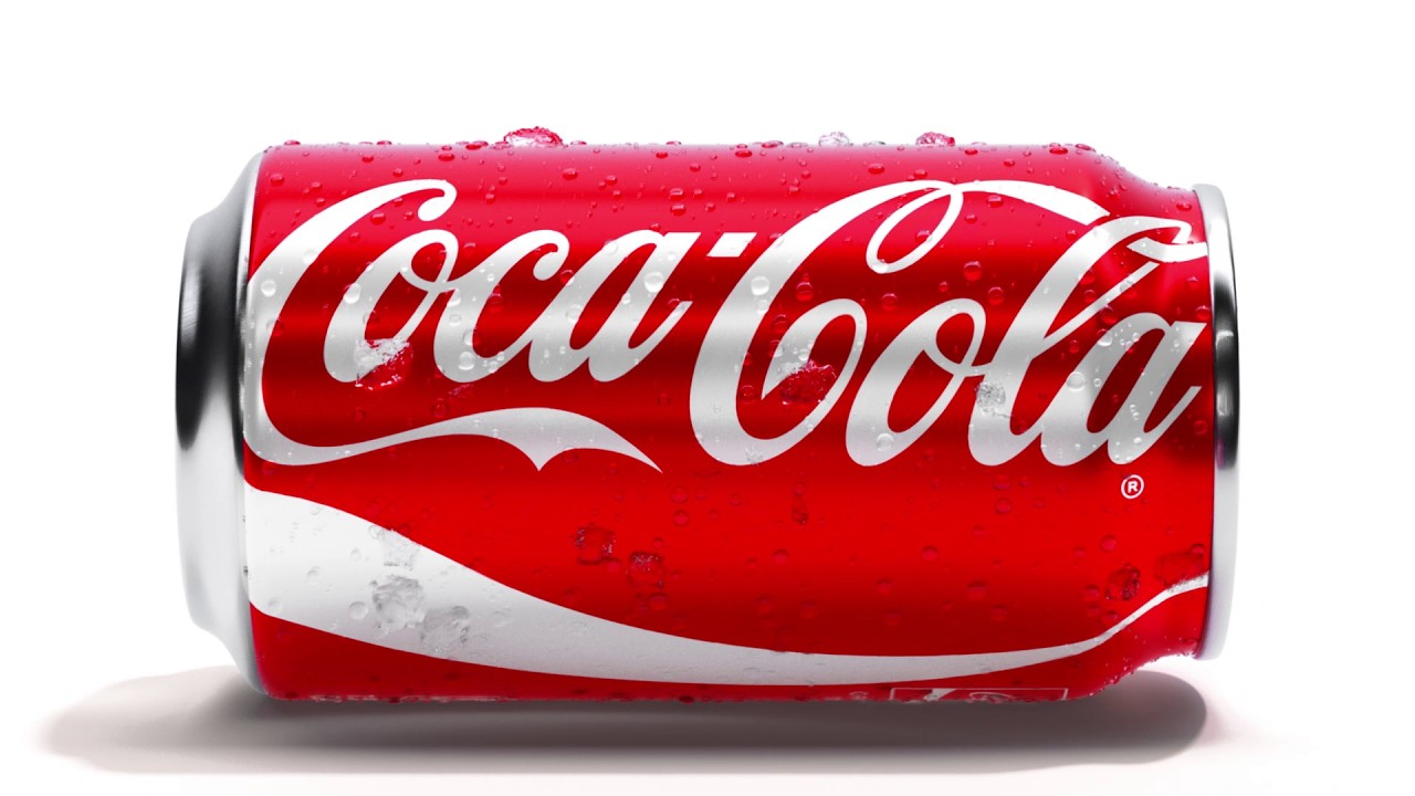
Some brands pursue radical reinvention, as seen in high-profile examples such as Tropicana and Jaguar. Coca-Cola, however, has traditionally taken a more evolutionary approach, drawing on its rich archive of visual assets and the memories it has built over generations. The brand understands that, much like fashion, styles can be rediscovered and reinterpreted. This allows a brand to bridge generations by feeling both familiar and new. Mini and the Volkswagen Beetle are also strong examples of this approach.
There are, of course, moments when a brand must be bold enough to create an entirely new narrative—particularly in response to a new business strategy, geography, product, or technology. Both established and emerging brands, including DuPont and Nokia, have shown that this kind of transformation can be achieved successfully."
Drew Coughlan, Senior Creative Director, Saffron Brand Consultants
"It’s not every day you get to work with a brand that is so recognisable. This type of iconicity can only be built over time or through impressions (think Netflix or Amazon). Whether it’s the Coca-Cola logo, Coke Red, the Ribbon – it would be foolish to shy away from these assets because they do so much heavy lifting when it comes to building identity and recognition.
The work that JKR has done isn’t just about the standardisation across markets and SKUs, it strengthens and extends the brand's iconicity, into assets new and old, and making it work across everywhere Coke shows up. Sparking not just recall, but the taste of an ice cold Coke on a hot summer's day, or just the idea of happiness that it brings. But also, RIP Coke bottle logo end-frame.”

"It isn't about aesthetic vanity": Mark Davison, Partner, Manifesto Growth Architects
"When a global brand makes any changes to its identity, it’s always met with a mixed reaction from the design community, and commentators don’t hold back. But critics of Coca-Cola’s new global brand refresh are missing the point here. The refresh isn't about aesthetic vanity; it’s about amplifying its most iconic assets.
While Coca-Cola is one of the most recognisable brands across the globe, this isn’t enough to sustain growth. Even the most recognisable brands need to continue evolving and think about how they’re showing up across developing retail environments and digital experiences while maintaining an identity that customers are familiar with. And in today’s tech enabled environment, which fuels the rapid iteration of creative assets, the support of a company’s own teams to ensure seamless integration of the new brand is now more important than ever.
This isn’t the first time Coca-Cola has refreshed its identity and it certainly won’t be the last, and it’s this continued evolution coupled with championing its most famous assets which makes Coca-Cola such a successful brand."