The internet's video content overlord, YouTube, has clicked play on a new logo (above) to accompany a fresh, clean site redesign. YouTube is constantly tinkering with how its site looks (remember star ratings?) but this is the first time the composition of its logo has changed since the site was launched in 2005.
Previously, all YouTube logos boxed the word 'Tube' in a red screen. Sure, YouTube has played around with the colour of the screen before, even had a go at gradient colours and highlights, but never before has it separated these design elements so abruptly.
The new logo puts the emphasis on the play button by putting it in front of the name, and rams the message home by making the red brighter than ever. It's a crisp, tidy logo backed up by some sound brand guidelines that show how it will work on different backgrounds. But is it as good as the designs in our best logos list? (If you want to edit YouTube videos, check out our list of the best software for editing for YouTube.)

Over on its official blog, YouTube had this to say about the redesign:
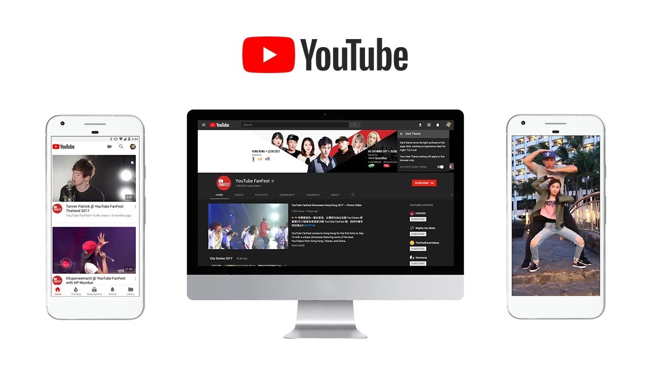
"The bright red cherry on top of this update sundae is a refreshed YouTube Logo and YouTube Icon. Designed for our multi-screen world, the updated Logo combines a cleaned up version of the YouTube wordmark and Icon, creating a more flexible design that works better across a variety of devices, even on the tiniest screens.
"Why’s it more flexible? When room is limited (say on a smartphone) you can use the brightened up Icon as an abbreviated Logo, which will be seen more easily and read more clearly."
The new logo is rolling out to mobile and desktop devices today, with an update arriving on other apps and services in the not too distant future. Watch the new logo and site in action in the video below.
And to see it in all its glory, make sure you've got one of the best monitors available.
Related articles:

