





A couple of years back, a throwback Atlanta Falcons logo design was raising eyebrows due to an unfortunate resemblance. Although it was a revival of an old design that the NFL team had used in 1960s, the combination of black on red and the hard stylisation of the bird of prey motif reminded some of the aesthetic of a certain fascist regime from the 1930s.
It seems the team wasn't fazed by the controversy one iota. Two years on, it's doubled down with a remixed design that takes the Third Reich resemblance even further. The memes didn't take long to arrive.
@AtlantaFalcons https://t.co/9yJwwIi1QIOctober 22, 2026
@AtlantaFalcons Please explain how you missed this? https://t.co/noRcZcfBVGOctober 22, 2026
@AtlantaFalcons not a good look, meinami https://t.co/3qv6FNS4L1October 23, 2026
On social media, the Atlanta Falcons' new profile picture has been dubbed the "gridiron cross" and the "Bird Reich". "I read that the NFL wanted to conquer the world but I didn’t think they meant it so literally," one person comments on X.
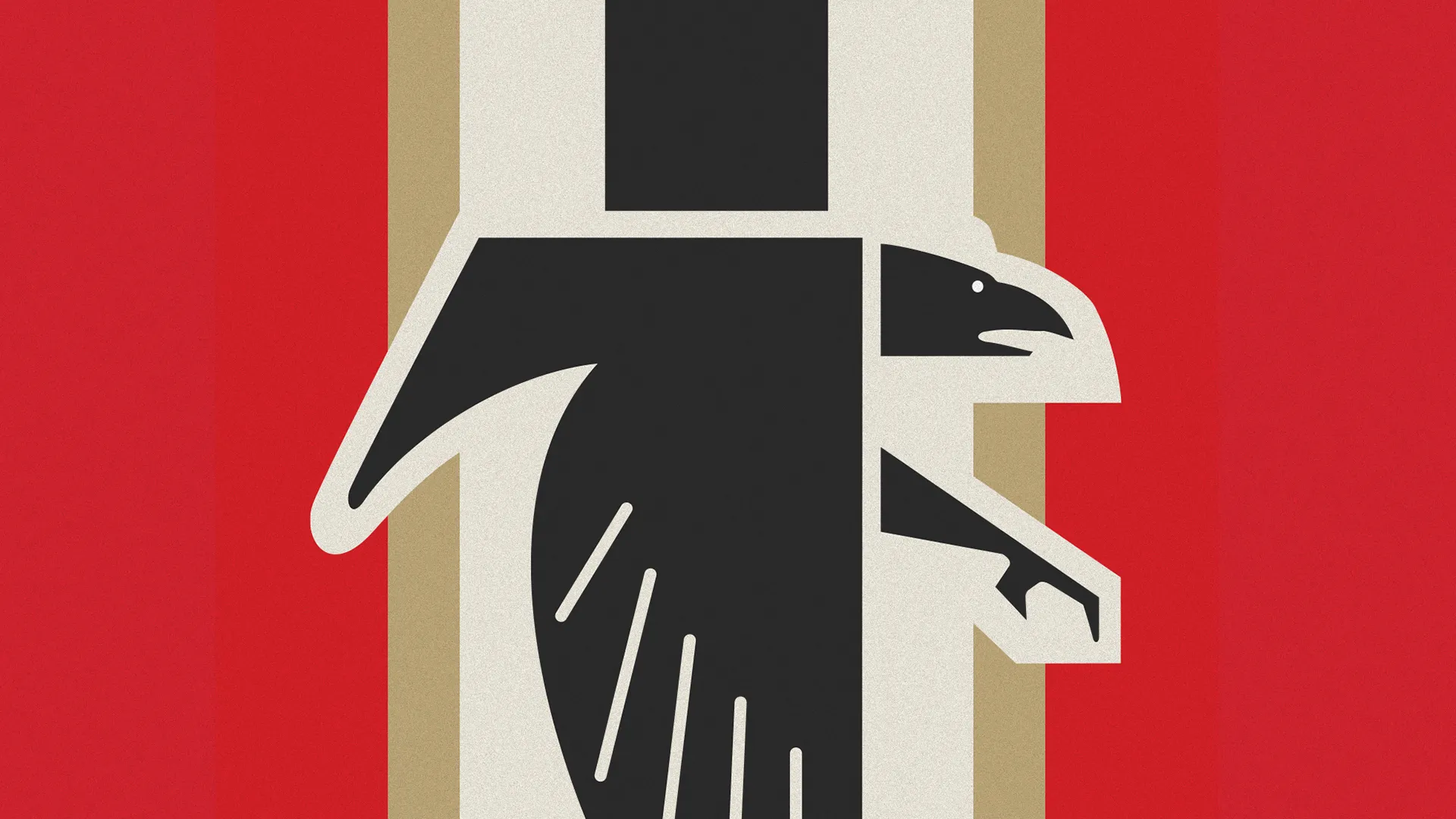
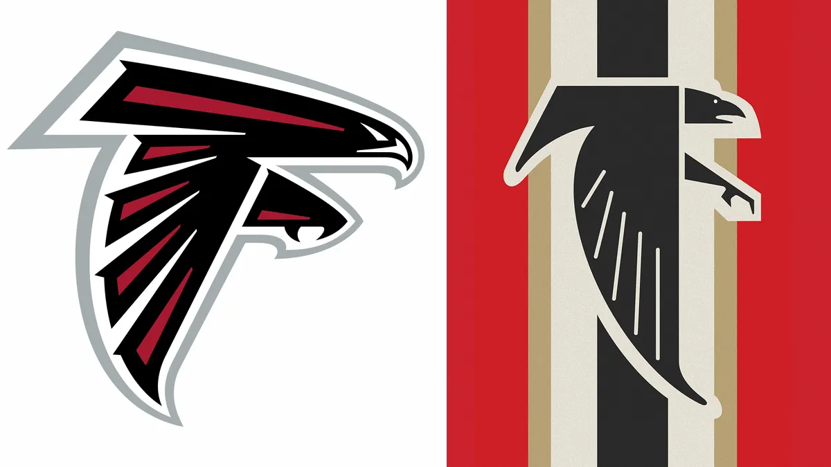
The logo shows the previously used angular black falcon forming an 'F' shape over red, beige, black and cream vertical stripes. It's presumably intended as a temporary design just for this weekend, as the Falcons will play against the 49ers on Sunday wearing retro 1966-inspired uniforms, comprising red helmets, black jerseys and white pants.
To be fair to the Falcons, Nazi Germany never had a monopoly on birds of prey insignia (nor even the swastika, which had a long history before it was adopted by the Third Reich). The bald eagle is also a familiar piece of US iconography.
But after all the comments and ridicule during the last revival of the 1960s design two years ago, there's no way that the team didn't know what was coming this time around. And the addition of the vertical stripes only makes the resemblance to Nazi iconography more apparent, which it must have realised.
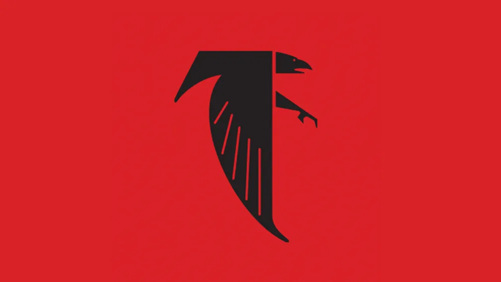
I'd be interested to hear from long-term Falcon fans about whether the same comparison was made when the team originally used this logo back in the 1960s. I guess that in those pre-social media days, people didn't pick apart graphic design in the same way they do today.
Even the best sports logos can generate controversy, and the Falcons logos aren't the most disturbing we've seen. That accolade goes to the old Red Sox logo. Meanwhile, the main Atlanta Falcons logo retains its place in our pick of the best NFL logos.