



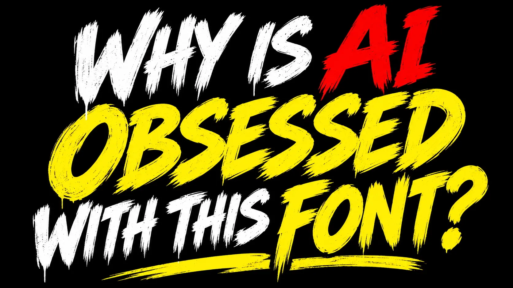
AI-generated art is everywhere, and not just online. If you've started noticing blatantly AI posters popping up in your own town, you aren't alone. I'm seeing the things in cafes, restaurants and even my local village hall (guys, I know you used AI to make that Fireworks Night poster). And while AI posters are generally easy to spot, there's one thing that gives it away every time: that bloody font.
You know the one. Aggressive brush strokes. A slight upward slant. It's loud, it's shouty, and it's everywhere. And now, people are comparing it to that other much-maligned font, Comic Sans. Which, if you ask me, is an insult to Comic Sans.
https://t.co/V7FoyshHWZNovember 2, 2026
So why are so many small businesses happy to make posters using the exact same aesthetic? The clue might be in the name: small businesses. If you're looking for the quickest, cheapest and easiest way to produce a poster, and you haven't got the resources to hire a designer, perhaps you'll be happy to make do with one of the first things AI spits out. And if you're not as chronically online as the rest of us, perhaps you won't even realise this style is so ubiquitous.
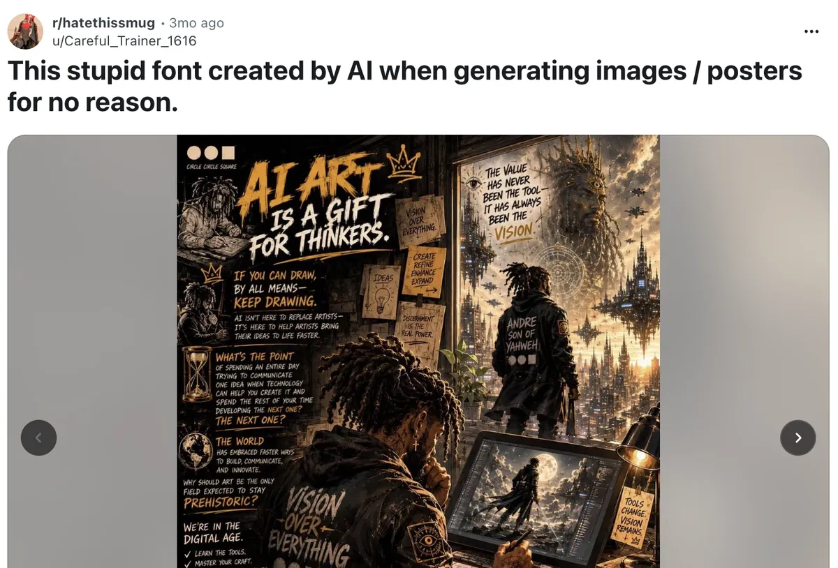
But comparing it to Comic Sans? Come one, now. Comic Sans might not be the most serious looking typeface around, but it was handmade for a purpose. According to Carrick Signs' signage and print expert Mandy Roscoe, Comic Sans was originally created to solve a very specific communication problem, made to “mimic informal, handwritten speech in cartoons, not to decorate official notices." Mandy explains, "The problem isn’t the font itself. It’s when it’s used in the wrong context for the message being delivered.” And in 2020, it was deemed the world's second most trusted font.
As for why AI keeps pumping out the same font, well, who better to ask than AI? I asked ChatGPT, who gave me the following answer:
AI image generators frequently use this bold, brushstroke-style lettering because they've learned to associate it with exciting, attention-grabbing design. Their training includes countless posters, advertisements and YouTube thumbnails featuring oversized capitals, distressed textures and bright colours. When asked to create something dramatic, AI often reproduces these familiar visual patterns. Interestingly, it isn't necessarily selecting an actual font, but generating lettering inspired by similar styles. This reflects AI's tendency to repeat popular design clichés rather than invent something original. Ironically, typography originally intended to look handmade, rebellious and expressive has become so common in AI-generated artwork that it now looks unmistakably artificial.
So, there we have it. Thanks, ChatGPT. You're right, it does look unmistakably artificial.