Spreadsheets are great, but they're not exactly exciting to look at. So if you want to engage an audience with any kind of information, whether that's survey data or a historical timeline, an infographic can be a great option.
But infographics by themselves aren't necessarily easy to understand: there are plenty of bad examples out there which prove that. So it's worth checking out some of the best infographics on the internet, to help inspire you to do it right.
What unites all those on our list is that they all convey a clear idea, through one striking visual device, rather than simply bombarding you with facts and figures. Because infographic design isn't decoration bolted onto data. It's what makes the data worth reading in the first place.
01. The Scale of the Universe 2

If you're looking for a great example of an immersive infographic, it's hard to beat this interactive tool from HTwins.Net. It guides you through the vast range of known objects in the universe, letting you scroll and zoom from subatomic particles all the way out to the observable universe, with everything in between sized accurately relative to one another. It's a masterclass in using scale itself, rather than illustration or colour, as the storytelling device.
02. NASA's Eyes on Asteroids

Interested in seeing more cool space stuff? This interactive data visualisation from NASA tracks near-Earth objects in real time, letting users explore the orbits, sizes and trajectories of thousands of asteroids and comets through an intuitive, navigable interface. It's a great example of how a genuinely huge, ongoing dataset can be made approachable and even a little addictive, without losing any of its scientific rigour.
03. Global Gender Gap Browser

Now on to something less fun, but definitely still interesting. The Global Gender Gap Browser takes what might be intimidating dataset and makes it easy to explore. Circles reorganise into line graphs as you look at country rankings, a moving median line adjusts in real time as you switch between regional views, and a customisable section lets you pick your own data points and watch the visualisation respond.
04. The History of Pandemics

Created jut as Covid was hitting, this somewhat depressing infographic presents a visual timeline of every pandemic in history, charting how many were affected, where each outbreak spread, and how it was caused. Putting all this into a single, readable timeline without it feeling cluttered is no small feat, but the designers have pulled it off masterfully.
05. Europe's Projected Economies

Using a unique, colourful radial layout, this clear and insightful infographic ranks every European country by projected nominal GDP. Countries are grouped by region, Northern, Western, Southern and Eastern Europe, and sized accordingly within each group, with a small map of Europe sitting at the centre to anchor the whole piece.
06. Baby names
This playful infographic from designer & data scientist Karim Douieb is a shapeshifting graph showing how popular your name was throughout the decades. Playfully using the letters of the given name, the dynamic visuals are a perfect example of simple, stripped back infographic design that's both informative and interactive.
07. World's Most Popular Artist
Who is your favourite artist? Frida Kahlo, Van Gogh, Banksy... the possibilities span countries and eras. But have you ever wondered if your passions lie with the same artist as other art fans in your country? This set of art-based data visualisations, created by Ken Bromley Art Supplies, are some of the most beautiful we've seen.
08. Species in Pieces
This stunning interactive site was created by Amsterdam-based designer Bryan James, who used CSS animation capabilities to create a platform to raise awareness of endangered species around the world. His “In Pieces” interactive catalogue of 30 animals is an innovative example of how animation can be used to not only help transform information but also act as a call to action for positive change.
09. How to build a human
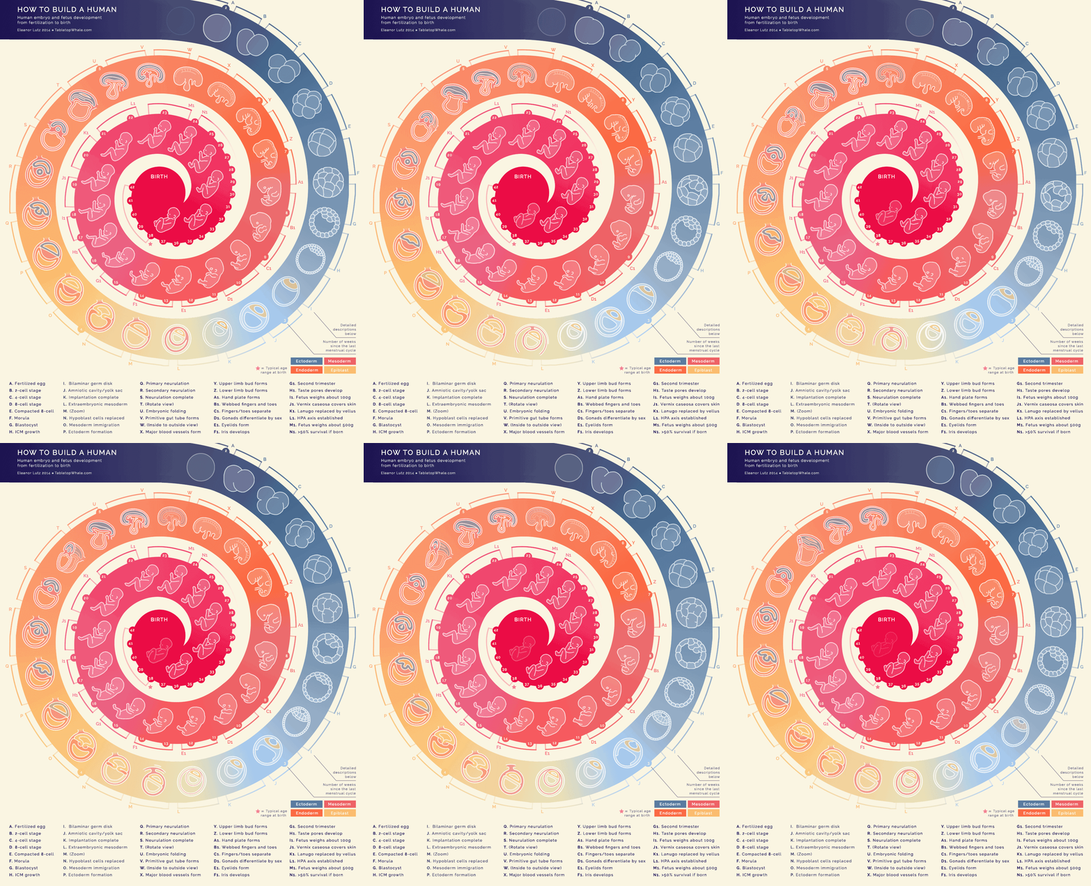
Within the static structure of a swirl, complete with markers for each month of pregnancy an embryo grows into a fully formed baby at birth in the centre. This animated infographic by Eleanor Lutz, is made up of 44 animations of nine frames each, totalling 396 sketches to produce this embryogenesis gif.
10. Font Psychology and Pop Culture
What effect does your font choice have on your audience, psychologically? That’s what this infographic by Venngage sets out to explore by reference to some of the most popular Netflix shows of recent years. From The Crown to 13 Reasons Why, what does each show’s typography say about their viewers, and what moods, genres and trends do they highlight?
11. History of Life

What better way to explore a world than by exploring our own world, and this is one of the best infographics to do so. Created by Juan Martinez, it defines each geological era of planet Earth, the changing shape of the land continents, and includes timelines, life milestones and mass extinction events.
12. A Stranger to Words

Dyslexic Artist Meng Chih Chiang created this data visualisation graph, which explores her own world of language. The fascinatingly complex infographic expresses the curve of her personal learning experience as she encounters language in her day-to-day life.
13. Oddity Viz
The winner of an Information is Beautiful award, Valentina D'Efilippo's creative visualisation of the iconic Bowie track Space Oddity contrasts Dorothy's expansive genre-spanning creations by opting to go narrow and deep instead.
D'Efilippo worked with researcher Miriam Quick to gather data about the track, which she then visualised as a series of ten 12-inch discs, each of which deconstructs the track in a different way: according to melodies, harmonies, lyrics, structure, story and more.
14. Hip Hop infographic
Design studio Dorothy has carved some of the best infographics in poster form. Its designs often chart the many complex connections between entertainment genres and sub-genres, and are perfect for any superfan to display on their studio walls. Here's a stand-out example exploring the history of hip hop, which delivered exactly what is promises, in all its detailed and well-researched glory.
15. An Analysis of The Beatles infographic
This interactive creation is one of the best infographics we've seen to analyse the Fab Four. It breaks down their career by year and by album and providing plenty of insight into who wrote what, which Beatle had the biggest vocabulary (hint: it wasn't Ringo), what most of their songs were about, and much more.
16. SWANH.NET

The best infographics go the extra mile, but this one goes the extra light year! Swiss illustrator Martin Panchaud has adapted the original 1977 Star Wars film, A New Hope, into a 123-metre-long animated wonder. Created in Illustrator CC, using 157 pictures across 22 separate files, it took him over a year to produce.
17. Left vs Right
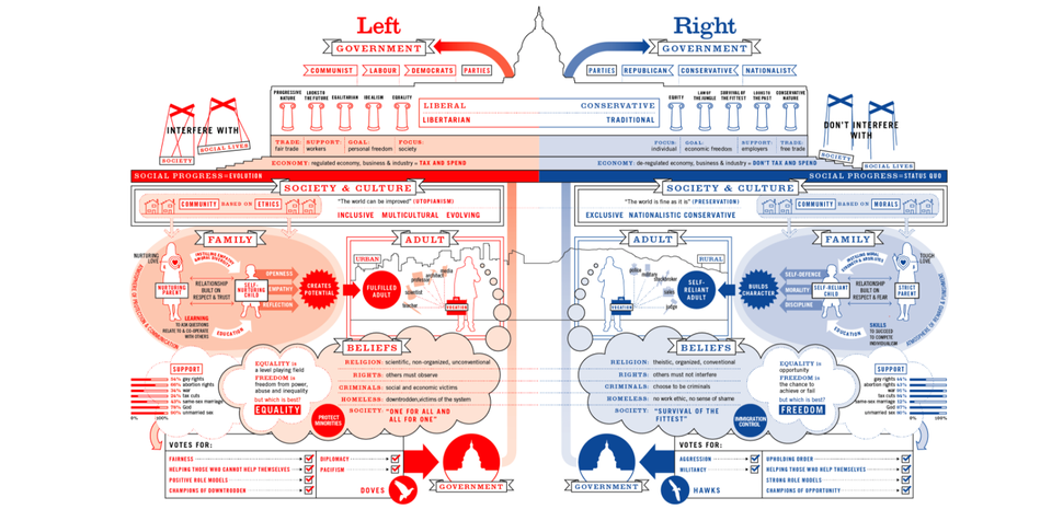
Information is Beautiful is a treasure trove of gorgeous visualisation, and this beautifully clear infographic by David McCandless & Stefanie Posavec shows how the left and right are broadly defined around the world. A great way of distilling something that confuses a lot of people in an easy-to-follow way.
18. Ranked: Countries with the Most Debt
Whenever you hear about government debt, the figures are always so astronomical it’s difficult to understand what any of it means in real terms. Which makes this infographic from Visual Capitalist quite an eye opener. Visually comparing the amount of governmental debt owed country by country, you’ll probably be very surprised by the disparity in debt across the globe.
19. Apollo Missions

Winner of an Information is Beautiful award, Paul Button's visualisation of the Apollo missions charts every manned rocket flight by year, distance and path travelled, as well as which astronauts were on board. It thus explains incredibly complex processes such as calculating different orbits, flight paths and landing zones in a simple, visual way.
20. The History of Art timeline infographic
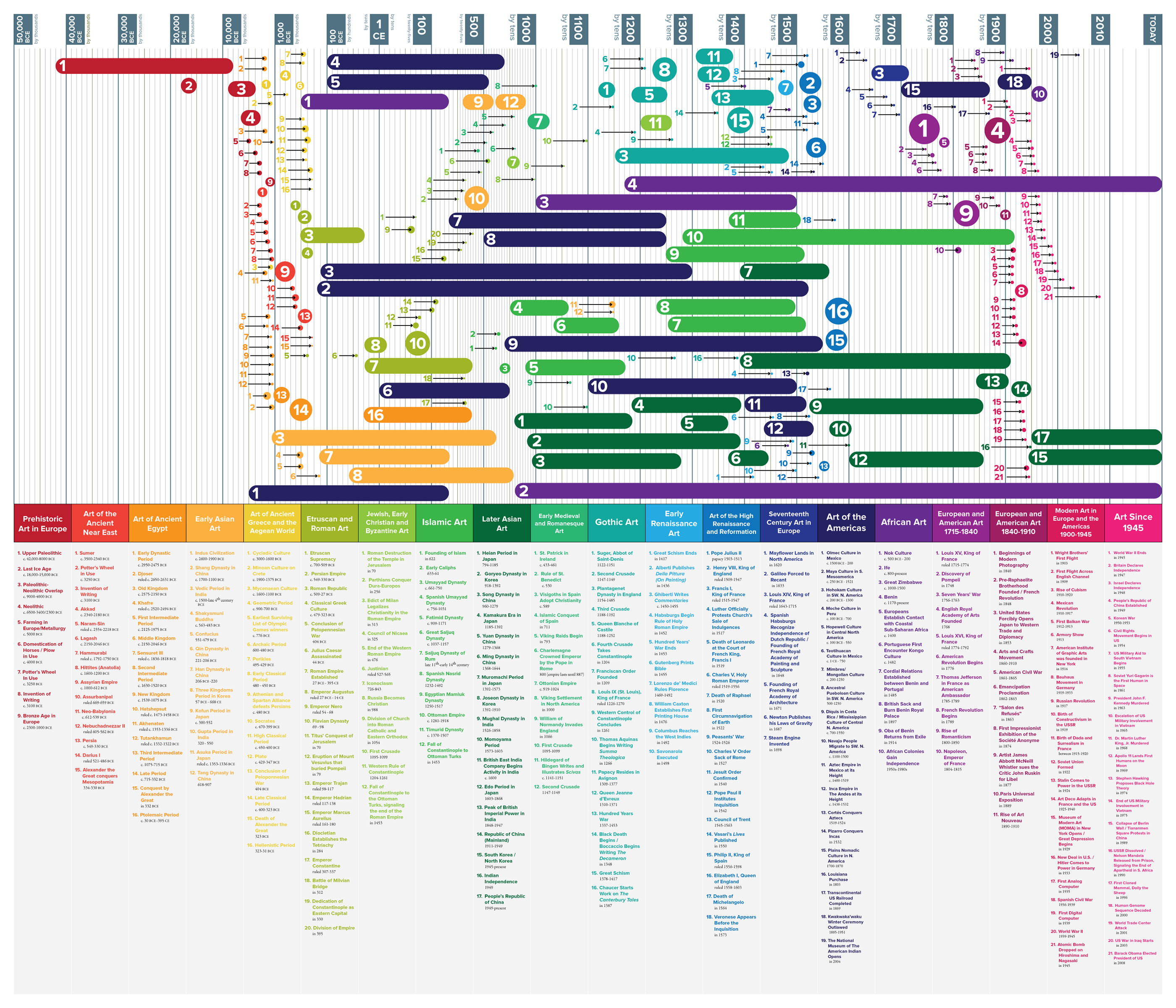
One of the best infographics showing a timeline, this design by Matthew Cobrin was created for an Art History class when he was an undergrad at The New England Institute of Art, Massachusetts. We love its use of colour, bold lines, and fascinating subject matter.