6 tips for creating powerful data visualisations
Mike Brondbjerg explains how to use data in your creative process at Reasons to be Creative 2015.
Sign up to Creative Bloq's daily newsletter, which brings you the latest news and inspiration from the worlds of art, design and technology.
You are now subscribed
Your newsletter sign-up was successful
Want to add more newsletters?
You might know the difference between data visualisation and data art, but where, exactly, does your project sit on the visualisation spectrum? That's a crucial question for any designer or developer working with data, according to designer, developer and artist Mike Brondbjerg.
In a cracking How To session at Reasons to be Creative 2015 in Brighton, UK, this morning, Brondbjerg kicked off the three-day conference with an exploration into where a series of very different projects sit on the visualisation spectrum between insight and expressiveness.
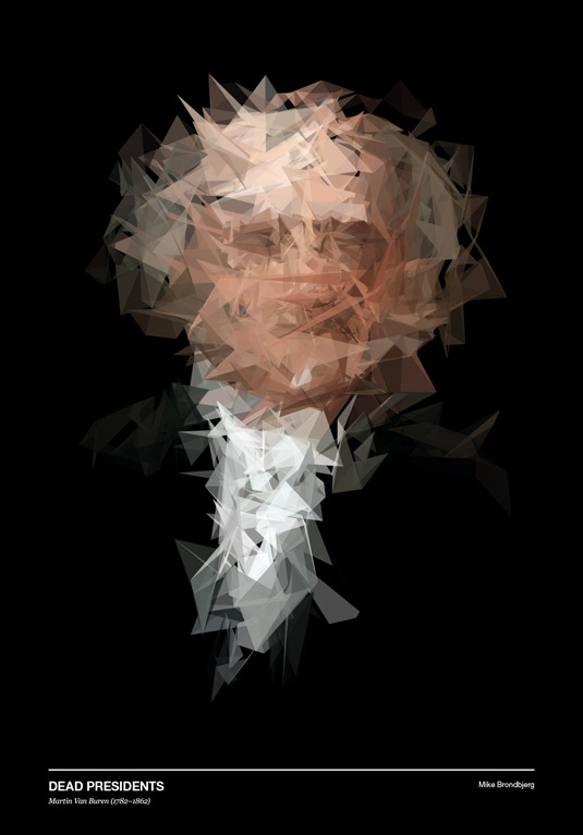
Aimed at developers who want to explore code as a creative tool, and designers who want to use the diversity of data to expand their creative output, the session at one point mapped and animated live heart rate data from an Arduino Pulse Sensor to the vertices of a 3D sphere, displacing them in relation to the data values to build an impressive final visualisation.
Article continues below"Writing code to create drawing systems and using data as a creative material can be incredibly powerful," explains Brondbjerg, who worked through a number of projects at the more expressive data art end of the spectrum.
"I can't draw – but I still want to draw things. I use the skills I have as a developer to create systems for drawing, and feed data into those systems. It's about using data as a creative material."
We caught up with Brondbjerg at Reasons to be Creative 2015 to find out his advice for working with data. Here are six tips that he aims to apply to his work…
01. Know your tools
In a studio workflow, choosing the right tool is important. I find Processing and p5.js are great because you can output to so many different image formats, and create content for many different platforms, from web, print and installations to motion graphics and video.
Sign up to Creative Bloq's daily newsletter, which brings you the latest news and inspiration from the worlds of art, design and technology.
02. Work iteratively
Build up code one step at a time, paramatise visual rules of the design so you can change the output quickly and experimentally, and try to create systems that will surprise you.
03. Simplicity is key
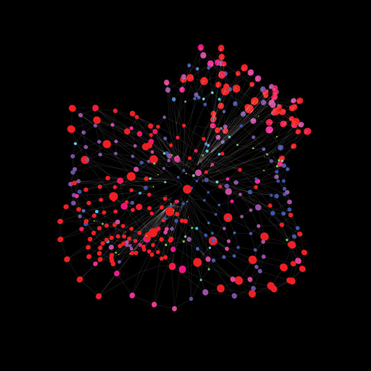
In more journalistic data visualisation projects (not data art), where insight and communication is the motivation, it's important to ensure that every visual choice you make supports clarity and understanding.
04. Respect the data source
If the data is important then treat it with respect. More often than not, data will be about people's lives.
05. Use data that inspires you
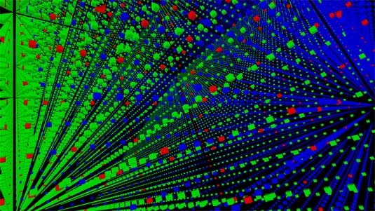
In both data viz and data art, try and use data that is personal to you or inspires you somehow. Using data as seed material can yield more interesting visual results in generative design than just random noise, but try to keep that interest in there.
06. Data doesn't have to be perfect
It's the spikes and anomalies that can give your output character.

Julia is editor-in-chief, retail at Future Ltd, where she works in e-commerce across a number of consumer lifestyle brands. A former editor of design website Creative Bloq, she’s also worked on a variety of print titles, and was part of the team that launched consumer tech website TechRadar. She's been writing about art, design and technology for over 15 years.
