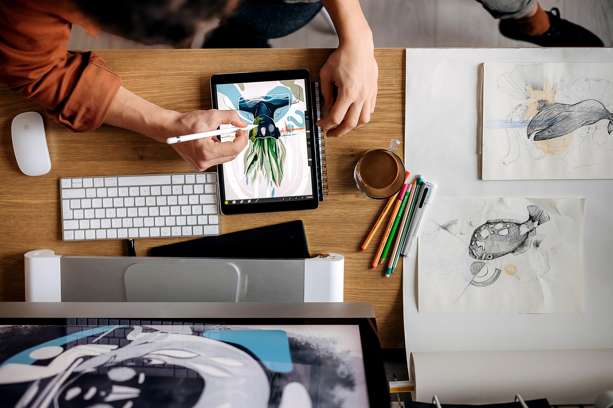




The Dreamer series is a personal body of work – a canvas I use to express emotions, dreams and memories through illustration. Most of the ideas begin as quick doodles, fragments of compositions or silhouettes that evolve into finished illustrations.
Whether by sketch, 2D digital or 3D, I add to this series. In this workshop, I’ll break down my process of transforming a doodle into a completed Dreamer painting inside Photoshop. Rather than focusing on perfect line art from the start, I prefer to gradually build images through experimentation, layering and progression.
My workflow is instinctive and painterly, where the image constantly evolves through paintovers, adjustments, and refinements. Throughout the tutorial, I’ll show how I create custom brushes, brush modes (Color Dynamics, Clipping Masks), gradients and layer modes to create depth, atmosphere and texture while keeping the process flexible.
(If you need the tools to follow along, see our guides to the best drawing tablets and sign up to a plan at Adobe to get Photoshop, or see our guide to the best Photoshop alternatives).
01. Early ideation and blockout process

When it comes to personal work, I often keep small sketchbooks filled with quick ideas, compositions and silhouettes. It’s a nice way to archive thoughts and images that I can revisit for future paintings. For this piece, I was going through older sketches and found a series of drawings that immediately felt right for the mood and atmosphere I wanted to create.
Once I pick a doodle, I move into Photoshop and begin blocking out the scene. Sometimes you can scan the sketch and paint over it, but personally I enjoy rebuilding the image through quick digital thumbnails and rough blockouts instead. It keeps the process loose and painterly, and many of those early textures naturally carry throughout the rest of the painting.
I never work on a pure white canvas, so I usually begin with a grey-toned background. Using a simple brush at low opacity, I loosely establish the black and white values and overall composition. Once the structure feels balanced, I add a full colour layer set to ‘Overlay’ mode on top of the painting.
02. Creating Custom Brushes

For this tutorial, I decided to create a custom brush while also showing how I modify existing brushes through the ‘Brush Settings’ panel. I begin by creating a simple grass-like shape using the Lasso tool.
Once the shape is ready, I create a selection around it and go to Edit > Define Brush Preset. Photoshop now converts the shape into a usable custom brush.
From there, I open Window > Brush Settings, where I can modify the brush’s behaviour in different ways. To the left, you can see the modification Effects from A to D, with the exact sliders and settings used listed to the right.
One of the most important settings in my workflow is ‘Colour Dynamics’, which I continue using throughout the tutorial.
03. Painting the grass

Using the brush created in the previous step, I begin filling the field with grass. I paint the grass layer by layer to create depth and perspective. The furthest line of grass stays on the bottom layer, followed by the midground and finally foreground.
Keeping these separated allows me to quickly edit colours, adjust size variations and control the rhythm of the composition. I usually paint with 100% pressure, so separating the layers helps me manage scale and colour shifts between each row of grass.
You can see the layer progression from left to right.
04. Building the rock shapes

In this step, I begin painting the cylindrical rock formations following the original sketch idea. Each rock stays on its own separate layer so I can freely edit, repaint or add grass elements between them later.
I continue using brushes with ‘Colour Dynamics’ enabled so the rocks naturally contain subtle texture and brightness variation from the beginning. After painting the initial forms, I use the same grass brush as an Eraser to break up the bottom edges of the rocks and blend them into the ground more naturally.
05. Refining the rock forms

At this stage, I begin adding more depth and perspective to the rock formations. Since every rock is separated into its own layer, I create a new layer above each one and use ‘Create Clipping Mask’ so that anything painted only affects the selected rock beneath it.
Using the Elliptical Marquee tool, I draw the shape that I want on top of the rock and paint within the selection in order to create the upper surface.
Pro tip: Navigator
I use the Navigator panel in Photoshop because it always shows a small thumbnail of the artwork while I paint. If I cannot see a detail affecting the image in the Navigator, then that detail is usually unnecessary to me. It helps me manage how much detail is needed and where the viewer’s attention should go.
06. Adjusting perspective

Following the previous step, I continue to apply the same process across all the rock formations. To do this, I right-click on the active selection and choose ‘Transform Selection’.
Unlike ‘Free Transform’, this option transforms the selection itself rather than the painted layer. Image A explains the process, while Image B shows the overall scene progression.
07. Refining Dreamer

At this stage, I begin pushing the character design and gesture further. My workflow usually doesn’t follow a perfectly clean drawing from the start. Instead, I constantly redraw, repaint and adjust forms throughout the painting process.
As shown in Image X011, I use the Lasso tool again to define parts of the cape. I also create a separate layer underneath the main cape shape to draw the folds at the end of the fabric.
This helps me paint the underside and movement of the cape without interfering with the upper layer. Keeping these parts separate makes the process faster and more flexible.
08. Creating the monolith

The monolith is another simple geometrical shape that becomes important in the composition. As shown in Image A, I start by using the Rectangular Marquee tool to create a straight rectangular selection.
I fill that selection with a gradient in order to give the object its first value and light direction. After that, I right-click and choose Free Transform. This is different from Transform Selection, which I used earlier. Here, I am transforming the actual painted layer, not just the selection.
Inside Free Transform, I choose Distort and move the bottom middle point until the shape matches the perspective I want in the scene.
Then I duplicate the layer, darken the duplicated side and use it to fill the gaps, building the monolith’s side plane and depth. With the help of a few simple selection and transform tools, the object starts to feel solid and integrated into the image.
09. Adding colour and contrast

At this stage, I begin introducing stronger colour into the scene, starting with the monolith. I apply a red gradient set to ‘Linear Light’ mode, then use selections to cut and adjust certain areas of the monolith.
Next, I add a dark blue gradient in the background with the layer set to ‘Overlay’ mode. Lastly, using a brush with ‘Colour Dynamics’ enabled, I paint across parts of the scene. The image to the right shows the layer first set to ‘Normal’ mode, then changed to ‘Colour Dodge’ at 50% opacity.

10. Colouring Dreamer

In this step, I continue pushing the colour palette, mainly focusing on Dreamer. Purple is used for the body, yellow for the cape, blue for the hood and red for the scarf.
After the initial paintover, I switch the layer mode to ‘Hard Light’. The important thing to remember is that each layer mode creates a different effect, so it is always worth testing different modes to see which one gives the result you need.
To finish the step, I add a purple gradient above the full scene. The ‘After’ image shows the gradient set to ‘Colour Dodge’ and ‘Soft Light’ at 50% opacity.

11. Shadows and highlights

In this step, I focus on balancing the overall contrast of the image. Sometimes I use Image > Adjustments > Shadows/Highlights to quickly push the darker and brighter areas of the painting.
Afterwards, I paint shadows manually using Photoshop’s default soft brush on a layer set to ‘Multiply’.
12. Texture and atmosphere

Colour Dynamics can make even a simple brush feel alive. Here ,I take a default round Photoshop brush and apply Colour Dynamics to it, following the same idea from Step 2 Using a default circular Photoshop brush with ‘Colour Dynamics’ enabled, I paint across the sky on a separate layer.
The above image shows the final effect after changing the blending mode and opacity. I enjoy creating textures this way because these little fragments, colour shifts and noise give the image a more organic feeling.
I follow the same technique again, this time applying it across the full frame with a red colour influence, which shifts the painting toward more purple warm tone and helps unify the atmosphere.
Pro tip: refreshing perspective
From time to time, I flatten a copy of the image while keeping the original mask layers underneath in case I need to adjust something later. I also flip or invert the image to break the comfort and habit of my eye.
When you look at a frame for too long, flipping it can immediately reveal what feels wrong or what can be improved. It refreshes the whole perspective.
13. Camera Raw Filter

Towards the end of the painting process, I use Camera Raw Filter. It can be found under Filter > Camera Raw Filter. Before using it, I create a flattened copy of the artwork while keeping the original painting underneath.
The filter gives many options for adjusting contrast, colours, light, sharpness and hue, making it great for balancing the image. The feature I focus on most is under the ‘Effects’ section: Texture, Clarity and Dehaze. Lowering Texture and Clarity softens the edges and details.
I then place this softened version above the original painting and set it to ‘Screen’ or ‘Lighten’ mode at low opacity to create a soft atmospheric glow.
14. Final touches

The final step is about giving attention to the image and balancing everything one last time. I also used a copyright-free image of stars from NASA.gov. I place the star image into the scene, increase the contrast and set the layer mode to ‘Lighten’ so only the brighter stars remain visible.
After that, I paint a few stronger stars to create more depth and variation. I also continue refining the rocks, Dreamer and the monolith shadows while adjusting the overall balance of the composition.
I usually add a bit of sharpness and sometimes subtle noise before signing the final artwork.
This article originally appeared in ImagineFX. Subscribe to ImagineFX to never miss an issue. Print and digital subscriptions are available.
Creative Bloq is now easier to access than ever before with our on-the-go app, which brings you all the content you know and love from our website, but in a super-streamlined design.
Download the Creative Bloq app for iOS
Download the Creative Bloq app for Android

