



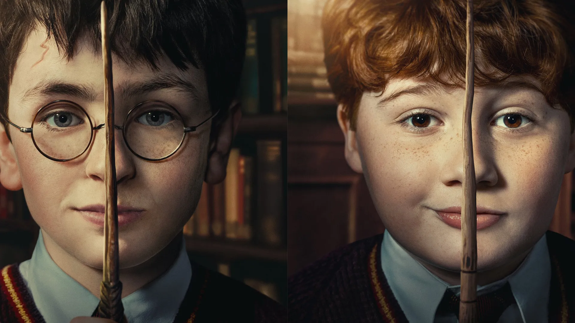
In case you hadn't heard, there's a new Harry Potter series on the horizon. This December we're all hopping back on board the Hogwarts Express, only this time it's on TV, with HBO planning to serialise the entire book series over the next few years. The trailers so far have drawn sharp scrutiny – which you might expect, given the popularity of the films. And now, a new series of character posters is raising eyebrows.
What did those poor kids do to upset the editor of these posters? The designs each feature one of the principal cast members' faces in close-up, with their wand held aloft in front of it. Their faces are effectively cut in half by the wand, and some feel they look bizarrely stretched. Poor Ron seems to have been particularly afflicted. Not only that, but each half of the faces appears to be lit by a different light source, making the whole thing look weirdly spliced together. Suffice to say, these aren't among the best print ads we've seen.
New posters for HBO’s ‘HARRY POTTER’ series. Premieres December 25 on HBO. https://t.co/T8xqd9MCNDNovember 9, 2026
"Unfortunately, this is the first major mistake since the beginning of the marketing campaign. It’s already receiving a lot of negative reviews on the official pages. I’m shocked they released it like this, especially after how flawless the attention to detail has been from the very beginning," one Redditor comments. Another adds, "Each poster looks like they took one half of their face from two different photos and combined them along their wands. Absolute terrible editing work, imo."
And to add insult to injury, fans have quickly knocked together an improved take on the design, focussing on just one half of each characters' face. These are arguably more striking and dramatic, and, more importantly, the faces don't look distractingly wide.
Commentfrom r/HarryPotteronHBO
Time will tell whether the series lives up to the books, or the original film series. But one thing's for sure: these aren't among the best posters of the year, let alone all time.