15 top typography projects of 2015
Daily design news, reviews, how-tos and more, as picked by the editors.
You are now subscribed
Your newsletter sign-up was successful
Want to add more newsletters?
Five times a week
CreativeBloq
Your daily dose of creative inspiration: unmissable art, design and tech news, reviews, expert commentary and buying advice.
Once a week
By Design
The design newsletter from Creative Bloq, bringing you the latest news and inspiration from the worlds of graphic design, branding, typography and more.
Once a week
State of the Art
Our digital art newsletter is your go-to source for the latest news, trends, and inspiration from the worlds of art, illustration, 3D modelling, game design, animation, and beyond.
Seasonal (around events)
Brand Impact Awards
Make an impression. Sign up to learn more about this prestigious award scheme, which celebrates the best of branding.
There's tons to learn about typography, and thankfully there are a huge number of typography resources available online, including typography tips and typography tutorials. But it's not just about technical expertise: you also need to be creatively inspired. And what better way to get a burst of inspiration than by checking out some of the best typography projects of the year.
From silly to serious, these projects also show a real passion for typography. Which are your favourites? Also take a look at the top web design trends in 2015.
01. Swiss Star Wars
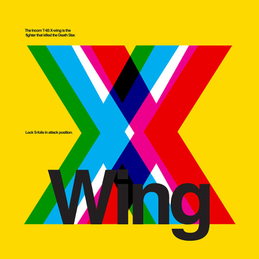
In the year The Force Awakens hit the cinema, 2015 was a year of epic Star Wars excitement, and even typographers weren't immune to it. Argentinean graphic designer Fernando de Carabassaset created Swiss Star Wars, a cool series Star Wars-themed posters in the International Typographic Style; that's the Swiss Style to you. Learn more here.
02. Fenwick window displays
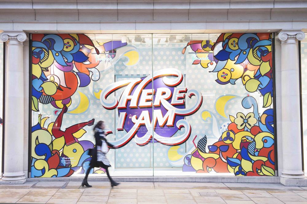
Creative studio ROBU were invited by Fenwick of Bond St. to create the branding and window installations for its first campaign of 2015. It took inspiration from John James 'Jim' Fenwick himself: the man exclaimed 'I am here' as he first stepped through the doors of the store on Bond Street. Illustrated by Andrei Robu, the designs are bold, bright and in-your-face, with a beautifully created font throughout. Read more here.
03. Hidden tributes
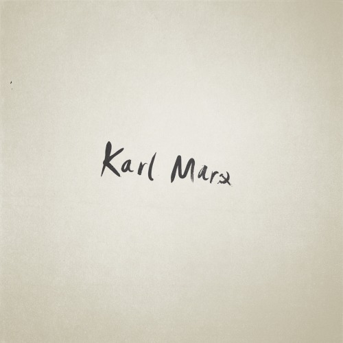
Swedish illustrator Patrik Svensson has worked for brands like IKEA, Sony and Starbucks but it's this personal project that caught our attention. Associating a visual element with a variety of famous names, both fictional and real, the element is then cleverly integrated into the name typography. From Peter Pan to Charlie Chaplin to Coco Chanel, the tiny tributes are as charming as they are inventive. See more here.
04. Forma and co number typography

Barcelona graphic design, illustration and motion graphics studio Forma and Co were commissioned by Yorokobu Magazine to create some original number typography. Using popping primary colours throughout, with a clever use of negative space that creates an almost 3D-like effect, the team did a wonderful job in producing a unique number font. See more here.
05. Famous logos in handwritten type
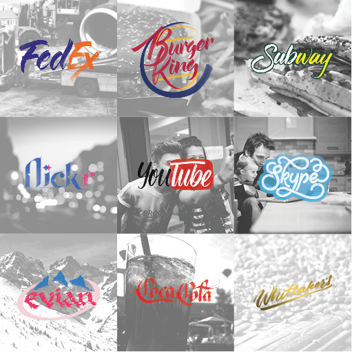
Auckland based designer Sara Marshall created this logo design to explore the defining attributes of some of the biggest companies in the world. "The purpose, besides being a personal exploration of letterforms, is to reimagine these logos while retaining key defining elements of their original branding," she explained. Learn more here.
Daily design news, reviews, how-tos and more, as picked by the editors.
06. Trust your gut
The book Things I Have Learned in My Life So Far by top designer Stefan Sagmeister has been a hit since its release. Bristol-based typographer Yee Poon was so inspired by it, that she decided to create a project in response to the book. Taking the best advice she's ever received, she created a delicious project that creates type out of food – paying homage to the 'gut' in her quote. Learn more here.
07. 36 days of type
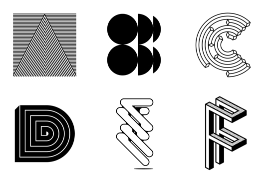
Typographer Alexander Wright recently put his type design skills to the test by participating in the 36 days of type project, which saw him create a new typeface every day for 36 days. "I wanted to create a system where each letter could show its own personality and characteristics, yet somehow, very loosely, still maintain a sense of familiarity with the other designs of the group," explains Wright. Read more here.
08. The Typefaces
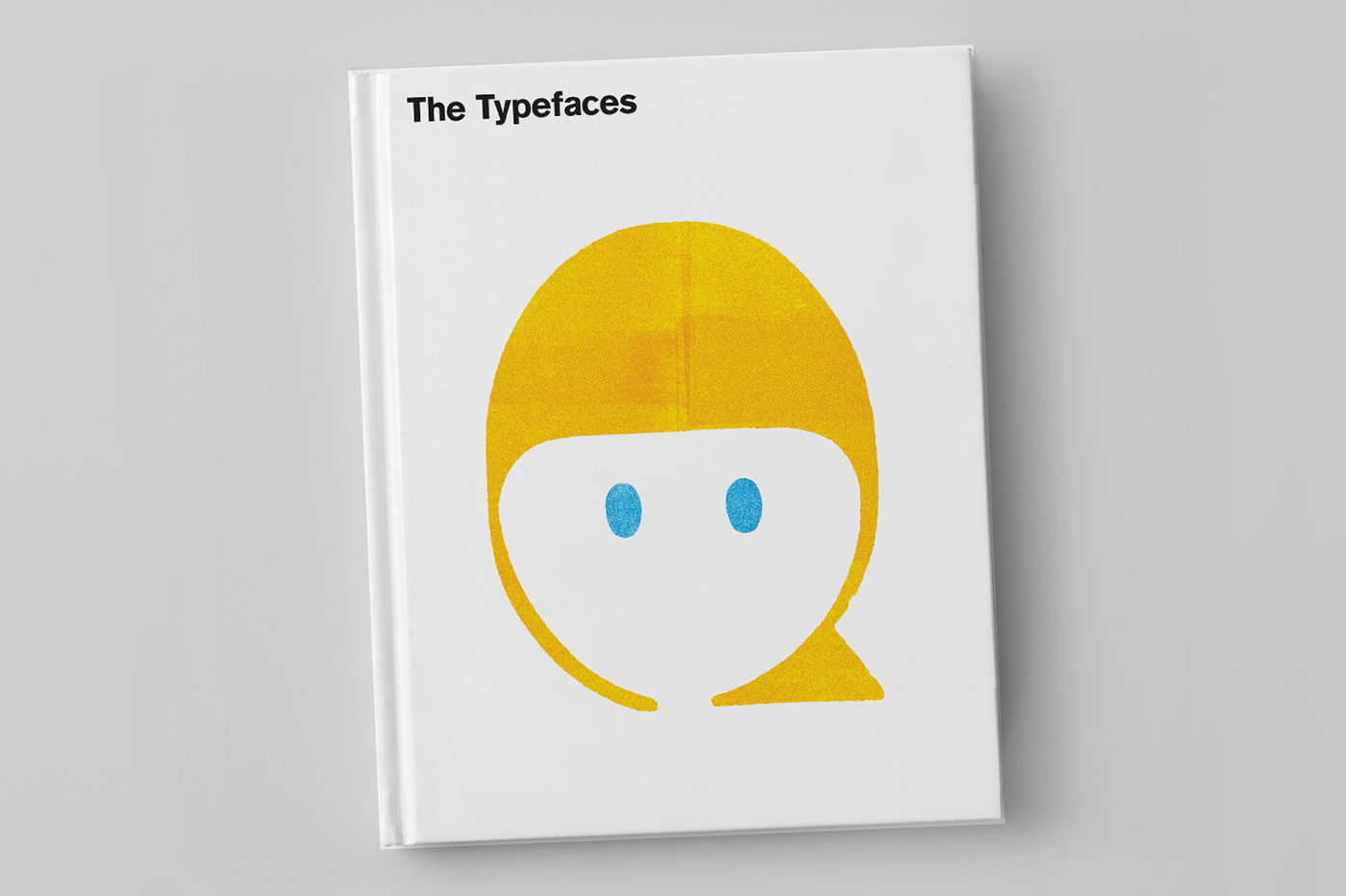
On of the best typography books of 2015, the Typefaces is a new book from Singapore based designer and illustrator Scott Lambert that aims to celebrate playful products for kids and kids-at-heart. "Inspired by letterpress printing and childlike observations, The Typefaces are simply faces in type," Lambert explains. Read more here.
09. Type-patterened bags
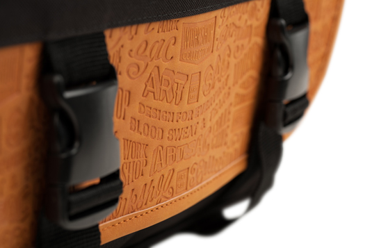
Working in collaboration with award-winning British designer Alex Fowkes, Artsac released these new typographical patterned bag designs. The words chosen to feature in Fowkes' type pattern all relate to design, with a few added extras that reflected the project well. "Design for everyday is Workshop's slogan, it's about bringing good design and bespoke artwork to something you use everyday. There's also a few random words in there like blood, sweat and tears, but they were thrown in simply because we were working so hard." Read more here.
10. Chocolate bar CV
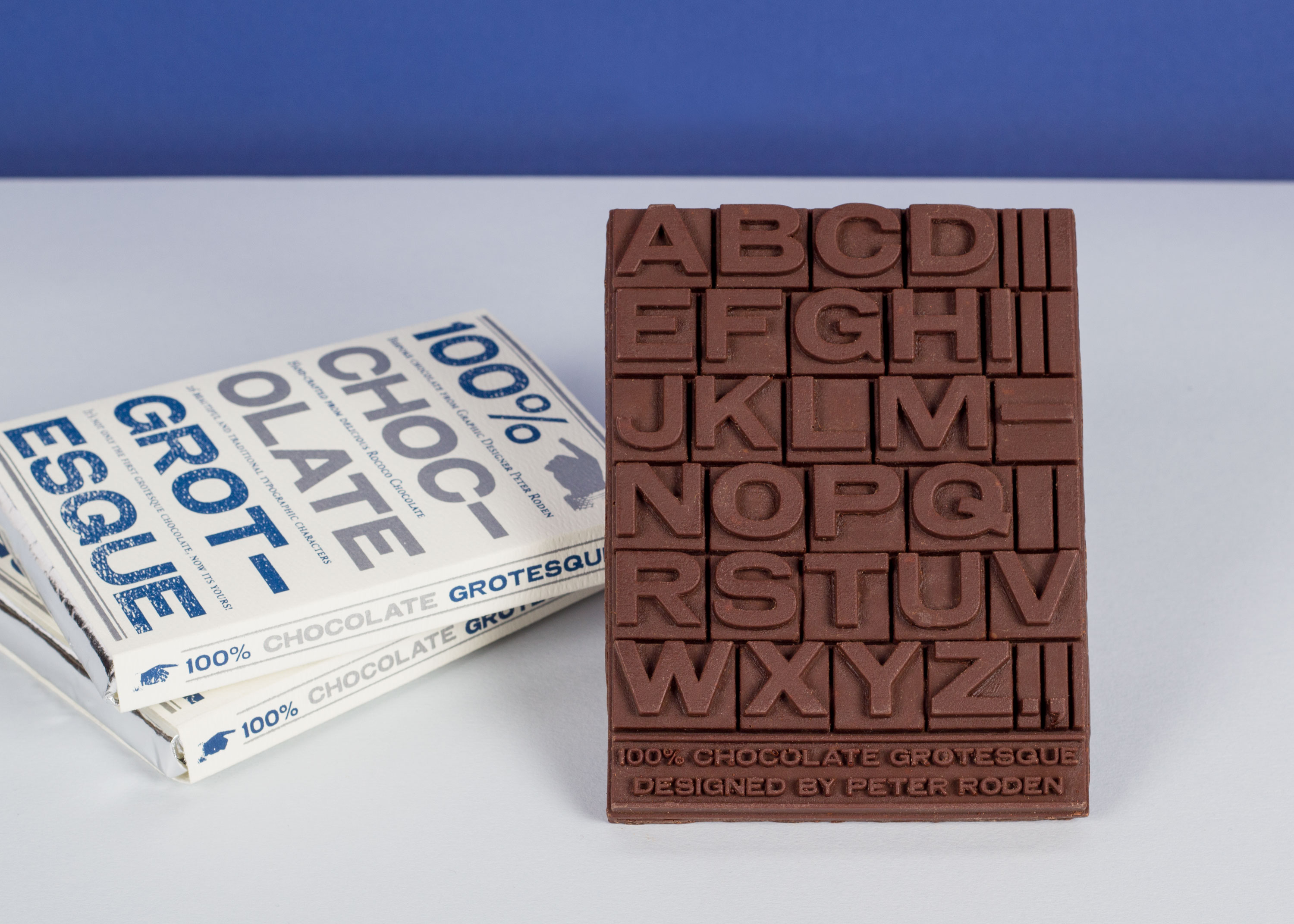
Peter Roden – currently studying graphic design at London College of Communication – came up with a delicious way to showcase his skills. Chocolate Grotesque was designed to be a beautiful, edible and engaging self promotional tool.
11. Fonts made from old signs
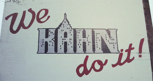
For designer and letterer Jessica Krcmarik, the founder of type foundry Gratiot and Riopelle, her walk to work sparked the idea of creating fonts based on Detroit's hand painted signs and advertisements. From old ads for soda, to new signs for car washes, Jessica photographed them all and sorted them by neighbourhood. Noticing similarities in the fonts she compiled, Jessica was able to create distinctive typefaces for different areas of the city. Read more here.
12. Typography scrabble

There are plenty of beautiful board game designs out there, but this typography version of Scrabble is perfect for font fans. Created by graphic designer and Scrabble enthusiast Andrew Capener, this release is the third of his 'Scrabble Typography Editions'. Released by Winning Solutions, this set includes 12 new fonts chosen by Capener, plus a redesigned game board and score pad. Read more here.
13. Typography notebooks
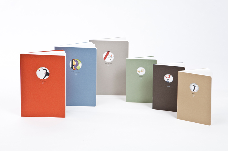
We've already got an inspirational list of great notepads for designers, but this range from Fabriano Boutique is as beautiful as they come. Designed around the theme of typography by Italian graphic designer Silvana Amato, the illustrations about the fonts were produced by Steven Guarnaccia. The notebooks are available in the usual formats – lined, squared and blank – with odes to fonts such as Helvetica, Garamond and Times. Typographers will be snapping these up in no time. Take a closer look at the designs below. Read more here.
14. The font that teaches you Japanese
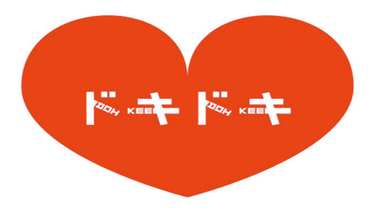
After multiple trips to Japan johnson banks still couldn't read the language, so they created this unique typeface that combines English language and one of the three Japanese scripst. By incorporating phonetic English sounds into Katakana shapes, johnson banks created Phonetikana, a readable hybrid for English speakers new to the language. Read more here
15. 365typo
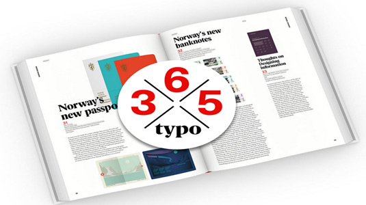
Published in collaboration with Association Typographique International, the 365 stories in this beefy book focus on key events from the last year, latest developments, and predictions of what the future holds for typographers. It features 100 contributors, including Fiona Ross, Bill Gardner, Sonja Knecht and many more. Read more here.
Liked this? Read these!

Tom May is an award-winning journalist specialising in art, design, photography and technology. His latest book, The 50 Greatest Designers (Arcturus Publishing), was published this June. He's also author of Great TED Talks: Creativity (Pavilion Books). Tom was previously editor of Professional Photography magazine, associate editor at Creative Bloq, and deputy editor at net magazine.
