Why art and blockchain are a match made in heaven By Dom Carter published 13 July 18 This infographic explores how tech is disrupting the art world.
Infographic: the history of the internet By Dom Carter published 6 July 18 The world wide web has come a long way.
Infographic: How people really use voice assistants By Ruth Hamilton published 29 June 18 Including some surprising stats about smart speaker use.
Pro tips for creating interactive infographics By Creative Bloq Staff last updated 31 January 21 Here's how to create a truly stunning interactive infographic.
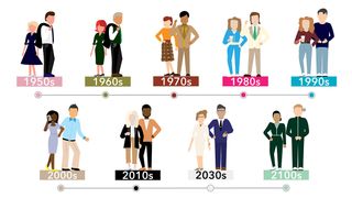
Infographic: How the world of work is changing By Dom Carter last updated 24 January 22 Insight into workspaces of the past, present and future.
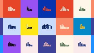
What does your handwriting say about you? By Creative Bloq Staff published 28 May 18 The personality traits your handwriting reveals about you.
How to create amazing infographics By Ruth Hamilton published 25 April 18 8 pro tips for making memorable data visualisations.
15 design terms you're probably getting wrong By Dom Carter published 15 March 18 Lots of designers get this technical jargon mixed up.
Infographic: The Oscars by numbers By Ruth Hamilton published 28 February 18 The most surprising stats connected to the Academy Awards.
New tool gives designers data visualisation super powers By Julia Sagar published 20 October 17 Ground-breaking infographics tool Lincoln sneaked at Adobe Max.
Sketch vs Photoshop: which design tool should you use? By Dom Carter published 16 October 17 See the pros and cons of both design tools in this useful infographic.
Pick a winning font for your brand with this infographic By Dom Carter published 22 September 17 Nail brand typography choices with this helpful infographic.
Interactive infographic maps UK music scene By Dom Carter published 1 September 17 Big UK bands explored in highly clickable typographic map.
New infographic helps you present with confidence By Dom Carter published 4 August 17 Overcome your stage fright and wow the crowd with these useful tips.
New infographic helps you colour match your branding By Ella Taylor published 1 August 17 Easy guide to which colours are perceived as cheap or elegant.
7 great infographics by graphic design agencies By Tom May published 17 July 17 Top-class data visualisations from leading studios.
10 top movie infographics By Jim McCauley, Ruth Hamilton published 23 June 17 If you're a fan of the movies and have a soft spot for data visualisation then you'll love these awesome infographics.
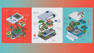
10 trends shaped by the iPhone By Dom Carter published 19 June 17 It's been a decade since the iPhone arrived and shook up how we communicate. See the 10 trends it shaped.
Is it time to break up with your difficult client? By Dom Carter published 11 May 17 Thinking of calling it a day with a difficult client? This flow chart will help you decide if it's time to break up.