With the right design, the best adverts have the power to stick in the public conscience for years, shaping the trends we know today. From print to TV, ads across the decades have moved, inspired and perplexed us, transcending from merely selling products to becoming cultural touchstones.
Tapping into our collection of the best adverts by decade, we've curated a selection of the very best ads to bring you some diverse creative inspiration (including some favourites from our collection of the best print ads). So join us as we delve into iconic campaigns spanning almost a century – a nostalgic time capsule of advertising's best moments and a testament to the enduring power of storytelling.
01. Coca Cola: Hilltop (1971)
This iconic Coca-Cola commercial from 1971, soundtracked with the song 'I'd Like to Buy the World a Coke', has an endearing origin story. Creative director Bill Backer got his inspiration after his flight was redirected and he saw disgruntled passengers bond and find shared happiness over drinking Coke together.
This simple idea – that a soft drink could easily bring people together regardless of background – sparked the concept for the ad's song and message of unity.
“I think this ad really reflects the zeitgeist of the seventies," says film director Caroline Hajny. "The idea of peace, love and unity. Woodstock taking place just a few years prior to its release. The peace movement against the Vietnam War. A lot of similar themes are reflected in the lyrics and images that must have really resonated, especially with young consumers at the time.”
02. US Government: We Can Do It! (1943)

The famous "We Can Do It!" poster from 1943, featuring the iconic image of a woman flexing her arm in a show of strength, has become a symbol of the generational shift toward mass employment of women during World War II.
Contrary to popular belief, it wasn't originally created to motivate women to join the workforce. At the time, women were already widely employed in factories and shipyards, so its aim was to raise morale. Nonetheless, the ad remains an empowering symbol of female empowerment to this day.
In that sense, it's very much going against the grain. As Matt Hauke, senior designer at Design by Structure, notes: "While brands such as Aunt Jemima and Uncle Ben's are clambering to undo their dated cultural imagery, it’s refreshing to have an image be reappropriated through sheer cultural will, to have a positive impact."
03. Apple: 1984 (1984)
Another ad directed by Ridley Scott, this ad was an allusion to George Orwell's novel 1984, first published in 1949, depicting an dystopian society. With its stark contrasting visuals and chilling monologue, this dramatic commercial introduced the Macintosh as ushering in the defeat of an Orwellian future, positioning Apple as revolutionaries fighting conformity with the empowering personal computer.
Now considered a watershed advertising masterpiece, it was added to the Clio Awards Hall of Fame and named the greatest commercial ever by Advertising Age in 1995.
“Aired in the Super Bowl and only shown once on air – and billions of times in various new business meetings – it was the first epic ad that came decades before social media,” says Dave Buonaguidi, author of Blah! Blah! Blah!: Memories and advice from one of British advertising's mavericks. “It was long, had a huge budget and was selling something really interesting: the future.”
04. Guinness: My Goodness, My Guinness (1936)

In 1936, when advertising was largely descriptive, dry and literal, this campaign for Guinness stood out for taking a more imaginative approach to capturing people's attention. Created by artist John Gilroy, it's considered a landmark in advertising history, and still stands up well today.
"The campaign is a great example of taking a brave creative leap into the abstract, with various circus animals depicted in humorous situations," says Matt Hauke, senior designer at Design by Structure.
"On paper it makes little sense, but captures a joy and humour that only creativity could bring," he adds. "And the campaign paved the path for the brand's quirky and off-beat advertising for years to come."
For more on Guinness campaigns, see our best Guinness adverts piece.
05. Old Spice: The Man Your Man Could Smell Like (2010)
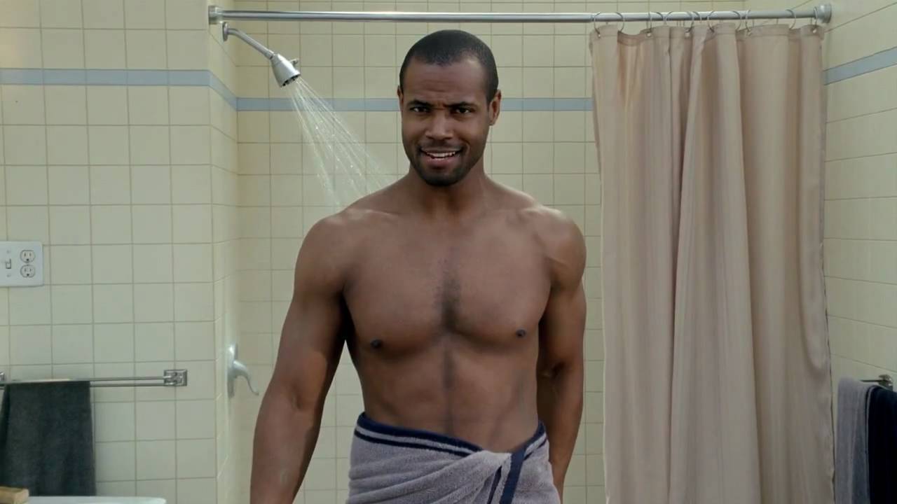
In 2010, aftershave Old Spice was generally seen as as a legacy brand for older gents. But this funny and surreal advertising campaign by Wieden & Kennedy turned all that on its head. The iconic commercial starred Isaiah Mustafa as the 'Old Spice Guy', who delivered outlandish claims about the product in a tongue-in-cheek manner, ironically promoting the idea of increased masculinity through product use.
"These ads went viral by defying convention, with their surreal scenarios and rapid-fire absurdity," recalls Ash Miri, founder of Air Landline. "From riding a horse backwards to transforming a shower into a tropical paradise mid-commercial, each ad pushed the boundaries of traditional advertising with its unpredictable and outlandish humour. With their witty scripts, imaginative visuals, and Mustafa's deadpan delivery, they were some of the most brilliantly bizarre and memorable commercials of the decade."
06. Volkswagen: Think Small (1959)

The "Think Small" campaign by DDB for Volkswagen in 1959 flipped the script on the advertising of the time. At a time when US car ads promoted luxury and size, this ad instead boldly highlighted the Beetle's compactness and simplicity.
"Think Small is arguably the ad that changed advertising," says Richard Fenn, creative director at House 337. "Addressing the small size of the car was a challenging proposition. As was marketing a German car to the American public in the aftermath of the Second World War. But the clever and straightforward approach of this campaign made it stand out amongst the sea of sameness of the idyllic post-war illustration style.
"It’s clearly no accident that Apple's 'Think Different' campaign, said to be inspired by old VW ads, followed the same path of shaking things up and looking at things differently," he adds.
07. Playstation: Mental Wealth (1999)
This eerie ad caused quite a stir when it first launched and it's now widely regarded as one of the strangest TV ads of all time. Directed by Aphex Twin's Chris Cunningham, this bizarre Playstation ad features an alien girl with a Scottish accent discussing her gripes with humankind and the benefits of "mental wealth".
In a 2019 interview with GamesRadar, lead actress Fiona Maclaine reflected on the experience, saying "At the time, I certainly hadn't seen that kind of technology of manipulating someone's face before. People genuinely thought that's what I looked like."
08. Bob Dylan: Greatest Hits poster (1966)

Legendary designer Milton Glaser's poster for Bob Dylan's 1967 Greatest Hits album is considered a classic emblem of 1960s counterculture. Its bold design merged East Coast stylised minimalism with West Coast psychedelic exuberance, as well as brilliantly incorporating the star's name as a typographic design element.
"It’s one of my favourites among Glaser’s beautiful work,” says Lauren Hall, illustrator and designer with Brilliant Artists. “Featuring Dylan’s silhouette with vibrant, psychedelic hair, I love the way the vivid, swirling colours and dark silhouette perfectly reflect Glaser’s rebellion against the modernist ‘less is less’.”
09. Marlboro: Marlboro Man (1954)

The rugged, masculine cowboy persona known as the Malboro Man was one of the most iconic figures in 1950s advertising. First appearing in 1954, this simple approach successfully marketed filtered cigarettes to men by avoiding health discussions and leaning into stereotypes of masculinity.
It had a massive impact on advertising in general, adds Alex Robinson, founder at Novus Digital. "The Marlboro Man wasn't just incredibly successful," he explains. "It was a dextrous personification of a product; a method that has retained popularity to this day. There is absolutely no shortage of anthropomorphised items or services in the 2020s, from Geico’s Gecko to the notorious M&M characters."
10. Hovis: Boy on the Bike (1973)
Directed by Ridley Scott in 1973, this simple but nostalgic commercial shows a boy pushing a bicycle, laden with Hovis bread, up a picturesque cobblestone street, narrated by the older voice of the boy reminiscing.
It was hugely popular at the time, and for generations it's been impossible to hear Dvořák's Symphony No. 9 without thinking of it. Though commonly believed to be set in the north of England, it was actually filmed on Gold Hill in the town of Shaftesbury, Dorset, with the narrator speaking in a west country accent.
“This ad is an absolute classic,” says Ozzie Pullin, director with production studio Anattic. “No bells and whistles, just a simple strong honest story that has heart, which I feel most commercials nowadays don’t have."
11. Nike: You Can't Stop Sport (2020)

The advertising industry offered many poignant responses to the COVID-19 pandemic. But this Emmy-winning ad, crafted by Wieden + Kennedy is our favourite. It brilliantly interwove various sporting moments and diverse participants together through a split-screen format. And this was accompanied by a stirring narration that acknowledged the widespread cancellation of events while instilling optimism about the enduring spirit of sports.
"This ad wasn’t just a beacon of hope in the midst of a pandemic," says Shelley Adamson, creative director at UNIT9. "It was also a work of visual mastery, at a time before Gen AI was widely available to help. A message of togetherness is reinforced by the seamless joining of contextually different frames, while perseverance is embodied in the knowledge someone probably spent hundreds of hours scouring through footage to find just the right moments."
Find more branding pro picks at our best logo of the decade series.
12. Levi's 501: Launderetee (1985)
Is this the sexiest ad of all time? Created by Levi's advertising agency BBH, it featured model Nick Kamen stripping down to his boxers in a 1950s-style laundromat to the sound of Marvin Gaye's 'I Heard It Through the Grapevine'.
This combination of classic Motown, a heartthrob model, and the nostalgic all-American setting captured the rebellious spirit of jeans in their prime era. It was an instant cultural phenomenon.
“With young potential buyers romanticising the ‘50 and ’60s and the stars of that era, setting this commercial in that time was the perfect move to grab their attention," explains director Caroline Hajny. “This ad played a huge role in reviving Levi’s as a brand, cementing it as a desirable staple piece in every young person’s wardrobe. Sales were up by 800% as a result, so if that doesn’t speak for itself, I don’t know what will.”
13. United Colors of Benetton: The Face of AIDS (1990)

In 1991, Benetton sparked major controversy with this ad campaign featuring a haunting image of AIDS activist David Kirby on his deathbed, surrounded by family. The powerful photo was taken in 1990 by photographer Therese Frare, documenting Kirby in an Ohio hospice before his death from AIDS. Benetton's creative director Oliviero Toscani colorised the intimate family moment, purposely likening Kirby's appearance to a depiction of Jesus.
“This controversial move on the part of the brand not only shed light on the grim reality of AIDS but also marked a departure from traditional advertising norms,” explains Anastasia Kārkliņa Gabriel, cultural theorist, strategist and author of Cultural Intelligence for Marketers. "It is a significant artefact because it disproves the misconception that conscious marketing that sparks public backlash is a recent phenomenon.”
14. Tango: Orange Man (1992)
Here's another ad that was controversial at the time, albeit for very different reasons. Created by now-defunct ad agency HHCL, it depicted an orange painted man unexpectedly slapping a Tango drinker across the face, with commentators rewinding and narrating the event, as a metaphor for the drink's intense taste.
The surreal, slapstick humour stood in contrast to typical product ads of the time. And it sparked major controversy when children began injuring each other by mimicking the ad.
“This has to be up there as one of the best concepts of all time,” says Holly Bamford, head of client services at Borne. “In an era where lots of advertising was following a similar rule book, these ads were just completely fresh and irreverent – and sickeningly funny. I used to find them hard to watch, but that was the point. They made Tango famous in an instant, and now enduringly so.”
15. Nike: The Morning After (2000)
The Y2K scare of 1999 is now long forgotten, but at the time people feared a computer glitch at the turn of the millennium might cause chaos, tragedy and even death. This Nike ad by Spike Jonze played on this fear with humour, by depicting a jogger entirely unfazed by a series of post-apocalyptic scenes.
"The ad, created by Wieden+Kennedy Portland, connected us with this shared relief, encouraging us to persevere through uncertainty and adversity," recalls Grace Kim, associate design director at Hook. "Even more two decades later, it endures as more than an advertisement; it's a cultural symbol, mirroring the fears and hopes of its time. It also reinforces the belief in the strength of determination and perseverance."
16. Dove: Real Beauty Campaign (2004)

Dove's Real Beauty campaign of 2004 presented a real turning point in how women are portrayed in advertising. Unusually for the time, these ads featured women of diverse shapes and sizes, rather than ones with 'perfect bodies'. The aim was, in the brand's own words: 'To make women feel comfortable in their own skin and to create a world where beauty is a source of confidence rather than anxiety.'
"This ad was launched at a time when not many brands were confident enough to speak out about social issues or challenge the status quo," recalls Ellie Duffus, head of sales and marketing at Yonder Consulting. "The campaign called out traditional beauty standards – at a time when it was really needed – and laid the foundation stones for other brands to follow suit."
17. Ronseal: It does exactly what it says on the tin (1998)

You don't generally expect a TV ad by woodstain manufacturer to change the way people speak. But that's exactly what happened in the UK following this ad for Ronseal. Created by HHCL, it emphasised that Ronseal's products would perform as described by using the slogan "It does exactly what it says on the tin". Beyond we knew it, the phrase had become part of the British venacular.
“This tagline became widely used beyond the ad, even by former UK PM David Cameron and in a song by Katie Melua,” says Sam Russell, creative director at verbal branding agency Reed Words. As for the ad itself, he praises: "the delivery: no frills, straight to camera, the product never out of shot, and the script and its wonderfully crafted repetitions; like something from Samuel Beckett.”
18. Always: Like A Girl (2014)
Directed by Lauren Greenfield for Leo Burnett, this ad for menstrual hygiene brand Always challenged the derogatory use of the phrase 'like a girl' succinctly and powerfully. And it had a huge cultural impact.
"This wasn’t your typical Super Bowl ad for Budweiser or the latest Apple device," says Mallory Hern, associate design director at Hook. "It evoked an emotional response, one that dug deep on a personal level.
"It used words meant to dim our light to ignite a flicker of defiance within each of us," she continues. "It repurposed a single, well-chosen phrase, a phrase that continues to make us think, feel, and question the very core of how we use language to define ourselves and the world around us. It’s a reminder that the best ads aren’t just seen, they’re felt."
19. Budweiser: Wassup (1999)
You couldn't go anywhere in 1999 with hearing people shout "Whassup?" at each other. That's thanks to this simple but memorable ad featured a group of friends greeting each other while hanging out watching a game and drinking Budweiser. Made by DDB Chicago and directed by Chuck Stone III, it tapped into a cultural truth about how men interact by showing rather than telling, allowing the product integration to feel natural.
“The ad is simple, which is what makes it so iconic,” says Natasha Nanner, senior director of creative strategy at Whalar. "Four friends, watching the game, having a bud. The focus of this ad is the friendship and humour between the group; the product is merely an extra. Ultimately, the best thing Budweiser did was trust that less is more.”
20. Cadbury: Gorilla (2007)

Created by Fallon London, Cadbury's iconic 'Gorilla' ad has grown to become a fan favourite, but it wasn't always so well received. When Juan Cabral, Fallon London's creative director at the time, pitched the idea to superiors many thought the idea was (understandably) a little too bizarre. Despite some initial trepidation, Cabral went ahead with the project, going on to win a Cannes Lion award in 2008.
“When I saw it with my team, there was an instinctive and immediate reaction that it hit the brief in terms of making people feel something. When I then shared it with my superiors, it’s fair to say they thought I was mad. They said: ‘Let’s get this right. You want to make an ad that’s three times longer than a normal ad, has got no Cadbury’s chocolate in it and there’s no message?’” Cabral told The Guardian.
The simple 90-second ad features a gorilla drumming to Phil Collins' 'In the Air Tonight'. While simple in premise, the ad was a hit with consumers, birthing a new era of 'random' playfulness in the advertising sphere.