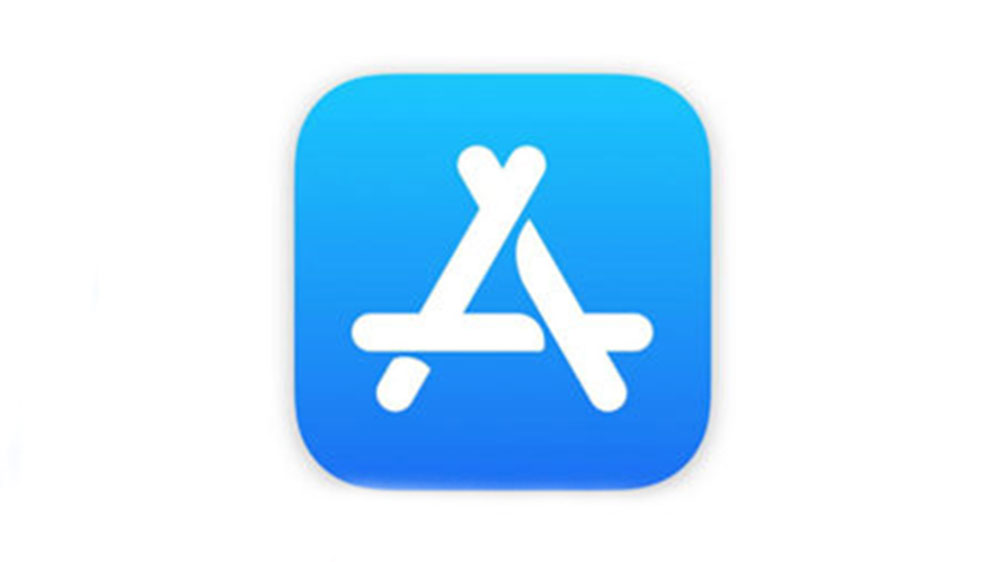
New App Store logo ditches traditional art tools
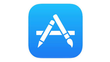
The App Store icon waves goodbye to its signature pencil and paintbrush.

The App Store logo has been given its first major redesign, alongside new icons for Maps and AirPod animations. These redesigns have been released as part of Apple's sixth developer beta for iOS 11, which also included bug-fixes and performance upgrades.
Perhaps the most significant feature of the new App Store logo (above) is that it ditches the pencil and paintbrush graphics that have been a key part of the app's previous icon designs. Instead, these artistic tools, which effectively teased at the sort of content users could expect to explore when they tap the symbol, have been replaced by a sleek letterform.

Apple has made big moves to ditch skeuomorphic designs on its mobile apps before. And while the App Store logo isn't skeuomorphic, it's yet another decision by Apple to move away from using real world objects in its icons.
One bonus of the redesign, though, is that the updated icons look better at higher resolutions. Check out some more updated app squircles in the Tweet from iCulture below.
De zesde beta van iOS 11 brengt nieuwe icoontjes voor de App Store-, Kaarten- en Klok-app https://t.co/vvHT64icmS pic.twitter.com/LVKQ1qxau6August 14, 2017
Related articles:
- 10 commandments of logo design
- 35 beautiful band logo designs to be inspired by
- 11 brilliant resources for logo designers
Daily design news, reviews, how-tos and more, as picked by the editors.

Dom Carter is a freelance writer who specialises in art and design. Formerly a staff writer for Creative Bloq, his work has also appeared on Creative Boom and in the pages of ImagineFX, Computer Arts, 3D World, and .net. He has been a D&AD New Blood judge, and has a particular interest in picture books.
