The striking 007 First Light opening credits have reignited interest in James Bond's remarkable legacy of visual design. From Maurice Binder's gun-barrel opening sequence to Robert McGinnis's action-packed handpainted posters, the movies have a rich tradition of iconic design.
It might seem unlikely that the various Bond actors played much of a role in the design side of the franchise, but an image has resurfaced showing actor Daniel Craig apparently taking a close interest in the poster for his debut as 007 in 2006's Casino Royale, and it's stirred up quite debate about graphic design.
We've all been this coworker before. [Despite having no background in graphic design or advertising, Daniel Craig gives the marketing department detailed notes on the 'Casino Royale' teaser poster. April 2006] pic.twitter.com/BAMmTYu3uWMay 12, 2026
Posting on X, an account called the Bond Dossier shared a photo taken during the production of Casino Royale, in which Daniel Craig appears to be pointing at a detail in a teaser poster while the designer clasps her hand to her face, in what people are interpreting as a sign of exasperation provoked by unwanted design advice from a non-expert.
"We've all been this coworker before," the Bond Dossier writes. "Despite having no background in graphic design or advertising, Daniel Craig gives the marketing department detailed notes on the Casino Royale teaser poster," the account writes in the caption.
What was intended as a comic observation has sparked as serious debate about feedback in graphic design and whether the designer knows best.
Surely every designer has experienced struggling to contain a sign when a client or someone on the periphery of a project expresses an unexpected opinion on their work, whether it's a poster or a logo design or choice of typeface. It's frustrating. You want to say, trust me, I'm the designer.
Some of those commenting on the post are critical of Craig's apparent intervention (we don't know what he actually said on this specific occasion, but it's been reported before that he favoured a more modern, grounded aesthetic compared to the more dramatic posters of previous eras).
"That might explain why the poster was utterly forgettable and dull," one person suggests. "Let the actors act and other professionals do their job, this foreshadows how much involvement DC had. The influence he had, the other Bonds never had at all. He is a girly prima donna," someone else complains.
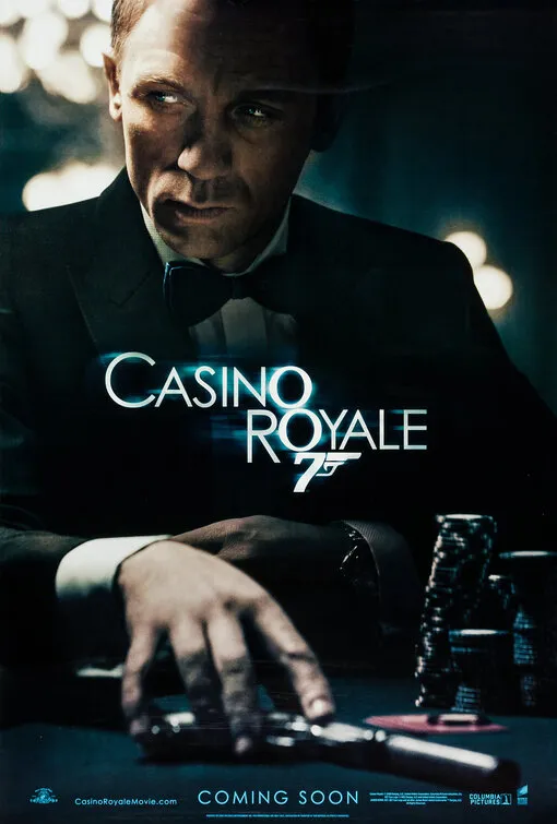
Image credit: EON Productions / Vox & Associates
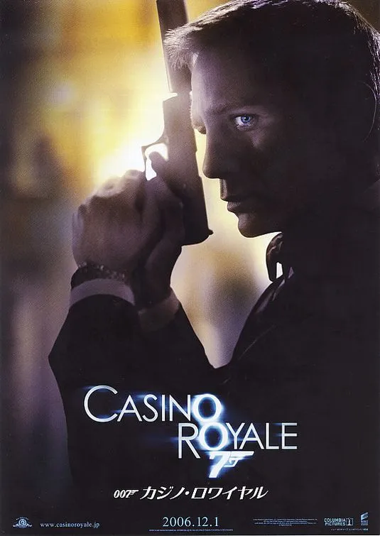
Image credit: EON Productions / Vox & Associates
But taking feedback on board is part of a designer's job. These days everyone has an opinion on design, as the frequent logo design controversies and backlashes show. Several truly disastrous rebrands show that it's a good idea to get more opinions from outside.
"Sometimes you want untrained eyes to look over something," one person points out on the X post. "If you are used to something from working in it every single day, sometimes having that untrained set of eyes may see something that you are so used to that you may not even notice."
"You don’t need credentials to have an opinion on aesthetics," someone else points out. "In many ways, institutionalized or prepackaged concepts flatten art more than they elevate it. Art thrives on individual perception, not gatekeeping."
"Graphic design is designed to please the consumer, I have no issue with someone outside of the field critiquing it when the field's whole purpose is based on those out of it being satisfied by it," another person argues.
Someone else points out that top-billed actors often have a contractual right to approve how their likeness is presented on a movie poster. After all, their face is their brand and a poster design can impact their future reputation.
This Casino Royale poster has always bothered me. The images on the top right and bottom right make the film look more action heavy when it’s not. from r/JamesBond
Designed by Vox and Associates, now Vox 360, the Casino Royale poster that Craig's pointing to in the photo made it into use as an international one sheet for the movie. To the left is what appears to be an unused teaser poster.
The main theatrical poster turned was more controversial for its inset action scenes, and it continues to get criticised over the unsubtle use of Photoshop to transpose Daniel Craig's face from a promo photo (above). Still, anything's better than Amazon's James Bond poster redesigns.
Creative Bloq is now easier to access than ever before with our on-the-go app, which brings you all the content you know and love from our website, but in a super-streamlined design.
Download the Creative Bloq app for iOS
Download the Creative Bloq app for Android

