






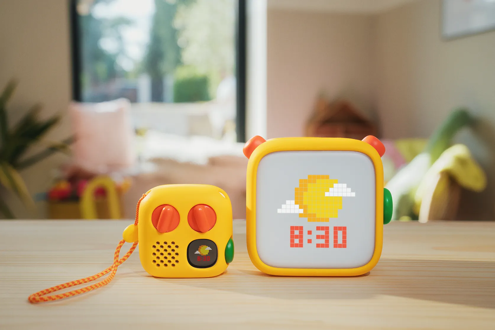
I’ve been obsessed with Yoto since 2019, when a friend introduced me to the tactile, lo-fi audio player for kids. My children have used it daily ever since, and it’s one of the most interesting brands out there. It arrived just as parents were looking for an alternative to endless high-stimulation screens, and it has grown from a community-led, Kickstarter-style product with its foibles into a polished, self-assured brand that still listens closely to its community.
So when I heard a new generation was on its way, I asked to speak to the design team behind the biggest shake-up of its physical design yet. It’s a fairly tricky proposition: a product used by children but invested in by parents, with a clear mission and a feature set that’s still evolving. The new players have a mischievous new look, a green dial (big news in the world of Yoto) and a few other added features. Most importantly, the design team and Yoto chose not to lean any harder on the screen’s capabilities. For families trying to rely less on screens, that’s a crucial decision.
Below is my conversation with Jack Godfrey Wood of design studio Heirloom, covering the design mission, how the players were prototyped and tested, and the challenge of designing for a product with such a clear purpose and such a vocal community.
How did Heirloom come to work with Yoto?
We knew people there. One of our colleagues worked on the original Kickstarter version, the wooden cube with the two blue dials, and two of our team designed the later generations at another company. When we started Heirloom, we took on the current fourth-gen players, so our team has been involved in and out from the beginning. It made sense straight away, because we all had that Fisher-Price cassette deck as kids and this felt like this generation’s version. Once Tom and Ben showed us the community they’d built, I knew it would work.
What were the aims for the redesign?
There were technical aims and design aims. Yoto wanted more storage, more battery and more internal robustness, and they wanted the player to be splashproof. That meant a lot of work on keeping dust and liquid out. Inside, the downloads are faster, there’s more storage and the sound is better, so they’ve fixed the things I wanted fixed as a parent. Our job was to make the players fit better in kids’ hands, travel better, and be easier to hold, carry and drop without anything breaking.
Where did your design decisions come from?
Both the community and our own experience, plus writing some rules. Yoto’s core goal is “kids in control and parents in charge”. We also knew we didn’t want addictive, distracting moments. Both screens have more resolution than before, but we kept everything in pixel world, because to us that’s Yoto. It’s a fun menu, not a distracting screen. We could have added motion, like a character that waves at you if nothing happens for 15 minutes, but we felt the community would say that was wrong.
Does Yoto’s approach feel different to other consumer tech clients?
Yes. Yoto’s goal isn’t to keep eyeballs on the screen. It’s how often the player gets used and whether it adds value to a child’s and a family’s life. It’s a very clear moral code, which makes design decisions easier. A lot of the pixel work we did is artful, precise and beautiful, but we kept it happily lo-fi and didn’t turn it into another Apple product.

What was the big challenge on content?
Yoto wanted the backup content stored in each player to be available on the player itself. That way, if you can’t find the card, your kids can still listen to what they like, and you don’t have to get your phone out at 9pm when nobody’s going to bed. The hard part was doing that without turning the screen into an iPod or an iPad.
So how does the green dial work?
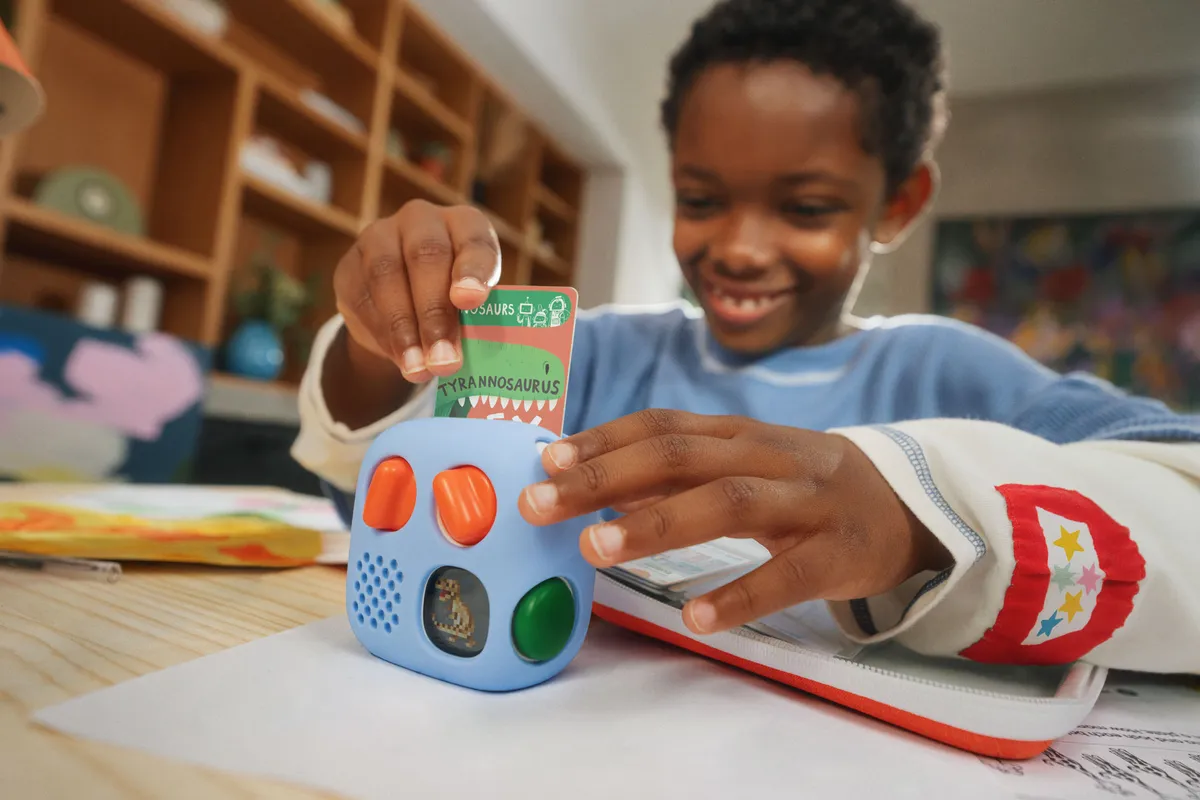
It was our way of giving kids access to what they want without overwhelming them with 200 cards. Daily radio and podcasts have moved onto it, along with 20 favourites. It populates automatically, but parents can set up day and night versions in the app. At night, all 20 can be sleep or relaxation content. In the daytime, you can have Elton John and Harry Potter. It also means your favourites are there wherever you go, which is really good for holidays. We still love cards, though. In all our research, they’re still the main way younger kids want to use it.

How many concepts did you go through?
For one of the players, up to 10 to 15 concepts across a few different areas. When we gave the more pebbly form to some children, it was obvious how naturally it fitted their hands and how much they wanted to hold on to it, so we presented that one with a strong recommendation. For the other, we looked at five or six directions, but Yoto wanted it to feel like a continuation of the previous products. The concept was quite singular, and we spent a lot of time on the detailing: where the dials sit, how sharp they should be, and so on.
What did you change about the dials and finish?
The dials used to be crisp. We softened them so kids can reach them from different angles, and made them slightly longer for more grip. The smart button isn’t in the middle, which most designers would do. Because it’s a kids’ product, kids can use it from the front as they hold it.
How do you work with such an opinionated community?
Because we’re external to Yoto, they do most of the community work and the feedback is funnelled to us through the Yoto team. We’re forthright about what we think is right within Yoto’s mission, and we don’t try to do everything people ask for. The challenge is that the community is always ageing up, but we also have to look after new families who’ve never used Yoto. A new user shouldn’t have to learn anything, and an existing user shouldn’t be thrown off because every feature suddenly does something else. The community’s feedback is great because it comes from hard-won experience, not assumptions.
How do you keep Yoto feeling like Yoto?
By keeping the mischief, fun and wonder, and the underdog spirit, rather than suddenly feeling like a big corporation. My favourite bits are the hidden details. There are little faces between the dials, and the charging cable has four tiny Yoto logos, one of which is winking. No one’s going to talk about it, but one day someone will spot it and get a little flutter of appreciation.