



It seems fair to say that HBO's new Harry Potter series has a lot to live up to. Will it do justice to the books? Can it recapture the (ahem) magic of the movies? Will it step outside of the shadow of the controversies surrounding its author? But most importantly, won't somebody think of the blocking?
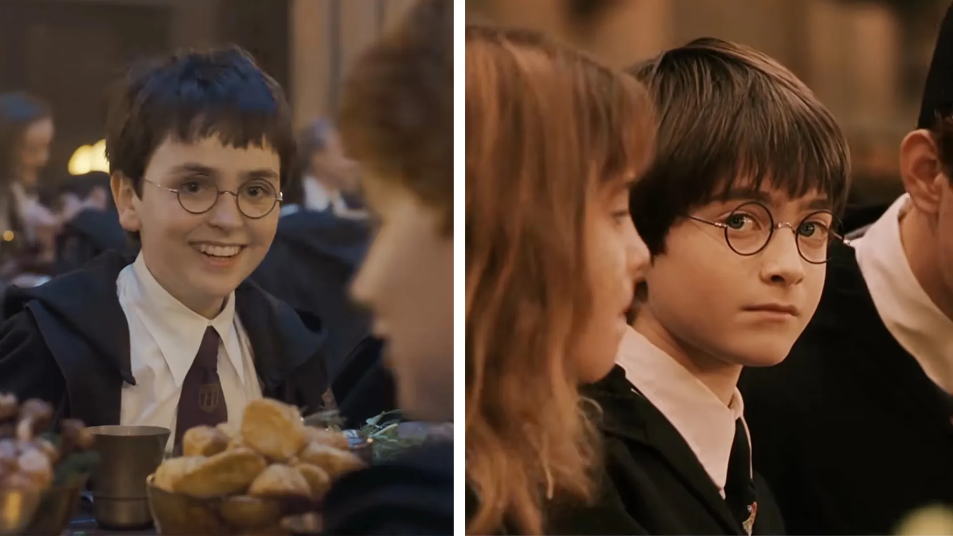
Yes, blocking—the staging and positioning of actors on screen—has become a buzzword after HBO dropped the very first piece of footage from the show, depicting a feast in the grand hall of Hogwarts. Fans are naturally comparing the scene to its 2001 movie counterpart, and not favourably.
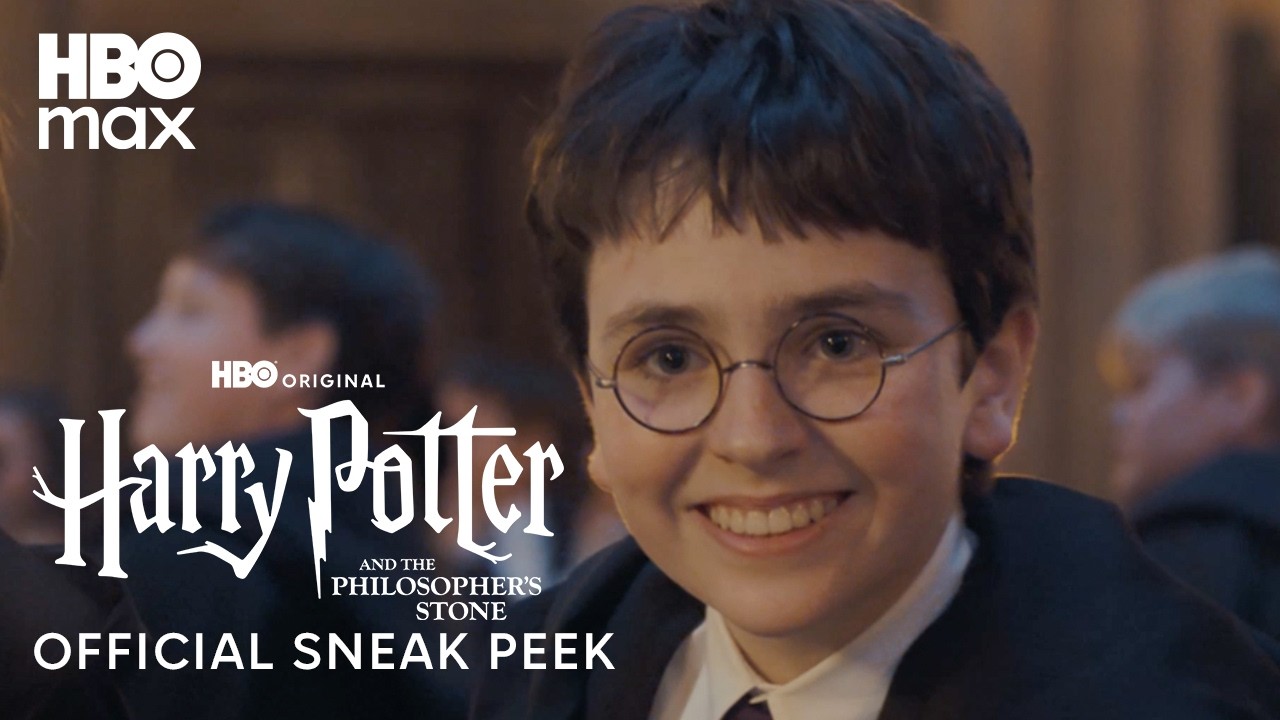
Viewers have been lamenting for years the move towards dark and washed out colour grading in modern movies and TV shows, and it seems not even Hogwarts is immune to the gloom. Compare this grand hall scene to the same one from the movie version of Harry Potter and the Philosopher's Stone and difference is night and day. HBO's offering looks like somebody at Hogwarts forgot to top up the electricity meter.
But it's the staging that's raising the most eyebrows.
Remove the color and focus on the composition and blocking. Even in black and white, the remake looks flat. The 2001 clip contained so much more exposition: house ghosts, Snape, student backstories. Every square inch of the frame is used. The new Dumbledore and McGonagall look botoxed and appear in vanity makeup, everything is center frame so that it can be shared on social media in vertical videos.November 15, 2026
Blocking really is becoming a lost art form now isn’t itNovember 15, 2026
A Great feast banquet hall scene Harry potter HBO (2026)/Harry potter and Philosopher's stone (2001) https://t.co/86bQoRP5IRNovember 15, 2026
Indeed, many individual shots from the 2001 original tell a story through the simple fact of their composition. When Harry spots Snape through the crowd, the framing of the two characters creates instant intrigue and drama. But here, the individual shots look much duller and less vibrant.
Overall, the whole looks rather like a recession indictor. From the darker palette to what looks like a vastly reduced food offering at the so-called 'feast', the whole thing looks, to quite Ryanair, "cheaper than a Ryanair flight". And given the recent response to the new posters for the series, the whole thing has a long way to go to win round fans.