Top 10 new agency portfolios of 2017
Whether you’re building a portfolio site for yourself or your agency, the same basic rules apply. You need to show your best work, in an attractive way, that tells a story about the kind of person or company you are presenting.
Design agencies obviously have more time and money to invest in their portfolio websites than most individuals, so nobody will expect your personal site to match their standards perfectly. But checking out the best new agency sites can still help you better understand the fundamentals of good portfolio design, and you’ll probably pick up some tips or ideas along the way.
So in this post, we present our favourite new agency portfolios of 2017. We hope they help to inspire your own efforts...
01. Act Normal
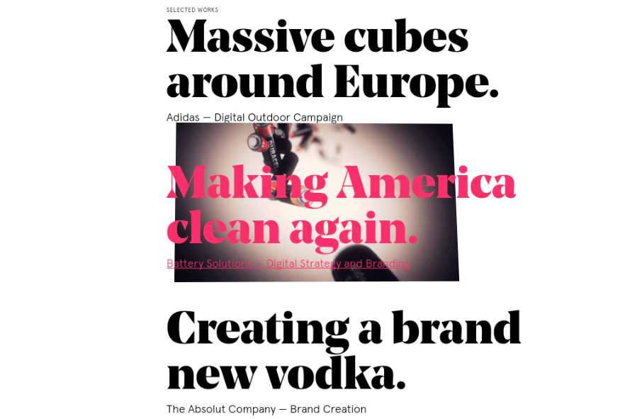
Act Normal is a digital studio in Stockholm, founded in 2015 by Oskar Sundberg and Per Stenius, which helps brands with marketing, branding and innovation. We love the bold, newspaper headline-style titles that announce their best work on their portfolio site. Hover over one of them, and an eye-catching motion graphic appears over the top, tempting you to click through.
02. Facility
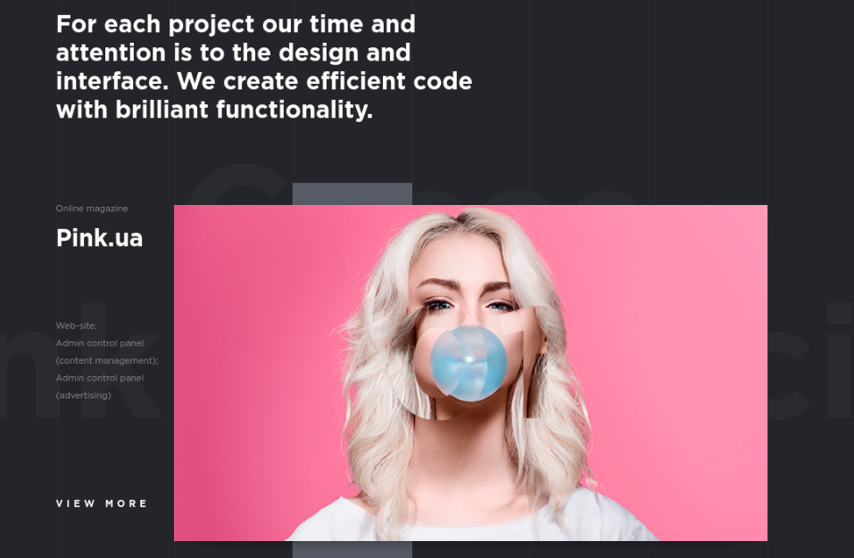
Founded in June last year, Facility is an integrated web agency based in Kiev, Ukraine that’s already got a lot of good client work under its belt. It presents these projects on its website in a restrained way that makes great use of large, colourful images and some subtle scrolling effects, which add visual interest without ever being intrusive.
03. Clearleft
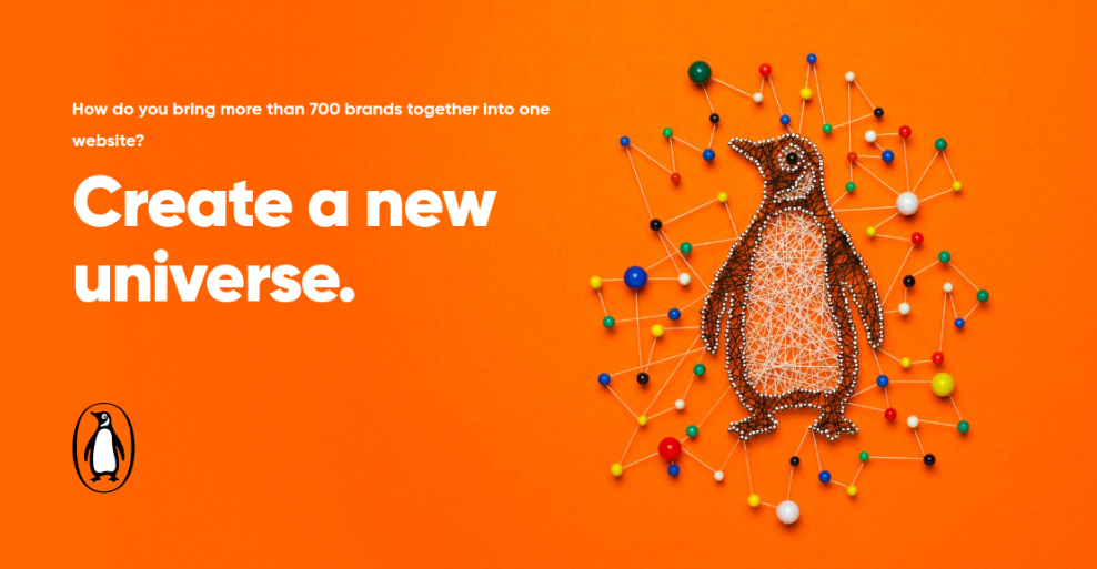
Brighton-based UX consultancy Clearleft is on one of the most established and influential names in web design, so you’d expect its revamped site to be something pretty special. And it really is.
Rather than just show screengrabs, Clearleft has really thought through how to tell the story of its projects in a visually enticing way. There’s no need, then, for flashy effects or animation; just good, solid design that makes you want to read and look at everything on show.
Daily design news, reviews, how-tos and more, as picked by the editors.
04. Maison Carnot
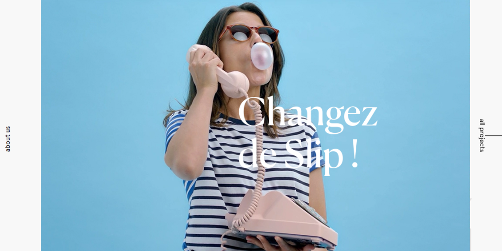
In general, video and scrolling effects are both overdone on agency portfolio sites. But Maison Carnot, an advertising agency based in Paris, has combined both on their website in an inventive and alluring way. Scroll down the nine projects on its homepage. To start with, you just see stills. But hover over one of them and they transform into short video clips, in a way that seems seamless and natural, rather than showy.
05. Adaptable
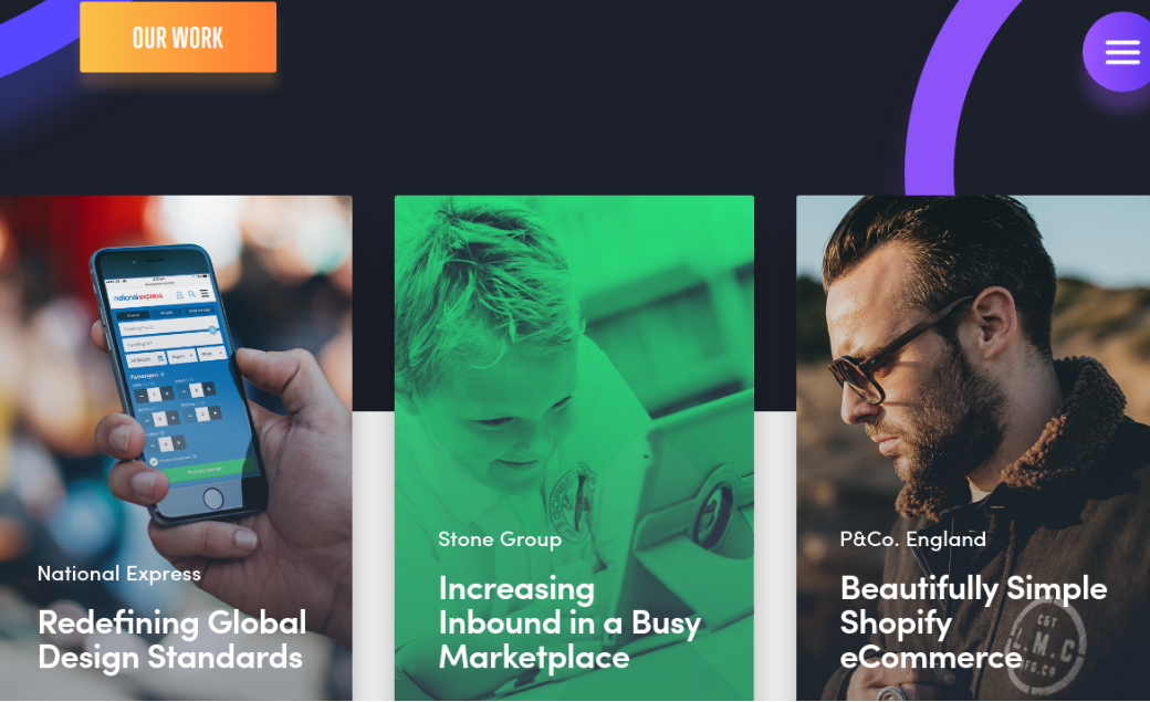
Adaptable is a digital studio based in Birmingham, UK, that specialises in ecommerce and lifestyle customer experience. The layout of its website is simple, but beautifully so, with thoughtful choice of images, inspired use of colour, and some snappy scrolling effects. The overall impression is a digital agency that understands the importance of aesthetics as well as functionality.
06. HE WAS BORN
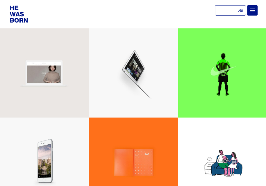
HE WAS BORN is a Korean design studio that creates websites, motion graphics, branding and mobile apps. It presents its top projects on its website within a column of rectangular blocks; hover over one and you’re rewarded with a lovely little animated transition. Click through and you get to see a wide range of imagery from the campaign, although if you can’t read Korean, you’ll need to copy and paste the explanations into Google Translate.
07. WANNA
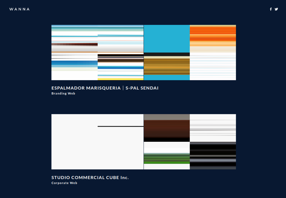
WANNA is a web design and development studio based in Sendai, Japan, and it takes quite a startling approach to presenting its work on its homepage. As you scroll down you see, not screengrabs but representations of the main colours used in each project. It’s a bold and imaginative approach to grabbing the viewer's attention. And of course, if you click through you get a more standard representation of each site, with a proper screengrab and description.
08. Humaan
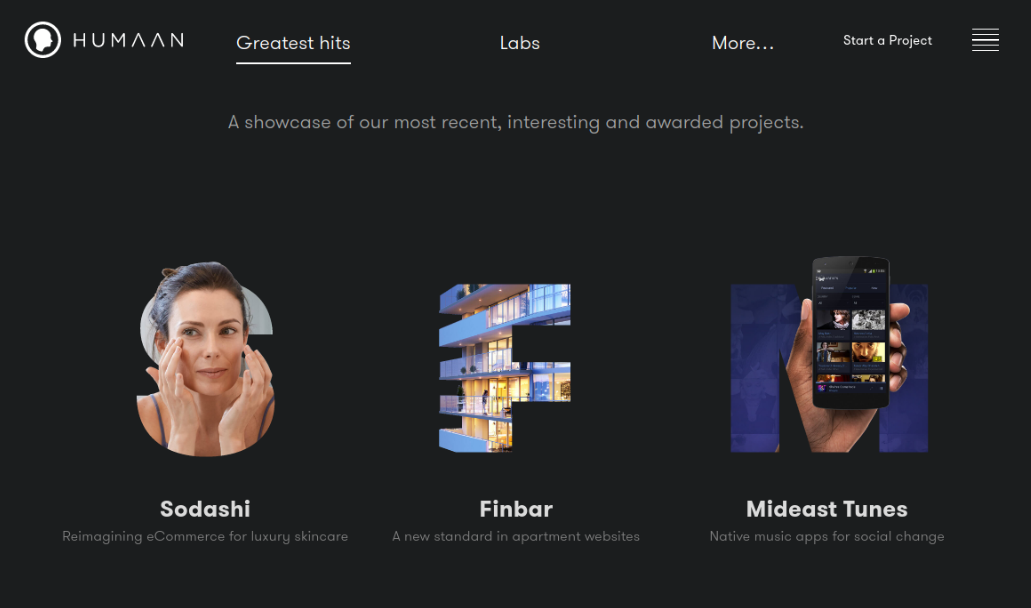
Humaan is an award winning agency based in Perth, Australia that’s focused on web design, mobile, ecommerce, and digital strategy. Dark backgrounds don’t usually work too well on portfolio websites, but Humaan’s artful, grid-based layout and clever use of cutouts work together well, really making each of the featured projects sing.
09. Herokid Studio
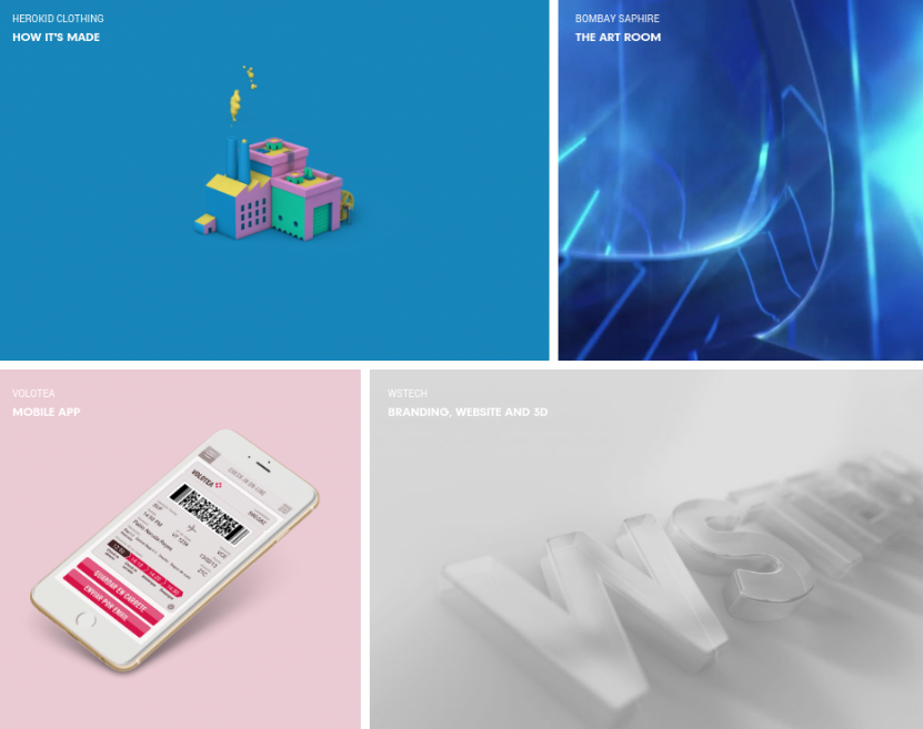
Herokid Studio is a Barcelona-based digital studio offering creative services to clients worldwide, combining art, technology, storytelling and strategy. Its website homepage brings its work front and centre, in a grid layout that’s brought to life via sumptuous colour combinations and some nice touches of animation and video.
10. Creatlive Studios
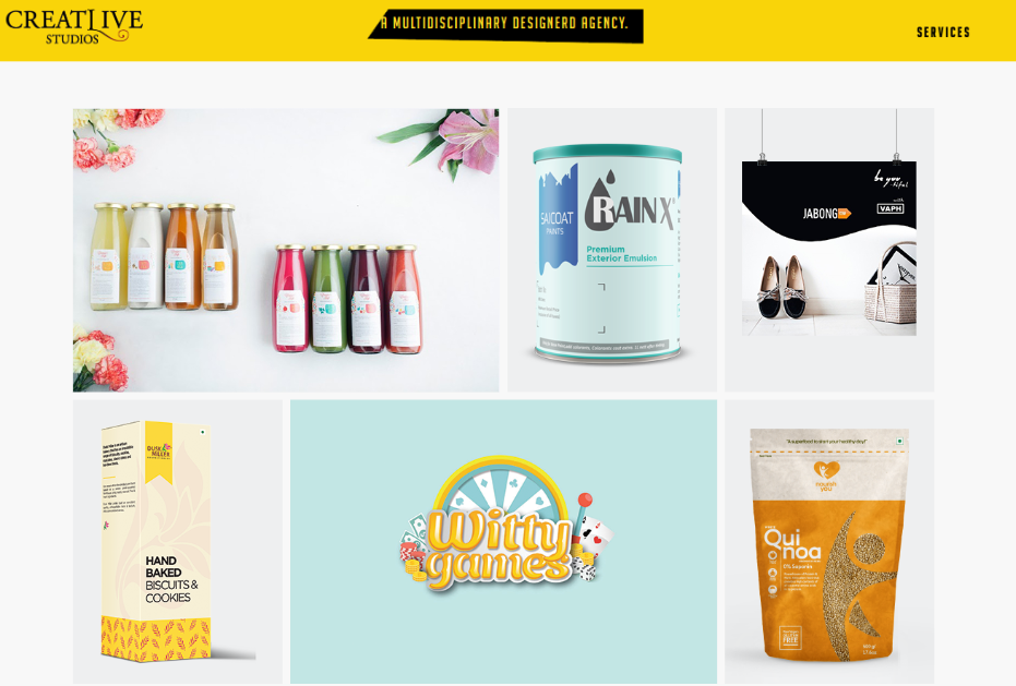
Creatlive Studios is a multidisciplinary agency based in Hyderabad, India. While the masonry layout of its homepage may not be the most original way to present work, the inspired use of colour, with a strong focus on yellow, makes this portfolio site seem fresh, youthful and vibrant.

Tom May is an award-winning journalist specialising in art, design, photography and technology. His latest book, The 50 Greatest Designers (Arcturus Publishing), was published this June. He's also author of Great TED Talks: Creativity (Pavilion Books). Tom was previously editor of Professional Photography magazine, associate editor at Creative Bloq, and deputy editor at net magazine.
