Computer Arts cover contest 2015: top 30 entries revealed
After much deliberation, we can reveal the top 30 cover designs for the forthcoming New Talent issue.
Sign up to Creative Bloq's daily newsletter, which brings you the latest news and inspiration from the worlds of art, design and technology.
You are now subscribed
Your newsletter sign-up was successful
Want to add more newsletters?
Loek Vugs
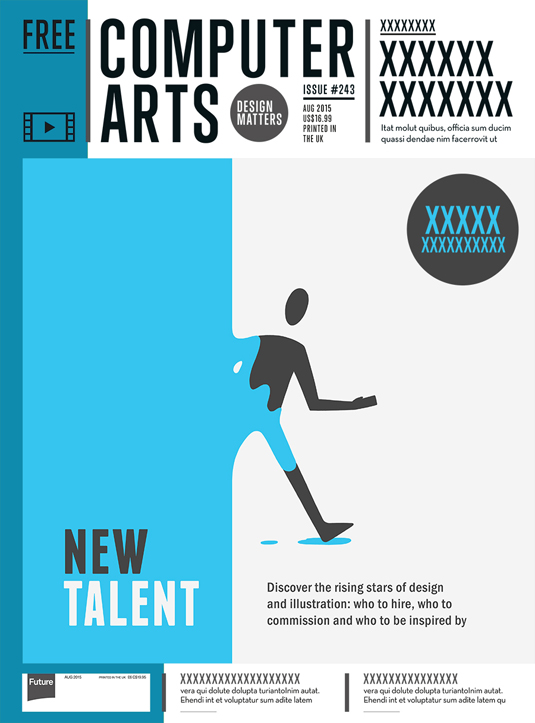
- Loek Vugs
- Age: 22
- Education: Communication and multimedia design, Netherlands
- Concept: “Talent often comes out of nowhere so I wanted to visualise this in a very minimalist way,” says Loek.
- Print/digital enhancements: Loek suggests a UV spot varnish for the character to emphasise the 'new' aspect, “as if it was a product that just got a new paint job.” For digital, he animated the character in a loop, so that they came through the paint and walked right out of the frame.
Mateusz Napieralski
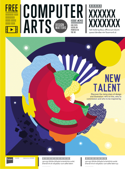
- Mateusz Napieralski
- Age: 24
- Education: Motion graphics at Ravensbourne, London
- Concept: “I compared the birth of New Talent to the literal formation of a star being born in space,” says Mateusz. “It is the combination of various qualities such as talent, hard work, dedication and passion coming together over time that make one stand out and shine brighter than the others.”
- Print/digital enhancements: Mateusz reckons the print edition could be enhanced using diffuser foil on detailed elements such as the light rays shining from the star. “I think it would be really interesting if there was an illusion of the star bursting as you pick up the magazine, caused by light reflecting off the foil.”
Mathew Lynch
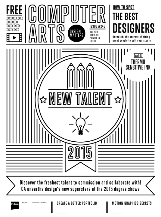
- Mathew Lynch
- Age: 23
- Education: Graphic design, illustration & digital media at Bradford School of Arts
- Concept: Mathew used simple forms, clean-cut lines and geometries to symbolise the theme of New Talent on the cover, with a style that's on-trend and linked to the idea of rising stars and new ideas on the creative scene.
- Print/digital enhancements: The print edition is set up to use thermo-sensitive ink, which “enables the reader to literally reveal the new talent within”. As for digital, Mathew suggests animating the trim paths in After Effects.
Mohd Fairiz
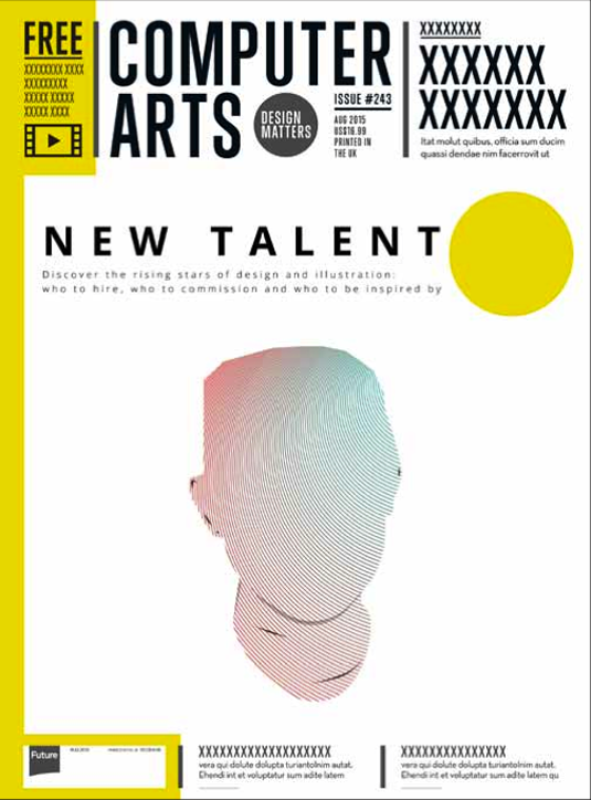
- Mohd Fairiz
- Age: 29
- Education: BA Graphic design at KLMU, Malaysia
- Concept: Mohd's cover concept plays on the idea that new designers are talented but not yet the finished product. “It's a canvas for designers to create an identity for themselves,” he says. “The idea is that each cover will differ from each other.”
- Print/digital enhancements: Mohd suggests a non-gloss print on the drawing part of the cover: “This enables designers to draw their artwork on the canvas. The digital version could come with a PDF of the cover so that designers could open it in Illustrator/Photoshop and create their design.”
Rebecca Tyler
- Age: 22
- Education: Graphic communications at The University of Northampton
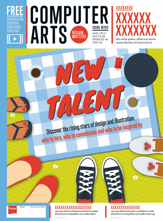
- Concept: Rebecca hones in on the theme of fresh new talent with the feet of new summer arrivals surrounding the title.
- Print/digital enhancements: For print Rebecca suggests a fresh, bold colour palette with a spot UV varnish applied to the text, coffee and iPhone screen as well as the border of the picnic blanket, to imply the radiance of a summer sun. She also envisions applying a fragrance burst of freshly cut grass.
Rui Canedo
- Rui Canedo
- Age: 23
- Education: Communication design at ESAD, Portugal
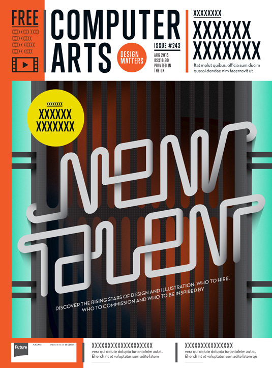
- Concept: “What does passion feel like? You have this heat inside of you that starts growing until you're on a run, full of ideas and will power, smoking hot,” says Rui. “To showcase this idea I explored an electric grill.”
- Print/digital enhancements: Rui had the idea of a thermochromatic finish so that when applying pressure with the fingers the bars of the grill would begin to turn red. For digi, he suggests animating the type so that it heats up and cools down.
Sean Steed
- Sean Steed
- Age: 20
- Education: Architecture and fine arts (graphic design) at Cornell University
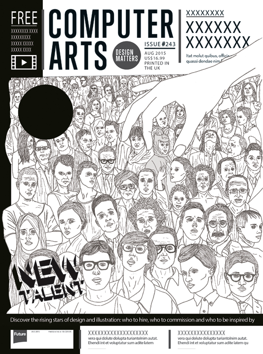
- Concept: Sean wanted to work with the idea of 'standing out from the crowd', tying in with the concept of being 'hand-picked'.
- Print/digital enhancements: Multiple potential finishes were envisioned by Sean: “A laser-cut cover page followed by a dramatic black page that highlights the individual 'standing out from a crowd' (notice he is a little quirky and dressed in a dinosaur costume: weird is good).”This individal would glow in the dark (spot UV) to further reinforce the concept. “Lastly, the 'New Talent' title and circular icon could be die-cut and filled with a glossy black paper or have a rough matt finish.”For digital, Sean offered the idea of animating the 3D title. “It could go through twists and flips that show depth. Eventually the title becomes bigger to clearly show the theme for this issue.”
Sophia Potamitou
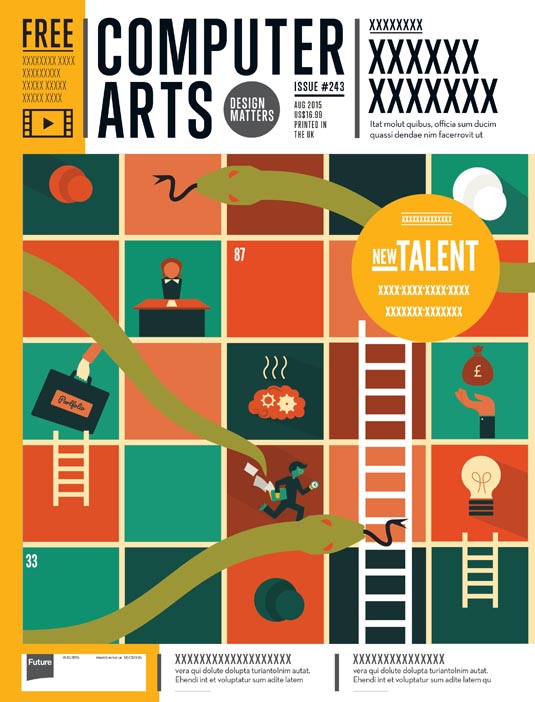
- Sophia Potamitou
- Age: 23
- Education: BA Illustration at Plymouth University
- Concept: “The concept I chose for the Computer Arts front cover depicts the classical board game 'snakes and ladders', which is symbolic of the steps a design student has to go through during university that will determine their success (or decline) in the work place,” says Sophia.
- Print/digital enhancements: Sophia envisions having the main ladder and connecting flash containing the title 'New Talent' embossed or UV coated. For digital, she animated some icons on the board to make it potentially interactive and to capture attention.
Tess Smith-Roberts
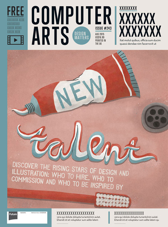
- Tess Smith-Roberts
- Age: 18
- Education: Art, history and photography 'A' level, (currently enrolling for an Illustration degree at Kingston University)
- Concept: “Toothpaste is something that makes you feel instantly fresh,” says Tess. “But because it's part of everyone's routine it also suggests that anyone could potentially be this new talent.”
- Print/digital enhancements: Spot varnish on a raised title was Tess's suggestion. “A textured matt background would work well to contrast this, making the title stand out even more.” A mint fragrance was also part of her vision, to really embody 'freshness'.
Wendy Ma
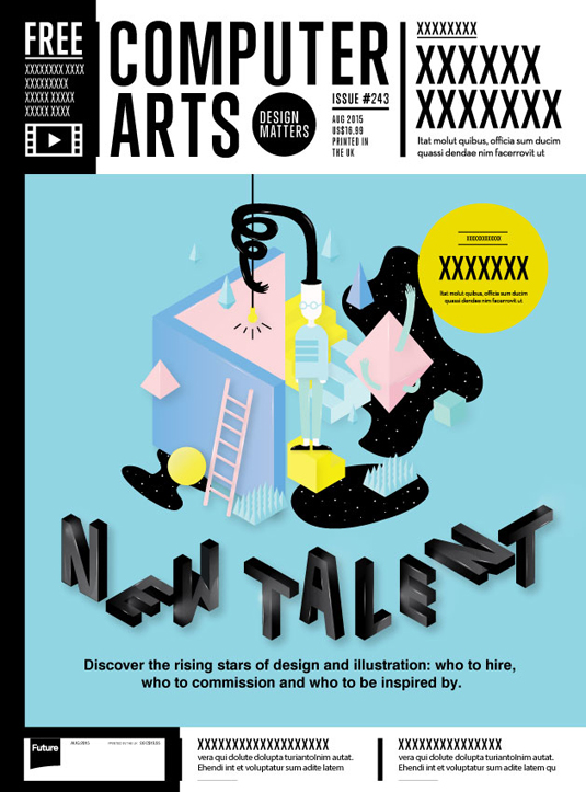
- Wendy Ma
- Age: 25
- Education: Interactive Arts and Technology, Simon Fraser University
- Concept: Wendy's illustration portrays a designer's mental space and “reflects the process of creating new designs by using creativity and inspiration from the world around them,” she explains. “Each object in the image represents an insight that is used in the unique perspective of the designer.”
- Print/digital enhancements: Wendy suggests lenticular printing for the black blobs to increase reactivity: “The stars will move when you change the angle of perspective.” Coated textures could also be applied to other illustrated vectors, she thought, as well as embossed printing, giving the background a more grainy texture for contrast.For digital, illumination of the lightbulb and subtle movements of the geometric shapes and stars would make up the majority of the animation. Wendy also had the idea of introducing an interactive page on flipping the cover, where the reader could trace letters which would be translated into 3D fonts.
Sign up to Creative Bloq's daily newsletter, which brings you the latest news and inspiration from the worlds of art, design and technology.

The Creative Bloq team is made up of a group of art and design enthusiasts, and has changed and evolved since Creative Bloq began back in 2012. The current website team consists of eight full-time members of staff: Editor Georgia Coggan, Deputy Editor Rosie Hilder, Ecommerce Editor Beren Neale, Senior News Editor Daniel Piper, Editor, Digital Art and 3D Ian Dean, Tech Reviews Editor Erlingur Einarsson, Ecommerce Writer Beth Nicholls and Staff Writer Natalie Fear, as well as a roster of freelancers from around the world. The ImagineFX magazine team also pitch in, ensuring that content from leading digital art publication ImagineFX is represented on Creative Bloq.
