Any history of the Disney logo is, by necessity, going to have to be a non-exhaustive whistlestop tour. Between Walt Disney Pictures, Walt Disney Studios and Disney Entertainment, none of which are to be confused with the Walt Disney Company (aren’t corporate structures just the best?), the House of Mouse has enjoyed many, many different logo variants that have been used and reused over the years.
So, we’re going to take a look at the key milestones from Disney’s logo history – the iconic marks and icons that have played a part in making the company the globe-straddling behemoth it is today. Check out our rundown of the greatest logos of all time (as picked by the experts) for more inspiring logo content, and don’t miss our guide to the best graphic design software if all this logo chat gets you itching to design your own.
1928: Dawn of the Mouse

The company we now know as Disney was founded by brothers Walt and Roy O. Disney in 1923 – and was initially called Disney Brothers Studio. Some simple letterheads have survived from that period, but the first instance of what we might better think of as a logo came in 1928. By this time, the studio had been rechristened as Walt Disney Studio (Roy was more the business than the face; he became CEO in 1929), and had also come up with inarguably its most enduring and instantly recognisable creation.

Mickey Mouse. Successor to Oswald the Lucky Rabbit, almost named Mortimer Mouse until Walt’s wife Lillian thankfully intervened, this distinctive rodent continues to be indelibly associated with the Disney brand to this day. And here he is, almost a full century ago, so fundamentally unchanged in his design that a child of the 2020s would recognise him instantly.
The name ‘Walt Disney Studio’ is rendered in a soft but still fairly businesslike sans-serif font, while Mickey’s name gets the full carton treatment of crowded boxy letters and drop-shadow. Mickey’s figure pops just in front of the studio name, adding an extra dimension to the mark.
1937-present: The Walt Disney Wordmark

Possibly the only icon more closely associated with Disney than Mickey Mouse is the Walt Disney wordmark, a stylised signature from the hand of the man himself, which we still see today every time we interact with anything Disney related, from visiting the parks to opening the Disney+ app.
While the many eager Disney historians online don’t precisely agree on when this wordmark started to be used, most put it at around 1937 with the release of Snow and the Seven Dwarfs. Though this mark would go through a fair few revisions and alterations, it’s pretty identifiable from the get-go, with that smooth, looping script firmly in place.

The version of the wordmark most familiar to modern audiences was introduced in the early 1970s. By this point it had strayed pretty far from Walt’s actual signature, and the most significant change was made to the ‘D’, giving it those incredibly exaggerated curves at the top and bottom and the off-centre vertical line, based on the golden ratio.

1985-present: The Castle
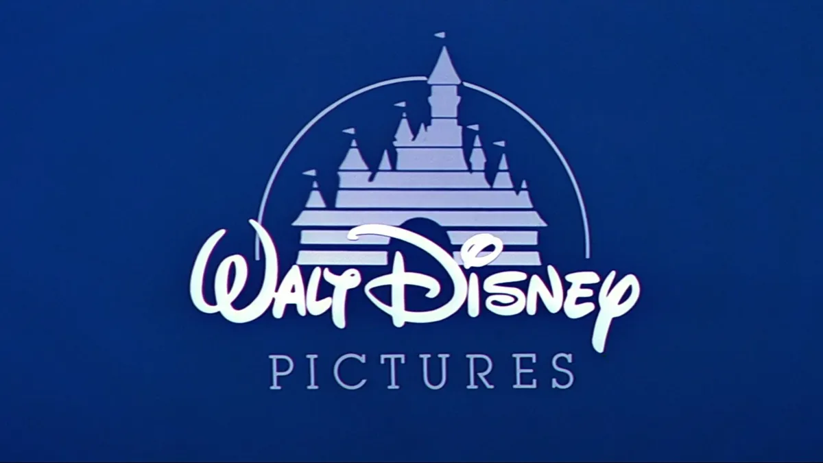
Anyone who has watched a Disney movie, whether on home video in the 1990s or on Disney+ last week, will have immediately encountered the iconic Disney castle. Paired with the classic version of the wordmark, this short animation has been bookending Disney movies since the mid 1980s, and has gone through a fair few iterations.
With the castle constructed simply from rectangular segments, a gradient and six flags, it is illuminated by the arc of a shooting star running over the top, a nod to the classic Disney song ‘When You Wish Upon a Star’ from Pinocchio, reflected in the a soft musical motif that accompanies the logo. The castle made its debut in an incomplete form with notorious box-office bomb Return to Oz in 1985, though a fully animated version would arrive later in the year with the more fondly remembered animated film The Black Cauldron.
This version of the castle would undergo a few minor cosmetic updates throughout the 1990s and 2000s, with the dark purple tint being softened to an easy-on-the-eyes blue.

In 2006, however, it would make the jump to full CGI with the release of the film Pirates of the Caribbean: Dead Man’s Chest. Much more vivid and detailed, this castle boasted details recalling classic movies like Sleeping Beauty and Cinderella.

A juiced-up version of the castle logo was introduced for the company’s 100th anniversary, revamped with additional lighting detail and a more dramatic sky, and has been in common use since 2024. The camera majestically pans around the camera as it transforms from classic white to fully detailed colour, and as we zoom out to the familiar front-on perspective, below the familiar letters of the name ‘Disney’ form in silver, beginning with that same magnificently curved ‘D’ from the middle of the 20th century.
This also highlights the other big change – in this variant, the company is 'Walt Disney Pictures' no longer, opting instead go by the mononym 'Disney'. You can see it in all its animated glory below.
Much may have changed, but with that classic 'Disney' wordmark from the 20th century still in place, the company hasn't quite forgotten its roots.
For more insights into how logos have changed, see our rundown of the Google logo history. And If you're feeling inspired by the evolution of the Disney logo and are looking to try one out for yourself, see our guide to how to design a logo.