






With a whole spectrum of colours only a few clicks away, perhaps it’s not surprising that working in black and white is sometimes overlooked.
But whether you’re working monochromatically to draft an illustration or using it for a finished piece, a black and white approach is full of benefits. It can even make you stand out in an art world that's saturated with vibrant talent (if you need the tools for your own art, see our guides to the best drawing tablets and the best pens for artists).
Foregoing colour can be an intentional creative choice rather than the result of a limitation, but for illustrator Sarah Koudelka-Mason it was born out of convenience. “After trying out all sorts of tools, I found pencils to be the simplest, least fussy medium,” she says. “All you need is a pencil and paper, which you can bring anywhere. Perhaps because pencils were also my first and most consistent tool in my art journey, I feel the most comfortable with them.”

For character artist and illustrator Joe Vriens, a black and white approach was the result of a fear of colour theory mixed with a dash of impatience.
“I’d always get excited to see the bare line work of a comic, too; it seemed much more achievable,” he reveals. “I could grab a pen and paper and make a comic without expensive markers, paints or digital tools.
“I’m also old enough to remember King Kong in black and white. I made my parents rent that thing probably once a month. In retrospect, maybe King Kong informed my approach all along?”

Illustrator Isabella Mazzanti points out that working in black and white plays into a long tradition of art styles, including her own influences which range from Gustave Doré’s engravings to contemporary manga.
“They seemed accessible and reproducible to me,” she says. “These early experiences were fundamental, because they shaped my aesthetic sensibility and my approach to drawing.”

Seeing as working in black in white is a deliberate approach, it also depends on specific considerations.
“You have to make sure the shading values are balanced well,” Sarah advises. “It’s easy for your shading to look flat or ’muddy’ if your tones are too similar, so you really have to figure out your darks, mediums and lights, and then tie them together with the between shading. I personally like to work lighter and work my way to the crisp dark lines at the end. So satisfying.”
“Line weight and shape design are also key,” says concept artist Alexander Joseba, who has worked for Epic Games, HBO, Ubisoft and more. “A strong silhouette can communicate a character or object very quickly, and different line weights can help separate forms and create depth. Since you cannot use colour to separate materials or planes, you need to do it through values, textures, edges and rhythm.”

“For me, black and white forces you to be more disciplined, although I also like to play with a more wild and instinctive approach. If the image works in black and white, it usually means that the composition, lighting and structure are solid.”
Alexander grew up looking at the work of great artists such as John Buscema, Mike Mignola, Alberto Breccia and many others.
“I was fascinated by the way they were able to communicate so much with ink: how they separated planes, created depth, controlled light and shadow, and made the whole image work so clearly, each one with their own very distinct style,” he explains

Some extra considerations are required when working in black and white, however. Alexander believes the most important consideration is readability.
“Without colour, you have to rely much more on values, contrast, shapes, silhouettes and composition to guide the viewer’s eye. Everything needs to be clear from the beginning: what the focal point is, what belongs to the foreground, middle ground and background, and where the main light is coming from.
“Working in black and white forces you to focus on the foundation of the image. You need to solve composition, lighting, values, silhouette, volume and overall readability properly. I think any artist who works well in black and white will also improve their colour work, because they understand values, light and structure better. Colour does not replace that foundation; it complements it.”

Isabella also warns against assuming that working in black and white is a simpler approach.
“A solid grasp of the visual language is essential in order to use it effectively,” she argues. “Black and white is not simply the absence of colour; when working with chiaroscuro, one chooses to tell a story based on duality, contrast and the exaggeration of ambiguity. I believe it is vitally important for an artist to understand this element, which has the power to intensify the viewer’s emotional engagement.”

When it comes to making black and white art work professionally, Isabella stresses that economic forces may be influencing publishers just as much as aesthetic considerations. “It lends images a classic, refined and timeless quality,” she says.
“Even when telling a certain type of story – for example, Gothic literature – black and white seems to be the most natural choice. It can be a risky choice, because one is foregoing the emotional appeal of colour, but when used in the right way and in the right context, it’s a winning decision.”


Sarah claims that black and white art is underrated, and that it’s not the usual approach commissioners are looking for. “But at the same time, if there are clients specifically looking for works of that nature and you’ve established yourself in that niche, you will find them. This applies to any unique niche of art, and I personally enjoy the challenge of going against the grain!”
For Alexander, black and white artwork is useful for both commercial production pipelines and for final illustration styles. “It depends on the project: sometimes it is a practical development tool, and sometimes it becomes the final artistic language,” he says.


Even if artists don’t gear their black and white artwork towards clients, focusing on it can still improve their overall craft. “Balancing tones in a final image is super-important, so if you can master greys then moving on to colour will feel easier,” says Joe.
“You can guide the viewer’s eye with tones alone, so it can help your compositions greatly. Focusing on greys or even black and white can take a lot of the pressure off as well, which allows you to really dig into lighting and form.”


Meanwhile Sarah is a firm believer that practising black and white art is one of the best ways to strengthen your understanding of the fundamentals.
“Without the distraction or support of vibrant colours, you are encouraged to look at your work in a simpler and more intentional way,” she says. “You start to see shape language, values, lighting, contrast, composition and depth a lot clearer.

Isabella agrees: “The absence of colour changes the way an image is perceived,” she says. “Rather than depriving the image of something, a black and white approach reveals its essential and most intimate nature; it speaks to the viewer in a more universal, almost archetypal language.”

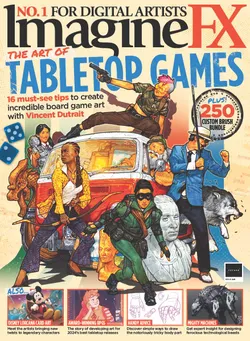
This article originally appeared in ImagineFX. Subscribe to ImagineFX to never miss an issue. Print and digital subscriptions are available.
Creative Bloq is now easier to access than ever before with our on-the-go app, which brings you all the content you know and love from our website, but in a super-streamlined design.
Download the Creative Bloq app for iOS
Download the Creative Bloq app for Android
