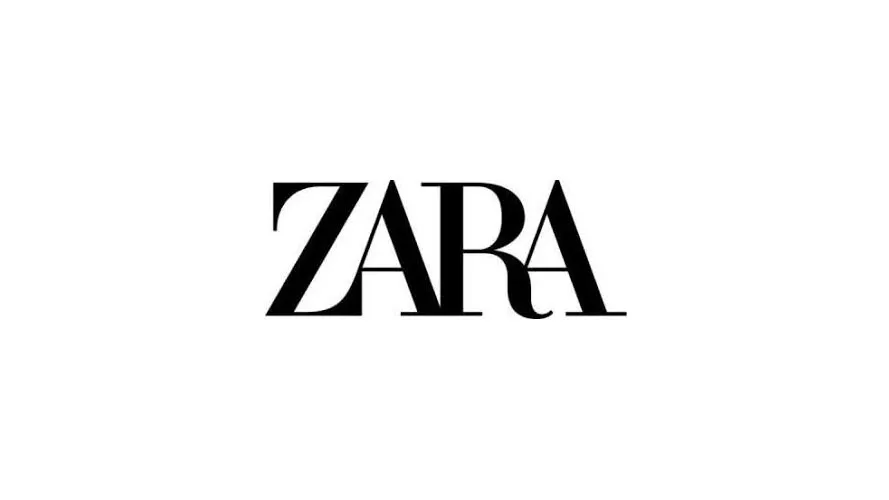
Major fashion chain Zara has released a new logo, and incited the wrath of designers on Twitter, thanks to some over-enthusiastic kerning. The original logo, pictured below, was an all-caps wordmark that was a little too spaced out for our liking. But it seems to have overcorrected the issue for its new look (above), in which the letterforms are so enthusiastically overlapped they are barely legible.

So it's not lacking in personality, and it'll certainly stand out in a sea of increasingly similar-looking high street logos. But is there much else positive to say about this new logo design? Erik Spiekermann called it 'the worst piece of type I've seen in years', while others suggested it looked like it was kerned by a robot.
Zara have updated their logo. pic.twitter.com/GhhQziNV1DJanuary 26, 2019
That is the worst piece of type I’ve seen in years. Was this done by one of those new robots that will replace humans?January 26, 2019
The new logo was launched with Zara’s Spring/Summer 2019 campaign, which has French art director Fabien Baron at its helm, with some suggesting the logo may be temporary to coincide with the campaign (or perhaps using it as a good way to test out the new logo?).
The new typography is now all over Baron & Baron's website. The site also shows a more detailed look at the logo, including how it will work on mobile devices, across posters and in lookbooks. And we think it looks rather elegant – see the image below. It does bear a pretty striking resemblance to the typography in Harper's Bazaar in the '90s, when Baron was creative director (as Gareth Hague pointed out on Twitter).

The website also outlines the reasons for the collaboration between Zara and Baron & Baron (and we suspect, the new logo), saying it "gives rise to an approach that blends elegance with edge – lifting the retailer to the level of luxury contemporaries, in a celebration of art and fashion for all".

As well as the Harper's Bazaar likeness, designers have also been quick to point out the logo's similarity to The Met's 2016 rebrand by Wolff Olins, which similarly failed to draw much praise on its release (it was memorably compared to a typographic bus crash).
What do you think of the new Zara logo? Let us know your thoughts on Twitter or Facebook.
Read more:

