26 websites that are in need of an update
Our web design contributor doesn't want to offend anyone, but these sites really could do with a refresh…
Sign up to Creative Bloq's daily newsletter, which brings you the latest news and inspiration from the worlds of art, design and technology.
You are now subscribed
Your newsletter sign-up was successful
Want to add more newsletters?
07. razorfish
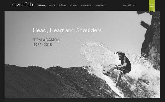
This site seems pretty cool, but once you start navigating through it, you quickly realize you're lost. Because of how this site is laid out, the header tends to change colors.
08. PCWorld
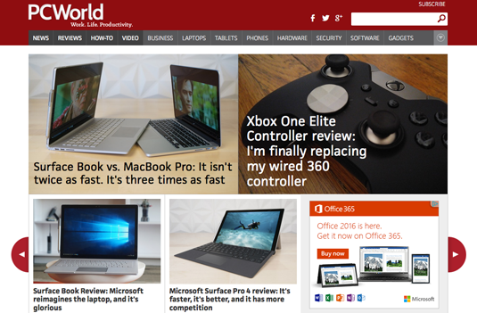
The last time I visited the PCWorld site was a few years ago, but I don't recall it being this poorly designed back then. The random full screen ads are the worst. If you're looking to drive away customers, you nailed it.
09. My Coke Rewards

This site wouldn't be so bad if it didn't use a mobile design for its desktop version too. While it's great to support the mobile community, I think you took it a little too far.
Article continues below10. myspace
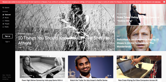
Wow! This is still a thing? Who knew? My biggest gripe with myspace is their search feature. I've honestly never seen anything like this before. It felt out of place and way over-the-top.
11. Satan's Rapture

Now we're talking real doom. In fact, it's so 'doomey' there's even a disclaimer on the site: "WARNING: THIS SITE MAY CONTAIN MATERIAL THAT SOME CONSIDER OFFENSIVE OR DISTURBING. PARENTAL GUIDANCE IS SUGGESTED." I'm not entirely sure if they were referring to the content or the web design.
12. BrandsMart USA

An interesting thing happened when I visited this site. I went back in time. If I were to take a guess, I'd say I landed somewhere around the early '90s. The funny thing is one of the first images this site displayed had to do with Back to the Future. Honestly, that made me laugh out loud.
13. Cartoon Network
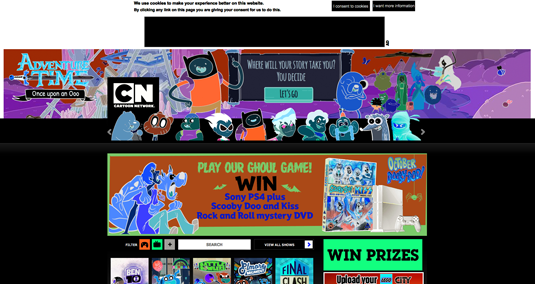
I love Cartoon Network – it has some funny shows – but this website is terrible. The drop-down navigation menu makes me dizzy. When you're designing a site, please take us old folks into consideration. We can't handle all the bouncing.
Sign up to Creative Bloq's daily newsletter, which brings you the latest news and inspiration from the worlds of art, design and technology.
14. Bo'ness Motor Museum
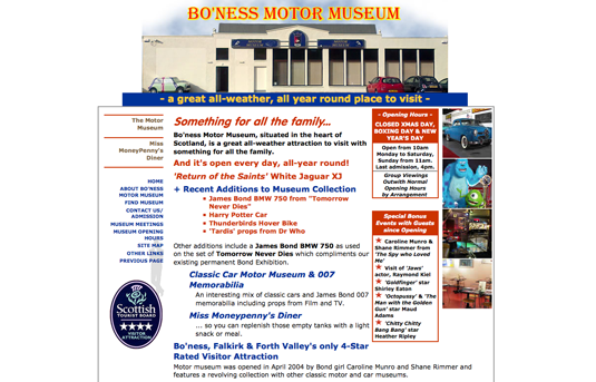
Again with the flashback to the yesteryears. Maybe they did this on purpose; you know... it being a museum and all. But my goodness, that header font. Really? Ouch!
15. Internet Archive
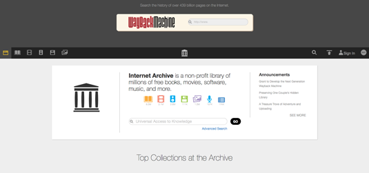
The first thing I noticed about this site was its use of a floppy disk in the menu bar. When was the last time you saw a floppy disk? This just screams, "Hey, I'm outdated and haven't caught up with the times." Now, where's my soldering gun so I can burn a hole in this floppy and double its capacity?
16. Scottish Museums
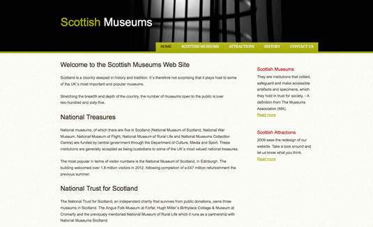
This site wouldn't be too bad except for the broken links. Rule number one, test things and make sure they work. And if they don't, you may want to consider fixing them. Just sayin'.
Next page: the final 10 sites in need of an update

The Creative Bloq team is made up of a group of art and design enthusiasts, and has changed and evolved since Creative Bloq began back in 2012. The current website team consists of eight full-time members of staff: Editor Georgia Coggan, Deputy Editor Rosie Hilder, Ecommerce Editor Beren Neale, Senior News Editor Daniel Piper, Editor, Digital Art and 3D Ian Dean, Tech Reviews Editor Erlingur Einarsson, Ecommerce Writer Beth Nicholls and Staff Writer Natalie Fear, as well as a roster of freelancers from around the world. The ImagineFX magazine team also pitch in, ensuring that content from leading digital art publication ImagineFX is represented on Creative Bloq.
