7 golden rules for creating brilliant iOS 7 icons
How do you create the perfect icons for iOS 7? Craig Grannell picks up some insight from design experts.
Sign up to Creative Bloq's daily newsletter, which brings you the latest news and inspiration from the worlds of art, design and technology.
You are now subscribed
Your newsletter sign-up was successful
Want to add more newsletters?
The design of iOS 7's icons has proved divisive, but as Bjango director and lead designer Marc Edwards pointed out in our feature on what Apple got right and wrong with iOS 7's icons: "App icons are typically updated in conjunction with major releases, and so I doubt we'll see much change at all until iOS 8. So love them or hate them, they're here to stay for a while."
The snag for designers is that because Apple's changes were so radical, iOS 6 icons can't help but look dated when surrounded by newcomers. But how exactly should you go about designing for iOS 7? Is it really a case of stripping everything back and ramping up the colours to 11? We decided to find out and spoke to icon design experts, who revealed seven golden rules for designing iOS 7 icons.
01. Use recognisable metaphors
Edwards notes that icons are often seen at small sizes and so keeping the concept simple is key: "That usually means sticking to one or two recognisable objects. If you can, use a unique colour and silhouette to help with recall."
Article continues belowDesigner Jon Hicks adds that the metaphor should be recognisable by what it does (such as Camera) or what it is/its identity (for example, the Safari 'brand') and notes that the likes of Apple's own Settings and Game Center fail at both.
Soft Façade creative director Dmitry Tsozik also stresses designers shouldn't try to be too clever: "Don't put some random circle on a white background and call it an icon. Research your colour and metaphors, and don't make your users guess!"

02. Go bold
Iconfactory co-founder Gedeon Maheux says that even if you're not terribly keen on Apple's eye-searing icon colours, the company's laid the foundations for a visual style that others should to some extent follow: "Use bold contrast in your designs. iOS 7 is marked by bright boundaries, clear lines and expressive colours." He adds that pastels and muted colours therefore don't work well against the "bright, fun palette" that is the iOS 7 home screen.

03. Use the grid
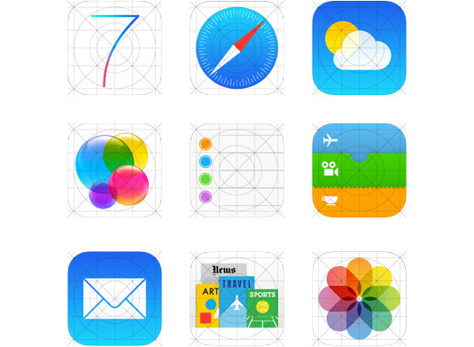
Maheux recommends at least starting out with the template grid that Apple fashioned for iOS 7: "It has proportion and harmony built right in. The more apps that use it as a base, the more apps will look unified on the home screen." However, he says you also shouldn't feel too constrained: "If you need to break the grid to make your icon awesome, then go for it."
Sign up to Creative Bloq's daily newsletter, which brings you the latest news and inspiration from the worlds of art, design and technology.
04. Avoid the written word
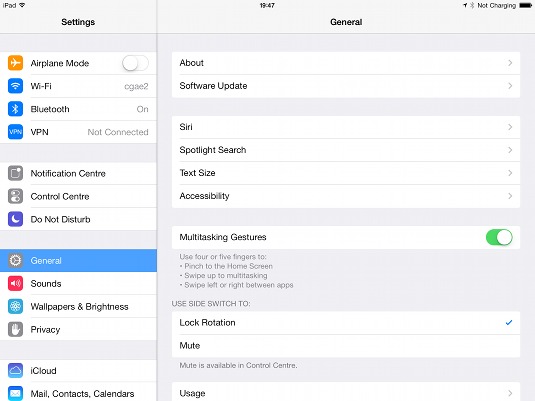
One of the more striking aspects of iOS 7 is how much it relies on type. With button borders largely absent, coloured text often denotes something that can be used for actions, but Edwards warns this line of thinking should not extend to icons: "Avoid text, and definitely don't try to cram an entire word into your icon. Where possible, icons should be symbolic and not linked to any one specific language."
05. Add some depth
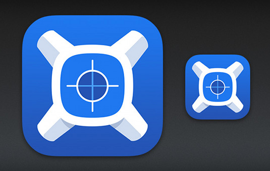
Apple's work on iOS has been called flat design, but Jony Ive was keen to point out that the system really has a 'layered' concept, rather than existing on a single plane. Maheux reckons icon designers can think similarly when crafting icons they want to stand out: "Don't be afraid to experiment with subtle shadows and shading of elements beyond simple gradients. There's a world of possibilities in iOS 7, and things are not always as flat as they may seem."
06. Create a consistent visual style
One look at the icons for Apple's App Store suites and it's clear they're part of a single range. Thinking beyond a single app can benefit designers, but Hicks warns you shouldn't be too restrictive in terms of style: "Consistency doesn't mean keeping all the line weights and colours exactly the same, but having a visual style that harmonises." He explains this could be a simple solid white glyph on a basic gradient, or a multi-coloured transparent icon on a white background - or something else entirely. "But decide on a style - one that allows flexibility for a variety of metaphors - and stick to it."
Edwards adds that it can also be useful if the icon represents the app inside: "You can do this by keeping the style and colours consistent with the main UI. If nothing else, this can increase the association of app and icon."

07. Seek perfection
This isn't a new line of thinking, but with an OS that champions elegance, simplicity and fine details, anything rough and ready now really stands out like a sore thumb. "The principles of creating good icons didn't change with iOS 7," agrees Tsozik, "but do go and read books about modern design, architecture and typography, and spend time perfecting your vector skills".
Words: Craig Grannell
Liked this? Read these!
- Great examples of doodle art
- The best photo apps for iPhone, iPad and Android
- The ultimate guide to logo design
Got a great icon design tip? Share it in the comments!

The Creative Bloq team is made up of a group of art and design enthusiasts, and has changed and evolved since Creative Bloq began back in 2012. The current website team consists of eight full-time members of staff: Editor Georgia Coggan, Deputy Editor Rosie Hilder, Ecommerce Editor Beren Neale, Senior News Editor Daniel Piper, Editor, Digital Art and 3D Ian Dean, Tech Reviews Editor Erlingur Einarsson, Ecommerce Writer Beth Nicholls and Staff Writer Natalie Fear, as well as a roster of freelancers from around the world. The ImagineFX magazine team also pitch in, ensuring that content from leading digital art publication ImagineFX is represented on Creative Bloq.
