This indie game turns watercolour art into playable puzzle spaces
Sign up to Creative Bloq's daily newsletter, which brings you the latest news and inspiration from the worlds of art, design and technology.
You are now subscribed
Your newsletter sign-up was successful
Want to add more newsletters?
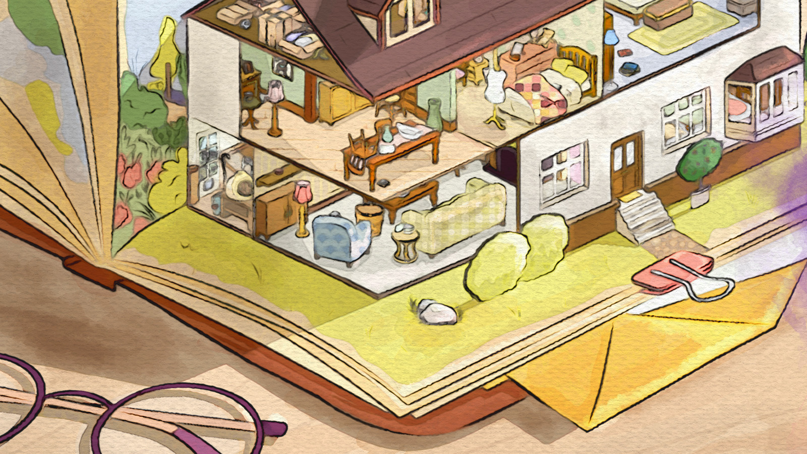
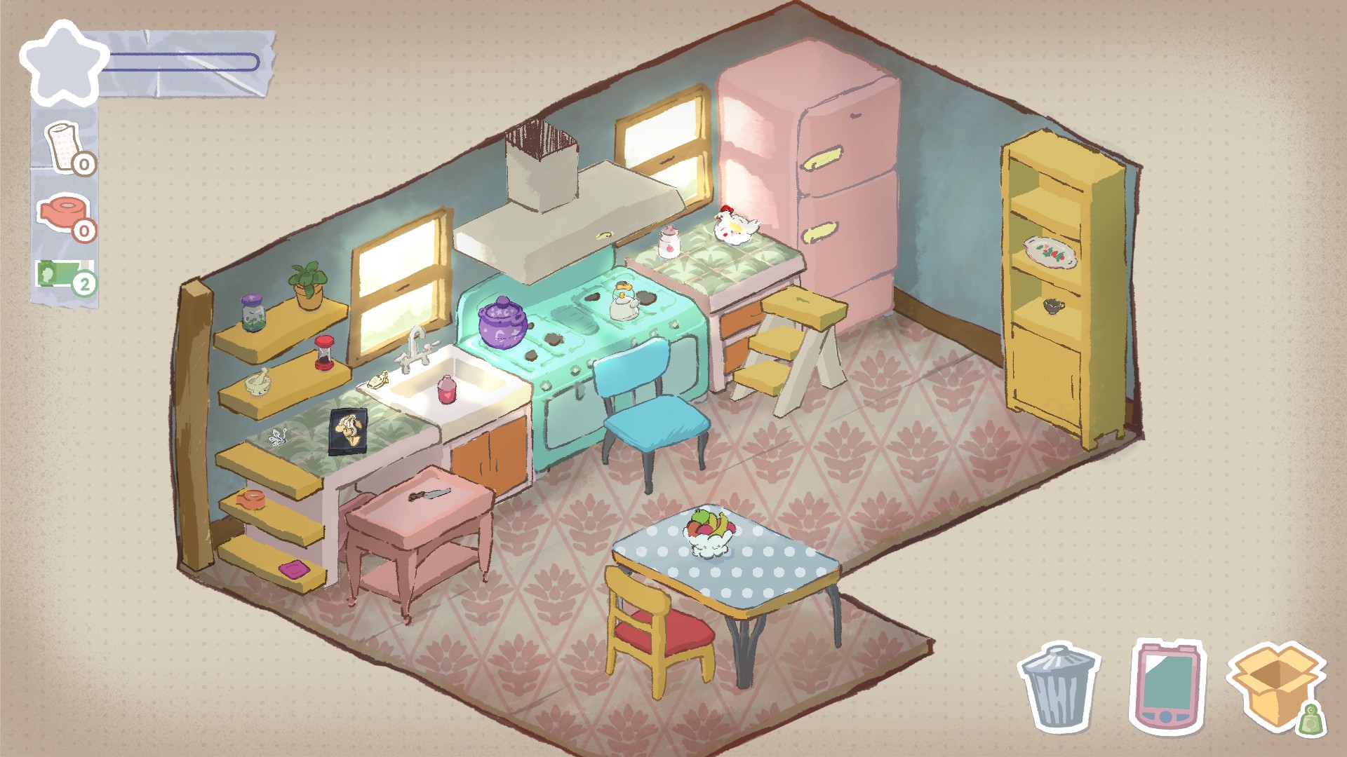
At first glance, A Storied Life: Tabitha is restrained: the game depicts a hand-painted house in soft watercolours, its rooms filled with familiar objects. By picking up, rotating, stacking, and packing items, the game’s art comes alive through building meaning through use rather than passive observation
For Lab42 Games, achieving that look meant testing ideas in-engine and letting production realities shape the style. Assets moved repeatedly between Photoshop and Unity, workflows were refined, and an art bible was locked down to keep the hand-drawn feel consistent at scale, a process that will feel familiar to anyone working with the best digital art software or the best game development software.
Below, studio director Terry Goodwin and concept artist Lucia Pigoli break down how Tabitha’s visual direction developed from early prototypes, how practical constraints informed creative decisions, and how a deliberately pared-back style emerged through iteration rather than game design and theory. And for another example of excellent hand-drawn art in games, read my MIO: Memories In Orbit review.
CB: What was the very first image that defined Tabitha, and how close is the final game?
Lucia Pigoli: I joined the project when a visual library was already created as reference for further development; Adina, the concept artist that worked on the prototype, did a great job creating the pillars of the style we wanted to achieve.
The objective was to have something with a very crafty look, with a watercolour texture, with elements that resemble a scrapbook or a diary, which gave the right base for conveying emotions.
There were a lot of tests and back and forth between Photoshop and Unity and that’s how we built the art direction.
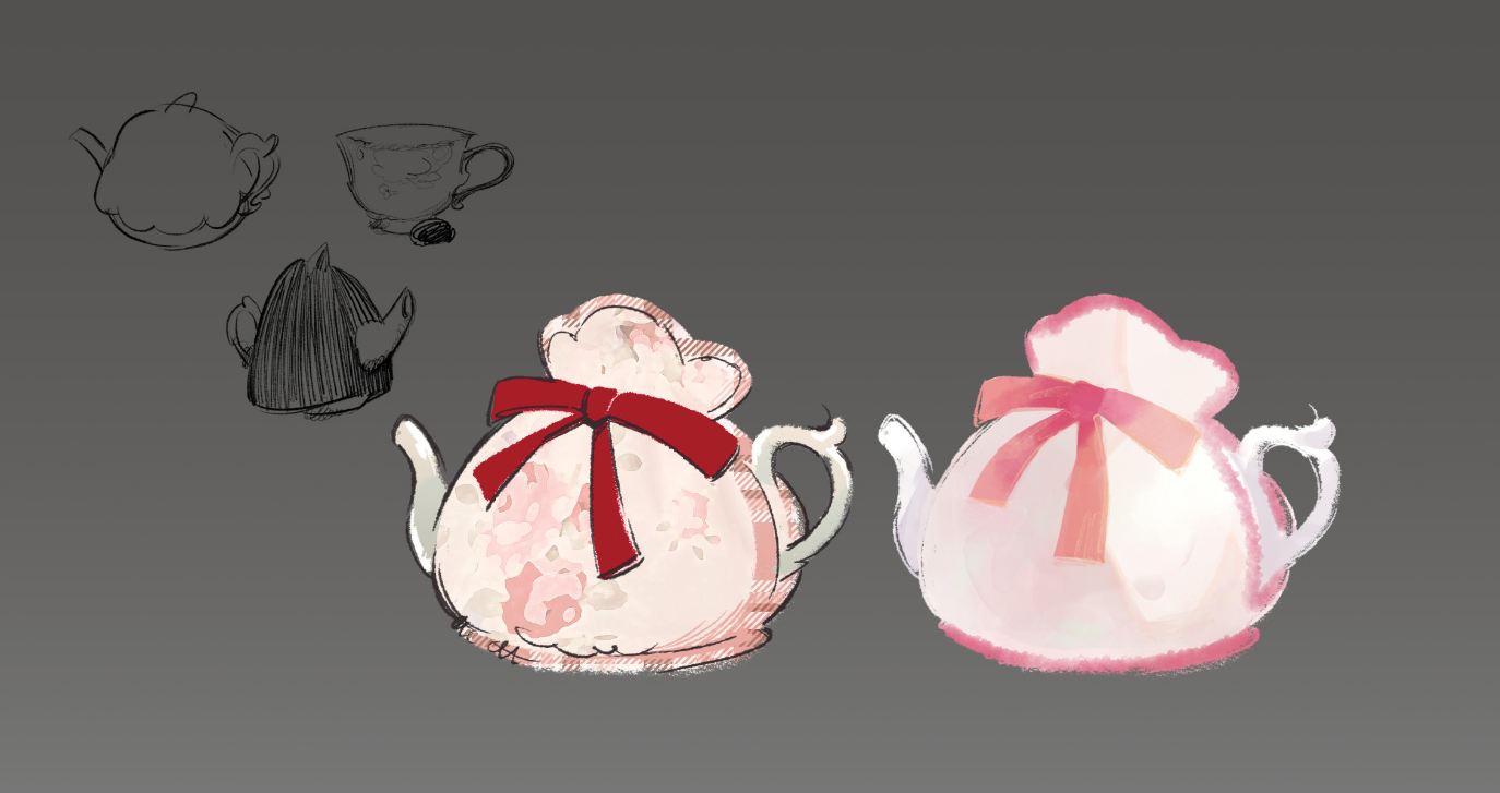
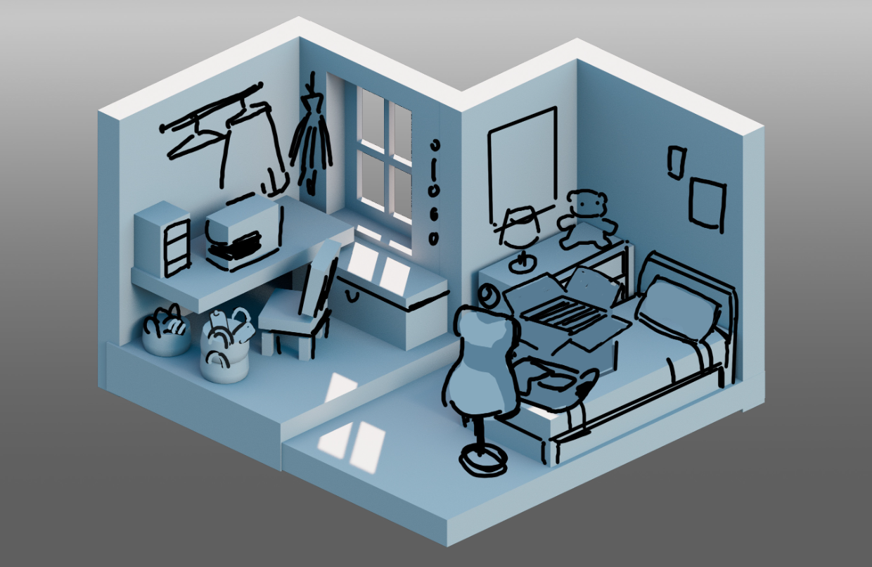
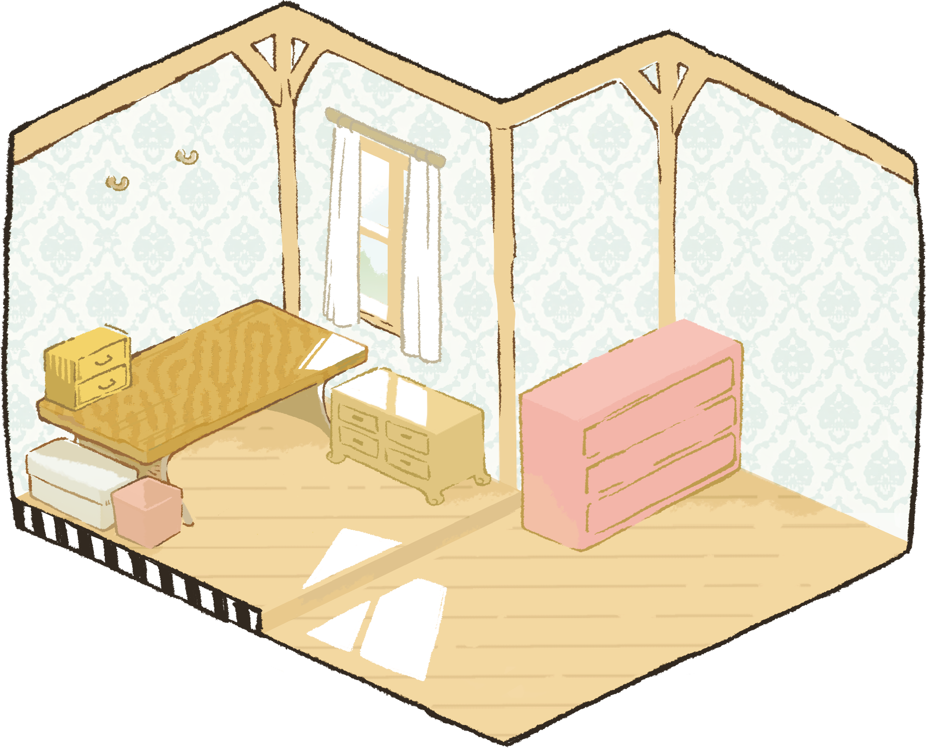
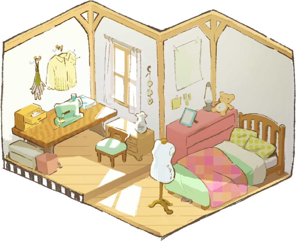
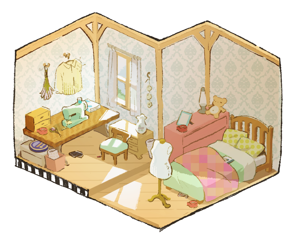
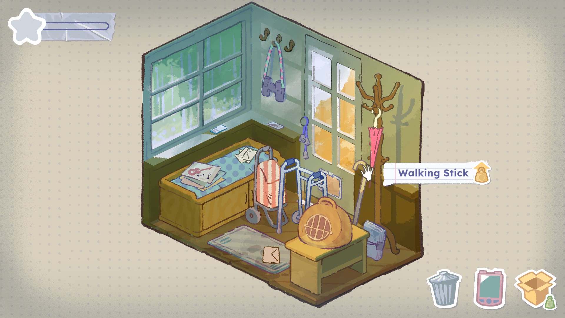
The image that we keep referencing even now that the game is reaching its completion is the sewing room, which was the first level ever made: that room has a lot of character and, even if the style slightly changed through time because of production or art choices, it still encapsulates the vibe we wanted to express.
After that first room, we had to be quite pragmatic and create rules for the art team to have a cohesive style throughout all the rooms, guidelines that could be easily picked up and would allow us to produce assets as quickly as possible: that’s where the art bible becomes essential!
CB: How did you visualise memory without relying on clichés like blur or sepia tones?
LP: I believe memories can recall a wide range of emotions and through time each individual retains what they believe to be the most valuable and meaningful elements of the original experience.
We didn’t want to be too attached to just a nostalgic feeling, we wanted to paint a full picture filled with emotions: we needed all the colours we could have.
Also, this game is not about the past, it’s about how you deal with it now, especially because everything that happens in the past still resonates and influences what we are today.
The experience we propose is very much rooted in the present, it’s very unapologetically real, so no blur or sepia tones could really represent all that.
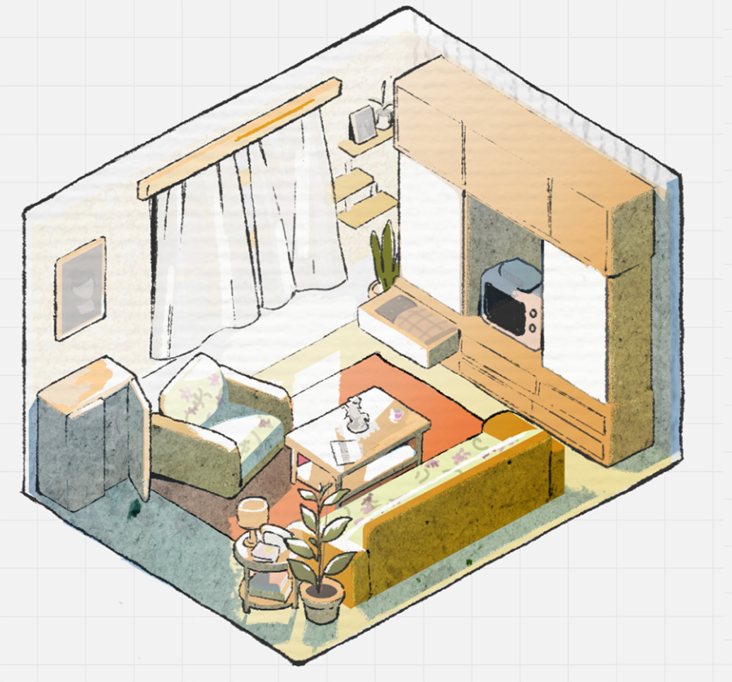
CB: How did you keep the art's colour, shape, and texture emotionally consistent?
LP: We have a comprehensive art bible that explains all the passages and details of the style and how to make usable assets to be implemented on Unity.
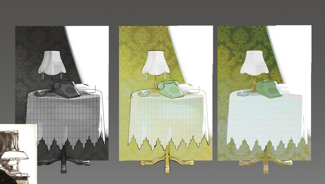
A lot of exploration was done regarding the linework (asking ourselves how thick, what colour, how clean or sketchy) and shading (how painterly or simplified, what colours), but we always had to keep in mind the watercolour look.
That’s why we had the restriction of using just two brushes on Photoshop and a precise structure for the shading and lighting layers as well.
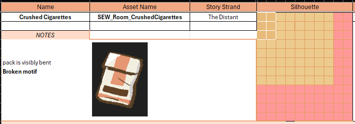
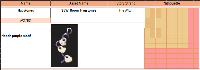
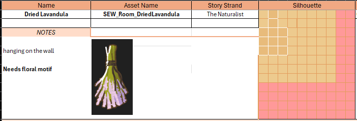
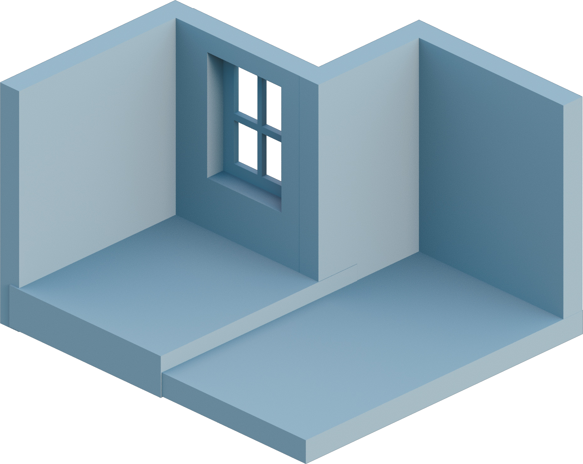
We use a grid and reference size of a wall as template for when we have to draw a new room, so we have consistency in proportions and perspective, also thanks to the 3D blockouts our designer provides to us.
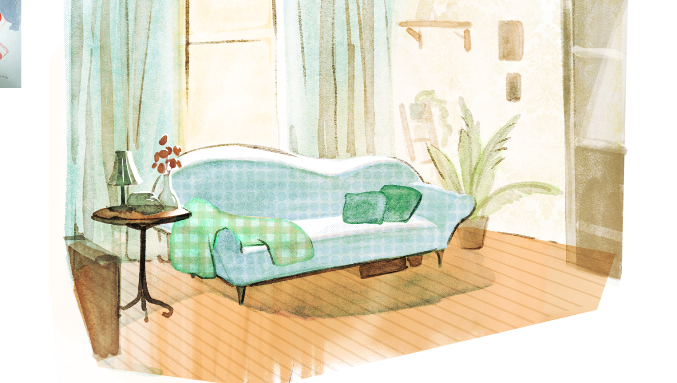
We have a weird treatment for patterns: we decided we wanted them to be flat facing the camera, rather than following the perspective of the room, which gave it a slight collage look.
Sign up to Creative Bloq's daily newsletter, which brings you the latest news and inspiration from the worlds of art, design and technology.
These are just some examples, but we have pages that explain how to approach the project on an art perspective.
On the other hand though, once we mastered those basic rules, we also were able to have each artist’s style to shine through, by allowing small differences that came out depending on how each person draws and interprets the rule itself.
CB: Was there a moment where the concept art had to change dramatically once it was in-engine?
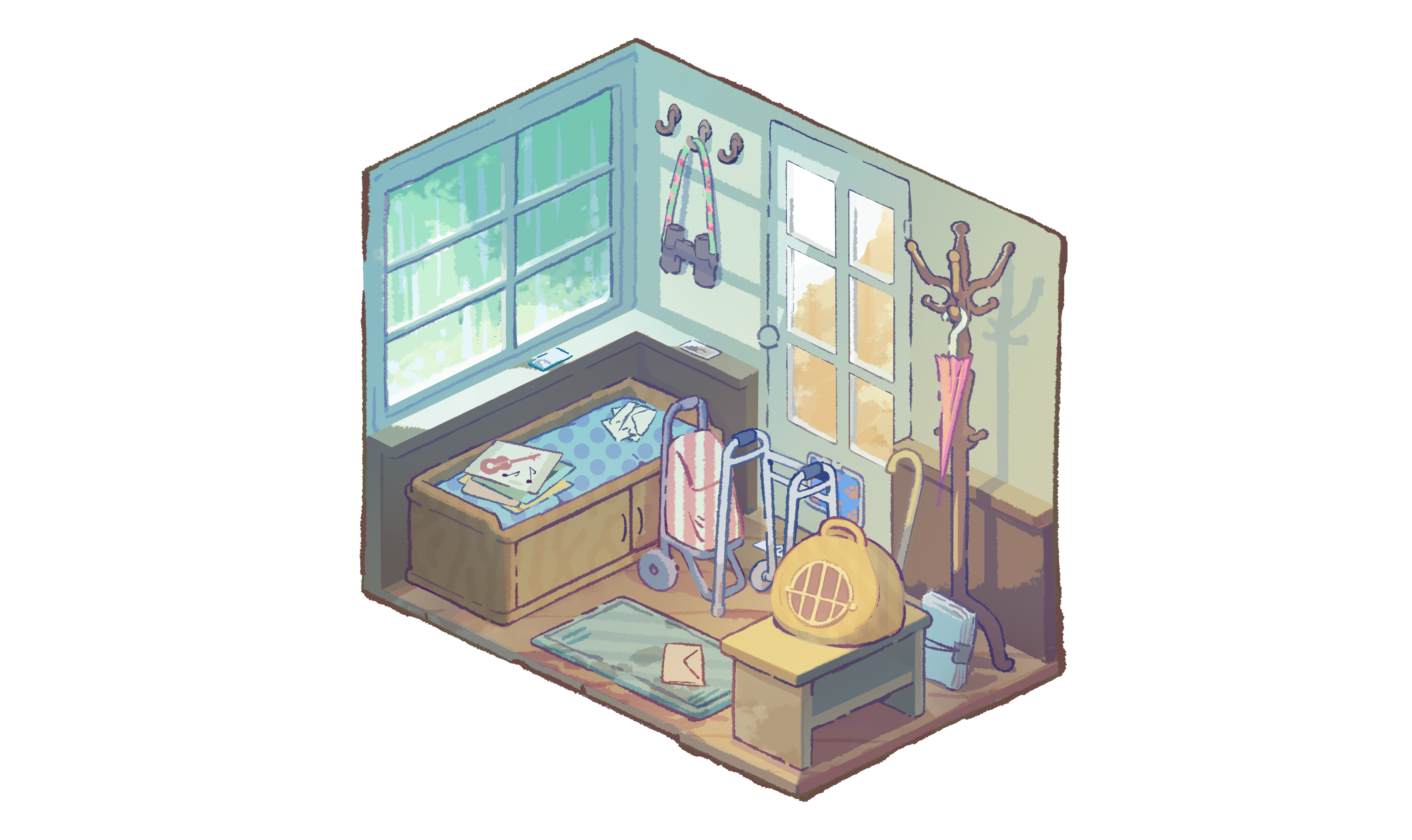
LP: I already mentioned the sewing room, but also the porch had a little bit of a rework at some point, because we realised that the more you go towards an “handmade” look, the harder it is to reproduce that look, and since those were the first rooms made, after developing the art rules, we had to get back to them to adjust whatever looked too much out of place.
We also had to change some colours and lighting of those rooms, either to better match the narrative side (we always have to convey certain emotions within each chapter) or to make corrections on the design of some objects.
Everything about the game is making something very much linked to being a human and feeling emotions, so I believe its art is incredibly important, that’s why lighting and colours play a crucial role.
CB: How much of Tabitha’s inner life is communicated through environment design?
LP: I believe that objects and places sometimes tell more than just a character’s look or dialogue, because they can be quite honest while also giving you certain emotions.
Places retain stories and that’s something we can show through visuals we build (again, colours and light are key) to accompany the player in this narrative experience.
That’s why the house in the game is so eclectic and full of different objects, different vibes and different possibilities for the story you want to create.
Was she a loving mother? Or was she a tormented widow? Did she have a passion for gardening or the occult? All of these?
The player needs to dive in and make their own assumptions by investigating what that person actually was through the objects she owned.
CB: At what point did the team realise that the game required a reflective visual style?
Terry Goodwin: We tried all sorts of different styles and perspectives in the early stages. I initially visualised it as more of a traditional hidden object game, as did Cherish, our Games Writer who created the concept for the game. But once I’d defined the breadth of content we’d need, with over a dozen fully furnished rooms and over three hundred individual items, that presented natural constraints on the way we could build out the game.
Lee Piper, one of the lead creatives of the studio, was heavily involved in the embryonic stages of the project and helped me tremendously with thinking through our artistic goals. Working with our concept artist Adina, Lee pushed me to be mindful of the amount of detail we were putting onto the screen and what that meant not only for the player experience, but also production.
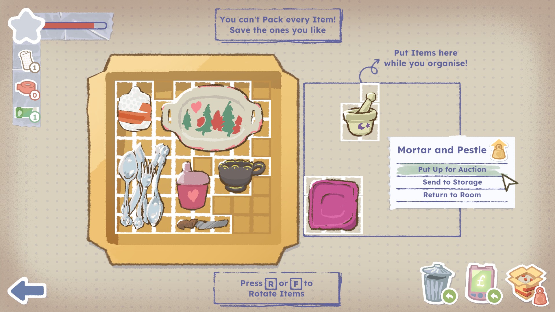
Adina had created a set of items and a packing box in a style that I just adored during that early concepting phase, but Lee convinced me it was too detailed and didn’t reinforce the concept of the game. We reluctantly pivoted again, and that became the style we settled on. He was absolutely right.
CB: How did you balance artistic freedom while maintaining the game's coherence?
TG: We had a very robust pre-production period, which followed a much looser, almost game jam like pre-pre-production period where we prototyped the game mechanically while trying all sorts of directions for the art and presentation. Cherish always had a firm grasp of the different emotional journeys she wanted players to have access to and was quite far ahead of the rest of us in a production sense.
By the time we entered pre-production she’d mapped out each chapter in the game; every room was given a set of themes and a general vibe to reinforce those themes. From there I created a timeline for the game to take place within, and added weather and time of day, which allowed me and Chun, our Art Director, to map out things like the angle of the sun, how light would come into the rooms from outside, whether we needed artificial light.
The art team are really fabulous at working within these sorts of natural constraints, choosing evocative colour palettes and textures to tell Cherish’s story and sell the deliberately vague time period we wanted each room to represent. We established a predictable pipeline very early on which meant we didn’t need to spend a lot of time iterating at all, and Christina, our Producer, could plan our deliveries and they’d deliver them. I could trust their instincts completely.
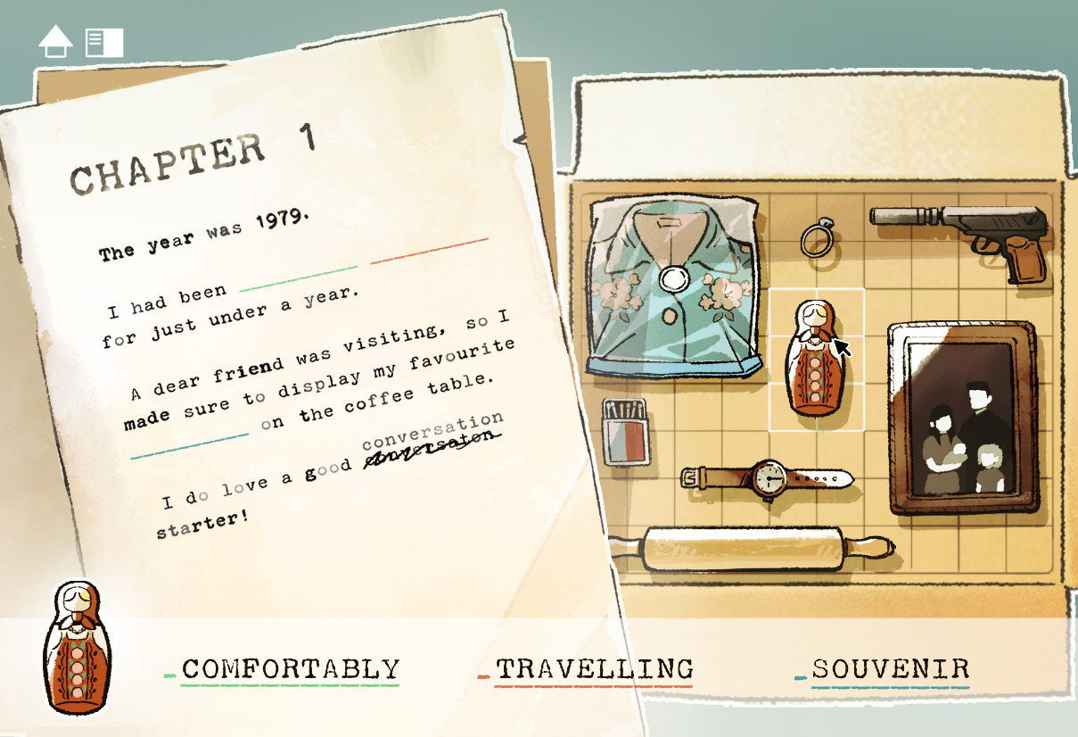
CB: How did 'quiet discovery' influence scale and visual cues?
TG: That’s a real confluence of decisions. One of the development pillars of the game was “Delight,” which challenged us to make exploring every nook and cranny feel rewarding, basic interactions should be fun and surprising – the joy of discovery, in all senses of the word, is a priority.
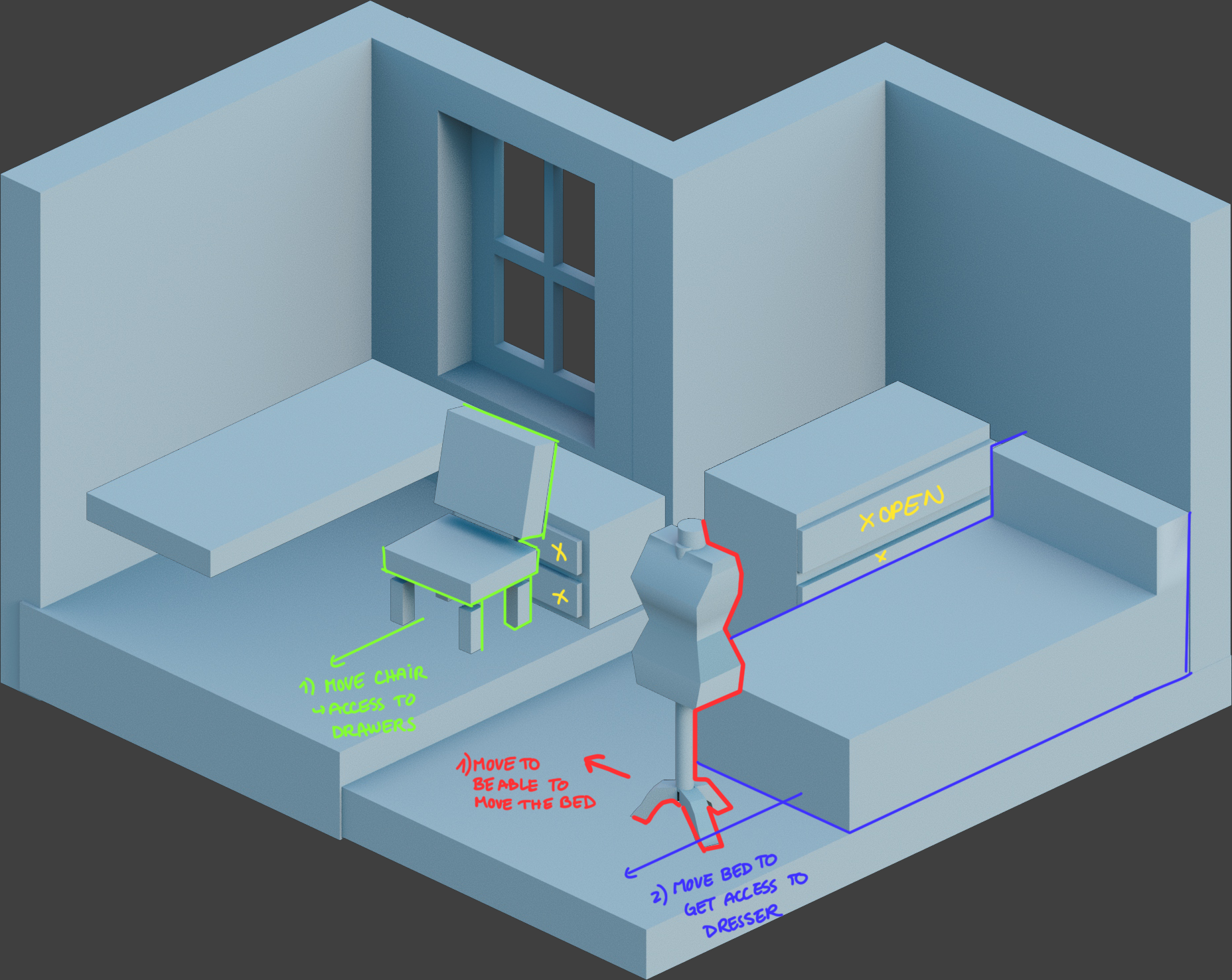
To me, that means if the player understands what they need to do they shouldn’t feel frustrated trying to carry it out. We didn’t want players to be frustrated when trying to pick up items, or open a cupboard, or move furniture.
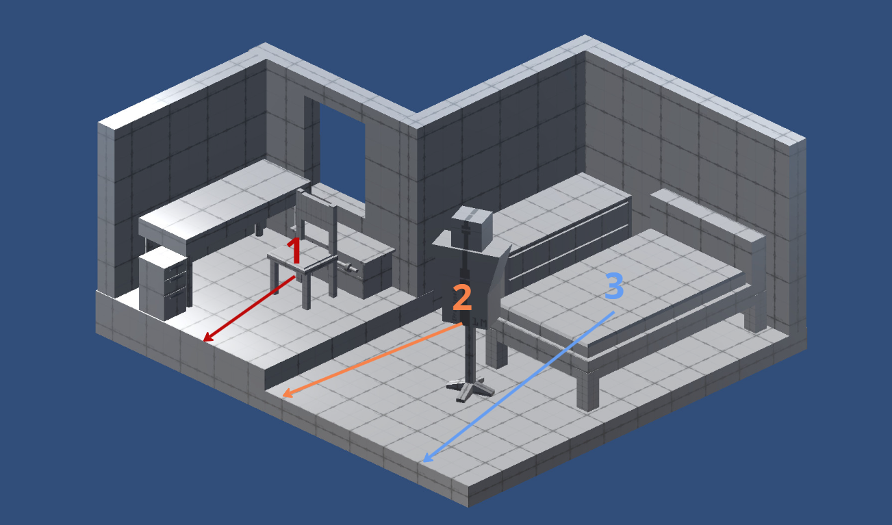
So, for a smooth gameplay experience, this meant we had to pay close attention to the collision areas (the clickable parts) around all of these things, which naturally gave us constraints around spacing of interactable elements. We came to these decisions and realisations through white box prototyping, informing our art rules that came later. It was really about player experience.
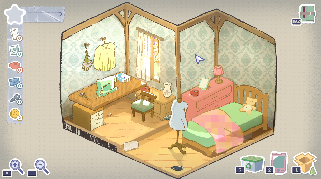
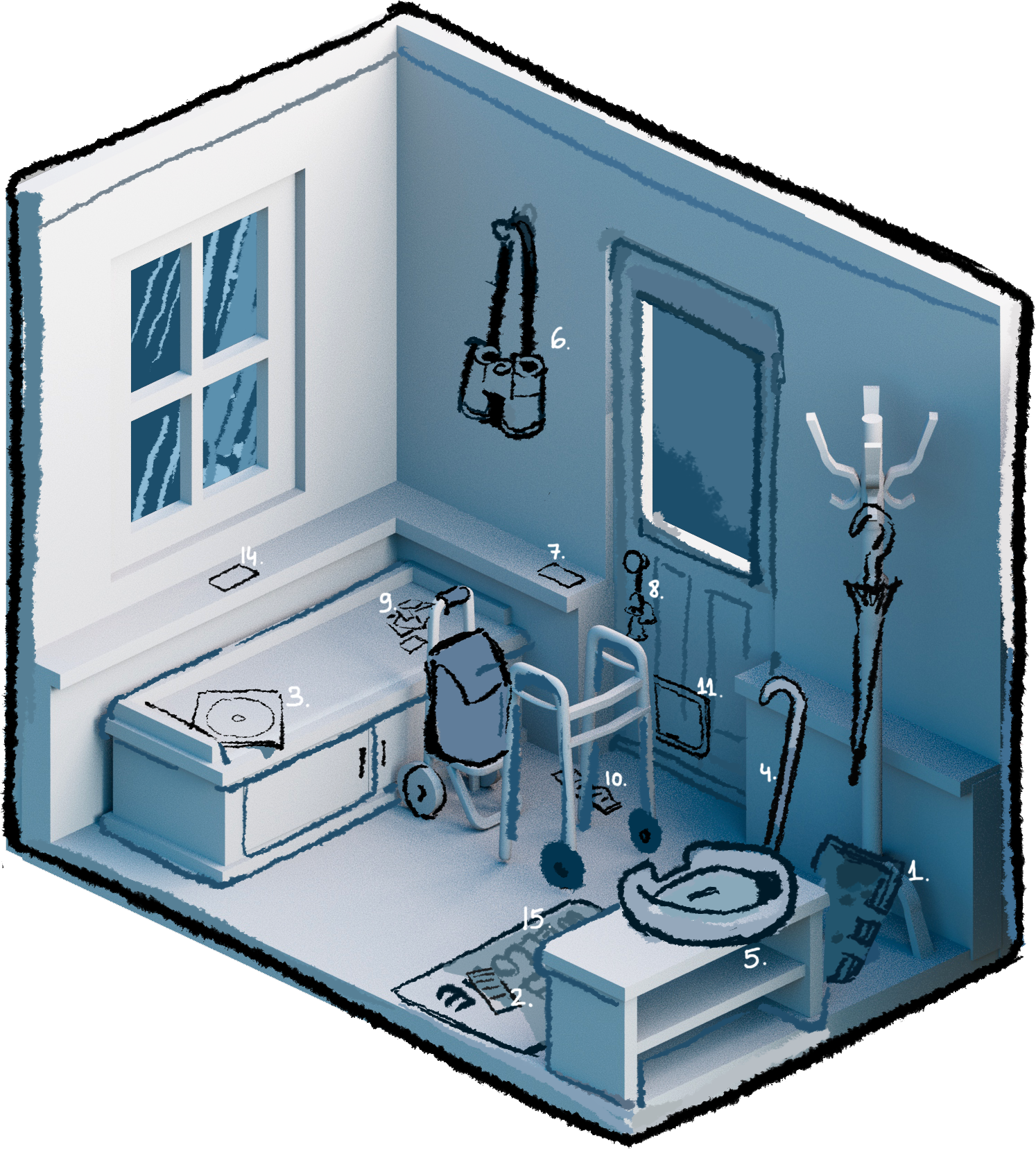
The relationship of scale between things in the room came in a direct line from the story. The process of writing memoir chapters generates the items for the rooms; a passage about quiet rebellion becomes a cigarette packet, crushed from being hidden between the headboard of a bed and a wall, for instance. The next step of creating the rooms is then defining grid shapes of these items, such that we could design them to fit together in various configurations.
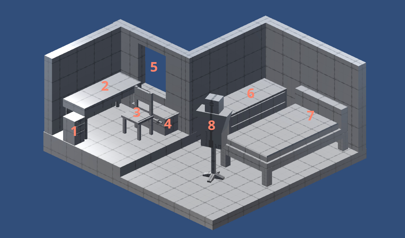
This puzzle leads to the relative scale between the items – which may not be truly reflective of reality, but that’s fine! A white box of each room is designed with crude representations of furniture, so we can make out the movement puzzles, then the items are placed.
This design-first approach to the items and the rooms means the art team have a thoroughly rationalised blueprint to start from to serve the player experience, and can rapidly sketch out line art versions of the rooms, letting us take a wide view of things like density of detail across the environment, how cluttered the room feels (which we sometimes want to accentuate, and sometimes don’t).
CB: Were there moments where the art actively changed the narrative or pacing of the game?
TG: The loose, almost dream-like art style we settled on didn’t lend itself to lots of fine detail – fluctuations in line thickness and seemingly random breaks in those lines were absolutely intentional, to reinforce the handmade feel we wanted, and to support the themes of remembrance, recollection, reflection, but without making anything feel fantastical.
That lack of fine detail naturally meant that our items could never convey things like, for example, small nibbles on a sippy cup, or the well-worn smoothness on the apex of a regularly used walking stick. The intent was to force players to bring a lot of themselves to the game – to consider these items carefully, to imbue their own meaning by filling in those blanks in their head.
We work in close collaboration with our publisher, so we’d get into very deep conversations about all of this, and it was the perspective of a few people at Secret Mode that, actually, maybe we wanted to give a little bit more to the player as a starting position. Maybe we want to give a bit more provenance? Together, we decided on an approach of adding written descriptions for each of the items to compliment the artwork, to fill in just enough of those gaps to hook in players even more.
A blade of grass stuck in the focus wheel of a pair of binoculars is not something we could have conveyed with the art style, but we could with Cherish’s beautiful writing. These lovingly written pieces of history of these items snatch at the emotion of a point in time, and we’ve seen so many players elect to stop and read every one of them before they do anything else, which affected the pacing of the game in the best way.

Now that the game is finished, what do you think the art communicates about memory and identity that the script alone never could?
TG: One of the really interesting things to me about the concept Cherish came up with for this game is the abstraction between the Now half, represented as visual, almost tangible, and the Then half, represented by an incomplete written account.
The script of the game is a confident recount of a series of places and times in someone’s life; the art of the game is about a cosy country house and the stuff currently in it. The connection between the two happens entirely within the mind of the player. There’s no real visual evidence of anything you choose to write about. You decide what it means.
I really wasn’t sure about the direction to have the art style be so heavily rooted in suggestions of shape and detail, next to some of the more detail-rich styles we explored in the concept phase, but it dovetails so perfectly with the concepts of memory that the game asks you to explore within yourself.
Apparently every time you access a memory in your mind, you’re actually accessing a copy, of a copy, of a copy, as far down as you’ve thought about it before, down to the original – which itself, was, imperfect. Every item in the game has a “dreamy” highlight at the top left. Things really aren’t to scale with each other. There are suggestions of faces, but you can never make them out. It’s real life, but maybe one step removed.
Something we found when talking to people about the concept of the game, early on, was just how many people immediately understood the implications of it even half-way through describing the mechanics, because they’d directly had the experience of the setup of the game. Cherish was pulling from her own memories of going through her grandparent’s stuff after they died.
But I’ve never done that. For me, I’ve always been thinking about an elderly friend that I’d helped with groceries and things like that during Covid times when she couldn’t go out. She was preparing to downsize and would give me things from her life: beautiful, ornate wine glasses, a painting of a Venetian canal, a novelty statue of George W Bush that said funny phrases when you pressed a button. Each item would come with an elaborate story, a snapshot of her life. I loved to hear about her lifestyle, so many free experiences.
What stories would I be able to tell about her with those wine glasses, if she hadn’t told me? What would that painting mean to her? The idealised dream-like-yet-real quality of our rooms, with their warm fireplaces and dust twinkling in the sunlight, speaks to memories more half-forgotten than anything in the memoirs.

Ian Dean is Editor, Digital Arts & 3D at Creative Bloq, and the former editor of many leading magazines. These titles included ImagineFX, 3D World and video game titles Play and Official PlayStation Magazine. Ian launched Xbox magazine X360 and edited PlayStation World. For Creative Bloq, Ian combines his experiences to bring the latest news on digital art, VFX and video games and tech, and in his spare time he doodles in Procreate, ArtRage, and Rebelle while finding time to play Xbox and PS5.
You must confirm your public display name before commenting
Please logout and then login again, you will then be prompted to enter your display name.
