Sign up to Creative Bloq's daily newsletter, which brings you the latest news and inspiration from the worlds of art, design and technology.
You are now subscribed
Your newsletter sign-up was successful
Want to add more newsletters?
Animated features introduce a different set of technical considerations into the grading process than live-action films, but the underlying creative priorities remain the same. The animated movie Rally: From Paris to the Pyramids was newly released in Norway and will be presented at the European Film Market in Berlin. Colourist Dylan Hopkin’s role was to refine and guide the visual language established by Qvisten Animation, shaping light, colour, and texture to support story, performance, and pacing, using DaVinci Resolve and Fusion.
“My approach to grading animated feature films is very similar to how I work on traditional live-action features,” says Hopkin. “It always begins with the story, identifying the unique visual qualities each scene has to offer and using them in service of the narrative.”
That alignment between animation and grading was central to the process. “One of the key differences when working on animated features is that more specialised animation directors are often more technically fluent than their live-action counterparts,” Hopkin explains. “They have a deep understanding of how light, colour, texture, and rendering interact to shape the final image.”
Director Rasmus A. Sivertsen has a substantial back catalogue of animated content on his CV, having worked with Hopkin on five previous features, a familiarity that allowed for deeper collaboration across departments on Rally. Hopkin’s background in motion graphics and basic 3D workflows also helped establish a shared creative language.
“That shared vocabulary helps streamline collaboration and problem-solving throughout the process,” he says. The brief itself was deliberately restrained. “It was to create an organic look that pops in a joyful way. We always showed respect for the original creative intent of the images: a good grade should not draw attention to itself.”
A core principle throughout the film was shaping light to guide the audience’s attention, maintain contact with character performance, and preserve a filmic sense of density and depth. Below, Hopkins outlines how that approach was applied across the film’s key environments using DaVinci Resolve.
Carry on reading to learn Hopkin’s grading process for Rally: From Paris to the Pyramids, in his own words. For more colour grading advice in DaVinci Resolve, read how Santiago Menghini used the software on Babiru.
Sign up to Creative Bloq's daily newsletter, which brings you the latest news and inspiration from the worlds of art, design and technology.

Collaboration and calibration
When it came to handling hues and saturation, I relied heavily on the ColorSlice tool to create a sense of deep subtractive saturation. The more saturated a hue is, the deeper the hue gets. During this type of correction, it is important not to overly affect the hues of brighter luminance, as they become too flat. This is especially important with skin tones.
Denser hues mimic the feeling of saturated hues shot on film-emulsion. This technique was used on every single shot, including the titles.
Director Rasmus A. Sivertsen was my main collaborator throughout the grade. We’ve worked together on five animated features, and he is an incredible storyteller who has a clear understanding of both narrative intent and technical detail, which helps keep creative decisions focused and consistent.
Before the first grading session, I organised the film into scene-based groups. This is central to my workflow, as it simplifies how I visualise shots relating to one another and allows scene-level look adjustments once initial balancing is complete.

A few weeks earlier, we had graded the main trailer, which gave us an early opportunity to establish looks across a range of scenes. Those grades became useful starting points and were carried into the feature using Resolve’s ColorTrace tool.
Our first grading day together focused on two to three shots per scene to establish tonal direction, resulting in a library of hero shots. I then balanced the film independently before review sessions with Rasmus, where adjustments were made, and notes logged.
I use a dedicated still album to capture timecode-accurate notes, which allows me to access specific shots quickly. Compositing supervisor Johannes Evje Gustafsson joined one mid-stage review to align grading and compositing. The full grade, including prep, took around 80 hours and followed a structured, iterative review process.
1. Flåklypa village
The native village where our main heroes live has a grounded look of rural Norway. Rougher on the edges and a broader use of earth tones and faded surfaces. Apart from the gentle use of the ColorSlice tool to enrich the saturated hues, I made sure we had our full attention on our heroes by shaping light with power windows and using the global exposure in the HDR Grade tool to bring the characters closer to us.
2. Experimental super fuel
Rasmus wanted to increase the visibility and potency of the fuel canister throughout the movie. To add extra emphasis to the experimental ‘super fuel’ derived from cow flatulence (Metan Rapido Potente), I used a Magic Mask for selection and manipulated the yellow-green hues of the liquid to create a slightly more vibrant green mixture.
3. Il Tempo Gigante
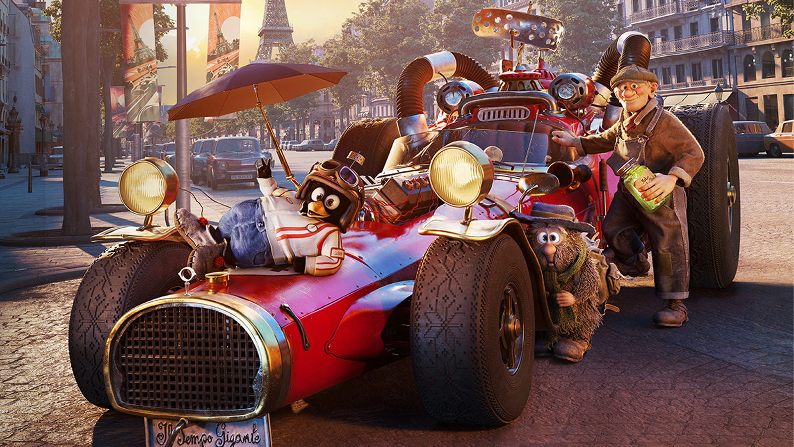
To enhance the red Italian sports car paint on the hero race car “Il Tempo Gigante”, I used the ColorSlice tool to fine-tune the car paint and tweak the subtle red-tonal ranges. The hue must not lean too much towards orange-red or magenta-red, but maintain a perfect sweet spot in various light conditions.
4. E-LUX HQ
Rasmus wanted a lush, glorious, saturated LA-tech billionaire vibe for evil mastermind Ellen Busk´s E-LUX HQ. I accentuated colour separation between warmer hues against a subtle purple hue in the sky. We also added subtle glows and diffusion to make the room feel high-tech and expensive.
5. The Race – Paris
The race locations are more vibrant than the more mundane rural village where our heroes, Solan, Ludvig, and Reodor, originate.
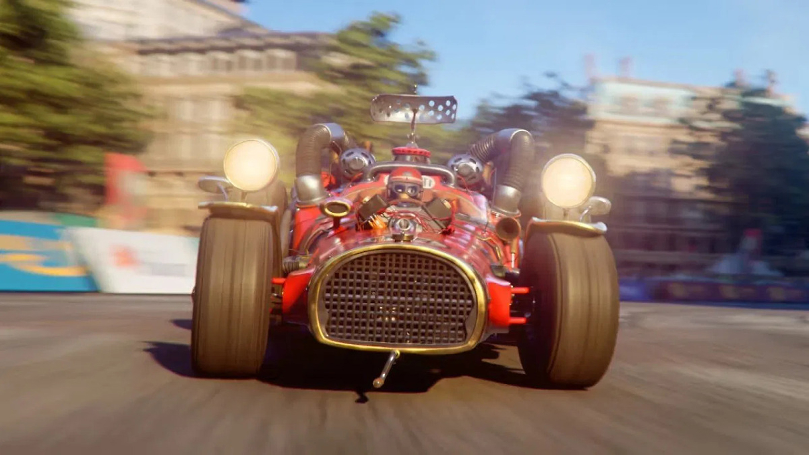
When rotating hues toward other hues, e.g., creating a more stylistic feeling where the blue and cyan hues were compressed towards each other, I relied on the hue-vs-hue curves. This hue-shift was used throughout the race sequences to create a slight ‘heightened Hollywood’ touch that made the skin tones pop slightly more by narrowing the colder tones of the colour palette.
ColorSlice was used to create the deeper saturated colour tones.
6. Shaping light in action sequences
During one of the most intense racing scenes along the shores of Italy, Reodor – driving Il Tempo Gigante – has to overcome a sabotaged bridge. For a dramatic moment like this, it is extremely important to focus on the hero racing car. I used carefully placed power windows (masks) to locally darken and lighten specific areas to lead the audience towards the car.
This technique is something I used on many shots throughout the movie. Shaping light is a huge part of grading, which basically embraces old-school ‘dodge and burn’ methods from still photography.
7. The desert (Egypt)
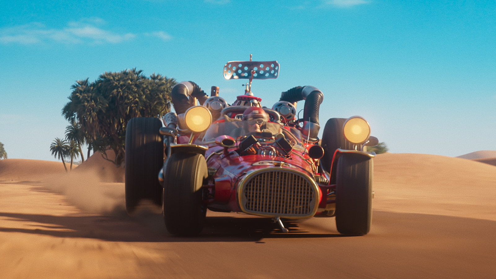
For the desert scenes, the action is nearing the climax. Rasmus wanted the audience to feel the sweltering heat and intense action; at the same time, we pushed the look slightly closer to a Hollywood blockbuster palette.
Power Windows (masks) were locked onto the drivers’ faces by using the powerful tracker in Resolve. Deeper saturated hues were yet again created with the ColorSlice tool, and we used the Camera Shake OFX to intensify the sense of speed.
8. Using Fusion for analogue TV effects
Throughout the movie, the local TV station, Flåklypa TV, provides coverage of the race. Rasmus wanted the TV studio to feel old-school and in a slight state of disrepair. For this, I exaggerated the spotlights and created localised colour imperfections. I also made a Fusion comp including Analogue Damage OFX for interlacing lines/chroma noise/ghosting, Prism Blur OFX & Lens Blur OFX to create lens imperfections towards the edge of the image, and utilised a Displacement-node powered by real interference footage from old televisions.
It was fun to do some lightweight effects work in addition to colouring!
9. Texture and stylisation
Rasmus was keen to bring a sense of semi-realism to the images to avoid creating an overly digital-looking finish. Early on, he asked for suggestions about adding texture with film grain. I used the built-in Resolve Film Grain OFX plugin to come up with some options, and we ended up using a subtle film grain based on a modified 35mm preset. I find that grain is really helpful during grading, especially for animated features. Just remember that a little bit goes a long way: don’t over-season the images.
The 3D images were delivered as EXR-sequences (ACEScg) and graded in an ACEScct-project for the theatrical release. It’s hugely beneficial to use an industry standard pipeline like ACES, as I get to see the images from exactly the same starting point as the artists at Qvisten Animation, which gives peace of mind to all involved.
I used colour space-aware grading tools like the HDR grade tool to perform exposure and white balance adjustments, which keep the manipulations photographically correct. The HDR grade tool is also really powerful for creating specialised contrast/saturation/white balance adjustments on user-defined tonal ranges called ‘zones’, which is very important in maintaining image clarity.
Visit the Rally – From Paris to the Pyramids website for more details, and Blackmagic Design for more DaVinci Resolve and Fusion.

Ian Dean is Editor, Digital Arts & 3D at Creative Bloq, and the former editor of many leading magazines. These titles included ImagineFX, 3D World and video game titles Play and Official PlayStation Magazine. Ian launched Xbox magazine X360 and edited PlayStation World. For Creative Bloq, Ian combines his experiences to bring the latest news on digital art, VFX and video games and tech, and in his spare time he doodles in Procreate, ArtRage, and Rebelle while finding time to play Xbox and PS5.
You must confirm your public display name before commenting
Please logout and then login again, you will then be prompted to enter your display name.
