






How do you rebrand a 200-year-old institution that wants its new logo to "feel like plants"? Plants are constantly changing; they grow, wilt, bloom, move in the wind, shed their leaves and sprout new ones. Captivating that in a permanent identity built to last years might seem like an impossible task.
And yet the new identity for the Pennsylvania Horticultural Society achieves it. The logo is a clear candidate as one of the best animated logos, and the blooming rebrand also includes one of the most beautiful brand manuals I've seen. There's even a flipbook, further demonstrating the dynamism of the mark.

Turning 200 years old in 2027, the Pennsylvania Horticultural Society is only 50 years younger than the US as an independent country. To mark its upcoming anniversary, it brought in local design agency Smith & Diction to create an identity that better represents the breadth of what it does, from urban greening to landscaping parks and the City Harvest initiative.
The existing logo design was fairly generic. It could have been the identity for a financial institution – or even a retirement home, as Smith & Diction point out. Depicting a single tree, it hardly represented the rich diversity of the plant kingdom. What kind of tree was it supposed to be anyway?
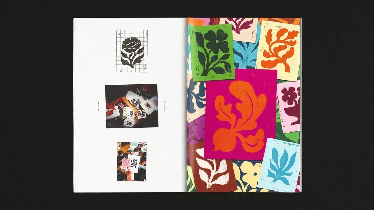
The agency's solution was a three-letter logo in which the letters become roots, with a different species of native plant growing from each. Smith & Diction says the process began with the illustrations. Summer McClure drew the plants and flowers within rectangles, chosen to represent Philadelphia's grid layout of city blocks.
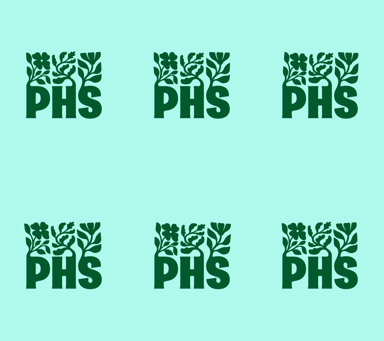
Image credit: Pennsylvania Horticultural Society / Smith & Diction

Image credit: Pennsylvania Horticultural Society / Smith & Diction
The logo was then animated. Henrique Barone drew the plants growing from the letterforms, frame by frame. This allowed the creation of the flipbook (see the Instagram post below) as well as the final animation, which feels like a timelapse video from a nature documentary. A second animation was made by Justin Lawes to show the plants moving as if swaying in the breeze.
The result is a strong, versatile and dynamic logo that represents nature, the city grid, the PHS's work to unite them.
The logo's backed up by further custom brand illustrations based on native flora for social posts and things like menus and signs. There are also floral illustrations for sub brands, including a peony for the PHS's annual flower show.
The beauty of this system is that it introduces another way in which the branding can grow like a garden. The idea is that the PHS can host workshops where people will be able to draw their own florals to fit the same dimensions, or make their own linocut prints.
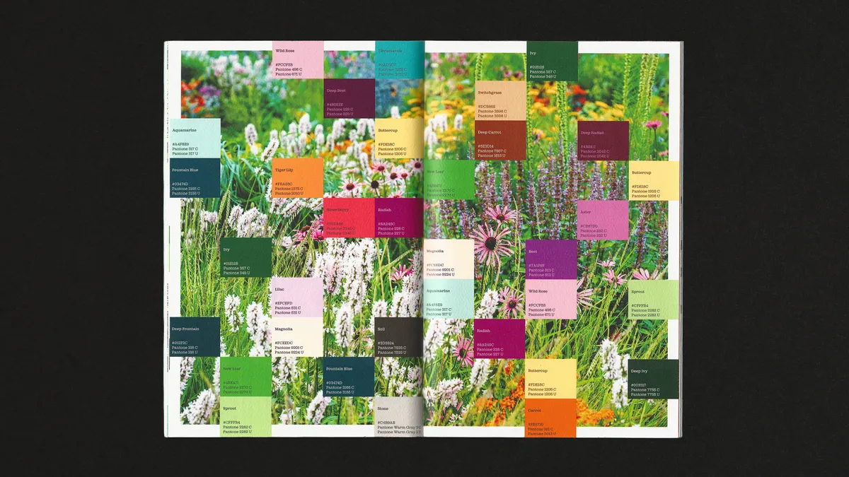
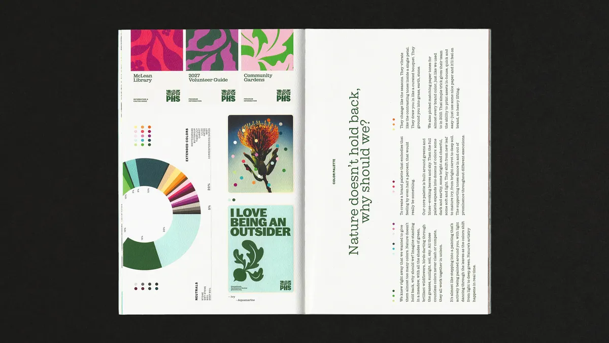
The colour palette is also unconventional, again reflecting the diversity of plant life. While there's a core set of greens and blues, the palette expands to contemplate dozens of colours. As for type, Caslon Doric is the lead, backed up by the elegance of ES Park, a choice inspired by the practical simplicity of old PHS exhibition posters.
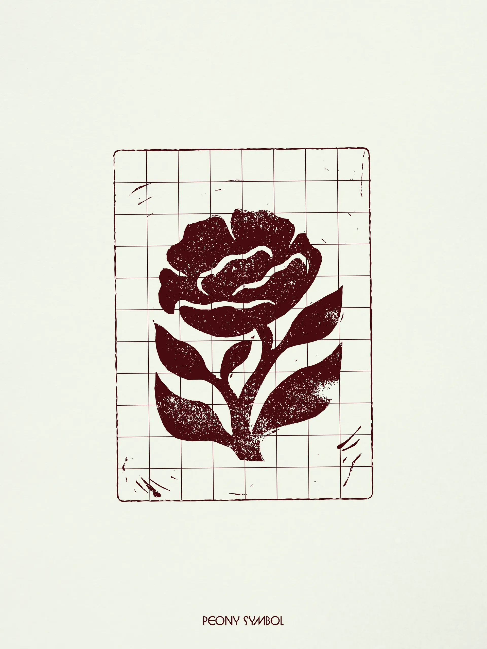
Image credit: Pennsylvania Horticultural Society / Smith & Diction
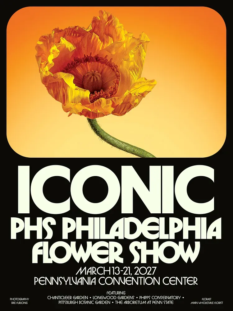
Image credit: Pennsylvania Horticultural Society / Smith & Diction
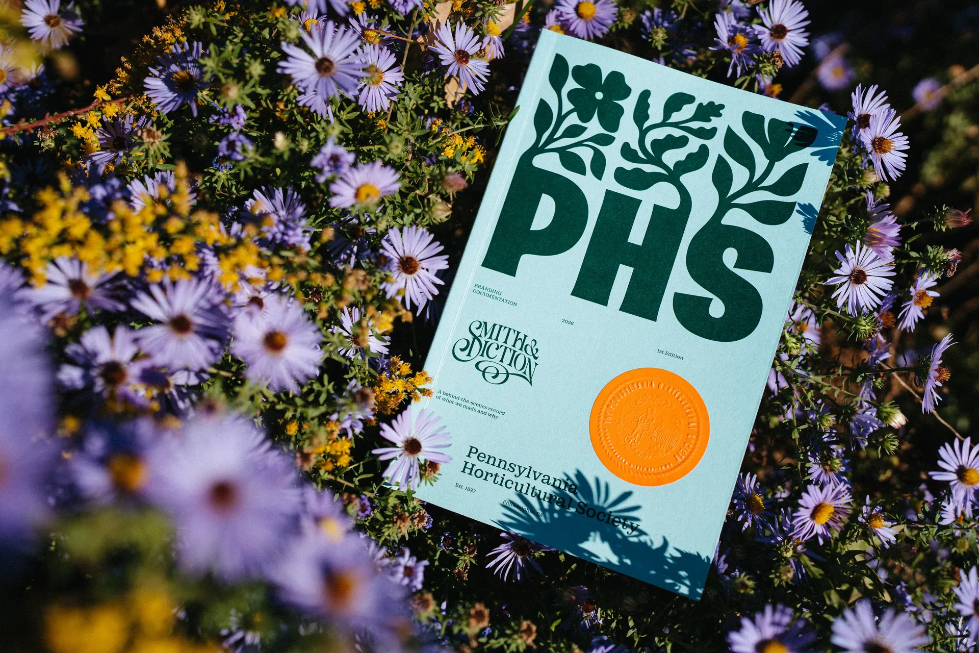
It's one of those projects that's blurs the line between brand design and art. That's apparent in the decision to produce a physical brand book, which was "designed as a reminder to touch grass and hold books".
"Making a shiny digital case study to talk about our partnership just felt inauthentic," Smith & Diction explains. "This isn’t a shiny digital brand, it’s rooted in the tangible: grass below your feet, warm sun on your face, the sound of birds chirping to one another from neighboring trees."
You can purchase a copy of the book for $60 for which you also get the flip book, a lapel pin and a poster.