Pantone reveals its Colour of the Year 2017
Colour expert Pantone has selected a refreshing colour to represent 2017.
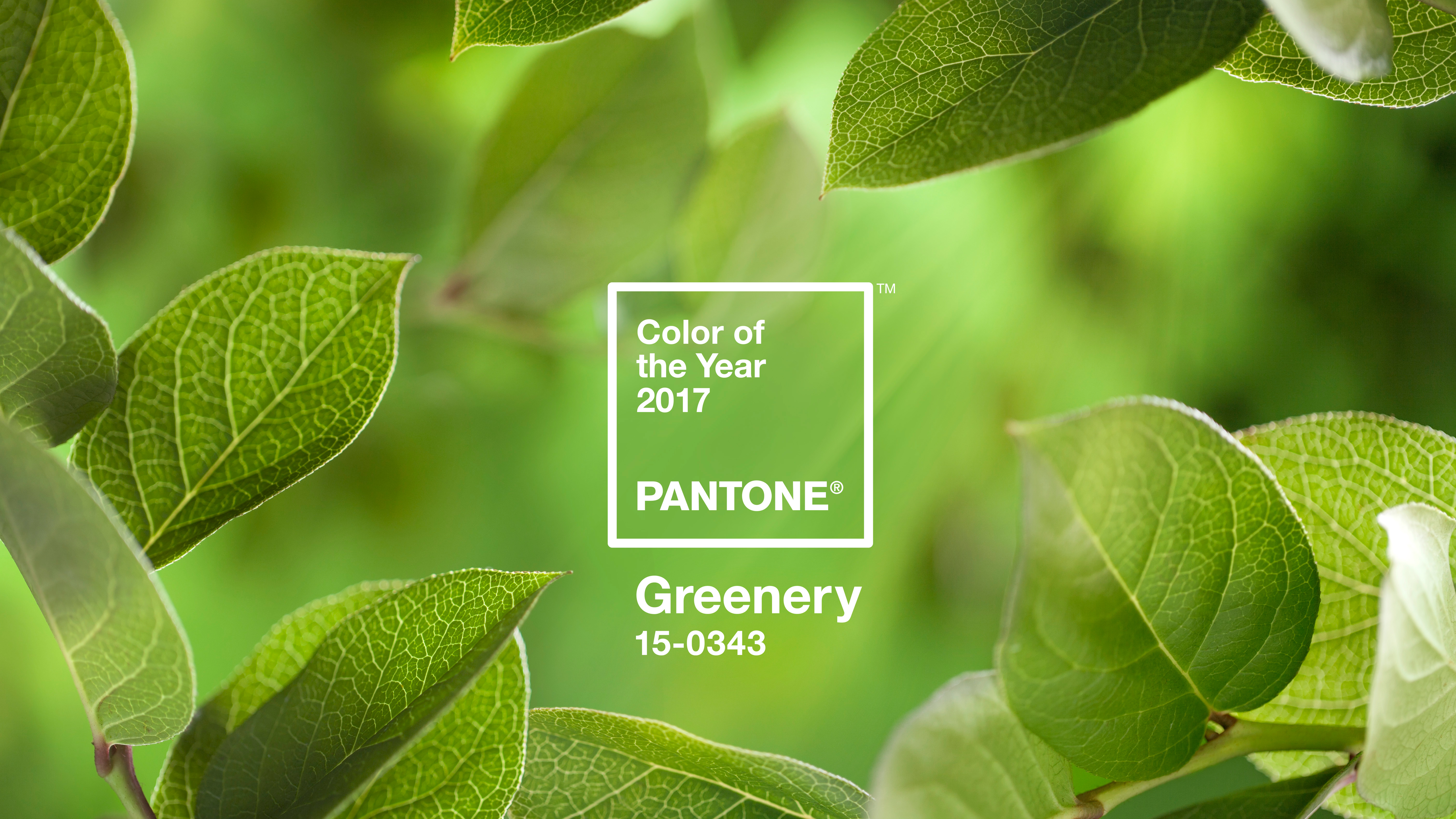
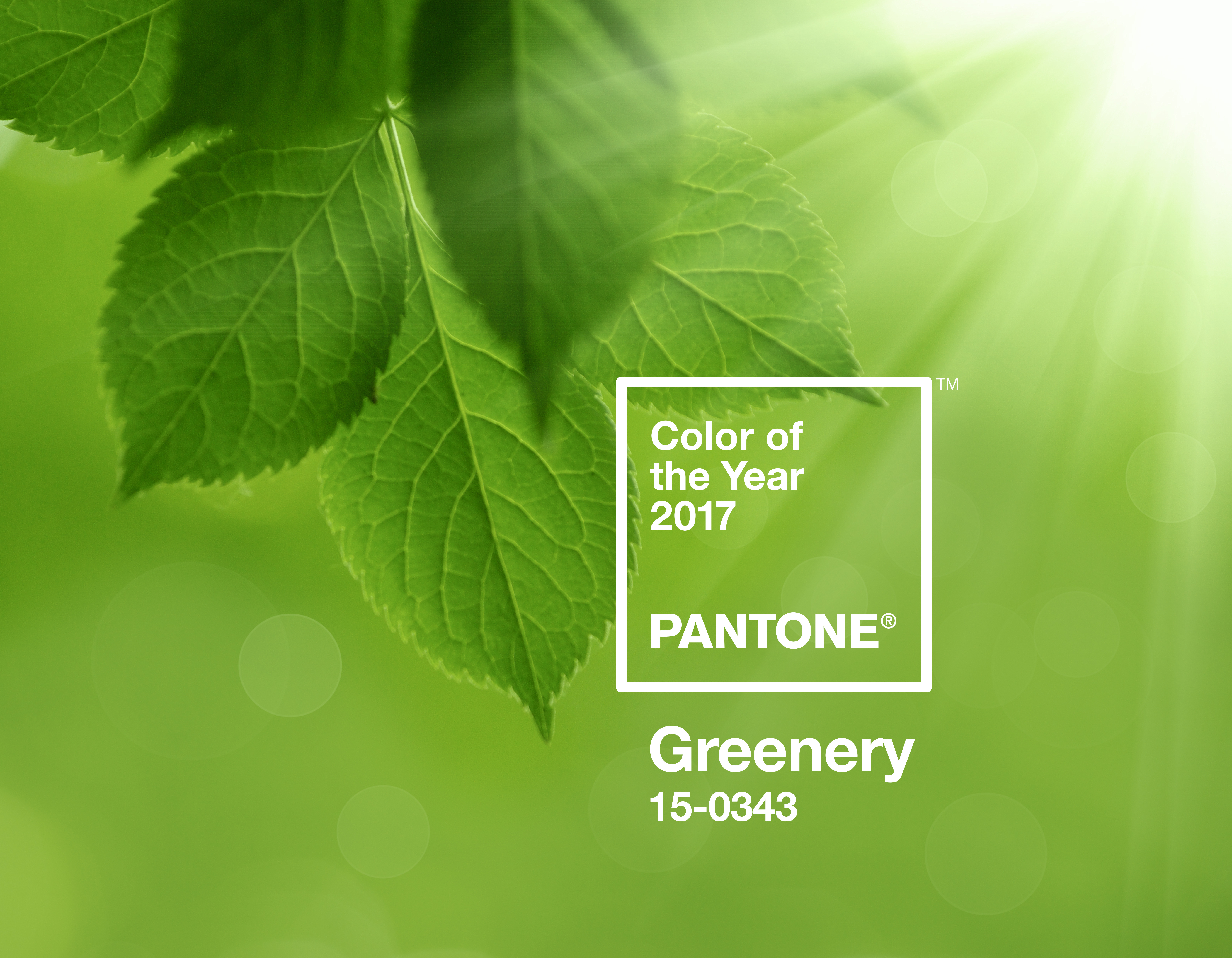
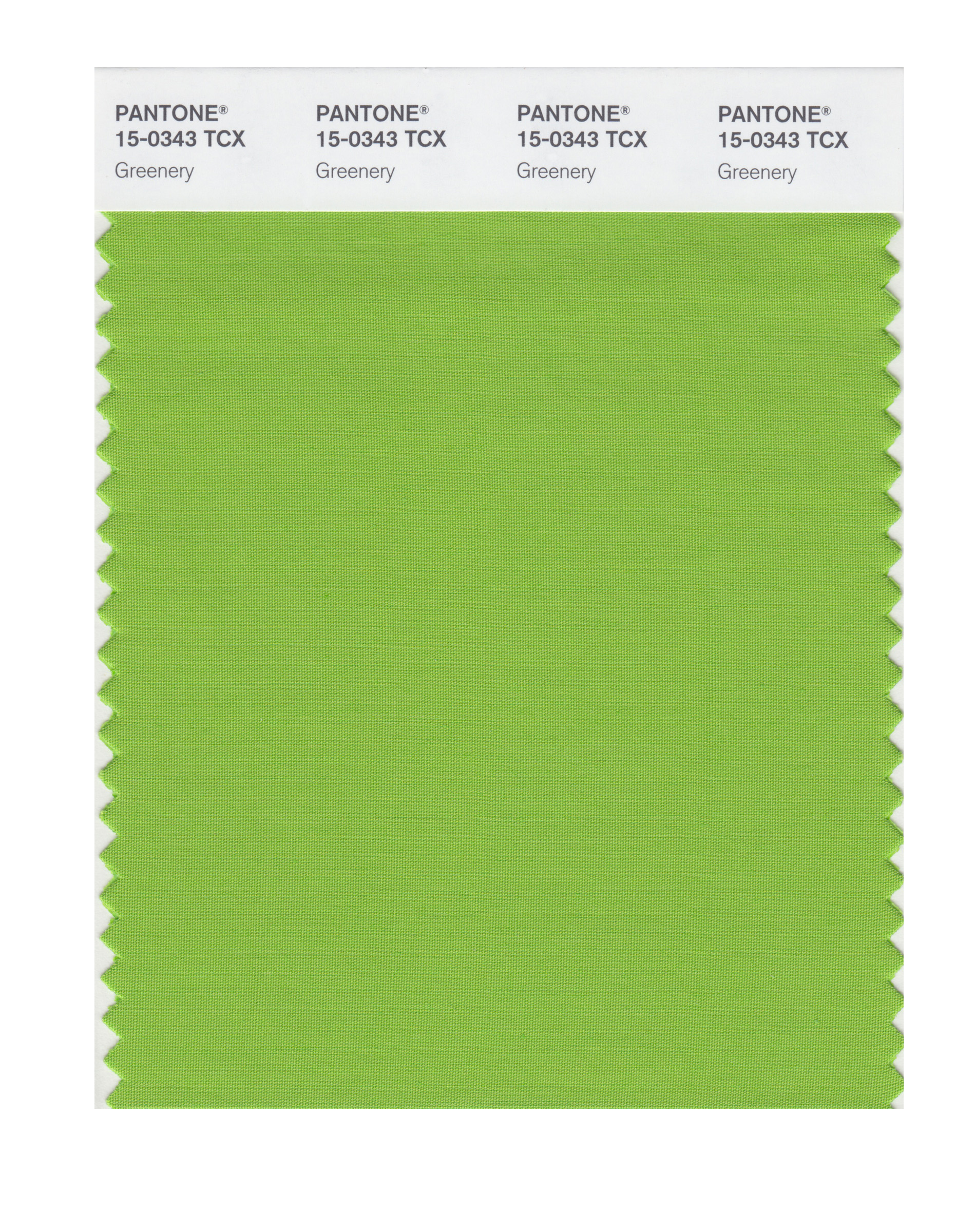
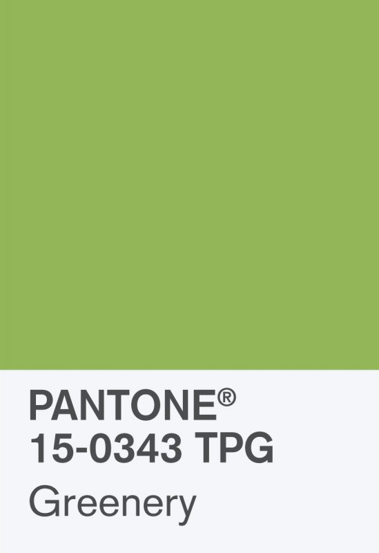
The global authority on colour, Pantone, have just announced that their Colour of the Year for 2017 is the refreshing PANTONE 15-0343 Greenery. This zesty yellow-green shade is the perfect palette cleanser for 2016, which coincidentally enough was represented by a combination of bruise-like hues which you could argue perfectly summed up the year ahead.
Under the direction of Leatrice Eiseman, Executive Director of the Pantone Color Institute, a team of ten collected a wealth of global influences to showcase the zeitgeist in colour. This took into account trends in the entertainment and film industries, as well as fine art, fashion, and lifestyle habits.
“While Serenity and Rose Quartz, the PANTONE Colour of the Year 2016, expressed the need for harmony in a chaotic world,” said Leatrice Eiseman, “Greenery bursts forth in 2017 to provide us with the hope we collectively yearn for amid a complex social and political landscape.
Article continues below"Satisfying our growing desire to rejuvenate, revitalise and unite, Greenery symbolises the reconnection we seek with nature, one another and a larger purpose.”
Get a good look at the new colour in the gallery below, and expect to see it influencing the choices of creative directors in the year to come.
Coincidentally, the latest issue of Computer Arts magazine covers the colour trends of 2017. Pick it up in stores tomorrow or buy it online.
Related articles
Sign up to Creative Bloq's daily newsletter, which brings you the latest news and inspiration from the worlds of art, design and technology.

Dom Carter is a freelance writer who specialises in art and design. Formerly a staff writer for Creative Bloq, his work has also appeared on Creative Boom and in the pages of ImagineFX, Computer Arts, 3D World, and .net. He has been a D&AD New Blood judge, and has a particular interest in picture books.
