Why Apple's 'Hermès' orange iPhone is going viral in China
Orange really is the new black.

Sign up to Creative Bloq's daily newsletter, which brings you the latest news and inspiration from the worlds of art, design and technology.
You are now subscribed
Your newsletter sign-up was successful
Want to add more newsletters?
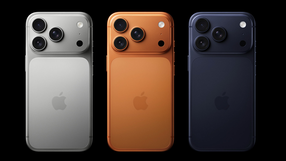
If there's one design area in which Apple tends to play it safe, it's colour. For a long time, the only options available for the iPhone were silver, grey or silvery-grey. Back then, the idea of a 'Cosmic Orange' iPhone was, well, cosmic.
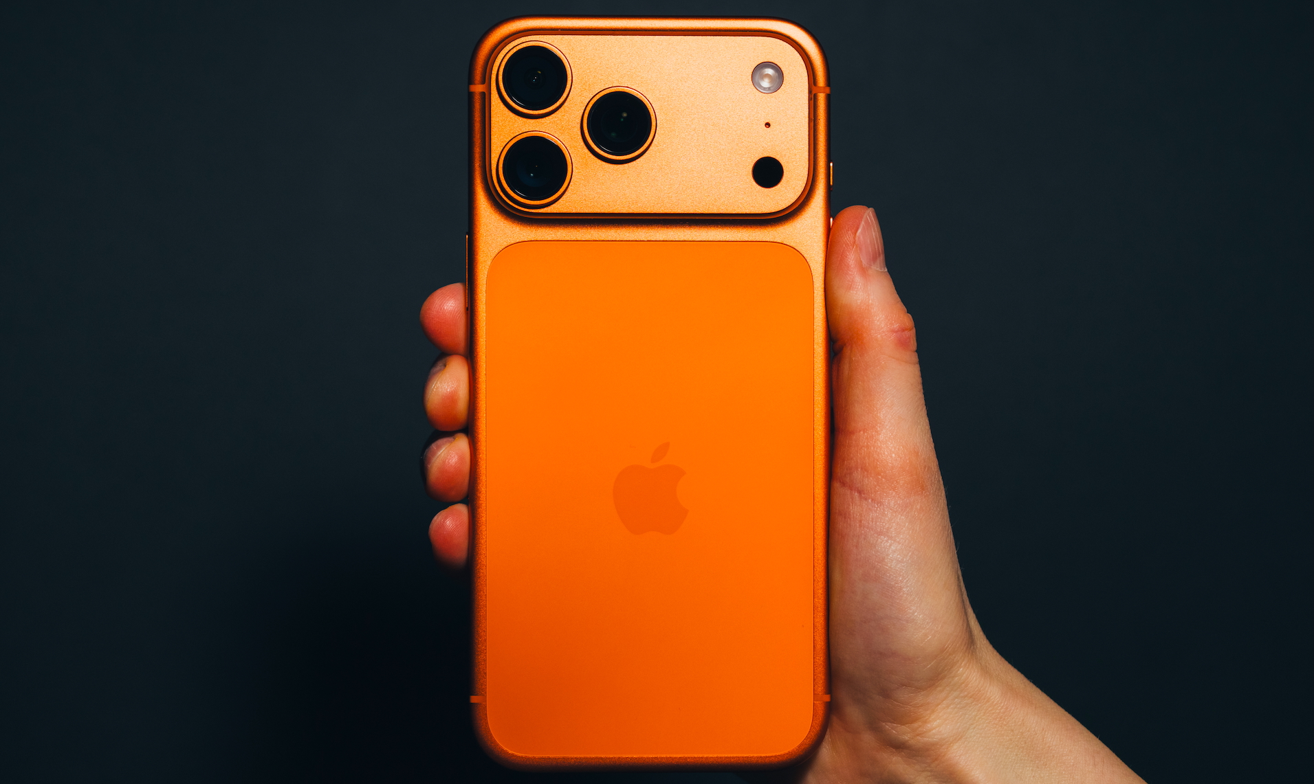
It's no surprise that 2025's orange iPhone 17 Pro has proven a huge hit – after a strong of muted hues, it's the first ostensibly flashy 'Pro' iPhone Apple has ever made. The best iPhone for photography is also the brightest – and it's proving particularly popular in China.
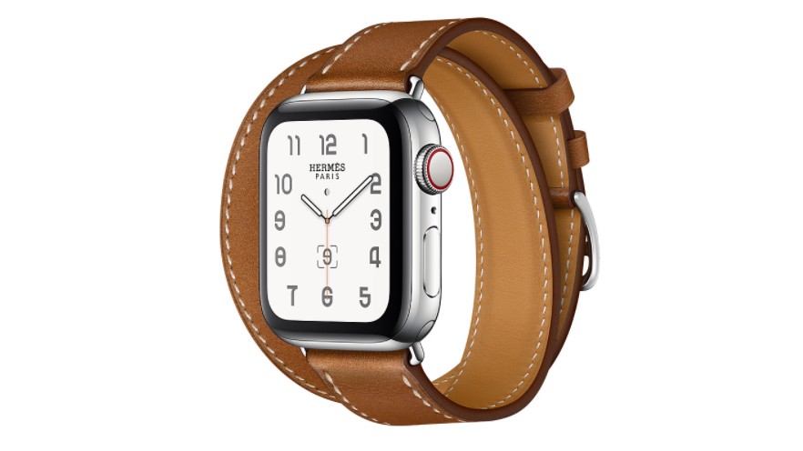
According to Financial Times, Chinese Apple fans and content creators have dubbed the colour 'Hermès orange’, "for its resemblance to the French luxury brand’s signature hue".
Article continues below 
iPhone sales have seen a 38% rise in China, reversing a years-long sales slump, and analysts are attributing it to the renewal of the 'status symbol' quality afforded by that splashy new orange.
“It sounds simple, but it’s the external obvious changes to design, which includes the introduction of a shout-out orange colour, that pulled out early upgraders,” IDC senior research director Nabila Popal told Financial Times.

Apple has been accused of stagnating from a deign perspective for a while now, with product updates looking increasingly incremental both inside and out. Indeed, the 17 line up represented its boldest aesthetic drop in years, and its success should surely be a lesson for the company – users need bold new designs to tempt them to upgrade.
And with a new MacBook Pro redesign rumoured to be arriving as soon as this year, perhaps Mac users will find themselves similarly tempted in 2026.
Sign up to Creative Bloq's daily newsletter, which brings you the latest news and inspiration from the worlds of art, design and technology.

Daniel John is Design Editor at Creative Bloq. He reports on the worlds of design, branding and lifestyle tech, and has covered several industry events including Milan Design Week, OFFF Barcelona and Adobe Max in Los Angeles. He has interviewed leaders and designers at brands including Apple, Microsoft and Adobe. Daniel's debut book of short stories and poems was published in 2018, and his comedy newsletter is a Substack Bestseller.
You must confirm your public display name before commenting
Please logout and then login again, you will then be prompted to enter your display name.
