Colour is one of the most important tools an artist has. The way you use your palette has a significant impact of the mood of your piece and how it reads to the viewer. The same principles that guide line, shape and value design are all relevant to colour (also see our guide to colour theory).
Contrast, rhythm, texture, variety, shape… colour is just one more lane where you get to play with all that stuff. It can be scary for new artists, but it’s the bit you get to have most fun with. If art were a meal, the values are the protein and the colours are the spices. When you nail the values and shapes, the colour is very forgiving.
01. Simplicity and rest
When realism is your goal, the colour of the light sources is the guiding factor in your colour design. If leaning into abstraction, it’s an endless playground. The goal is for you to understand that colour is here to make your life easier.
It’s one of the most emotional and instinctual ways to express yourself, as opposed to slightly more technical skills, such as perspective.
02. Colour framing
Now, take that concept and make it big. By grouping large sections of the art together with purple and blue, I’ve taken a complex list of illustration needs and simplified them into something that won’t overpower the text of the magazine cover.
The purple of the rocks and dragon create an implied frame around the centre of the image, and the big patch of blue at the top frames the title text.
03. Colour temperature
Colour design is deeply emotional and personal. Some concepts are learned from experience, like red being a colour of heat (fire), love (blushing) and brutality (blood).
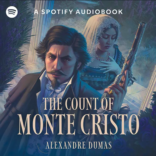
This piece is the cover I did for Spotify’s The Count of Monte Cristo audiobook, a story about betrayal, imprisonment and the count’s personal mission of revenge. He sees it as his personal mission from God. The colour scheme is meant to reinforce that.
The cool blues, which are more stage lighting than realistic moonlight, represent the tragedy these characters are each experiencing. Mercedes is bathed in it, because very little about her situation is enviable. The count has that blue across half of his face, to show the duality of his story.
Nature can be ignored. I’ve pushed the moonlight a lot further than nature would allow, because I’m here for the drama. In nature, darkness means a lack of colour, but this is art, and we’re here to tell a story. These decisions are where your personal style comes out
Hue, value and saturation
The warm light of the off-screen oil lamp is hot, like the count’s slightly absurd but entertaining mission. That heat is important.
You can try to categorise colour temperature by hue, but value and saturation play a big part as well. A really light, high saturation electric blue can feel warmer than a dark, muddy red. It’s different for each person.
It’s art. Where you put contrast communicates to the viewer. Since most of this piece is cool, the warm parts stand out, which is why I’ve kept most of them around the count. He should be the first read.
04. Colour as rhythm
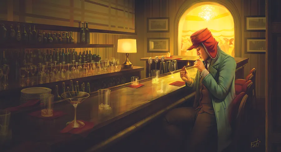
As I know colour can lead the viewer’s eye, it’s also important to consider the rhythm of that pathway. The fast and hard staccato of heavy metal drums hits differently from the sweet and smooth transitions of bossa nova, and you have that same control with colour.
This illustration uses the colour red like lily pads, so you can hop your way along the small red napkins over to the big red focal point that is Holden’s hat. Avoiding the use of red in other parts of the painting keeps those reds special and noticeable.
05. Local colour vs light colour
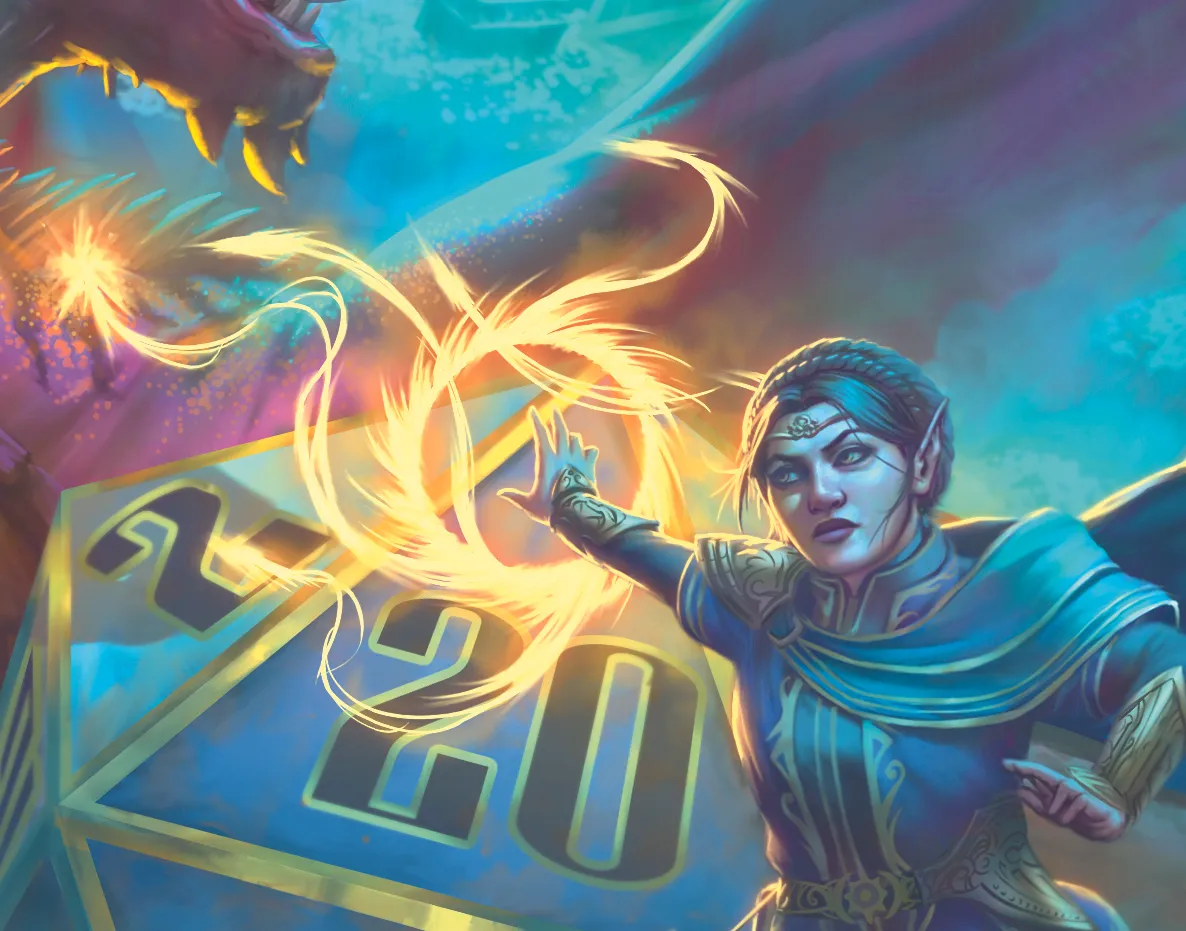
The local colour of an object is the way it looks under perfectly white light. Under a white light, every crayon in the box looks like the colour written on the side of that crayon. If you put the crayons under a red light, though, everything changes.
This concept can be a whole workshop in itself, but know that the colour of the light pushes everything it hits towards that colour. The severity depends on how pastel that light is, and the local colour and the texture of the object.
Here you can see the blue light from above is influencing everything that isn’t lit by the brighter light source, her magic missile spell.
06. Colour grouping
You can use that same concept to group things together under the same colour. By placing several objects under one coloured light, they all take on that colour and fade into each other. At least, it feels that way. This is one method of taking a lot of information and making it more easily digestible.
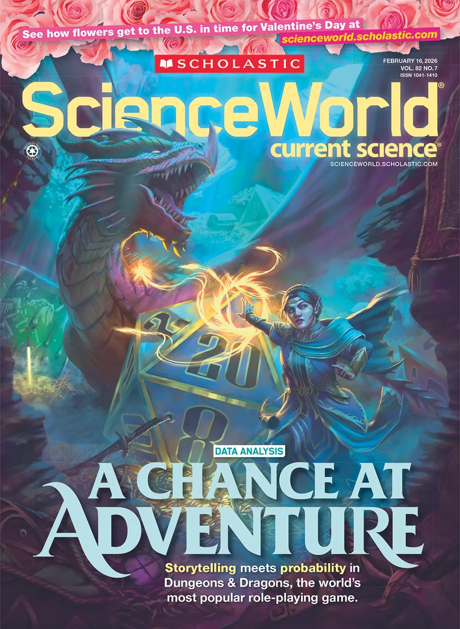
In this piece for Scholastic Science World, the client asked for a treasure trove of Dungeons & Dragons elements to be scattered throughout in celebration of the game’s long and rich history. To paint each one of those things in their local colour would turn into static really quickly.
07. Gradients
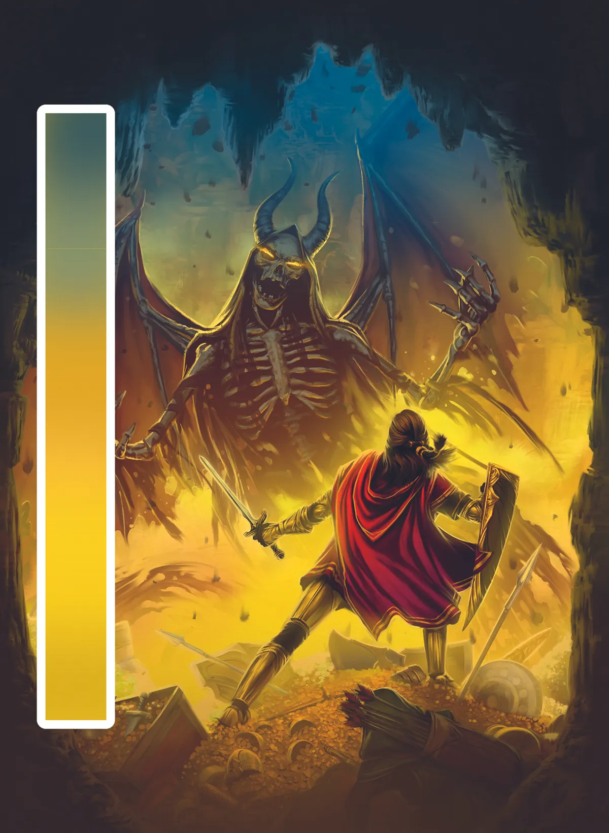
You can also use gradients to draw the eye to a particular spot. Back to the game box art, since the heavy metal skeleton is meant to add more to the story of our ambiguous hero (the player character), I want to draw the eye down from his bony, beautiful mug and towards the first read.
To do that, I’ve put cool blues and greens above, which gently blend into a warmer orange and eventual sunny yellow. Heroic yellow. The smooth colour transition is meant to counter the sharp edges of the demon
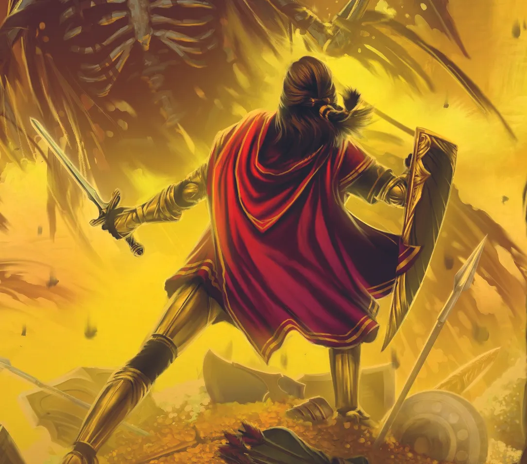
08. Exclusivity
You can also use colour like a bullseye. In the game art, I’ve made sure that the red of our hero’s cape isn’t used anywhere else in the piece.
By keeping all the other colours something other than bold red, it makes that bold red spot stand out immediately. If I choose to add more red items, each addition would take away from the overall impact of the cape. That doesn’t mean you have to be exclusive with a colour, but it’s a powerful tool.
09. The greys
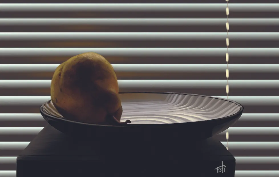
Now for something a little different. Diving back into my old schoolwork here. In this exciting painting of a cybernetic (but fully realistic) pear that is definitely sci-fi/fantasy art, I’m using colour very minimally.
By letting the pear be the only object in the image with a saturate local colour, it looks more important than everything else in the image. Also, keeping my palette this small makes all the colour bounce effects stand out more. The reflection of the yellow on the plate and blinds gets to be its own point of interest
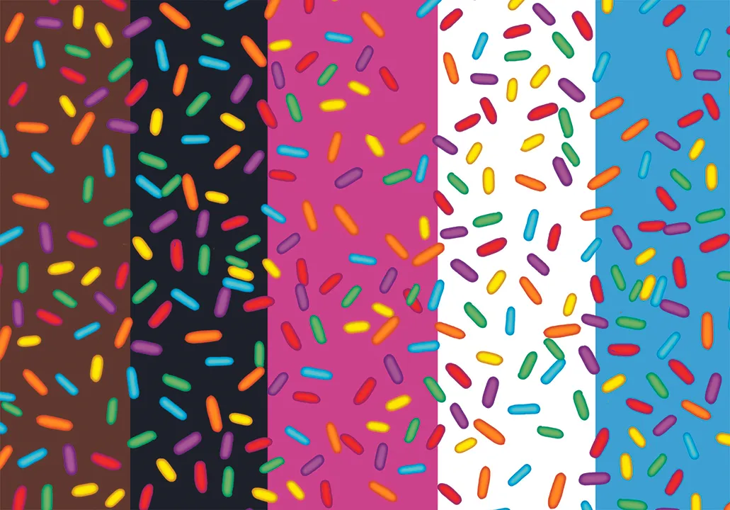
10. The sprinkles effect
What if I told you this next part was based on a dream I had? A dream that was structured like an art lesson. Well, that’s exactly what happened.
If you want objects in your foreground to feel special and colourful, consider toning down the saturation in your background. The less colour in your background, the more colour in your foreground can shine.
Putting different colours behind the sprinkles like this both illustrates that point and creates the flag of my kingdom.
11. Flat and graphic
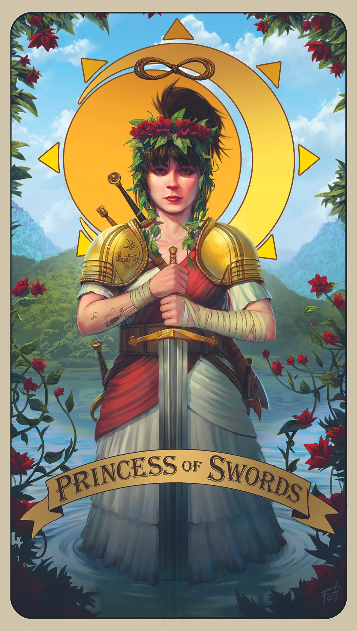
The same idea works for flat, comic-style art. Even if you’re not using colour to represent anything like real light, you can use these same concepts with good old salt-of-the-earth flat colour.
Here I’ve used the flatness of the sun/moon symbol behind Rachel to create a clear frame for the focal point. All contrast can be good contrast when used the right way, and realism versus iconography can be contrast
12. Harmony
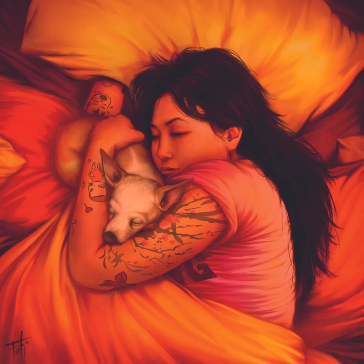
I also like using colour to create harmony. In this portrait, I wanted to centre in on the bond between Jade and her dog Pickle. It’s a warm, soft image, and the colour usage reflects that.
Keeping everything in this analogous colour scheme creates the sense that they all belong together. By telling the story with colour, I can tell the story of the art.
13. Disharmony

In this snowy landscape, I’ve used colour to harmonise 95 per cent of the image, but made one part different. Like the idea of exclusivity, but I’m doing it with colour, texture and tone to an extreme.
By keeping everything in an analogous blue colour scheme except for the orange fire, it makes that fire stand out way more than its real estate would normally allow.
14. Complementing colour combinations
Colour complements are another way to make the focal point pop, which is half the battle. In this interior art for the Illumicrate edition of the novel Slow Gods, I knew that both of the environments I’d be painting the main character Maw in were predominately green.
With that in mind, I chose red as the primary colour of his outfit. Red is the complementary colour to green, so placing one on top of the other creates the highest amount of contrast two colours can generate. Red/green, blue/orange and yellow/ purple are the three most basic combos that I use to devastating effect in the art ring
This article originally appeared in ImagineFX. Subscribe to ImagineFX to never miss an issue. Print and digital subscriptions are available.

