A beginner's guide to designing interface animations
Putting animation principles into web design

It's fun to read about these principles, but they're more useful when we put them into action. Let's take a stab at putting these techniques into practice with some CSS animation.
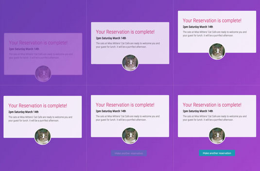
Our example is an animated alert box that confirms your booking at a fictitious cat café. It animates onto the screen to let us know our booking task has successfully been completed.
Our starting point is a bit, well, lacking. Our alert box does the bare minimum: it animates into view, followed by the associated button, which fades in below it. There's nothing all that compelling about it... at least not yet.
Article continues belowSet the timing of your web animation


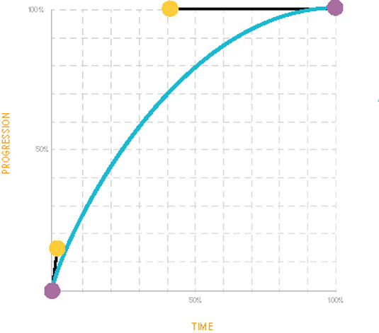
Timing is always a good one to start with. Our alert box is using the ease-out timing function, so it comes in at a higher speed and then slows into place in a low-key kind of way. Not bad, but it's still a little lacklustre considering the task at hand.
This is the last step in our transaction. We've just finished our task and booked something fun and exciting (at least, if you like cats). A little more energy and excitement is in order for this situation! A change to our easing will help take care of that.
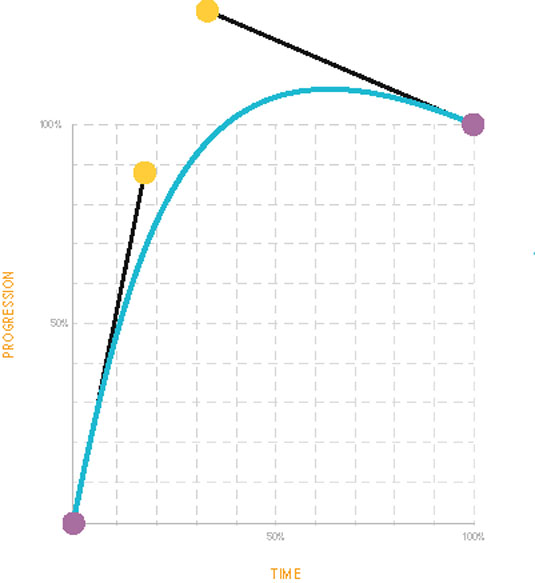
We'll keep the general feel of an ease-out, but we'll amp it up with a custom cubic Bézier function created on cubic-bezier.com. We'll have our new easing shoot out past the end point and then snap back into place.
Our new animation now reads:
Sign up to Creative Bloq's daily newsletter, which brings you the latest news and inspiration from the worlds of art, design and technology.
animation: slideIn .85s cubic-bezier(0.175, 0.885, 0.320, 1.275) both, fadeIn 0.25s ease-in both;With that change we've accomplished two things: We've created follow through action by having our box overshoot its destination. We've made the motion feel more energetic by using a curve with more drastic speed changes. In our example of how it looks now it's still too slow, but we'll address that at the end.
Add secondary action to your web animation
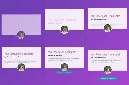
Our button is a prime candidate for some secondary action. It's related to our main alert box, and it can appear slightly afterwards. Its delayed fade-in hints at some secondary action, but we could create a more dramatic effect by having it slide out from under the body of the alert box, as if it's sliding down into place as a reaction to the alert box's upward motion.
To accomplish this, we'll add one set of keyframes for that slide down action:
@keyframes slideDown {
from {transform: translateY(-120px)}
to {transform: translateY(0)}
}
Add that animation to our button in addition to its fading in, with slight delays on both so they happen when the main motion has mostly completed:
button {
animation: slideDown .425s .55s cubic-bezier(.03,.16,.39,0.99); both, fadeIn .6s .5s cubic-bezier(0.550, 0.085, 0.680, 0.530) both;
}
It's already looking like a much more sophisticated and energetic animation!
Add some overlap to the animation
All of the content within our alert box is moving at the same rate, like it's a flat piece of glass with the text etched onto it. This doesn't fit with our goal of creating an energetic, fun mood with the motion. Animating the text inside the box separately will create some overlapping action to give the motion more life and create the effect of energy transferring from one element to another.
To accomplish this, I'll add one more set of keyframes for a less pronounced slide in. I'll apply these to the h2, h3 and the paragraph inside the box, each with a delay. The new set of keyframes is a shortened version of our slideIn animation:
@keyframes slideInShort {
from {transform:translateY(80px);}
to {transform:translateY(0);}
}
All three elements are assigned that animation with varying delays:
animation: slideInShort 0.3s cubic-bezier(.03,.16,.39,0.99); both, fadeIn 0.15s cubic-bezier(0.550, 0.085, 0.680, 0.530) both;Our example is really starting to shape up now.
Sass variables to manage delays and durations
Sass can save you some headaches when it comes to adjusting related durations and delays. I like to set my related durations and delays relative to a global Sass variable – like $dur:.6s, for example – then multiply that variable as needed for related delays and durations. It's a huge time-saver.
Add final touches and speed the whole thing up

We tend to keep animations slower than they need to be while we're designing them. And for good reason: we need to see what's happening in order to make our design decisions.
It takes much less time to 'read' an animation than it does to design it, though. Our eyes and brains work very quickly when reading motion, so speeding up our animations is almost always necessary – sometimes as drastically as half the speed. Don't be shy in chopping these durations down.
To finish off our example, we'll cut down the durations and adjust the delays accordingly. Optionally, we can also add in some Sass variables for the cubic Bézier values and durations to tidy things up. See our example in its final state.
After those few tweaks, our alert box animation is looking much more polished. All the motion involved has been aligned to the message we wanted to convey, using a few of the classic animation principles.
These techniques, along with the other eight in the list, can be applied to nearly any web animation task. The more we put them into practice, the better our motion design skills will become.
Want to know more about web animation? Award-winning SVG specialist Chris Gannon will talk about interactive web animation at Generate London on 21/22 September, while Aaron Gustafson will explore adaptive interfaces and demonstrate how they smartly morph to meet their users’ needs. The two-day/one-track conference will also cover conversational interfaces, web performance, accessibility, building interfaces for the next billion and much more. If you want to stay ahead of the game with advice from the industry's best, reserve your spot today!
This article was originally published in net magazine.
Related articles:
- 1
- 2
Current page: Using animation principles in web design
Prev Page Animation principles for web design