How to use illustration on websites - 5 creative examples
Illustration is a great way to spice up your website, but can make navigation confusing, says Gene Crawford.
Illustration can add character, warmth and personality into your web design. However, there is a danger of muddying the waters of interaction and communication if it isn't done well.
It's important to make sure there is a clear distinction between interactive elements and illustrative content.
This will ensure that the site is not only beautiful to look at but is also easy for users to navigate through and take any action, such as signing up for a newsletter.
Article continues belowDifferent styles
Differentiating between interaction and illustration can be approached in several different ways. However, it's normally best if buttons, navigation elements and calls-to-action aren't in the same style as the illustration on the rest of the page, to help them stand out.
For example, if the illustration is heavily textured and rough, perhaps everything the user interacts with should have sharp edges and drop shadows. If the illustration is line or one-colour, then a good way to differentiate it from the navigation would be to make all other elements brightly coloured.
Clearing the way
The point is that making these elements visually distinct from the illustration helps reduce confusion by making sure that users can easily spot what they want to do or where they want to go. This, in turn, will allow the user to marvel at the beautiful art on your site while still getting them on their way.
Five examples to check out
01. Basecamp

The website for the project management application Basecamp makes perfect use of symbolic illustrations to tell the story of what the application is and what you do with it.
Sign up to Creative Bloq's daily newsletter, which brings you the latest news and inspiration from the worlds of art, design and technology.
02. Xperiments
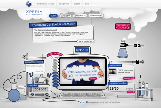
On the Xperiments website, the illustrative and interactive elements are mixed a little too closely. While beautifully illustrated it can lead to some confusing interaction points.
03. MailChimp
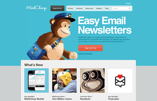
The email marketing application MailChimp is a great example of using rich illustrative and pictorial images and having a very clear differentiation between that and interactive elements.
04. Indubitablee
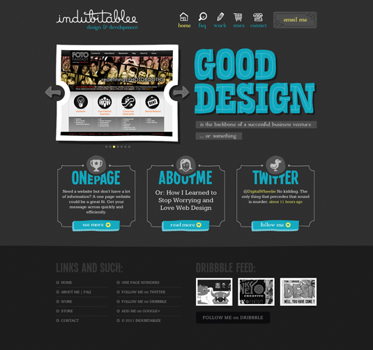
The web designer portfolio website for Indubitablee is a great mix of illustration and balanced interactive elements. They even use colour to help solidify the difference visually.
05. Ian James Cox
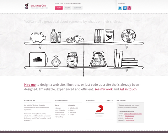
The portfolio website for Ian James Cox uses both illustrative elements and traditional navigation to create an interesting way to navigate the site's content.
This article first appeared in net magazine - the world's best-selling magazine for web designers and developers.

The Creative Bloq team is made up of a group of art and design enthusiasts, and has changed and evolved since Creative Bloq began back in 2012. The current website team consists of eight full-time members of staff: Editor Georgia Coggan, Deputy Editor Rosie Hilder, Ecommerce Editor Beren Neale, Senior News Editor Daniel Piper, Editor, Digital Art and 3D Ian Dean, Tech Reviews Editor Erlingur Einarsson, Ecommerce Writer Beth Nicholls and Staff Writer Natalie Fear, as well as a roster of freelancers from around the world. The ImagineFX magazine team also pitch in, ensuring that content from leading digital art publication ImagineFX is represented on Creative Bloq.
