Animate with CSS using Sass and Compass
Add interactivity and animation to your site with CSS3 using Sass and Compass. BKWLD's Matthew Aebersold shows how to trigger the animations using jQuery.
Sign up to Creative Bloq's daily newsletter, which brings you the latest news and inspiration from the worlds of art, design and technology.
You are now subscribed
Your newsletter sign-up was successful
Want to add more newsletters?

When it comes to adding animation and interactivity in the browser, there are countless solutions by many people. What I'm proposing here isn't a global solution to some problem, but rather a workflow that's clean, simple, easily editable, and a breeze to maintain.
At BKWLD, we get the unique opportunity to develop in a forward-thinking way. Most of our clients give us the freedom to add polish and beauty to modern browsers, and let the experience gracefully degrade when necessary. Doing this lets us focus on using CSS3 for all the animation and interactivity, while letting the older browsers simply display static content.
There are many benefits to letting CSS drive the animations on a page - chiefly performance, which is better across the board. Since we're trying not to change DOM elements 20-30fps, animations will perform better, especially on devices that would otherwise have a tough time keeping up. For instance, CSS3 animation performance on iOS is noticeably smoother and quicker. So, if you're building responsive sites that still maintain most of your animation and functionality for mobile sizes, then this approach is especially beneficial.
Article continues belowAs for browsers that don’t support CSS3, the transitions just won't happen. For example, if you have colours changing on mouse over, be sure to have a fallback so that the colour change still happens, just without a tween. Adding CSS3 transitions in an unobtrusive way is the best method for adding polish to your site, still allowing older browsers to access the content, which is ultimately the most important thing.
For this tutorial, I'm going to build a simple HTML page that showcases Sass, Compass and jQuery working together to create rich animation that’s easy to write and maintain. For most of the animations, we will implement them by simply adding or removing a class from the element. This is minimally invasive to the DOM and, like I said above, it keeps the animation layer in CSS, which boosts performance. Now I will introduce Sass and Compass, and explain why these utilities are beneficial and worth the time to set up.
Sass

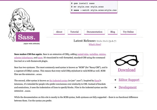
Sass is a preprocessor of CSS that adds additional functionality and power to regular CSS. In many ways Sass is very similar to CSS; it just extends its functionality, adding things like variables, mixins, nesting and more. It compiles into valid CSS, so the browser doesn't know any difference.
The first benefit of writing in Sass is the addition of variables. First, you declare your variable at the top of your document:
Sign up to Creative Bloq's daily newsletter, which brings you the latest news and inspiration from the worlds of art, design and technology.
$blue = '#3366cc';Then, you can use that variable elsewhere in your .scss file:
h2 {
  color: $blue;
}
.header{
background-color: $blue;
}When you need to change the colour, you simply edit the variable, and it changes everywhere that variable is used.
Another great feature of Sass is mixins (CSS that's declared in a separate block of code, and can be included anywhere). For example:
@mixin blueButton {
   border-radius: 10;
   background-color: blue;
   border: 1px solid black;
   padding: 10px 30px;
   color: #ffffff;
}
Then you can include that block wherever you want, even in multiple places. This makes editing and maintaining code very simple, especially when there are a lot of elements that have common styles.
a { @include blueButton; }
h3 a { @include blueButton; }
Mixins can even accept parameters, like so:
@mixin bgColor($customColor) {
   background-color: $customColor;
}
Then, when you style an element, you can call the mixin and pass the custom parameter:
a {
  @include bgColor(‘#3366cc’);
}
Compass

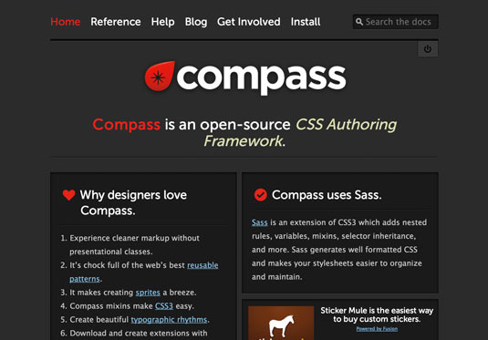
Compass is a great set of very powerful tools that are very easy to learn. When you use this in conjunction with Sass, it allows you to write very concise and readable code. Once Compass is installed on your machine, you can use it to create projects, watch projects and write CSS3-specific styles in a very convenient, short-handed way. For this project, I'm going to use Compass for watching the project folder (to compile our Sass into valid CSS) and for creating multiple prefixed properties with single lines of code.
One of Compass's main features is adding custom mixins that make writing vendor-specific CSS3 a breeze. For example, here's how you would normally add a border radius to an element:
.btn {
   -webkit-border-radius: 5px;
   -moz-border-radius: 5px;
   -o-border-radius: 5px;
   border-radius: 5px;
}
But with Compass, you can use the custom mixin that, when compiled, creates the code:
.btn {
   @include border-radius(5px);
}
This works with nearly every complex CSS3 declaration, from gradients to animations. Examples and explanations are available on Compass’s site, which has extensive documentation.
One final note: Compass and Sass are built with Ruby. If you're on a Mac, then Ruby is installed by default. If you're on Linux or Windows, a bit of setup is needed. If you need help, just visit the Ruby website.
Setting up
Let's get started by installing Sass and Compass. Open up your terminal and install Sass:
$ gem install sassAnd now, Compass:
$ gem install compassNote: if you're having trouble installing these gems from the command line, try running them with sudo, which will usually override any strange permissions settings you have on your machine.
From there, you need to put a config file in the root of your project. Create a file called config.rb and place it in the root of your project. Here's a simple example of a config file:
http_path = "/"
css_dir = "css"
sass_dir = "css/sass"
images_dir = "img"
javascripts_dir = "js"
As you can see, it's basically telling Compass where everything is in your project. Now, cd into your project folder, and run:
compass watchThis will listen to the project and compile valid CSS whenever you save any Sass (.scss) file. You can see all output generated in the terminal window, which is handy if there is an error. It will tell you what file is bad and even the lines that Compass/Sass didn't like.
The project
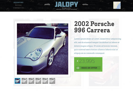
Now we can turn our attention to our project. The page I've made is a simple car dealership inventory page. It shows a grid of cars for sale. More information about those cars will appear when you mouse over the item. Also, clicking on an item will bring up a modal window with additional information.
The basics of the layout is just plain HTML/CSS. The interactivity is achieved by adding and removing classes with JavaScript (or in this case, jQuery) to trigger animations.
Project structure
Create your project folders in such a way that mirrors what you declared in your config.rb file. Below is an example of what the root of your project should look like:
root
   css/
   sass/
   js/
   img/
   index.html
   config.rb
app.scss
In order to take advantage of the Compass libraries, we need to include them at the top of our Sass file. To do so, put the following at the top of your app.scss file:
@import "compass/css3";
@import "compass/reset";
Importing compass/css3 basically brings in all of Compass's CSS3 mixins as described. The reset import brings in a full CSS reset block into your project. When the Sass is compiled, you will see the resulting reset in your main CSS file. The CSS3 libraries won't be visible, but you need to include them in order to compile your CSS3 includes.
Grid

The grid is just a floated list. All of the overlay information is already marked up and styled. But it's hidden for now, until we tell it to show. When you hover over the grid item, the content will animate in.
For this overlay, I'm simply using the :hover selector. It doesn't showcase the technique of adding and removing classes to the DOM element to trigger animations, but I favoured this approach because it's easier and cleaner. For the adding classes approach, see the hiding/showing of the modal window described below:
<li>
    <img src="img/cars/1.png" class="main-car-img" />
    div class="overlayHolder">
        <div class="overlay"></div>
        <div class="content">
             <img src="img/stats.png" />
        </div>
      </div>
      <img src="img/price.png" class="price" />
</li>
Modal

I'm showing a modal window on click, which brings up a detail window with specific information about that car. I am adding some animations using Compass to show how you can add some interactivity and polish. For X and Y movement, I'm relying on translateX and translateY, which is easy to grasp, and has fairly good browser support. I’m initially setting the modal window's Y position to its hidden, or off state.
For example:
//hide the modal so that it’s off screen
@include translateY(-100%);//Make sure it has some animation, 1/2 of a second, with easing
@include transition(translate 500ms ease-out);Show
By adding the class 'on', I’m translating it to 0px to bring the modal to its final resting place:
//Translate the modal to 0, which makes it centred vertically
&.on {
   @include translateY(0);
}
Hide
The beauty of this approach comes when it's time to close the modal window. You simply remove the class on, which makes the modal animate back to -100%. When you remove the class, the element will then inherit the styles it had previously. Because there's a translate declaration on that element, it will slide out of view, in the same way that it animated in.

Wrap
My example code shows much more than I was able to explain here. For this tutorial, I've a lot of content saved out as images. To extend the functionality of this site, make all the text, buttons, prices, etc, and then apply this animation technique to more elements.
Just don't rely on the animation to display vital content, or make sure there's at least a static fallback so people with less-capable browsers can still view the content. Hopefully you can extend, modify and evolve this code to fit your project. An up-to-date version is available on my GitHub profile.
Words: Matthew Aebersold
Matthew Aebersold is a senior Flash and interactive developer at BKWLD, and a freelance web designer & developer.
This article originally appeared in net magazine issue 242.
Liked this? Read these!
- Download the best free fonts
- Brilliant Wordpress tutorial selection
- How to make an app
Any questions? Ask away in the comments below...

The Creative Bloq team is made up of a group of art and design enthusiasts, and has changed and evolved since Creative Bloq began back in 2012. The current website team consists of eight full-time members of staff: Editor Georgia Coggan, Deputy Editor Rosie Hilder, Ecommerce Editor Beren Neale, Senior News Editor Daniel Piper, Editor, Digital Art and 3D Ian Dean, Tech Reviews Editor Erlingur Einarsson, Ecommerce Writer Beth Nicholls and Staff Writer Natalie Fear, as well as a roster of freelancers from around the world. The ImagineFX magazine team also pitch in, ensuring that content from leading digital art publication ImagineFX is represented on Creative Bloq.
