Beer brand gives Lunar New Year an abstract makeover
1664 joins forces with French artist Camille Walala.

Sign up to Creative Bloq's daily newsletter, which brings you the latest news and inspiration from the worlds of art, design and technology.
You are now subscribed
Your newsletter sign-up was successful
Want to add more newsletters?
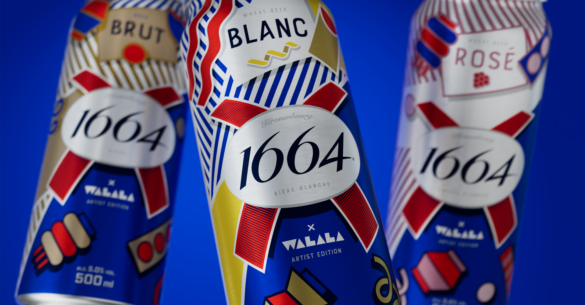
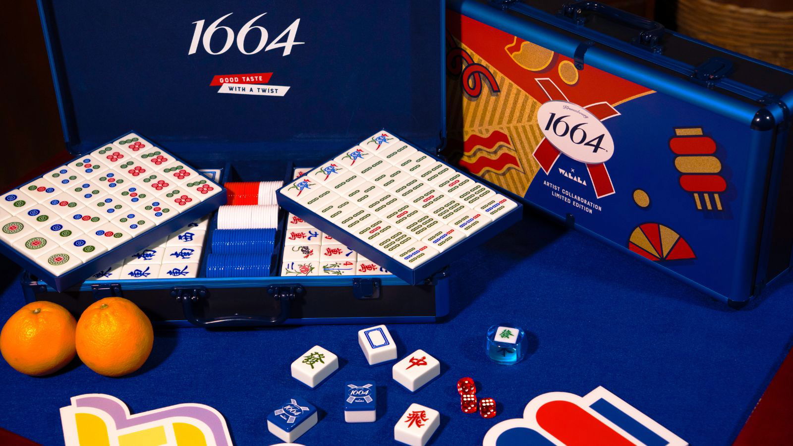
Beer brand 1664 has launched a vibrant collaboration with French artist Camille Walala, coinciding with this month's Lunar New Year celebrations. A subtle yet striking homage to the occasion, the campaign puts a distinct twist on festive tradition, bridging the gap between French and Asian culture.
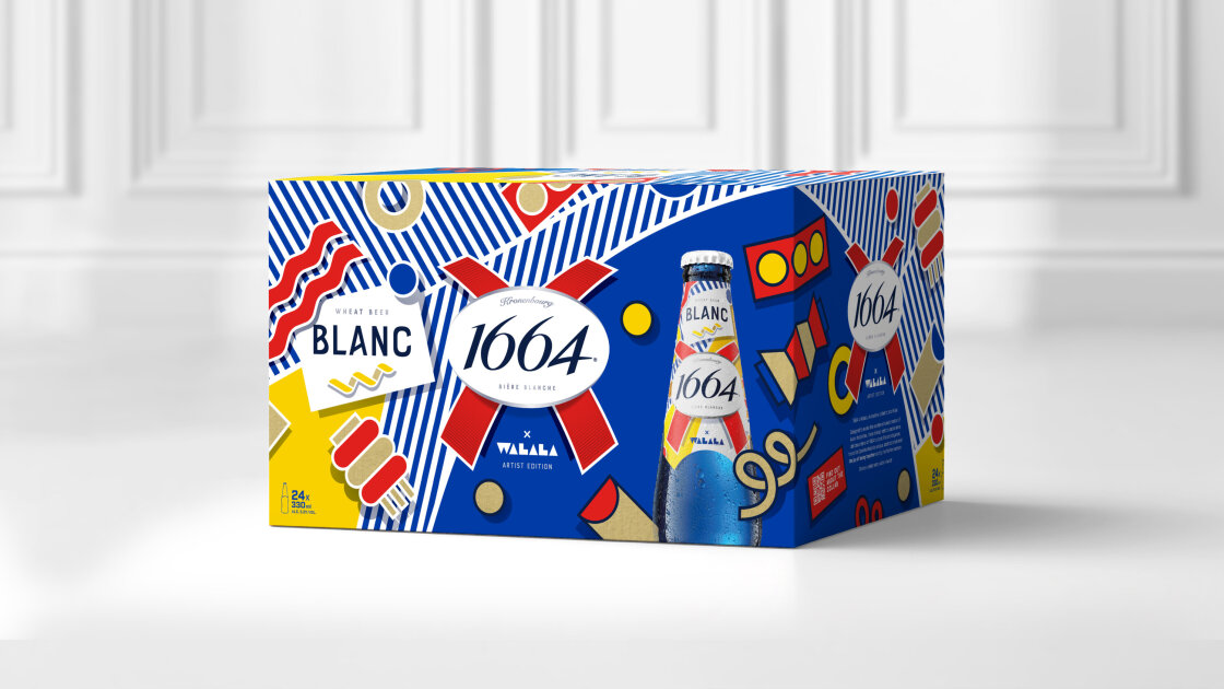
While there are no strict rules for creating standout packaging design, bold is best if you want to stand out from the crowd. With bright colours, abstract patterns and a clean contemporary flair, 1664's new limited edition packaging is a subtle blend of heritage and modern design.
While 1644 has been available in Asia for 8 years, its impression on the region has been humble, prompting the brand to immerse itself in the culture to reach its new audience. Guided by its ‘Good Taste with a Twist’ platform, the new collab with Camille Walala transforms festive tradition into abstract packaging design, "to move fluidly between beer, fashion and art."
Article continues below 
Created in collaboration with Epoch Design, at its core, the project is a fusion of culture. "Walala took inspiration from her French roots and deep love of Paris, from memories of festive family gatherings and from the seasonal son et lumière shows of her youth", explains the official press release. From bottles to boxes, the branding features "contemporary and abstract symbols with joyful, geometric patterns," that mix sophistication with playfulness.

While I appreciate the joyful spirit of Walala's artwork, I don't get a distinctly Asian feel from the design (naturally, since she's a French artist drawing from her experience). While the designs are inspired by Asian tradition, their graphic style makes the design feel a little too abstract. It also begs the question as to why a Chinese artist wasn't commissioned for the project to tie the brand more towards its target demographic, rather than its own strong heritage.
For more design inspiration, check out Sol's sunny rebrand or take a look at the BrewDog design refresh that bites back.
Sign up to Creative Bloq's daily newsletter, which brings you the latest news and inspiration from the worlds of art, design and technology.

Natalie Fear is Creative Bloq's staff writer. With an eye for trending topics and a passion for internet culture, she brings you the latest in art and design news. Natalie also runs Creative Bloq’s 5 Questions series, spotlighting diverse talent across the creative industries. Outside of work, she loves all things literature and music (although she’s partial to a spot of TikTok brain rot).
You must confirm your public display name before commenting
Please logout and then login again, you will then be prompted to enter your display name.
