Divine Chocolate’s gorgeous illustrations show the power of storytelling
I adore the vibrant packaging,

Sign up to Creative Bloq's daily newsletter, which brings you the latest news and inspiration from the worlds of art, design and technology.
You are now subscribed
Your newsletter sign-up was successful
Want to add more newsletters?
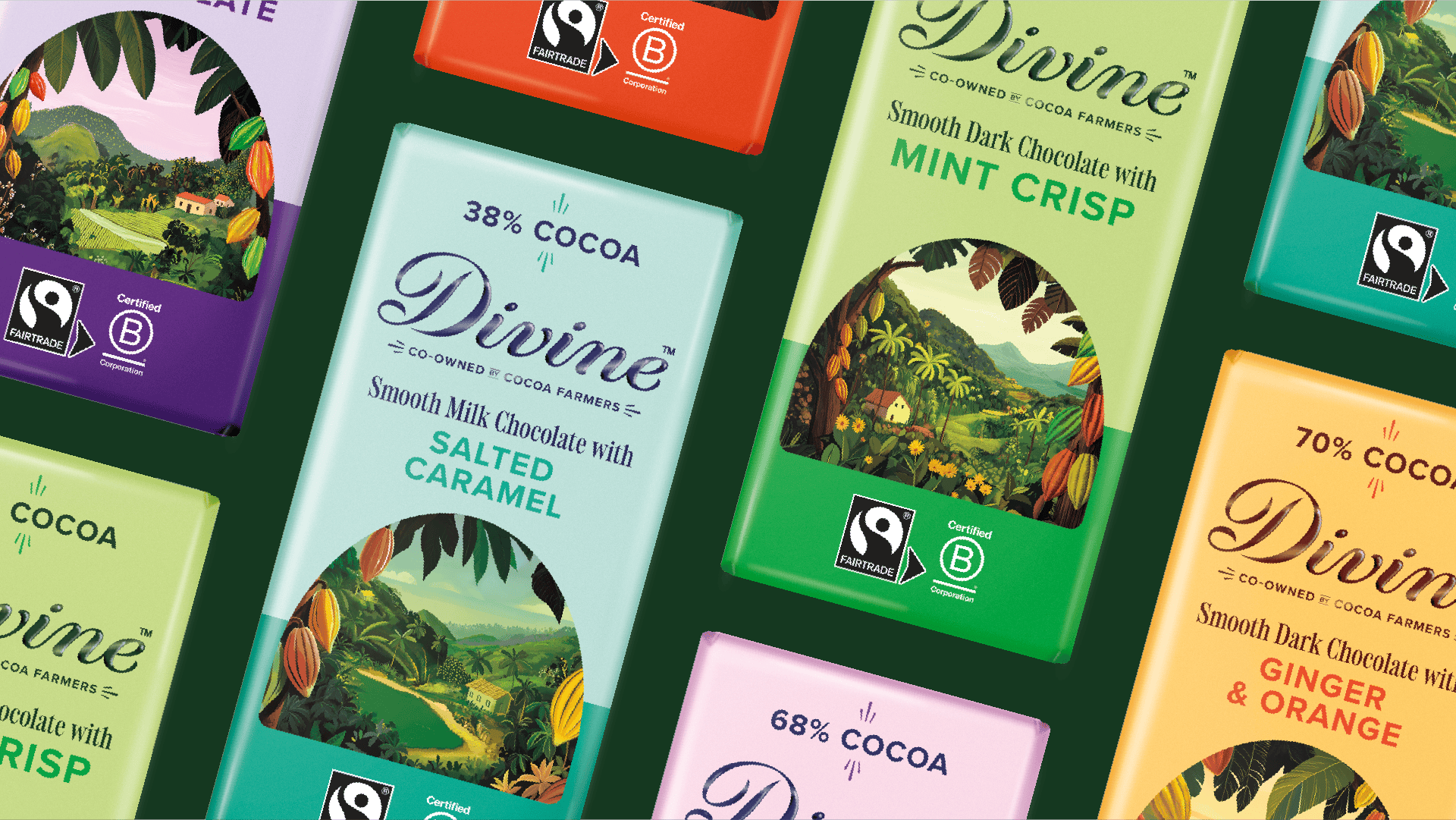
Standing out in the chocolate branding sphere is no easy task when you're competing against heritage names and fleeting trends. Cutting through the noise is the fairtrade chocolate brand, Divine, with its stunning new brand identity, bringing the flavours of Ghana to life through beautiful bespoke illustrations.
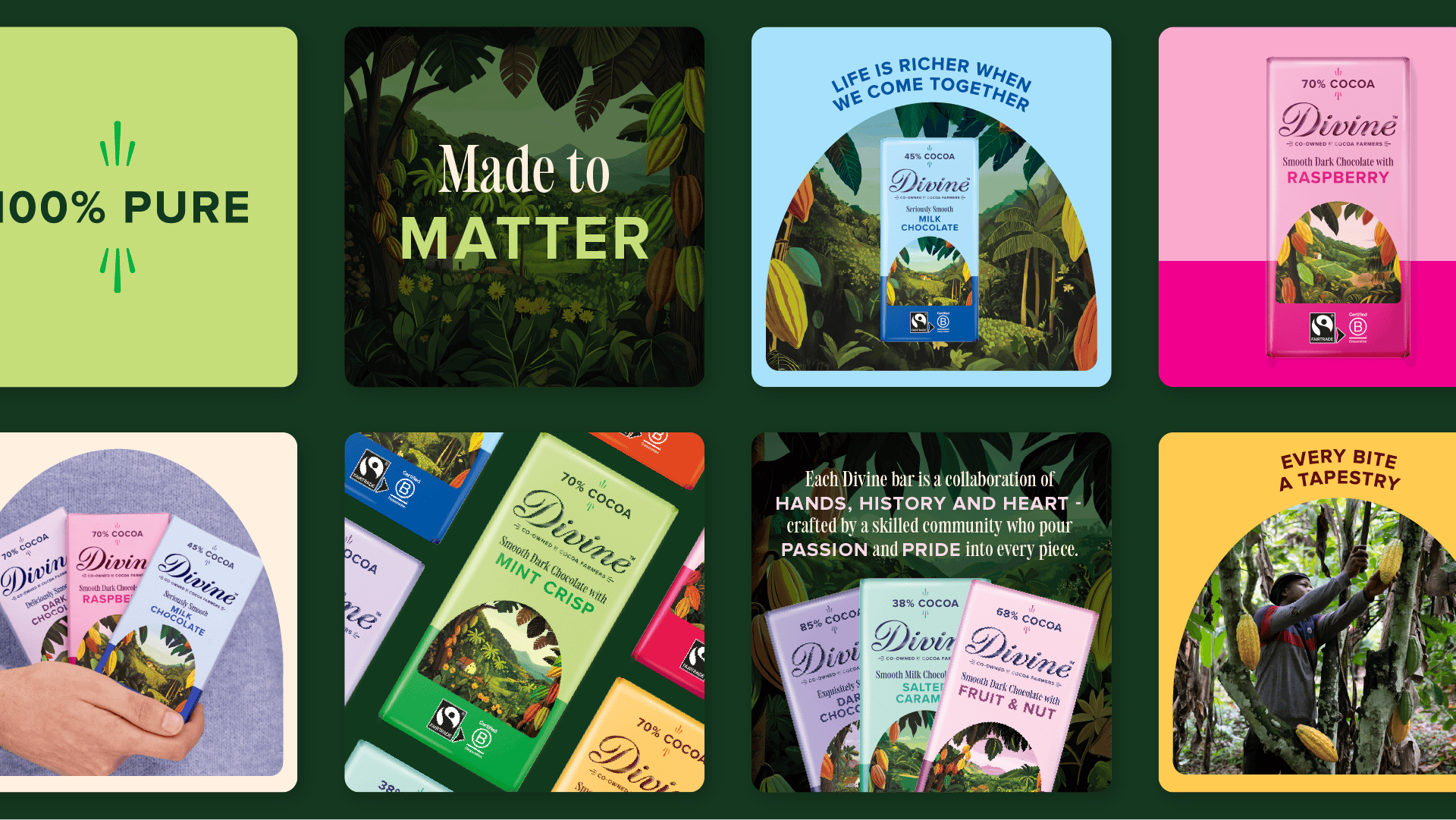
While some may believe the best rebrands are about grand reinvention and bold visuals, Divine proves that considered heritage design can be just as powerful. Vibrant, joyful and culturally rich, Divine's new brand identity shines in its palpably human quality.
Created by Wildish & Co, Divine's new identity is rooted in its heritage as a company founded by cocoa farmers from the Kuapa Kokoo cooperative in Ghana. "The starting point for the redesign was Divine’s farmer-owned, Fairtrade roots and the desire to place the people and places behind the chocolate more visibly at the heart of the packaging," says Sam Fresco, managing director at Wildish & Co. "We set out to move away from a system where flavour was primarily signposted through pattern, and instead make flavour, origin and product storytelling more central to the design."
Article continues below 
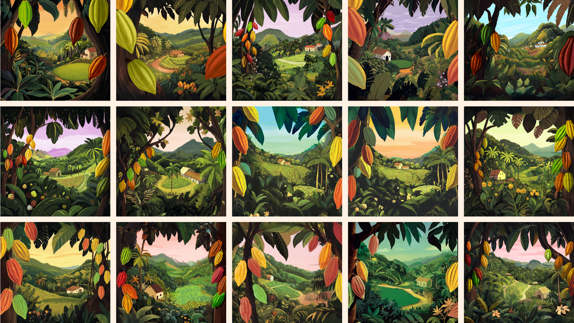
At the core of the brand identity is its colourful hand-drawn illustrations that capture a spirit of aspiration and warmth. 'While a more playful and abstract direction was explored early on, the client’s priority was to represent the source of the chocolate as accurately and respectfully as possible," explains Sam.
"We experimented with a range of landscape scenes and visual styles, incorporating farmers, huts, cocoa pods and wider farm environments, and testing approaches that ranged from more graphic and print-inspired to more realistic.
The final direction is a hand-drawn style that balances realism with elevation. It brings the story of Ghanaian cocoa farms vividly to life, helping to create an emotional connection with the people behind the product rather than relying on generic or symbolic imagery," Sam adds.

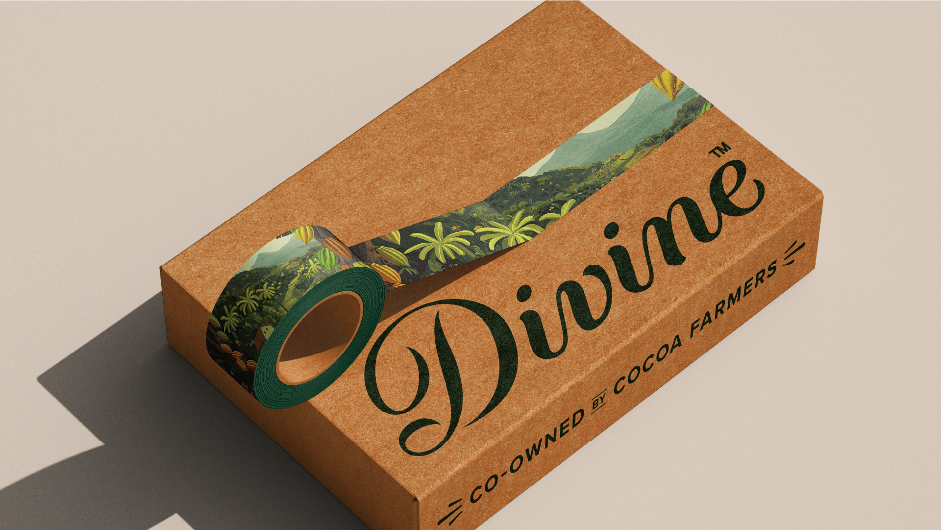
Colour was chosen carefully to reflect the brand's heritage, with core hues of dark green and cream connecting the brand "to nature, farming and sustainability, and to reinforce Divine’s Fairtrade heritage and farmer co-ownership."
Sign up to Creative Bloq's daily newsletter, which brings you the latest news and inspiration from the worlds of art, design and technology.
"At the same time, the team were keen to move away from relying on the traditional visual cues often used to signal premium chocolate, such as heavy blacks, dark browns and muted gold tones," Sam says. "Instead, the new palette is designed to feel confident, distinctive and flavour-led, allowing the product itself to take centre stage rather than defaulting to category conventions.
Across the wider range, the palette expands into a large spectrum of darks, brights and lights that directly correspond to individual flavours. Each bar is represented by a vibrant, flavour-led hue designed to stand out on the shelf, paired with darker supporting shades to improve legibility and contrast on pack. This approach helps Divine feel more expressive and contemporary, while still remaining rooted in its heritage and values," he explains.
A new, elegant serif typeface in the form of Holise Medium brings "warm, human character" that "reflects the people behind the product and the brand’s values, while its refined detailing helps signal quality and a more premium positioning." Paired with the existing Proxima Nova, the brand prioritises balance, flexibility and legibility that still feels grounded.

With a delicate balance of vibrant playfulness and charming, human-centred design, Divine has created a stunning brand identity with purpose. It's a prime example of how packaging can extend beyond empty design and become a beautiful storytelling tool that elevates your brand.
For more design inspiration, check out Fortnum and Mason's chocolate that you can hear or take a look at the Twix ad that was banned for the stupidest reason ever.

Natalie Fear is Creative Bloq's staff writer. With an eye for trending topics and a passion for internet culture, she brings you the latest in art and design news. Natalie also runs Creative Bloq’s 5 Questions series, spotlighting diverse talent across the creative industries. Outside of work, she loves all things literature and music (although she’s partial to a spot of TikTok brain rot).
You must confirm your public display name before commenting
Please logout and then login again, you will then be prompted to enter your display name.
